+- Crimson Daggers — Art forum (//crimsondaggers.com/forum)
+-- Forum: PERSONAL ARTWORK (//crimsondaggers.com/forum/forum-9.html)
+--- Forum: SKETCHBOOKS (//crimsondaggers.com/forum/forum-10.html)
+--- Thread: CGMythology's Sketchbook (/thread-7224.html)
RE: CGMythology's Sketchbook - cgmythology - 02-14-2023
darktiste: Thanks, revised the gun heavily hopefully it works better now.
CBinnsIllustration: Thank you! Excellent point and paintover regarding the lighting on the GOW image, really appreciate you taking the time to do that. I just implemented it and the image is all the better for it! Excellent work with the gun on the new image as well, just incorporated some of those suggestions on the current sketch!
LeoKi: Most likely, yes
 Glad you dig the GOW piece. I did take some artistic license in terms of the lighting as well, hopefully it's not too distracting. Regarding the knees on the new sketch, I think it's the shape of the elipses that's giving it that impression so I updated it, hopefully it looks more natural now!
.......................
I updated the GOW image based on CBinnsIllustration's excellent paintover, here is the final image:

I updated the sketch for the new illustration and went ahead and did some quick color tests. I'm going to stick closely to the lighting on the reference for this one as it's crazy dynamic, but I am taking a ton of artistic license for the character design. My personal favorite is C followed by E, but I would love to hear any suggestions on what works best before moving forward, so please let me know!

RE: CGMythology's Sketchbook - darktiste - 02-14-2023
Just a question that a window casting on the wall right? So where the cast shadow on her or more precisely where is the window that casting that shadow i know it outside the scene but it impoertant to determine if she casting a shadow on that shadow or if the shadow is casted from the opposite side?I suppose you intended to solve that more complexe problem later right? I wouldn't want to be in your shoe ...that the type of illustration where 3d knowledge would save alot of time to find the most dynamic answeers.Just using a dummy and a few simple plane a light source and etc...
RE: CGMythology's Sketchbook - Leo Ki - 02-16-2023
Yes, the legs look more natural now. I prefer palette A because it makes her more inconspicuous and all the more dangerous. Just my own bias.
I too wonder where the light comes from to paint the window onto the wall. I guess it will become clear once you start rendering more.
RE: CGMythology's Sketchbook - cgmythology - 02-19-2023
darktiste: I haven't implemented lighting on the figure just yet as I wanted to see how it looks with flat colors without shadows/highlights. Just added them now, hopefully it makes sense now as well!
Leo Ki: Glad to hear it! Ended up going with 'C' as it pops the most. Hopefully the lighting makes sense now that the image is finalized!
............
I finished up the painting process, had a lot of fun with this one, particularly in regards to the lighting as I feel it's quite dynamic! Below is the current preview followed by some steps for those interested. There's still time for some tweaks if necessary, so any final input would be most appreciated!


............
Next up I started work on a new image depicting 'Helen Of Troy'. This was a lot of fun to draw as I wanted to implement a theme/story and I feel it worked fairly well. Any input before I begin work on some color tests would be most appreciated!

RE: CGMythology's Sketchbook - darktiste - 02-19-2023
A thing you could do is to go look at roman collumn is to get inspired and realize that there different part to a collum there literally no roman architecture with no decorative element i would say.Also spear don't just stick out of a piece of wooden stick. Invest yourself in the work and research and it will pay off in the result.
The neck seem a bit force to the right compare to face which is kinda odd looking.Also the upper arm seem of different thinkness thinner on the left and thicker on the right.I can spot a few tangente also.It not bad sometime a tangente kind lead the eye it just something you gotta plan otherwise it not gonna work in your best interest.
I played around with the face to try to give her a more sad looking face with a little angle toward the ground (personally the mouth is kinda low in my correction i think it just add a bit of extra sadness but it now totally necessary if you want beauty also ) i think it a different take on expressiveness.The usual leak of wrapping for the belt around i think i don't have to mention it by now (personally it just a preference i like to break up the silhouette you don't have to)
RE: CGMythology's Sketchbook - cgmythology - 02-19-2023
darktiste: Great feedback! I researched some greek architecture and incorporated in the background, works much better now, excellent suggestion. Thanks for the draw over as well, very helpful as always.
................
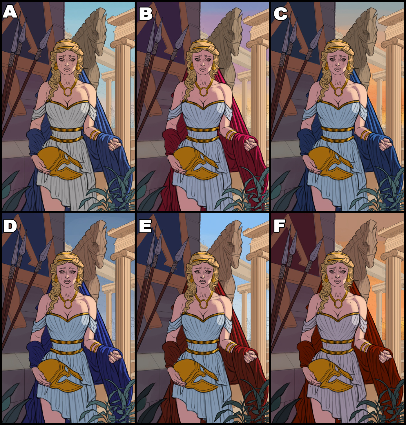
I updated the sketch, reworked the anatomy a bit as well as updating the structured in the background, I feel it works much better now. Next I did some color tests. My favorites are A, C, and E. Might combine elements from each that work the best and go from there I think, although I'm open to suggestions. Below is the updated sketch for the sake of clarity followed by the said color tests:


RE: CGMythology's Sketchbook - darktiste - 02-19-2023
I am leaning more toward a blue C OPTION it seem for me.But i would say try maybe something a little less saturated for the shadow since it mostly in shadow overall to inject some sadness in the color.Think of a raining day.Adding only the highest saturation of color to the eye will really help move the focus to the sadness in the eye i think.The sun set is also kinda poetic as it like loosing the light which is often associated with joy.
I am not sure as to what is going on exactly but maybe you could add smoke in the sky else i think the lightining can be kinda strange for C as you would not have the orange there if the sun is the other way around blue is the normal color of the sky when the sun rise or when it set you get the color change because of how the light hit the atmosphere.So where ever blue is facing it away from the sun and the color gradation is indicating where the sun is in the sky.In your scene i can count 2 light source since we see the side of those pillar we have to assume there something of equal force as the sun hitting the side of the pillar... as i previously commented contrast is good but also remember that primary and secondary light should have different intensity.That what scott robertson call the 1,2,3 read it not a must but it help define the form.Maybe she live on a planet with two sun =P i am a pest sometime sorry none artist probably don't care.
Please note the ''paint over'' is only for a idea of how desaturated it would look like.
RE: CGMythology's Sketchbook - cgmythology - 02-21-2023
darktiste: C it is! I feel that one works quite well so I went with that as suggested. I removed the sun in the background to keep the lighting consistent, but I added fire everywhere to reintroduce those warmer tones as well as to add drama to the scene, I think it works quite well. Your paintover is very useful as well, I incorporated some desaturated tones as suggested. Great feedback as always!
................
I went with C and continued to paint it in. Having a lot of fun with this one. The lighting on the figure was fairly challenging but I feel it works quite well. I had the shadows on the skin a bit too dark initially but I feel I've corrected that. Still has some ways to go, any input at this stage would be appreciated as always.

RE: CGMythology's Sketchbook - Azeol - 02-21-2023
What an illustration making machine you are! I should take some notes...
Though this might be too annoying to fix at this point in the process. The way she is holding the helmet seems a little awkward, like it would be falling out of her hand the way it is now unless she is pushing it into her body to keep it from falling, but the rendering doesn't seem to suggest that. Overall not the biggest deal though, just noticed at a quick look.
RE: CGMythology's Sketchbook - darktiste - 02-21-2023
My only concern i would say at this stage is pushing the value gradiant in the shadow side.3 value of the same color work enough for cartoony look but 1 or 2 value is just not enought to create the right amount of contrast personally i like strong contrast so it no surpris if i can't contain myself from trying to see a more contrasted version.
Note i focus on the character in particular for time sake.
What i want to say also is to trying to avoid putting the two light source at opposite direction giving each light a bit of a up or down angle help avoid a flatning and that also why as said previously you would possibly prefer the primary and secondary light to be of different intensity as it contribute to defining the volume.
Personally i think this composition would fix the previous mention problem and the rest of the body look superficial to the overall story.Minus the foreground element (plant) but it doesn't really matter as the overlapping helmet replace them just enought to be a foreground element instead.The only thing is the spear being crop.I like the verticality it give to the piece but i think we lose part of the story without the guard and the fire but it could be more implied like i said in an other comment with smoke in the sky and bigger flame near the shoulder portion. I just added the crop version(without the value adjustment) in case you feel the composition is interesting enough to go in that direction.
Oh and before i go just for giggle how would those spear not fall over if most of the weight is at the head of the spear?
Cheer and keep up the good work.
RE: CGMythology's Sketchbook - Jephyr - 02-25-2023
Hi CG, Lotza nice stuff since the last time I checked in. Watched the sketch vid — that turned out great.
Keep up the good work — and I know I don't have to say "keep posting new art." : )
RE: CGMythology's Sketchbook - Cruptic - 02-27-2023
Hey CG, man I have to bow to how prolific you are, it's insane to me. I would probably have a hard time even coming up with that many ideas, let alone painting full illustrations that often.
I have noticed a bit of inconsistency in each image when it comes to perspective and I'd say right now it might be the biggest thing holding you back. I'd urge you to maybe go back over a few of your past illustrations and identifying perspective issues and come up with ways to fix them - like not necessarily repainting the image but make mental notes of them - like 'oh I did this here, how can I avoid doing this in the future' type of. If you don't see any I can point some out if you want (when I have some more time).
Another thing is tangents, like darktiste already pointed out. They seem to creep in here and there - sometimes they cannot be avoided but maybe keep it in mind to not have multiple lines end at the same point in the image in spots you dont want to create focus.
Alright keep at it dude, you're doing great!
RE: CGMythology's Sketchbook - cgmythology - 02-28-2023
Azeol: Thanks! Hopefully the helmet looks more natural now with shading!
darktiste: Great points! Love what you did with the paintover, values on the shadowed side were giving me a bit of trouble so I appreciate the help! Hopefully the image looks better now in that regard in its final form!
Jephyr: Thanks for the kind words and support, really appreciate it!
Cruptic: Thanks for the kind words, and I agree about the perspective. I'll try to be more careful in the early steps and plan accordingly, as sometimes I do rush this step I admit. Great point about the tangents as well. I'll try to keep your feedback in mind for future illustrations as well, thanks again!
........................
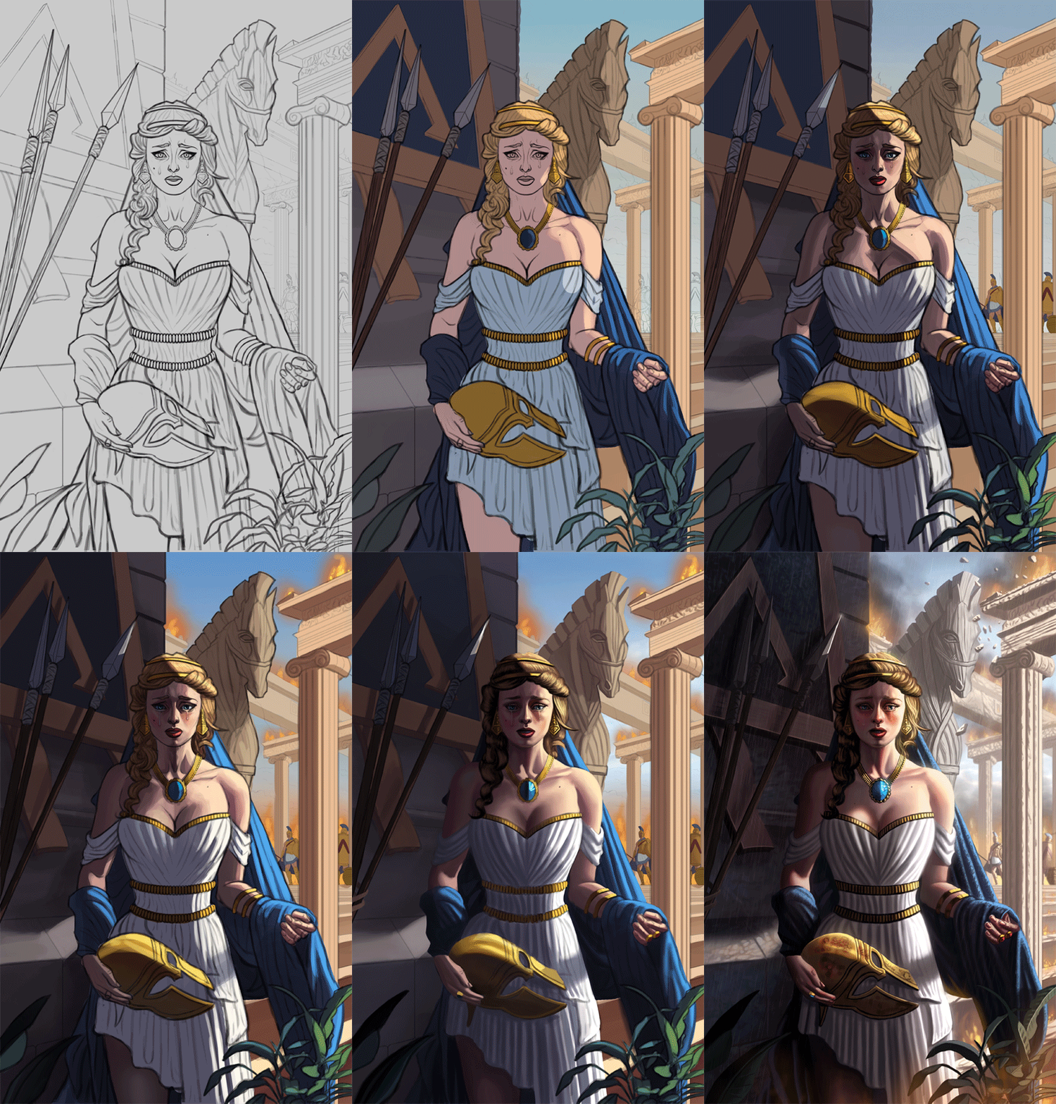
I finished up the painting process for Helen Of Troy, did my best to incorporate the feedback mentioned. Also went for something a bit more desaturated for the colors to add to the mood and hopefully create a more natural look. I'm open to feedback as well, so if something is really off please feel free to let me know! Below is the illustrations followed by some steps for those interested!


RE: CGMythology's Sketchbook - CBinnsIllustration - 02-28-2023
I like the latest piece! Her face is very nice and I love the Trojan horse! I did want to call out a few things that stick out to me that may or may not help. I would have showed a little more variance in the shading on her dress pleats. Having areas of 1 tone darker would really give it more depth and while there I would give the pleats some flattening where the helmet looks to be pressing against her. I would take some curtains and press against the pleating, you can see it flattens and tracts the folds in areas. Due to what looks to be your main light source I would adjust the shadows on her arm and where the casts handle of the other arm hits her dress. And maybe a little cast shadow on her face from her hair may help too. Did a really crude PO to help show where i meant. And maybe a little more shading on the necklace as it looks a little disconnected from her at the minute. But just my 2 cents though, great work once again. What you doing next?

RE: CGMythology's Sketchbook - darktiste - 02-28-2023
This one is kinda hard to rewind for me but here the primary idea i had in mind
Wetness+ Reduce Contrast
Because you introduce the idea that it raining which would reduce visibly
Here a few area i hit in more specific the tunic to introduce some shadow on the underside of the left breast, the space between the necklace and the hair , the left arm tunic part drapping over the left arm because the body is block some light, the interior of the helmet, the interior of the right arm and finally the interior of the right armpit.For the i face i gave more definition to the underside shadow to add sadness and also to help the form turn accordingly to the more angular nature of the side of the face.
For the wetness it important to bump up the contrast in the highlight and where the water doesn't necessarly role off because the more water sit on the surface the more reflective it become so also think where the water hit more.
One thing to consider also is how you did the structure in the background there is a big difference in the thickness of the beam going downward toward the left and the size of the supporting beam crossing under which look smaller in comparaison.Since it hard to tell how much other supporting beam exist outside the viewer eye i would say to review the scale for more believeablity not that it very noticeable just something to think about in term of functional design.
One thing i also did is reduce the visibility to introduce more atmospheric shattering in the background to reflect the change of weather.
Also just to say i like how you even took the time to add a few strap to group together those spear it just show how much you listen to feed back even in the smaller almost unticeable detail.
One observation for cloth and wetness is to consider how the water add extra weight and depending on thickness you can even get some of the skin color or whatever color underneath to start to show.Of course it not just thickness but how thight the material wrap around the form.
PM me if you want me to remove the wet t-shirt example
RE: CGMythology's Sketchbook - Leo Ki - 03-01-2023
I can't keep up! You're going too fast!
The lighting works well in the gritty sci-fi piece, and the yellow suit was the best choice for this brightness!
I agree with your choice of desaturating the Helen piece. You managed to make it express a whole range of tragedies beyond the myth itself.
I also agree with CBinns that her necklace looks like it is floating in the air.
To nitpick, I'm not sure Ionic columns existed at the time of Helen, not even Doric ones, but this myth has always been adapted to various historic periods, it's poetic license :)
PS: I missed your post, Darktiste, as it was on the next page.
There has been many good pieces of advice about this piece if you want to push it further, CGMyth. You can make it even more striking if you take the time.
RE: CGMythology's Sketchbook - darktiste - 03-02-2023
One small detail i just catch is the nail of her big finger it very weird looking it doesn't comform to the center line of the finger also how you did the wrinkle of that finger is like she as some kind of roll instead of just wrinkle it not wrapping.I think i would spend more time on all of her finger they look kinda rough and not very feminine.Also nail the should be more pinkish not this skin color the highlight on a nail it is strongest feature the rest of the nail is pretty much the same value even on the shadow side there isn't that much of a contrast the highlight feel also diffuse.
RE: CGMythology's Sketchbook - dimensional-knight - 03-03-2023
Dude, you're absurdly prolific! Awesome stuff!
So, if I may build upon darktiste's spot-on critique, to get more delicate hands you need to work on the fingers shape and shadows.
Their shapes are too cylindrical, while I get the sense you were going for a more lean look... and lean fingers are weird crooked twigs. There's not one shaped like another, and you'll have features like the knuckles being slightly fuller than the body of the fingers. A trick many use for knuckles is to shade them slightly darker and pinkish instead of rendering individual wrinkles, so they're still suggested but softer-looking. You're shading the nails a bit too harshly too, and they sit perfectly on the surface of the fingers while they should squish them a bit, making some of the fingertips also wider than the body.
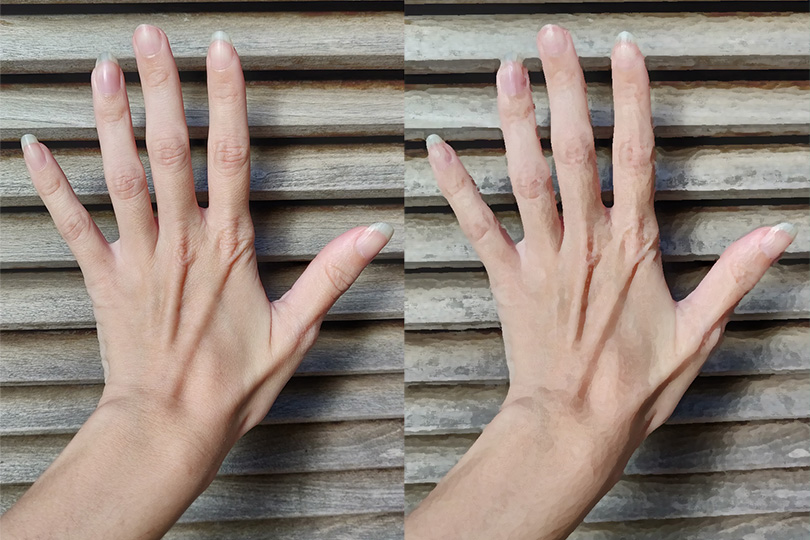
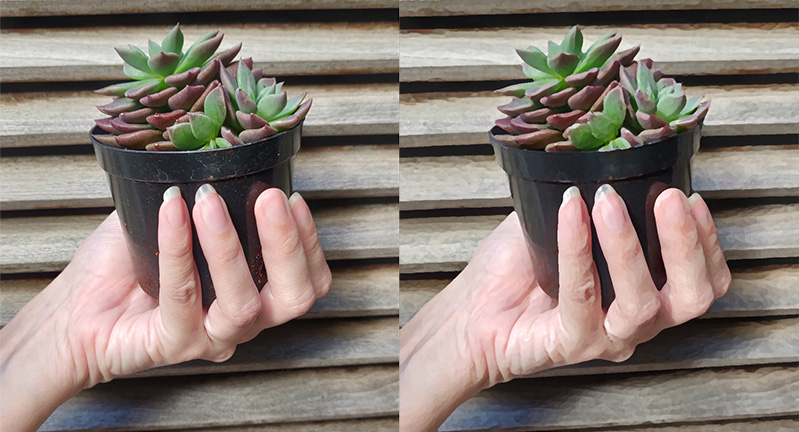
Turned fingers won't have round tips, in this type of hand the center of the digits protrude a bit. I happen to have hands of similar build (but bony!) and skin tone, so here are a few ref pics (please don't mind the nails, my care is limited to filing them as they get too uneven :x ):


I've applied a photoshop filter on the right to simplify the images. See how it's the skin on the root of the nails that gets more colored and darker, not the inner shape of the nail? The skin is very thin there, it can't catch many top highlights and they're very subtle, reflection-like, not lit vs shadowed area like. And the shadows on the fingers are soft because there's a lot of subsurface scattering going on, which is missing on Helen's hands.
It'd make her hands more like this, with less defined edges and hues marking the switch to different parts of the hands rather than deep shadows:

That's it. Keep up the good work, and I loved her facial structure, it's very cute.
RE: CGMythology's Sketchbook - cgmythology - 03-04-2023
CBinnsIllustration: Thank you! Great feedback as well, agree with pretty much everything and your paintover works really well in illustrating your input. I just incorporated and it works much better, thanks again!
darktiste: Great input! I don't want the rain to be too overpowering, but I agree that the fog could add to the mood a bit as shown with your paintover, and it works quite well! Did some subtle shading to the dress to introduce more skin tone colors to give it a very slight transparent feel, I don't want to take it too far as I don't want her to appear to sexual given the theme. I reworked the fingers a bit so hopefully they work better now as well!
Leo Ki: I'll try to take it easier! :D Glad you dig the color choices for the previous sci-fi piece! Glad you like the changes made the recent illustration as well, thanks again for your kind words and support, very much appreciate it!
dimensional-knight: Thank you! Great advice in regards to the hands, and the pics you posted were very helpful in that regard, thanks for taking the time to do that! I reworked them a bit and I'm hopeful they work better now!
Lydo: I agree about the stiff poses. In general I have a reference for the general pose which I try to recreate. In this case I had several references but none that I took on my own specific for this illustration which I now regret not doing. I love the sketches you illustrated, and I will definitely be applying your feedback for future pieces! Great work with the paintover as well, I usually think in shadows/darks to help define form but sometimes it doesn't compliment the skin quite well as shown with your image. I incorporated some of the lighter tones to the face, hopefully it's an improvement!
.....................
Some really great feedback I've received! Thanks everyone for taking the time to help me improve the image, really means a lot to me! I will also be applying some of the critiques for future illustrations as well, so hopefully my images can improve further as I go along. I updated the illustration and I feel it works much better now, and I think I'm calling it finished now unless something really major is off, so feel free to let me know! Below is the update!

RE: CGMythology's Sketchbook - darktiste - 03-04-2023
It as if everyone wanted this one to push you to the next level.Incredible moment on the forum not gonna lie.
Btw i wasn't suggesting anything toward nudity simply illustrating what wetness can do to cloth.