
+- Crimson Daggers — Art forum (//crimsondaggers.com/forum)
+-- Forum: PERSONAL ARTWORK (//crimsondaggers.com/forum/forum-9.html)
+--- Forum: SKETCHBOOKS (//crimsondaggers.com/forum/forum-10.html)
+--- Thread: CGMythology's Sketchbook (/thread-7224.html)
RE: CGMythology's Sketchbook - cgmythology - 07-24-2023
darktiste: Great input all around, made some of the changes you mentioned, hopefully the image is improved now!
CBinnsIllustration: Thank you, and great job with your paintover! Love what you did with the lighting, looks much more dynamic. I went ahead and applied your input and it looks much better I feel, so thanks again for that, very much appreciate it!
.............
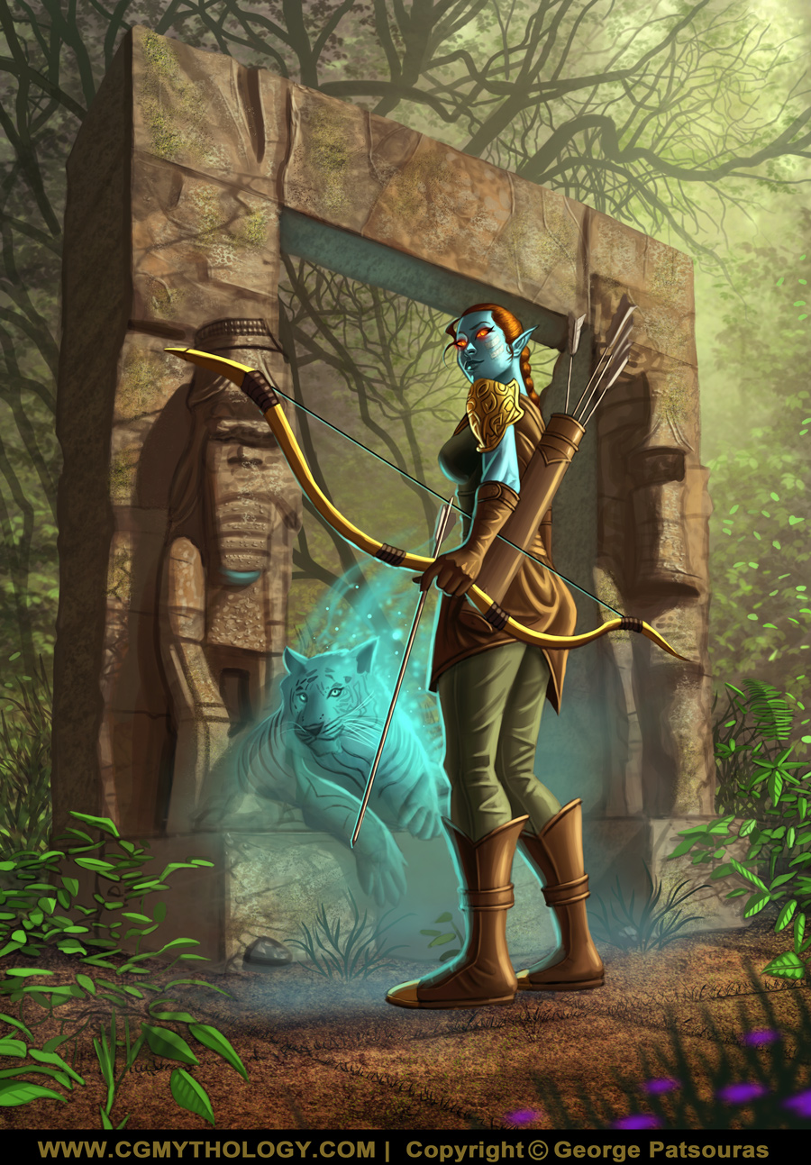
Final update for the 'archer', incorporated some more dynamic lighting and did some tweaking here and there to improve the image:
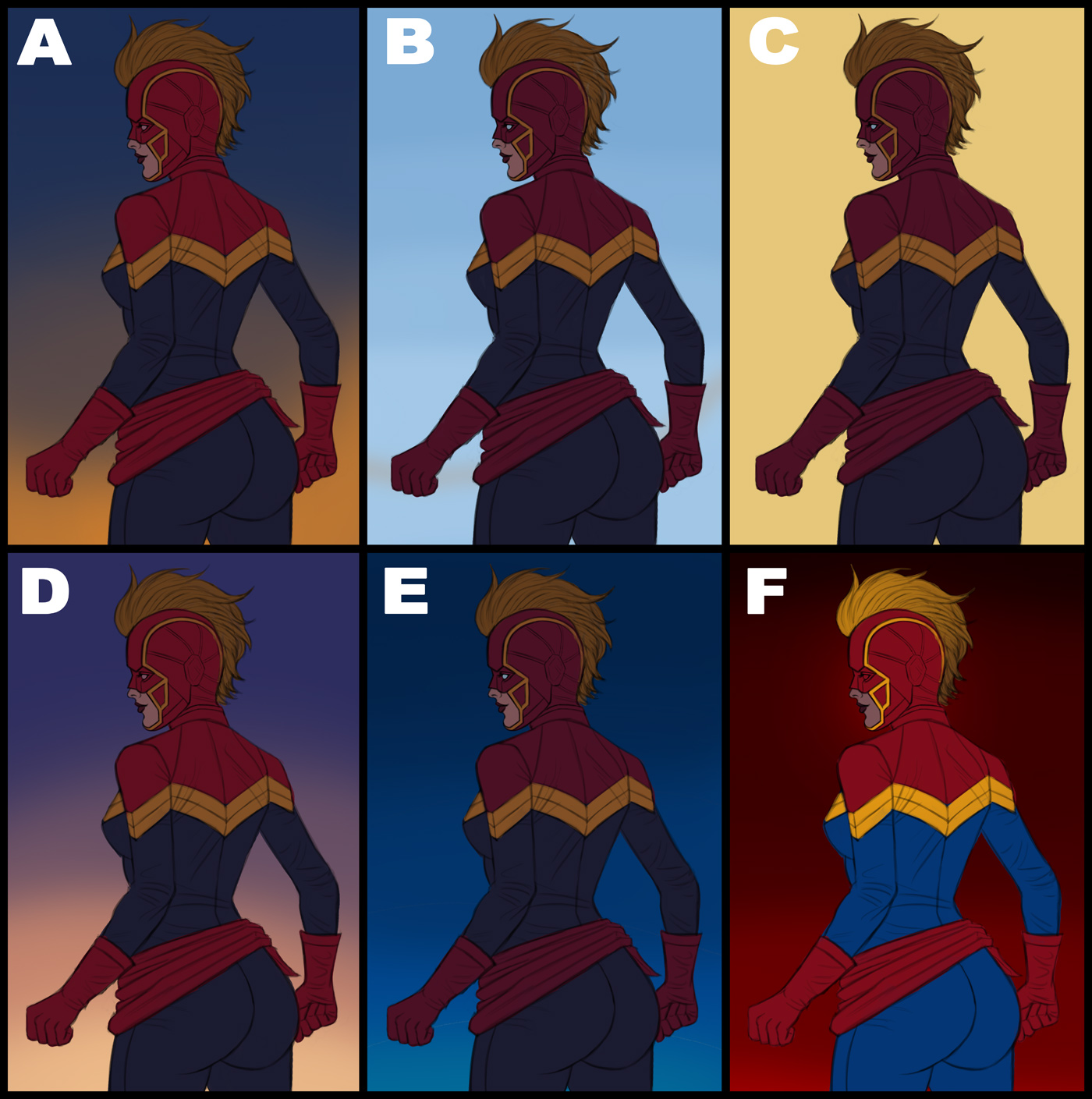
Next up I did some quick color tests for the new 'Captain Marvel' piece. My favorites are 'D' 'F' and 'A'. Not sure which one I'll end up going with, I'll probably take another look later to decide but I'm open to suggestions, so please feel free to let me know what works best!
RE: CGMythology's Sketchbook - CBinnsIllustration - 07-25-2023
Nice additions to the archer she looks great!
For me I like A or D, since she is red on top and blue on bottom it’s a nice natural contrast to have the background somewhat flip that. Looking forward to your progress
RE: CGMythology's Sketchbook - darktiste - 07-25-2023
I am a very bad boy i should have ask first but i still hope that you can excuse my initiative but i run that image throught what call the image to image function in Ai i think it did something still interesting enough to share with you may it be just the face without mask or the little detail of the costume and some slight change in the posture.
What fun is that it can even generate your character from a completely different pose so i really encourage you to go learn about Ai it such a great tool for posing.
I can even add or remove some element to your character so it very fast for iteration.
One the down size is that it remove the fun of seeing the idea come out of the ether because this is so much quicker.
Let me know how you feel about me using your work like this to give you feedback.(Just so you know this was done in private so no body can use those image to generate the way i did but i cannot guaranty that the work isn't in some kind of learning database) (Since it not original work but fan art i feel like you would be ok with it that why i gone with the initiative)
RE: CGMythology's Sketchbook - cgmythology - 07-26-2023
CBinnsIllustration: Thank you, the paintover you did was a great help so I really appreciate it! I agree with 'A' and 'D' being strong choices. I went ahead and developed 'D' and I feel that was the right choice!
darktiste: I'm not a fan of AI to be honest, there's too much of a gray area in regards to copyright at the moment. It can source (or 'steal') from other artists so I want to avoid it for the time being. With that said, the results you produced are interesting, I like the design of the first one specifically. On the other hand it reminds me too much of the movie iteration, and I want the image to have more of a 'timeless' feel so I decided to go with the simpler version of my sketch as I didn't want the costume to be too busy as well, I wanted the emphasis to be on her face. Thanks for your input as always!
...............
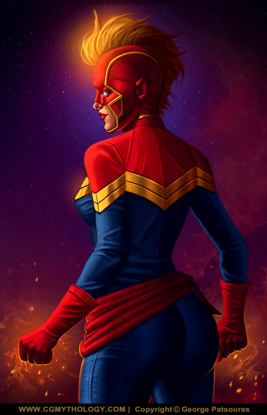
I went ahead and finished up the image, although I'm open to suggestions if something feels off. Below is the current preview followed by the steps for those interested:

RE: CGMythology's Sketchbook - darktiste - 07-26-2023
Waw the color are super great.Also the cloth look well done something i find was something you did not nail that hard on the tiger piece.
RE: CGMythology's Sketchbook - cgmythology - 07-26-2023
darktiste: Thank you! I was afraid they might be a bit oversaturated but I think I can get away with that due to the darker values. Glad to hear you enjoy the image!
.................
Time for a new illustration! I want to paint something within my comfort zone as well as painting armor in general, so I sketches out this portrait based on one of Howard Lyon's reference packs. Overall I'm quite pleased with the sketch, and I think I'll proceed with some color tests shortly - although if something feels off at this stage please feel free to let me know! Below is the sketch:

RE: CGMythology's Sketchbook - cgmythology - 07-26-2023
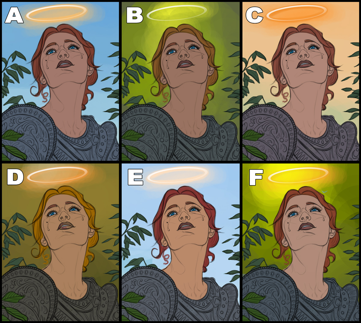
Finished up the color tests. I think I'll go with 'E' as it's the closest to what I have envisioned from the start, and it also pops the most!
RE: CGMythology's Sketchbook - darktiste - 07-26-2023
Great angle in the pose but i am not sure if she crying or hopefully crying by that i mean is she sad or is she done crying and is now hopeful that really what i want to establish in the way we read the expression.
I feel confuse as if i should feel sadness or hope maybe that the beauty of the balance that present in this piece...
A for me in the color exploration but obviously some light from the halo on the face...
RE: CGMythology's Sketchbook - cgmythology - 07-30-2023
darktiste: Thanks! I think the tears add a lot to the image, but I don't think it's essential to know the exact moment of when she cried as it won't make much of a difference, and it's better to leave such things up to the viewer to decide IMO.
..............
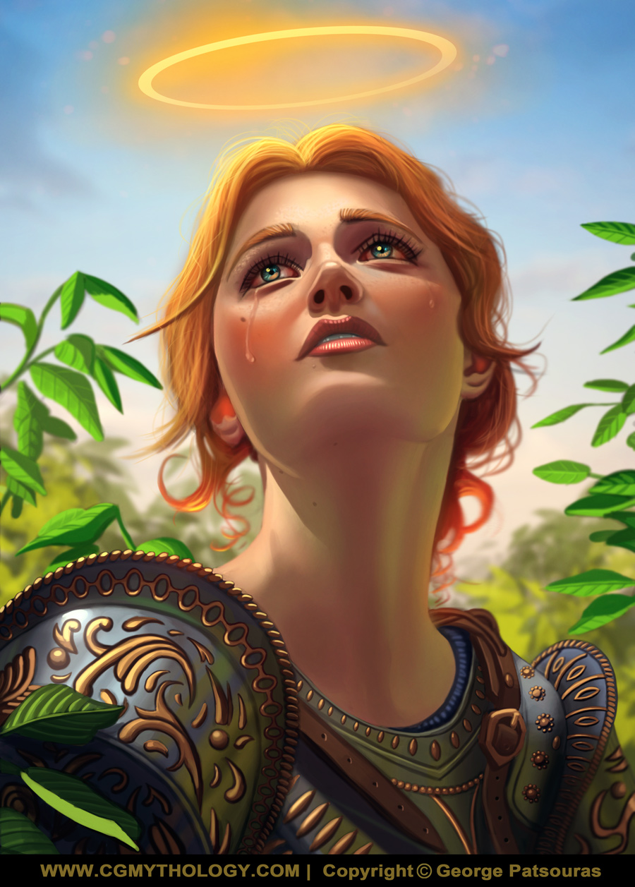
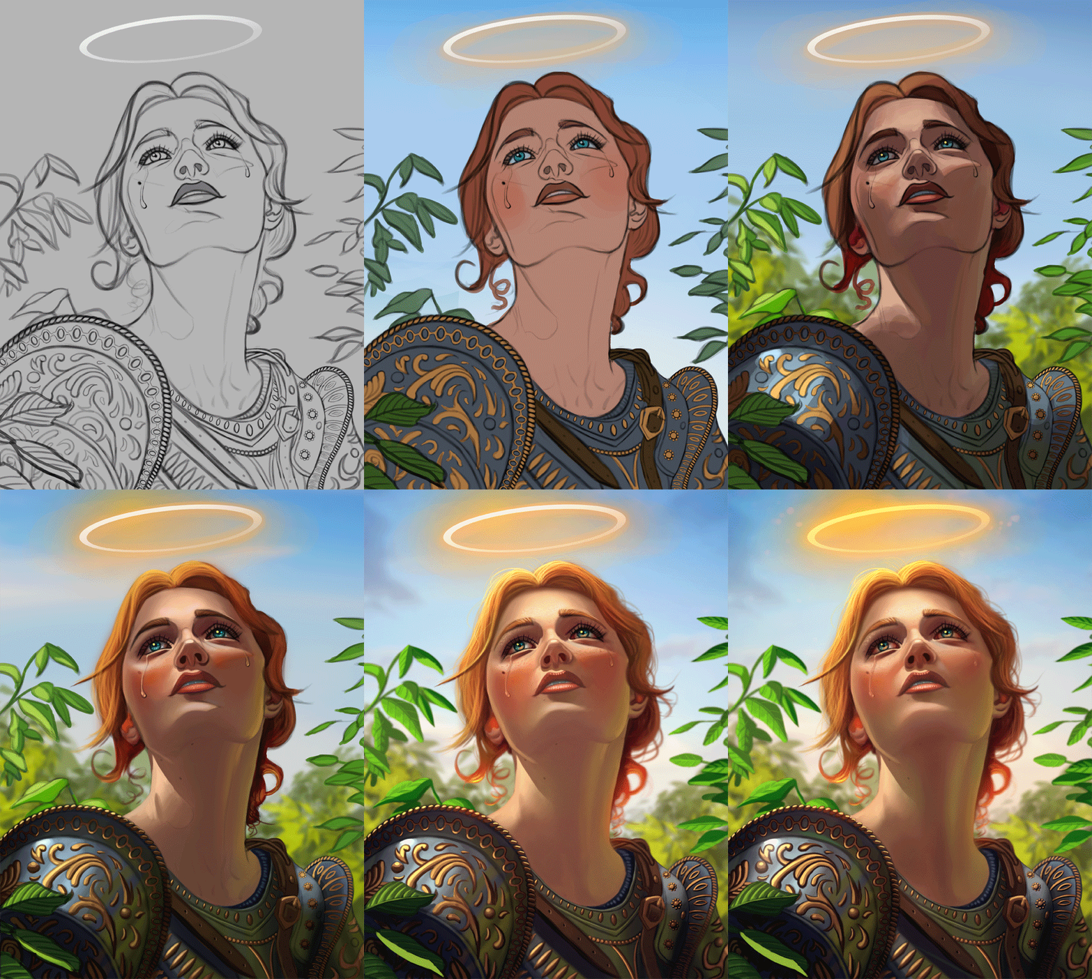
I finished up the painting process, and it went pretty smoothly thankfully! I think choosing the right color palette from the start makes all the difference, so those color tests seem to really pay off for me in the long run. Below is the current image, if something feels off feel free to let me know, otherwise I'll consider it finished for now. Also posted the steps for those interested, hope you enjoy!
RE: CGMythology's Sketchbook - cgmythology - 07-30-2023
And it's time for a new painting. Back to 'fan art' mode again. I sketched out 'Kitana' from the Mortal Kombat series. I based her likeness on actress Adeline Rudolph, who will be portraying her in the new Mortal Kombat film. In regards to the character design, I tried to sort of combine all of her recent looks to make something unique. Overall I'm very satisfied with the sketch. As always, any feedback on the sketch before I proceed with some color tests would be most appreciated!

RE: CGMythology's Sketchbook - cgmythology - 07-30-2023
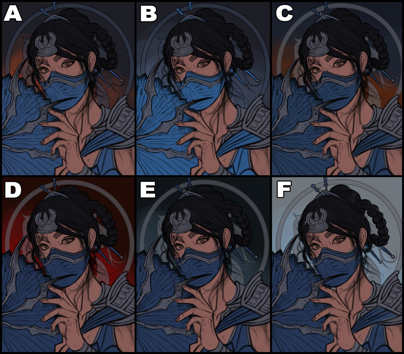
Finished up some quick color tests. I think 'D' and 'F' are the best. F pops the most but the light background doesn't suit the subject matter, so I'll likely go with D. Any input would be appreciated.
RE: CGMythology's Sketchbook - one_two - 07-31-2023
You seem to have a blast, man, a painting after a painting. Great productivity! Keep having fun!
RE: CGMythology's Sketchbook - darktiste - 07-31-2023
I think for your close up you need to crack up a bit the texture of the face but it not a portrait yet so not that much really.I said a few time that i think you make character that have that doll quality to them(extremely soft skin) sometime and i think breaking that up would help you get a extra level of realism obviously that might just be a matter of my own taste vs your ultimately i am not going to mention this much more longer if it not something you care about.
Ok so in my POV what i try to do is to create a bit of a stronger shadow side on the left and reduce that bounce light i feel was bit to strong.I also took away some of the darkness on her forehead and up the highlight on the face to pop the eye(mine seem a bit more hopeful i feel).
(Just mind that if you take reference from photo magazine there is a chance that they remove alot of the shadow to avoid showing the bumb on the skin this mean that you should try to take reference that are taken outside to avoid light scenario that would not fit the environemen the green you put in the shadow show that you think about bounce light so it show you are thinking about light even in the shadow side.)
Take note that i judge what you did as finish even those i tried a few thing differently it for the sake of giving you an other perspective on the final.
For the new piece i would go with D aswell but i would try to have some satured and desatured blue where you want the eye to go.
RE: CGMythology's Sketchbook - cgmythology - 08-02-2023
one_two: Thank you! Most of the work here are personal illustrations, so having a blast is the goal :D Glad you enjoy my work and thanks for your feedback as always!
darktiste: Normally I would have added a bit more texture as suggested, but I wanted her face to appear fairly soft looking, which is why I didn't deepen the shadows as well. Great suggestions however, and I actually incorporated them on the current 'Kitana' image in regards to the skin (was going for a gritty look with the new image, as opposed to the softer look from the previous one).
..............
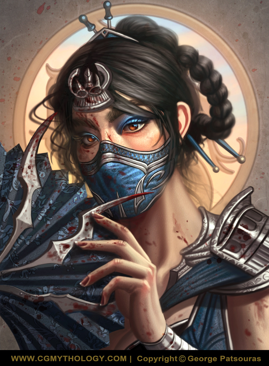
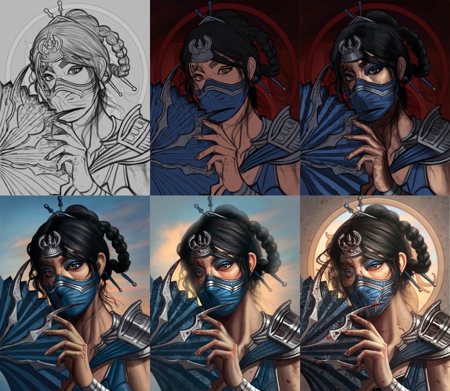
I finished up the current image and am fairly satisfied with it. The background was tricky and I ended up changing it several times but I think it all worked out for the best. Below is the current preview, if there's something off please feel free to let me know as there is still time to tweak it a bit if necessary. Also posted the steps for those interested as well.
RE: CGMythology's Sketchbook - darktiste - 08-03-2023
I feel the spot you miss the most is the neck skin tone when you desaturate the image you can see the value become alot more unify around the neck area than the shadow midtone and highlight you can see in the face area judging by the direction of the light the neck feel to dark.
When i add contrast to the overall image it help separate the character from the background a little more this help your form read less flat i would say because you have a flat background on this one normally you would have atmospheric perspective that would help separate the character from the background.
Also one other thing is the wetness of the blood do you want it more liquid or dry?
(Click on the image to zoom)
RE: CGMythology's Sketchbook - cgmythology - 08-03-2023
darktiste: Excellent feedback! I agree with pretty much everything you stated and I appreciate you taking the time to do the paintover, very helpful. I went ahead and updated the image.
.............
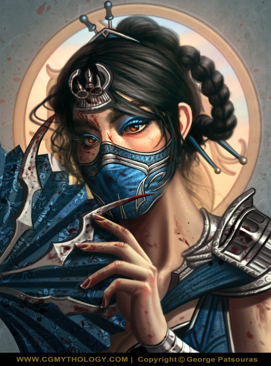
I updated the image based on darktiste's feedback. I'm considering it done for now as I'd like to move on to something else. Here is the final:
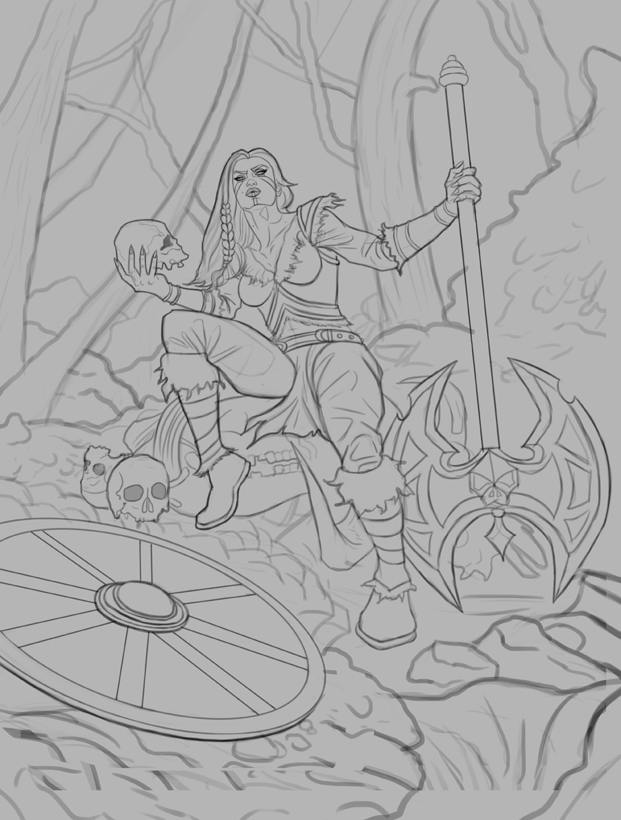
Time for a new illustration! I was in the mood to paint a viking again, this time a female one. The sketch was a lot of fun to create. For the figure I referenced one of Grafit Studio's reference packs, but came up with my own design for the figure. I'm pretty happy with the sketch but any feedback on it would be most appreciated before I make my way over to colors. Here is the sketch:
RE: CGMythology's Sketchbook - CBinnsIllustration - 08-03-2023
Hey I loved the Kitana piece, you did a great job on her eyes especially.
On the new Viking sketch, it is looking cool, the first thing that stands out to me would be the hand holding the axe. I would slightly thin out the shaft a bit as well as widen her grip. As it stands it’s almost a so if the shaft is a wide flat piece of cardboard. And I do kind of get a feeling of unbalance due to her posture, but that could be chalked up to her sitting position, but just wanted to point that out. I’m sure you do this already but perhaps flipping horizontally could give light to any unnoticed issues.
And the skull she is sitting on, maybe this would get cleared up in rendering, but I can’t tell what it is but it looks interesting and I kind of want to see more of it. Maybe making that element clearer at this early stage would help.
Also, is the idea she is sitting in her trophy room? Or did stumble upon some old skeleton graveyard? It might be cool to just make them severed heads as if a fresh battle has concluded perhaps, just a thought.
Good luck with this piece dude!
RE: CGMythology's Sketchbook - cgmythology - 08-04-2023
CBinnsIllustration: Thank you! Had a blast painting her so I'm glad you like the image.
Great points regarding the axe and balance of the figure! She's standing in a snowy forest, perhaps where a battle recently took place. I'll develop it further during the painting process but I really appreciate your suggestions. I also implemented all your feedback as well, thanks again!
....................
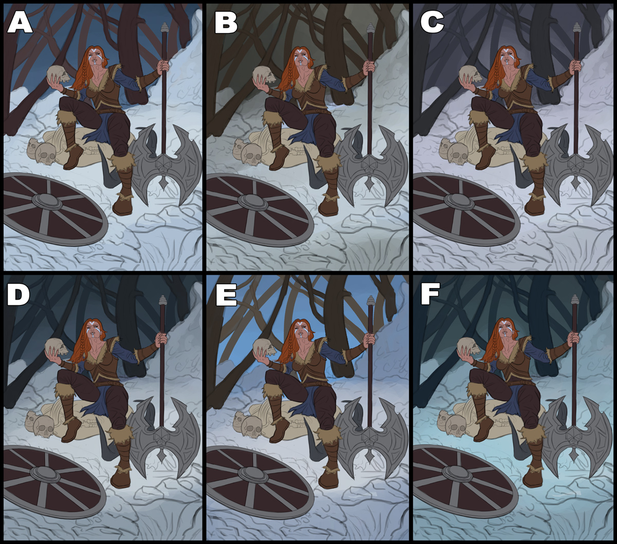
I fixed some issues regarding the sketch and went ahead and completed several color tests. I posted it below. My personal favorite is 'c' followed by 'b'. I might use a small portion of my cunning and mix the two, we shall see. Any suggestions encouraged as always!
RE: CGMythology's Sketchbook - darktiste - 08-04-2023
The size of that shield i think is taking to much space also i don't really see why it would be there other then to fill space and help direct the eye.If that axe is so massive why a shield it certainly not her shield... as for the element trying to blend them with the environment specially in snow scene is important the overlap where they touch the ground that where you want to break the normal silhouette of the shape to imply snow.(Take note it not included in the pov due to the crash)
Btw sorry i had to upload two image because my photoshop crash during the POV the reason for the 2 image is that one is to explain where i believe you want your point of interest to fall do you see the middle square at each corner you have the opportunity to put a point of interest.
The red line on the shield is to indicate that you have the opportunity to allign with this direction to create some direction toward the feet so the eye move down the leg and keep moving throught the other rhythm your radial element i am refering to as to what should allign to creat the sense of direction.Btw very good rhythm in here i would say.
Also an other thing is that i change the place of the skull to be instead on one of the four corner of the square that sit at the middele of the grind.(Might be added confusion but it create a nice overlap that you won't get as much if you place the object and they seem to just sit side by side which i feel it does in the original.
I suggest cropping a bit to achieve this result otherwise the point of interest fall away from where you want them to be.
Also the foot ideally should not touch the frame if you decide to go in the suggested cropped direction so if you can move it up a little that would also be better.
As for the color test i would take the color of B for the tree and go with the color of the background of C in the forest part.
RE: CGMythology's Sketchbook - Bookend - 08-10-2023
I think most of what could be worked on has been commented on already-- I'm just gonna weigh in on the choices xD
I like D, but with the F snow colour :) Or, you know, just D is good too, just my thoughts.