+- Crimson Daggers — Art forum (//crimsondaggers.com/forum)
+-- Forum: PERSONAL ARTWORK (//crimsondaggers.com/forum/forum-9.html)
+--- Forum: SKETCHBOOKS (//crimsondaggers.com/forum/forum-10.html)
+--- Thread: CGMythology's Sketchbook (/thread-7224.html)
RE: CGMythology's Sketchbook - cgmythology - 08-13-2023
darktiste: Great input! Thanks for that. I updated the image, cropped it a bit which got rid of the unnecessary space at the bottom of the image. Hopefully it's an improvement!
Bookend: Thanks! I went with D but the color palette changes a bit as the image progressed. Overall I'm happy with the color choices and hope it works it well now!
..............
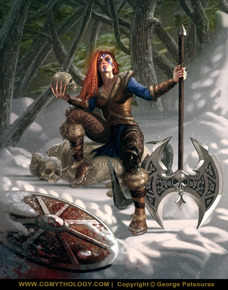
I finished up the painting process. This was a fun painting to bring to life, lots of fun with the atmosphere and the detail work. I attached the current progress, any input is appreciated as there's still time to make minor changes if necessary, so please let me know if something feels off. Below is the image followed by the steps for those interested!

RE: CGMythology's Sketchbook - cgmythology - 08-13-2023
I started work on a new illustration depicting climate change, albeit with a fantasy vibe. I went ahead with the color tests as well, I'm attempting to modernize my color work a bit, and I feel the last two are something that would work well in that regard. So I guess it's between 'E' and 'F'. Any input would be appreciated.
General pose was referenced from here. Below is the sketch followed by the color tests.


RE: CGMythology's Sketchbook - darktiste - 08-14-2023
So here a few thing i had i mind to darken the forest in such a way that it would help the head become more of a focus rather then the skull but it still is a point interest but due to the value difference between the face and the background the eye goes to the most contrasted point on the image which i would say is the face.One other thing to consider in a snow scene is if it sunny or not if it sunny you can add some bounce light to the bottom of object in the scene(simplified explanation)(i didn't include that part) also in a cast day vs sunny day you will have a difference in the color of the shadow side it grey in a cast day but in a sunny day you get the blue of the sky instead. I did some value correction on those skull they look a bit to ''unintegrated''.The reason i gone so dark in the forest is because the bounce light reduce as you get back into the forest and it felt the lighting was just to similar and unrespective of what going on and i also add the excuse of contrast.Oh also a last note since i didn't really work that in the POV you would get a blue gradiant in the snow shadow toward gray as you would get less and less bouce light the further back you go.
RE: CGMythology's Sketchbook - ThereIsNoJustice - 08-14-2023
I think your climate change drawing/painting is way too 'safe'. You are drawing something which a photographer could do with body paint. Go all out, make some really weird and unique melting / burning, etc. visuals, you know?
That's my thought anyway.
RE: CGMythology's Sketchbook - cgmythology - 08-29-2023
darktiste: Love your suggestions and the changes you made with your paintover. I agree that the darker values work well for the image. I went ahead and updated the images based on your input, thanks again as always!
ThereIsNoJustice: I agree that the linework is too 'safe', but the painting itself won't be; I've added a ton to the image, it was quite experimental in that regard, and I'll have an update on that shortly as it's almost done. Right now I went back a bit to try and finalize the viking image, but I appreciate your input!
.............
I'm almost done with the 'climate' image, but decided to take a bit of a break from that to finalize the Viking illustration. I went ahead and implemented the feedback I received, and consider it pretty much done at this point.... unless of course something major is off, so please let me know if that's the case! Below is the current preview:

RE: CGMythology's Sketchbook - darktiste - 08-29-2023
Pretty satisfying maybe next snow piece try to have add some snow footprint to make it a bit more believable it like not putting footprint of a beach i think it part of being aware of the surface and you know push the attention to detail at the level you are playing now.It just help create some visual rythem and it add some realism to the story telling like how did he get there also i feel like you could keep working on those fur texture it just a bit behind compare to other texture but i am really of new use to help you there that still a struggle for me aswell.
Also for the weapon adding a bit of history to the weapon with some dent and scratch that bonus point in my book.
But i call this one pretty much down what i am saying is you got opportunity to incorporate those feedback for later.
RE: CGMythology's Sketchbook - one_two - 08-29-2023
Nice job on the latest, maybe i would've scaled her hands down a bit. They seem to be quite large. Otherwise, great mood!
RE: CGMythology's Sketchbook - cgmythology - 08-31-2023
darktiste: Thanks for your final thoughts. I went ahead and added some subtle foot prints as suggested. Also a bit of wear and tear to the weapon. Hopefully things look more natural now!
one_two: Thanks and great input! Just made the hands smaller as well, good eye!
................
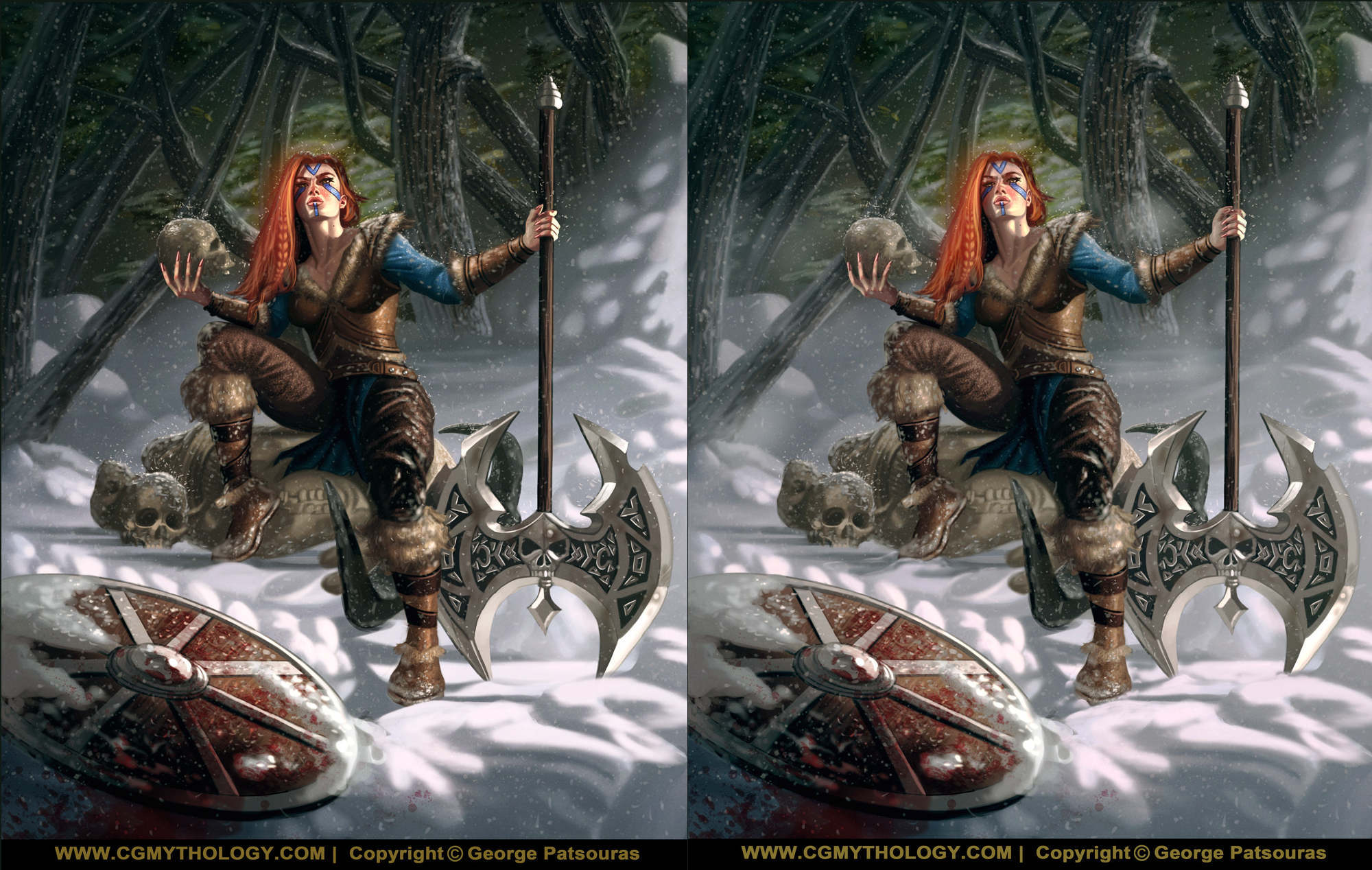
Some final changes to the Viking image:

I finally finished the painting process for the Climate image. It started off fairly basic but I kept adding to it to make it more unique and creative. Overall I'm fairly pleased with it. Any final input would be most welcome as well!

RE: CGMythology's Sketchbook - RottenPocket - 09-01-2023
Always so colourful! The climate change piece is eyecatching and communicates well. Some effects/blurring don't make sense with the form, but I am guessing the goal was heat haze?
I'll be 100% honest with the Viking piece - It's not your best work. I'm not sure what the time of day the image is meant to be - the lighting appears very bright so it's surprising that her body is so very dark when there should be a lot more reflected light from the snow. there's also not a lot of interaction with her feet, the axe and the snow, she's just hovering. Her left index finger is also coming out of the hand at a strange angle as though her hand is split between the index and middle fingers. The hand holding the skull is posed like she's holding a flat form, like an envelope, when fingers should be balanced around the form of the skull. The image just has a lot of small distractions.
RE: CGMythology's Sketchbook - darktiste - 09-01-2023
I disagree with the comment from Rotten on the light aspect personally i read the scene as an overcast day with a slight piercing of light from the cloud.For the skull i think it still a bit undercook in my opinion that why the form doesn't read but i also agree that the finger just look to allign in the axis of thing.
It easy to critic when you don't do those complex scene yourself but it doesn't discard the overall critic but this in my opinion in your top 5 in term of complexity because of the number of object in the scene the overall amount of different texture the lighting also changing from the front to the back of the piece.
I am not saying this your best piece either but look back and compare the women viking to the god of wars piece or to your viking guy and i personally say you have improve since.
Certainly it can be hard to compare different lighting scenerio but what is really important i think it to look at how your form read how your texture read and try to find a new balance personally i think i have made a few comment on the hand being one thing i would hit harder in your practice so that they have a better sense of wrapping around it easy to fastfoward the hand but there is so much realism and room for attention to detail in the hand it make a big difference between something that look like sausage to hand that look like you just been a mentored by Michael angelo .I don't blame you hand are straight intimidating so complex so versatile in movement which mean you can be sure you won't draw wto hand that look exactly the same.
RE: CGMythology's Sketchbook - RottenPocket - 09-01-2023
I'm back with a belated paintjob. Love what you do and my only reason for pointing out these is because they're minor but noticeable, and are minor fixes to achieve great results :)
When I say there are a lot of small distractions, it's mostly in places where the anatomy breaks a little. I would consider how the bent leg is attached to the hip too, but the main features I was drawn to were the hands and face. Her eyes don't follow the shape of the skull and her ear is not positioned the way an ear would at that angle. It's only on the double-take that we see these things as your work if often so detailed, it gives an uncanny valley effect as parts are rendered well but not quite right. The lighting is still dependant on your setting. If it's sunny, the forest behind would have more scattered light. If it's night, it's not exactly the same century to have LED spotlights. If it's overcast, you don't have these pure white highlights, the scene gets very washed out and dreary.
I'll try to visit more often and contribute in the early stages of the next one when you're asking for input.
RE: CGMythology's Sketchbook - darktiste - 09-02-2023
It doesn't make sense now that i take a step back to see a forest with some greeny if it a snow scene it would be mostly tree you would find in a nordic region or they would have lost there leaf what i suggest is to change the tree to reflect the habitat of a nordic region.
That more of an off being distracted or just leak of planning and making maybe part of the design as a second thought...
RE: CGMythology's Sketchbook - cgmythology - 09-30-2023
RottenPocket: Thanks! I tried to achieve a sort of 'focus' style photographic feeling with the portrait piece, not sure if I quite achieved that. Great input on the viking as well, might update it in the near future! Great work on the paintover as well, I'm a bit burned out from the image to be honest but I'll see if I can make time to update it.
darktiste: Thanks for the kinds words. Some pieces are more complex than others, helps me to keep things interesting and challenging. Glad to hear you think I've improved!
..................
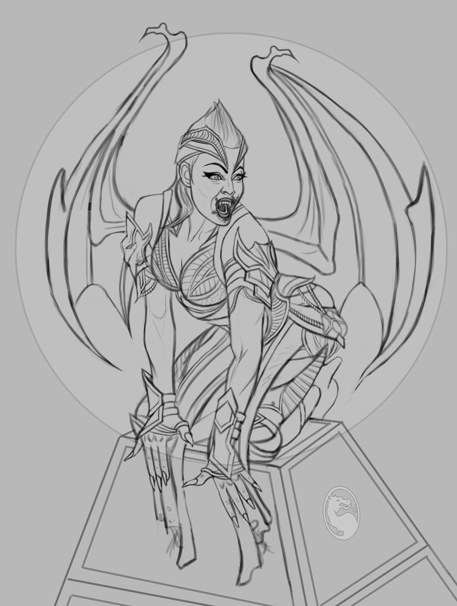
I've decided to move on to a new illustration as I got pretty burned out from the last two images and I wanted to do something fresh. This is fan art of 'Nitara' based on the new 'Mortal Kombat' game, which Megan Fox plays as, so her likeness appears on the character. The character design was quite complex so it took me some time to get right, but I'm fairly happy with the sketch.
The foot area gave me a lot of trouble so any suggestions in that regard especially would be appreciated... any feedback on the sketch would be appreciated actually, before I move on to color tests. I have a lot of ideas for some possible color palettes so I'm very excited to begin work on that soon as well. Below is the sketch!
RE: CGMythology's Sketchbook - darktiste - 09-30-2023
Those finger need more love avoid straight finger syndrome
The trunked pyramid look out of perspective to me object recede in the distance so why is the top left corner lower than the top left back corner that going back toward the vanishing point .Also the cloth drapping down doesn't follow the slant plane of the pyramid which make it seem as if the pyramid as window it hard to explain i have a hard time putting it in word.
You did a great job with the character.
RE: CGMythology's Sketchbook - cgmythology - 10-01-2023
darktiste: Great feedback! I updated the hands and reworked the perspective of the tower, hopefully things look more natural now.
.............
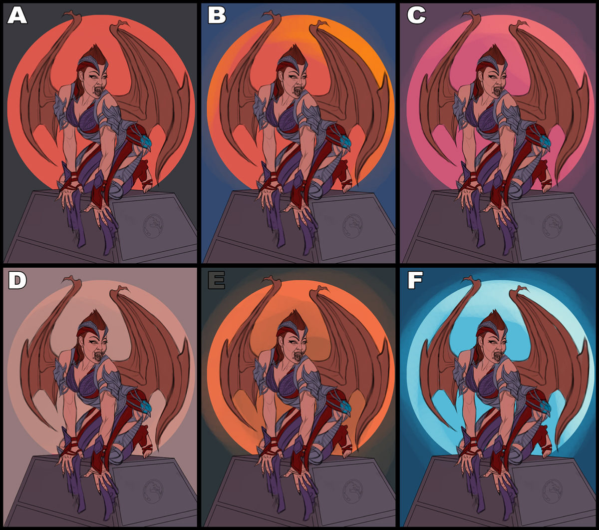
I updated the sketch and did some quick color tests. Any input on either the sketch or the colors would be appreciated. I'm leaning towards 'B' for the color palette, but I'll look at it with fresh eyes later, although suggestions would be great to hear on what works best!

RE: CGMythology's Sketchbook - darktiste - 10-01-2023
I would keep working on the feet they don't feel like they help her keep her balance.There also some tangente issue for example the arm on the right side create a tangente with the fold in the cloth.The ear and the bottom of her hat run parallel.There more...of that issue but you ge the idea...
You didn't give a thickness to the armor and they don't wrap around because of that.
For the wing i think the finger toward the outside thin out to much where it meet the other finger.The strap between the neck and shoulder that old her armor shouldn't be arcing as much is should be more flat toward the top of the arc specially on people without skinny people but it seem it would make a tangente one again there with the wing.There is zero indication of her shoulder muscle overlapping the torso going toward the trap muscle of the neck
For the color I like B and F.
One thing concerning your choose of color for the cloth the red color is kinda clashing in clarity toward the right wrist because it overlapping an other section of red so it confusing to understand if that cloth or if it part of the armor.Also the red hair with the red element of the hat that to me that just to much red.Revising the color to add clarity and having in mind that you have some overlap should help solve the leak of color clarirty.
Lastly the mortal kombat symbol also need to follow the slent of the pyramid i think it also kinda small but that up to you.
Don't rush those are some of the stuff that have already been touch on in my critic in the past you can always make a checklist of ''common pitfall you make'' like for example let check tangente or let check if my object wrap around my figure.I am gonna give you a break this one is pretty complex regarding tangente that understandable they can be tricky to catch but i think at this point there no excuse for giving no thickness to armor.
Sorry the POV is very minimal and small i had to restart over once i start to notice the color problem will doing the POV i move my POV from the greyscale to the color test so it not very clear regarding what as been adjusted.
Also due to some carpal tunnel issue i am currently having i did not fix as much as i could have so some element mention are not address in the POV.
RE: CGMythology's Sketchbook - RottenPocket - 10-04-2023
Let's revisit the sketch - as with the Viking there are a lot of small distractions that can do with some adjusting.
First off I think I found what you may have used as a loose reference for her facial features - Megan's eyes and this still for the face, brows and mouth:
The main issue with this is the upward perspective in the reference, while you illustration is viewing downwards, distorting her mouth and jawline.
I've roughed out the below:
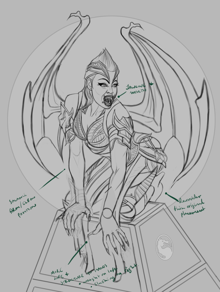
Jawline & Mouth: adjust the alignment and size of the mouth as it's just a bit too small and off centre with the rest of her face. The Jawline also needs a little filling out on the far side, as her form is not as gaunt as the sunken cheeks would indicate.
Foot/Shoe: Reconsider this original placement - the revision showing the toes awkwardly splayed to the side looks painful and less realistic than this position.
Hands: the left [her right] hand appeared too short so I've roughed out the new elbow and wrist placement that would balance it with her right arm, as well as how she's resting her weight on that palm. The fingers also should interact with the form more. Her left [our right] appeared more in a slashing gesture so consider adding more life to the finger placement to illustrate this.
RE: CGMythology's Sketchbook - cgmythology - 10-27-2023
darktiste: Thanks for your input as always, great stuff. I appreciate the paintover as well. I made some of the changes you mentioned and finalized the image, hopefully it's better now!
RottenPocket: Thanks for your input and paintover, very useful! Love what you did with the hands specifically so I incorporated it to the image, and updated the face a bit so hopefully it looks more natural now. Thanks again!
................
I finished up the image, took a bit longer than expected due to the complexity of the character design... I also ended up adjusting the color palette several times but I'm fairly happy with how it turned out. Below is the current preview followed by the steps for those interested. There's still time to make adjustments if something major feels off, so please let me know!


RE: CGMythology's Sketchbook - darktiste - 10-27-2023
When you use texture brush try to overlay them so they don't look so flat and sometime having the orientation and the size of the brush be randomize in the setting can help get a more natural result.
Also there a few shape that are just to angular that should be erase.
Use the brush tool with good taste always don't over rely on them to convey the texture with pratice you will always beat the stamp when it time to organize the texture on the piece you are working for the thing with a stamp is that it random so is the result and sometime it just break the illusion if a randomize shape allign or if thing look deliberately random sometime the stamp may overlay and make shape you wouldn't find in natural normally so it tricky...
RE: CGMythology's Sketchbook - cgmythology - 11-05-2023
Darktiste: Great input and I agree about the texture work. I have a habit of sometimes overdoing them a bit and it can flatten out the forms, so I'll definitely be more careful in the future in that regard!
............
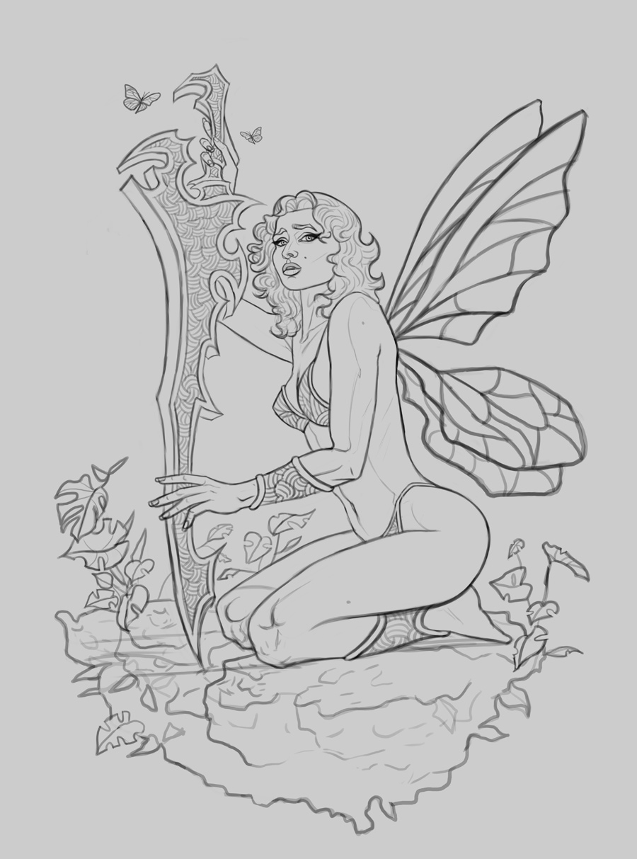
Time for a new personal illustration. I was in the mood to draw a fairy, albeit with a simple character design as the previous image drove me crazy in that regard, so I'm giving myself a bit of a break by drawing something a bit more simple. Below is the sketch, any feedback before I begin work on some color tests would be most appreciated!
