
+- Crimson Daggers — Art forum (//crimsondaggers.com/forum)
+-- Forum: PERSONAL ARTWORK (//crimsondaggers.com/forum/forum-9.html)
+--- Forum: SKETCHBOOKS (//crimsondaggers.com/forum/forum-10.html)
+--- Thread: CGMythology's Sketchbook (/thread-7224.html)
RE: CGMythology's Sketchbook - darktiste - 11-05-2023
I feel like a more delicate blade with low amount of curve would work better this one feel to thick and to aggresive in the silhouette i would make the handle more rounded and curve and have the blade more fluid and less angular but rather some nice long sweep curve.I would also keep the blade fairly thin toward the guard rather than thick.
The chin doesn't make sense for me right now it not following the perpective i visualize here we like see to much chin and not enough neck and the neck is to straight it should have a slight bend toward the chin as the head rotate.
Those feet heel look rather bulbous at fist glance. The hand and arm could feel a bit more delicate and thinner and the knee look abit to blocky which i think would go against the gracefulness of a fey that up to you. Right now i suggest to remove the line and create a softer gradiant to indicat the form change on the knee.For example the pelvis is more blocky that where i would put line because it bone really ''poking''
For the wing i would say try something with asymmetry for some dynamism also the back wing is clearly higher then it should be in perspective it what happen if you try to force something just to ''show more'' sometime more is less you already got 3 wing you don't need the fourth to get the idea across even if it might be pleasing to the eye.
RE: CGMythology's Sketchbook - cgmythology - 11-05-2023
darktiste: Great input as always! I made some changes to the line art, nothing too crazy but I feel it's an improvement. Next I worked on some color tests, please feel free to let me know what you feel works best!
........
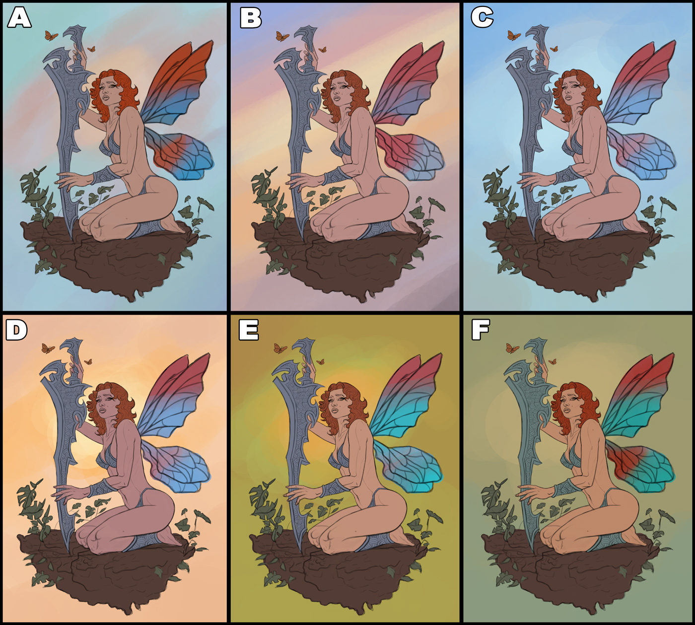
I did some minor changes to the line work and did a series of quick color tests. I have a few favorites and it's gonna be hard to decide which one to develop, so I'd love to hear any input in that regard! Below are the color tests:
RE: CGMythology's Sketchbook - darktiste - 11-06-2023
I like B or C.
But i am questioning what the little extra piece of land serve in the overall idea it certainly justify the pose but other then that i feel like it just to little to hold together right now it feel more like dirt then something that would hold itself if it a ''floating piece of land'' i can't keep that to myself for some reason.This piece scream ''a Faerie on the side of a lake with a beautiful sunrise/sunset behind her'' or the same idea but at night with some reflection on the lake and some nice rim light to complement those natural women curve.I think it just could be more then it is right now it feel a bit empty that but that just a question of how much love you wanna put in this one.
RE: CGMythology's Sketchbook - ballpoint - 11-07-2023
B and D, though I am eyeing F as well...
RE: CGMythology's Sketchbook - cgmythology - 11-12-2023
darktiste: Great choices! Ultimately I went with F but it ended up developing into something else entirely. Great point about the background, I do like the silhouette so I felt like leaving it empty might give it a bit of an abstract feel. I don't think every painting needs to have a highly detailed environment so it's good to experiment I think!
ballpoint: Great suggestions! I went with F as a starting point after giving it some thought!
...........
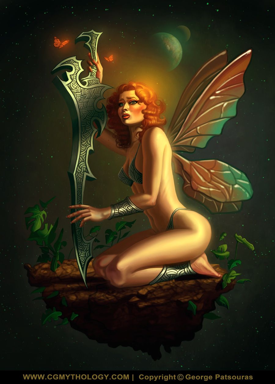
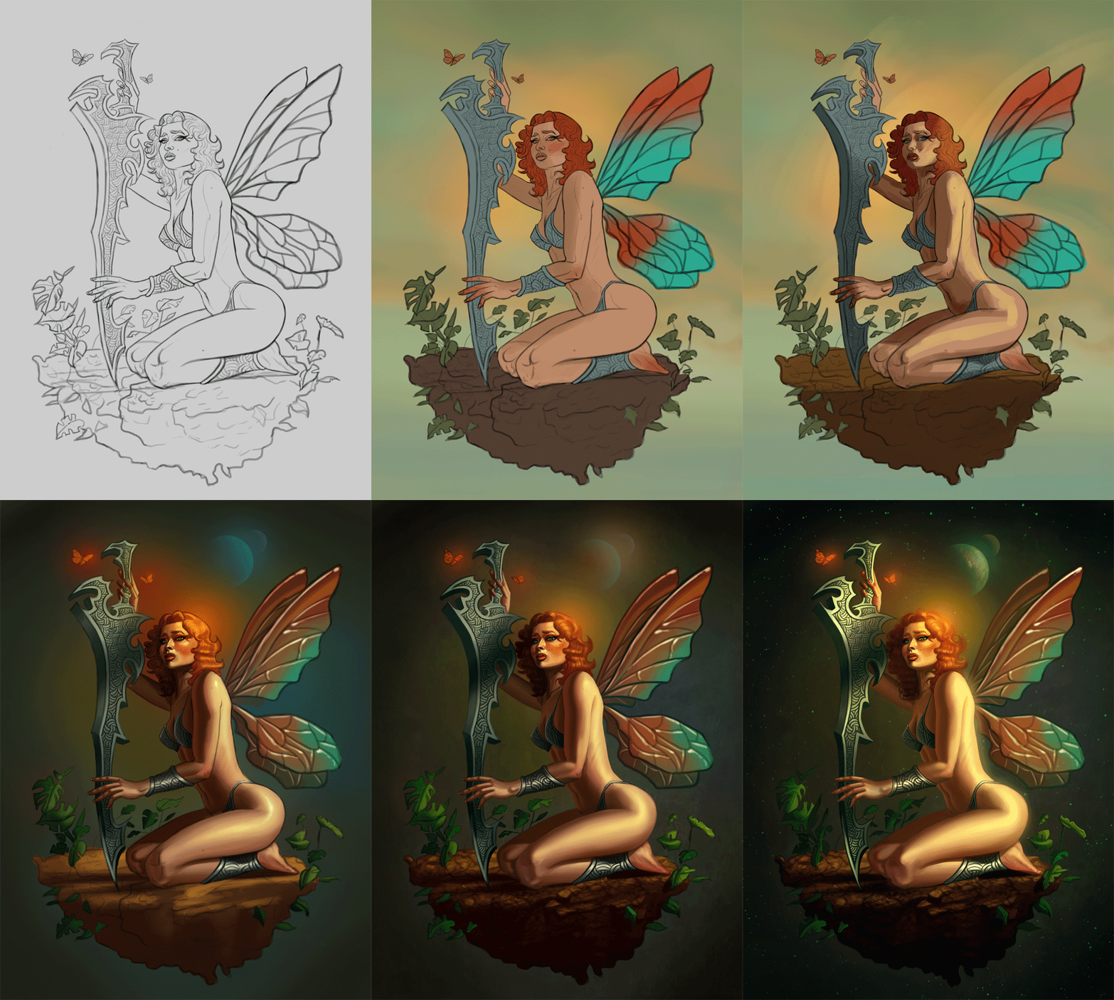
Thanks everyone for the suggestions! Ultimately I went with F as a starting point, but experimented with a darker environment early in the process which helped the figure pop, so I developed it that way. Ultimately I'm pretty happy with how it turned out. Below is the final followed by some steps. The image is pretty much finalized but I'll consider making changes if something major feels off, so please let me know!
.............
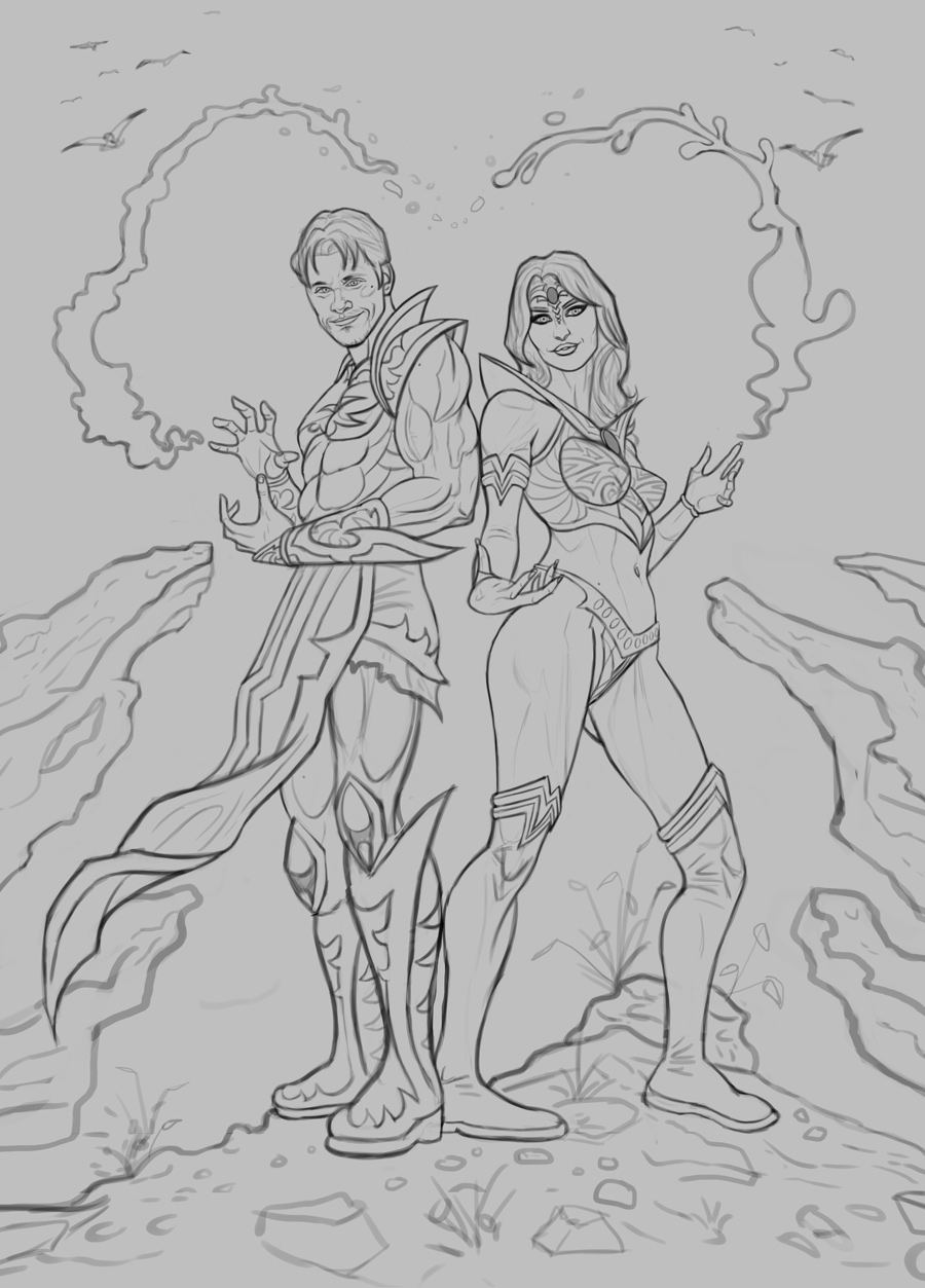
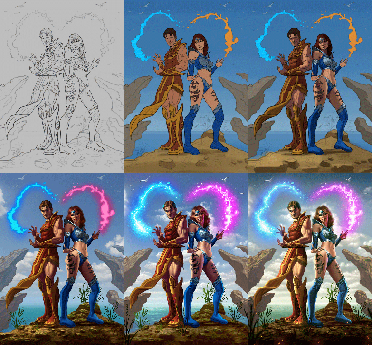
Next up is a new sketch. This will be a gift for two fellow artists I admired since I was a teenagerr - Henning Ludvigsen and Natascha Roosli; in fact they're work was my introduction to digital painting, and I learned quite a great deal from their work and tutorials so I thought I would paint them as fantasy characters as a gift for Christmas.
For the poses I had a reference from Satine Zillah that I bought from ArtStation that I did my best to recreate while coming up with my own original character designs. You can see in the sketch I've included some magical powers forming a 'heart' - I didn't want this to be too blatant, for an easter egg but I feel it work well compositionally.
I have some ideas for the colors, want something light, bright, and colorful but before I work on the color tests I would love to hear any input on the sketch as I'd like to get it as good as possible before complicating the image with colors, so any feedback would be great appreciated! Here is the sketch:
RE: CGMythology's Sketchbook - darktiste - 11-12-2023
The feet of the men are a bit to flat compare to the relative angle i suspect the slope to be .The women pose seem unresolved.
The repeating element on the side have no overlap so they look very '' flat in space.The men furthest knee look much lower then it should be since it a little higher then the front foot.The women hand as to much shortcut foreshorten and even as tangente on the furthest hand where two finger overlap.
What will be the challenge is to recognize how to adjust the gesture to properly represent the angled nature of the surface they rest on and the camera angle being so low is also a challenge because it push thing to more dramatic angle.
One thing i noted is how long the neck is so i try to shorten it to see what would happen.
Here a very sloppy POV i had to cut it short... here what the pov was trying to solve it was mostly about the women pose.Her feet is pointed so that her feet and the one of the men don't occupy the same space and the arm mirroring the leg help put some weight foward to keep the center of gravity balance.
I feel that they feel more connected then before before i feel like they were to equal in importance before.The space between them is more pleasing to the eye now and let the eye rest because the left character is very detail heavy so her bare leg offer a nice rest to move toward her shoulder and toward detail once again.
RE: CGMythology's Sketchbook - cgmythology - 11-16-2023
darktiste: Great feedback and suggestions as always. I made some changes to the line work based on your input and finished up the image, hopefully it works well now.
................
And the painting process is finished... for now at least. Below is the final image followed by the steps for those interested. If anything feels off please let me know as I have no issue making minor adjustments if needed.

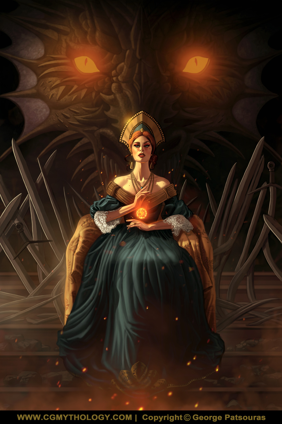
Next up is a sketch I started a while ago. The figure was referenced from Grafit I believe, wanted to challenge myself drawing and painting complex folds. Trying to achieve a 'Game of Thrones' look with this one, and I feel I was quite successful in that regard. Any feedback on the sketch before I begin work on the color tests would be most appreciated!

RE: CGMythology's Sketchbook - RottenPocket - 11-17-2023
Awwwe sheeet I leave here for five minutes and you've done two finished pieces since.
The GOT image looks really nice, probably would suggest flipping the canvas to correct her jawline and brow, and the folds of the dress interact more with the stairs.
RE: CGMythology's Sketchbook - JosephCow - 11-18-2023
ooh that looks cool! Nice one!
Minor adjustment: I agree with darktiste that the girl's foot/lower leg should be pointing toward us more. Maybe not as much as in his correction, but like a tiny bit more? It just feels a little twisted even though I know her lower half is pointed right
RE: CGMythology's Sketchbook - cgmythology - 11-20-2023
RottenPocket: Great input, followed your suggestion and implemented your feedback!
JosephCow: Yeah I see your point after taking a fresh look at the image, might make some adjustments at a later point!
.............
I finished work on the current image. The painting process went extremely smooth as I got the colors early on as I wanted them, and was very careful with my value work at the beginning stages which ultimately lead to a very smooth painting experience. I'm quite pleased with how it turned out, but I'd love hear any input so if something feels off please feel free to let me know! Below is the image followed by the steps for those interested:

RE: CGMythology's Sketchbook - cgmythology - 11-21-2023
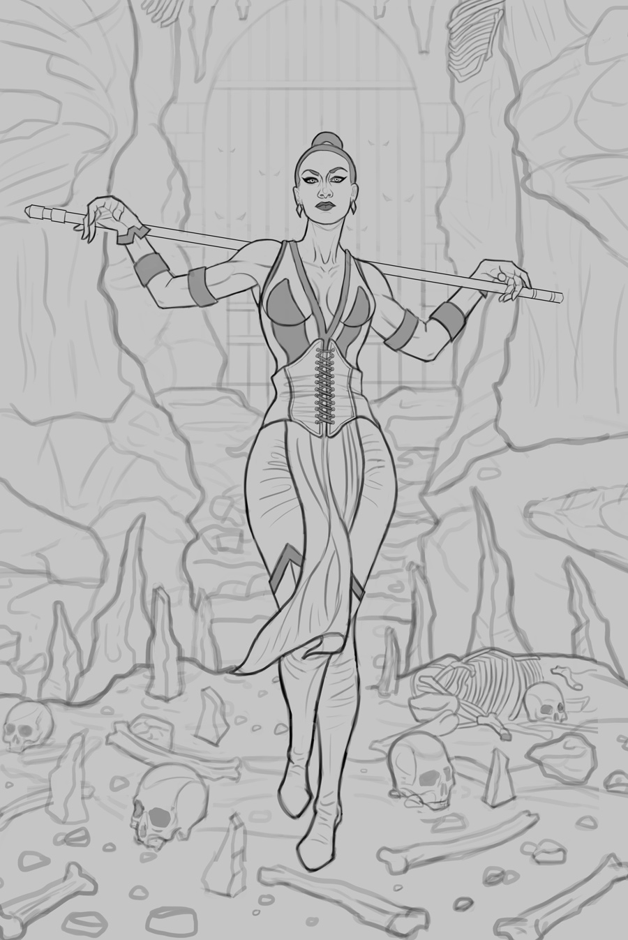
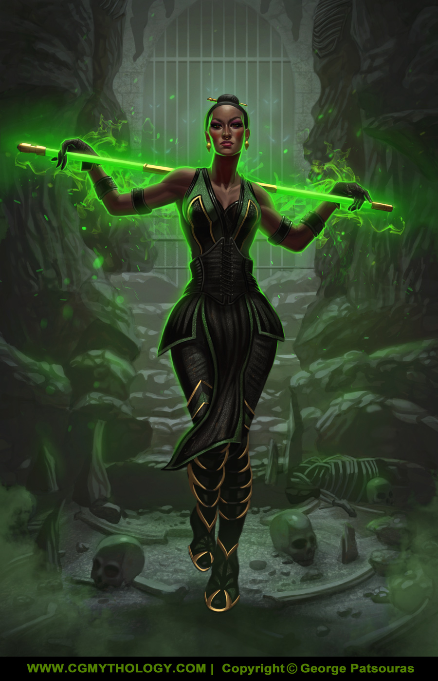
Time for a new illustration! I wanted to tackle another take on Jade from the 'Mortal Kombat' series without a mask, and a full body image as opposed to the portrait I recently painted. Should be fun! Any feedback on the sketch would be most helpful as I'd like to get that as close to perfect as possible before begin painting. Below is the sketch:
RE: CGMythology's Sketchbook - darktiste - 11-21-2023
The corset is very well done and your object wrap arround nicely which was often a point i would bring up a bit more in the past my only note on that is you didn't give them proper volume they wrap around but we should some volume to them as of now they have no thickness other then the line itself so i don't know if i can say that it intentional or not
.It hard to figure out if what behind her is it a door or a draw bridge i am also unsure as to what are those floating eye around her.
For the spike on the ground are they suppose to be natural formation or like part of structure because they are very geometric and flat on the bottom are they suppose to come out of the ground or are they resting on the ground?I know it a weird question but it will make sense if you give me the answers.
I feel like you need the ground to have more space to rest the eye right now it like you are trying to force the eye to move to much with object that clearly are suppose to move were eye.Remember sometime less is more
RE: CGMythology's Sketchbook - Lunatique - 11-26-2023
The pose is slightly awkward because of her right (our left) hand. The way the staff rests on the pinky feels like it would easily fall off with the slightest movement from her. It would make more sense for her to secure the staff more firmly in that hand. The center of gravity and weight distribution of her legs is also a little off. Usually when someone is putting most or all of the weight on one leg like that, the body will naturally lock the knee on that leg. If the knee is not locked, then the figure lacks a proper sense of gravitas. If the moment catches her in the middle of shifting her weight or moving instead of standing firmly, then it's as if when you pause the playback on an animation where the frame isn't on a keyframe but an in-between frame, and keyframes always look more dynamic because they show the extremes of each pose. Her stance should be either firm and steady, or dynamic and in motion. One thing I always have my students do it to get up in front of a full-length mirror and actually hold whatever prop the character is and then do the intended pose and see how natural or impossible it feels, and what the body will naturally try to do in order to achieve balance.
RE: CGMythology's Sketchbook - cgmythology - 11-28-2023
darktiste: Thanks! I revised the spikes a bit, but I think there now much more readable painted, but let me know! Thanks for your input as always.
Lunatique: Great input! I revised the pose a bit, especially the legs so hopefully things look a bit more natural now. Please feel free to let me know and great hearing from you!
.............
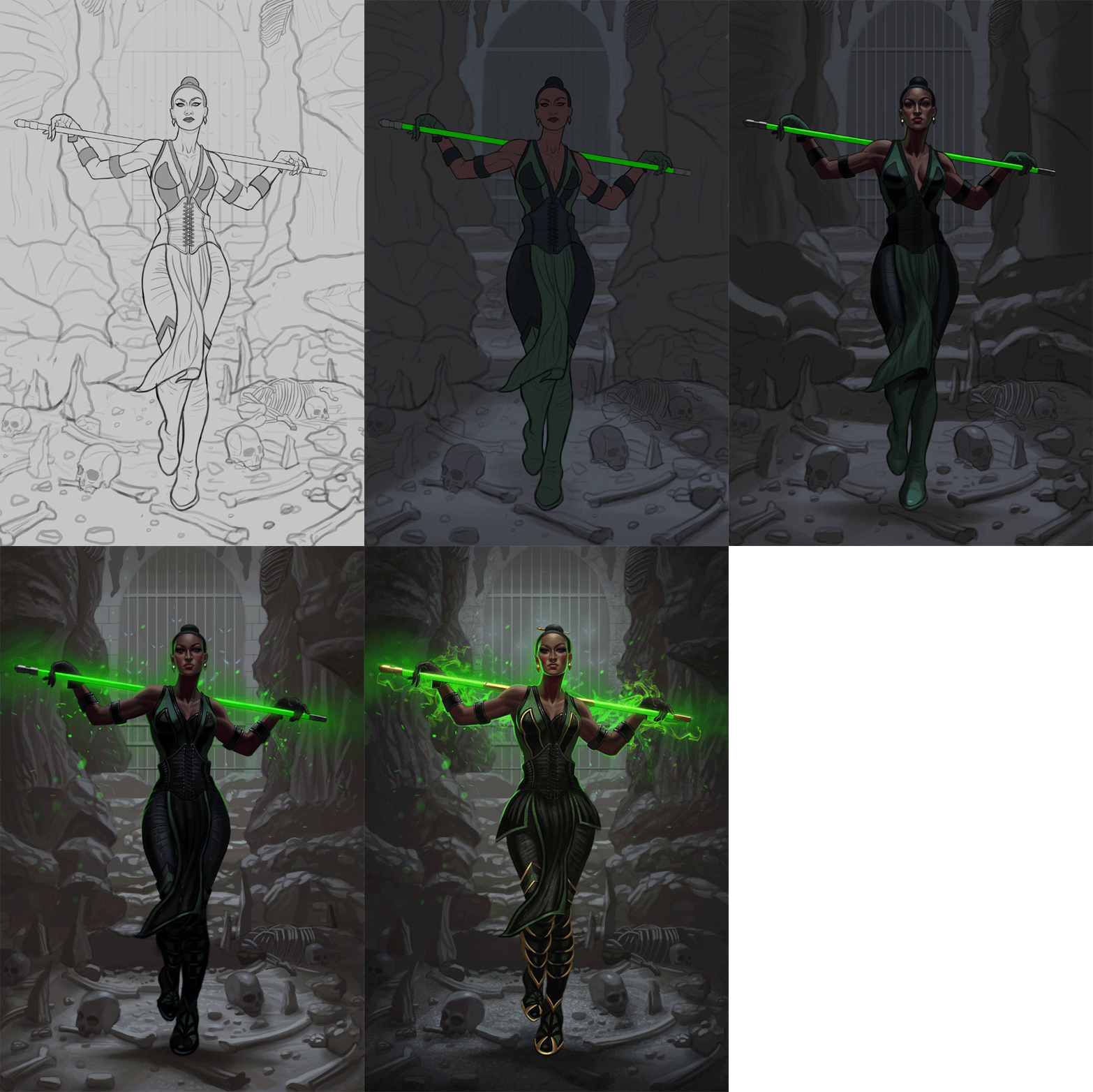
I went ahead and painted the image in after revising the sketch a bit based on the feedback received. The colors came out exactly as I intended from the start which is a welcome change of pace, usually I need to experiment a bit before finalizing the color palette but things went really smoothly here. Below is the image followed by some steps for those interested. Please let me know if something feels off as there's still time to make some minor adjustments if needed!

RE: CGMythology's Sketchbook - Lunatique - 11-29-2023
I see now that in the previous sketch, the staff simply wasn't drawn over the wrist so it looked like it was going behind the wrist, but the finished version makes so much more sense.
The green lighting from the staff is missing from her arms and some other areas of her body, but is very prominent on her head/neck. Was that on purpose? Also, in terms of strength of the green light, it would appear it should also reach the background, even if it's not the dominant light source.
RE: CGMythology's Sketchbook - cgmythology - 11-30-2023
Lunatique: Glad to hear that! Excellent feedback in regards to the lighting as well. I made some final adjustments to the image based on your input, hopefully it works better now!
..............
Did some minor refinements to the image, mostly in regards to lighting. I think I'm calling this finished for now as I'd like to move on to a new painting. Here is the final:
Next up is a new sketch depicting a statue coming to life. I've tackled this concept before but I thought it would be more interesting if it was more of a portrait piece. I had a reference for the statue which was the main inspiration for the image which you can view here. Below is the sketch, any feedback would be appreciated before I begin work with colors!

RE: CGMythology's Sketchbook - darktiste - 11-30-2023
What is the flaking all about is it suppose to be paint or moss?This piece like a nice opportunity to work on edge control and soft gradiant.
You should give those feather some volume and don't indicate the roundness of the wing as a edge(if you want to mark a area of shadow you can use a dotted line as a reminder and smudge it later on)
One problem i see is the shape of her right arm it getting deform as it hit the other volume it not cloth it could squish somewhat if press onto something but it rest over rather .Also if you compare the angle of the outside of that arm it are not really at a similar angle as the reference
The elbow is lower on the left but it pretty even in the reference so that mean also that the left arm is not following the reference correctly.
I am saying this with having in mind that this is heavly inspired by the reference almost a study rather then a attempt to make it your own.
RE: CGMythology's Sketchbook - Lunatique - 11-30-2023
(11-30-2023, 01:39 AM)cgmythology Wrote: Lunatique: Glad to hear that! Excellent feedback in regards to the lighting as well. I made some final adjustments to the image based on your input, hopefully it works better now!
..............
Did some minor refinements to the image, mostly in regards to lighting. I think I'm calling this finished for now as I'd like to move on to a new painting. Here is the final:
You did make some changes, but the direction of the staff light's illumination looks like it's coming from behind her instead of actually in her hands and in front of her forearms, and you have the green light also illuminating the bottom of her arms, which isn't possible based on the position of the staff. If you like, I can do a paintoever to show you.
BTW, thanks for the post in my sketchbook thread. In the past few years, every time I saw you posting something new on FB, I had some recurring thoughts I've wanted to tell you but wasn't sure how receptive you would be. It has to do with how your artistic development is progressing. If you're open to some suggestions I'll share my thoughts here.
RE: CGMythology's Sketchbook - cgmythology - 11-30-2023
darktiste: That's the material breaking to reveal the figure underneath the stone. The concept of this is the statue coming to life. It's hard to represent that with line but it should make much more sense when I color it in. Thanks for the quick fix as well, will make the changes mentioned.
Lunatique: Great points regarding the lighting, I seem to struggle a bit with artificial lighting. A paintover would be most appreciated, and I'm always open to any suggestions that would help me progress my artistic development as well, it would be greatly appreciated!
RE: CGMythology's Sketchbook - Lunatique - 12-01-2023
Here's the quickie paintover:
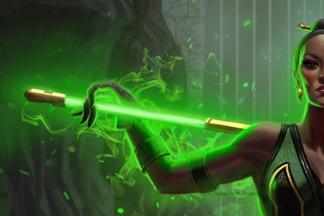
And here's the PSD so you can toggle my paintover off and on to see exactly what I changed
 jademk2-RobEdit.psd (Size: 892.3 KB / Downloads: 281)
The main issues were:
-The self-illuminating staff should look like it's brighter in the center to appear like it's really glowing.
-The green light from the staff is reaching areas it shouldn't, as well as not reaching areas it should.
And this leads me to the recurring thought I've had whenever I saw you posting new works in the past several years.
I've known your work since the early days at cgsociety, and over the years I've seen you continue to post new works at FB. I think it's great you have continued to work hard and produce new works, but what I'm also noticing is that you have some glaring holes in your foundational knowledge, and this shows up in your work consistently. We all have our weaknesses and blind spots and I certainly have mine. I mean, even Craig Mullins thinks he has them. Often it's far easier to notice it in others than in our own work, especially when our weaknesses and strengths don't completely overlap.
The things I have noticed are mainly:
-The lack of thorough understanding of how lighting works. It seems you have picked up some knowledge over the years, but it's not complete and this must be addressed in your next phase of artistic development. This is especially true for the type of work you do, which requires rendering of fictional scenes and characters in a relatively realistic style. Without enough fidelity, the work will lack the persuasive quality it needs. To fix this problem, you need to do a ton of lighting studies of different subjects and environments. Take tons of photo references of different lighting on different subjects/environments and analyze them, do studies from them. Go through your favorite movies and take screenshots, look at your favorite photographer's works, experiment with the lights in your home and take reference photos. Really focus on how cast shadows and form shadows work, how diffused and specular highlights work, how ambient bounced light works, how to cast shadows in perspective accurately, etc.
-Not enough fidelity in the depiction of different surface properties. I highly recommend you do the different materials sphere studies. You probably have seen them before, and maybe even attempted them yourself, but if not, put this on your to-do list. Also do a ton of still life studies of objects with different surface properties--wood, plastic, brass, stainless steel, glass, rubber, fruits, meat, skin, plaster--anything and everything.
-Anatomy/figure needs more work. You have studied this enough to not have glaringly egregious problems in your work, however, often your figures have this awkward look to them, lacking naturalistic presence. Areas where you used or didn't use references will have dramatic differences in fidelity, making your work inconsistent. I suggest you set a target stylistic parameter and then stick to it and do everything you can to keep it consistent. For example, if you want a realistic/believable look, then you MUST always use reference, without exceptions, because using good references is the bedrock of that style of illustration. You also must know your anatomy inside out and do tons of figure and portrait studies so you become extremely familiar with how people actually look in reality, not just in your stylized imagination. Even if you are aiming for a stylized look, you still have to do all that because the foundation of any stylization is reality, because that is what any style is based on. If you don't have a firm understanding of reality, you won't be able to effectively simplify, idealize, and exaggerate from that reality into a targeted stylistic look.
-Artistic sensibility. The awkwardness I mentioned might be seen in different aspects of your work, but there's also the overall sensibility of how you manage your values, your color palettes, your edges, your brushwork, how you selective detail, etc. We are all culminations of our influences, combined with our own creative impulses. One of the best ways to assimilate qualities from your influences is to do master studies, where you copy their work and try to walk in their shoes--how they manage values, how they deal with edges, the color palettes they use, how they simplify or exaggerate forms, their brushwork, how they handle lighting and surface properties, etc. This is a time-honored tradition that artists have been following for as long as art has existed. I don't know who your artistic heroes are, and only you know what qualities you want to take from their influence and infuse into your own work. Advanced artists might be able to simply use their intellect and analyze the works of those they admire and then execute works that contain those qualities, but for less developed artists, master copies is the most effective way. And usually for advanced artists, master copies remain the most direct and effect way to assimilate influences.
You have a lot of drive and I think if you create a more effective artistic development strategy with a targeted practice/study routine, you will see dramatic improvement in the next few years, to the point that you might even feel like you want to only keep the newer works in your portfolio and delete the rest. Where you are now, is a level that I think of as advanced-intermediate, where you have been stuck on a plateau for many years and can no longer advance forward into the advanced level. If you make the effort to develop in the areas I mentioned, I'm pretty confident you can break through onto the advanced level. I say this because I've seen this over and over in the artists I taught over the last 13 years, as well as in the artists I see on the Internet in general. Those who have kept their older works on the Internet, you can clearly see where they were stuck on a plateau with similar problems like the ones I see in your work, and then something changes and you see their work start to advance in fidelity and persuasiveness, as well as overall artistic sensibility, and the changes are usually in the areas I mentioned.
I know this is a lot to take in, but I've wanted to tell you this for years and hopefully it'll be helpful for the next phase of your artistic development.
I have my own demons to slay, and all these portraits I've done in the last few years is my process of getting there, as that's the one area I really wanted to get better at. I'm not there yet, but it's as much about the journey as it is about the destination--and some might even say it's all about the journey and the destination is but a byproduct of the journey itself.