
+- Crimson Daggers — Art forum (//crimsondaggers.com/forum)
+-- Forum: PERSONAL ARTWORK (//crimsondaggers.com/forum/forum-9.html)
+--- Forum: SKETCHBOOKS (//crimsondaggers.com/forum/forum-10.html)
+--- Thread: CGMythology's Sketchbook (/thread-7224.html)
RE: CGMythology's Sketchbook - cgmythology - 08-03-2024
darktiste: Yep, that's a great point. Luckily I kept a grayscale layer on top of the painting to make sure my values were working so I didn't have much trouble in that regard!
.................
I spent a lot of time on this image bringing it to life, and I'm quite happy with it. Came out pretty much as I had in mind which is always great. There's probably some errors here and there that I became 'immune' to for working on it for so long, so any feedback on what doesn't work or could be improved would be quite appreciated. Below is the current painting followed by the steps for those interested:


RE: CGMythology's Sketchbook - darktiste - 08-03-2024
Personally i think the setting is to bright your light source are directional meaning that they have cover that direct the light downward. The smoke would diffuse some of that light when it hit the smoke but as far as i know you would loose that diffuse light toward the ground since smoke rise and also you would get the most diffusion at the source.
The chair and the side of the bar are not necessary element even if they are nice addition to the bar setting the bar itself receiving light is enough to figure out where we are specially with the props on the table.
Generally speaking the light is kept toward the bar in real bar setting to attract the eye so customer purchase alcohol in a bar. To much light and it start to look like a restaurant that my personal opinion.
I tried going to the opposite end of lightning to see if there a in between.
I think i gone with a more classic lightning will you have somewhat stylize the light for ''dramatic effect'' with an almost light beam halo effect which is something we seem to ''somewhat clash on when it come to preference''
It hard to read the pinguin hand and the finger of joker and the side of cat women seem to create the shape of a weapon specially with the thumb of pinguin making what look like the hammer of a revolver it a strange tangent there. It a very hard sell on that perhaps is hand would be better against the barrel of the gun.
What i like in my version is how the smaller light frame Riddler and joker head. It also a double triangle composition in a way for the foreground and background.
One thing when you use line remember that if you loose the line there shape that might merge and get lost when they would previously read correctly
Sorry for the dirty pov.
RE: CGMythology's Sketchbook - Dominicque - 08-04-2024
I really love how you always aim to make completed pieces, testing yourself, you resolve and learning something new. I don't have much to add in the way of critique is Catwoman (and the Riddler) 's expression seem very posed, but also understated. I feel like you could 'punch up' the emotion, maybe like in https://www.pinterest.co.uk/pin/140806216454419/ or https://www.pinterest.co.uk/pin/101119954124651790/ just in terms of giving the eyebrows/nasolabial folds more gesture and expression. I like Harley Quinn's expression the best, tbh, even in the background.
RE: CGMythology's Sketchbook - JosephCow - 08-04-2024
i think this one's cool, the portraits in the background are a fun easter egg
RE: CGMythology's Sketchbook - cgmythology - 08-05-2024
darktiste: Great points, and I appreciate the paintover as well. I introduced some darker tones to the image, but I don't want it nearly as dark as your example as a lot of detail would be lost and the contrast would be a bit too high for my taste, but hopefully the update below is an improvement!
Dominicque: Thank you! Great point regarding the expressions. It's a bit late to make major changes, but I do appreciate the suggestions and reference material. Regarding Catwoman, I don't want her to appear to frightened neither as that wouldn't suit the character, but hopefully I found a decent balance of seductive and fearful in regards to her expression.
JosephCow: Thank you, glad you noticed those details as well!
..................
I did some minor updates to the image, basically introduced some darker tones to the background and blended the background with Harley from a previous step which hopefully makes things a bit more clear. I think I'm calling this done for now, unless there's something major that is off that needs correcting. Here is the current image:

Next up I finished an image representing enlightenment. I'm currently reading about the Chakra's of the human body and that was the main inspiration for this image. I'm quite happy with it. Pink/purple is a difficult color to use as it could look a bit unnatural but I feel I pulled it of quite well. Below is the image followed by the steps for those interested. Any feedback would be most appreciated as always:


RE: CGMythology's Sketchbook - Zvarthav - 08-06-2024
Hey, I went through your sketchbook, your art's pretty great. Sorry I don't have much to say specifically about the enlightenment pic as I'm not good at critique, but I saw several of your paintings in general are drawn straight on so they are very symmetrical. That's kind of boring to look at in my opinion, I think you would benefit from doing more dynamic angles. I see you say that yourself on page 37 too. I do get that for some images symmetry can be hard to avoid (and I know I'm guilty of symmetry in some of my own art, I'm trying to get better about it).
I also think you use a bit too much of a saturated (often yellow) glow in many paintings (not talking about your recent Batman piece, but for example, Poison Ivy). Just my personal opinion you are free to disregard, I do think your art is very good on the whole.
RE: CGMythology's Sketchbook - cgmythology - 08-06-2024
Zvarthav: Thank you kindly, really glad to hear you enjoy my work! I agree 100% with all your feedback as well, I definitely prefer symmetrical compositions so I have to be more conscious of this in the future. I also prefer golden or yellow-ish palettes and sometimes I tend to overdo this as well, so you're definitely on point with your feedback! Thanks for you honesty as well, very much appreciate it!
...............
I did some minor changes to the recent image, basically tried to make it less symmetrical. I think I'm calling it finished for now unless something really major is off:

Next up I finished up a sketch inspired by the 'Magic: The Gathering' series. I'm a huge fan of many of those artists so I thought it would be cool to do something in that style. I'm pretty pleased with the sketch but I wanted to hear any feedback before I proceed with some color tests, so please let me know!

RE: CGMythology's Sketchbook - Jephyr - 08-08-2024
Hi George,
I'm finally signed in after being away awhile.
The poker pic is awesome and I agree the color choice on the enlightenment pic is unusual but really fits the theme.
Lovin' the new sketch, the way you pushed the pose!
Hope all is well,
Ciao fer now
RE: CGMythology's Sketchbook - darktiste - 08-08-2024
I am gonna start sounding like a broken record but this piece would have benefited from thumbnailing specially in the gesture and if you really don't want to test more then one scenario you can always just do a quick mannequin. I feel like speeding up to a finish is gonna hurt more then it help did you use a reference for the pose?
The big issue of forum feedback is that it slow so i understand the problematic of asking for feedback at the early stage of a project when you want to get thing done. I think you need to be more balance between your study and the long project that give you time to to address your weak spot as well as get precious feedback at the early stage on the long form image that otherwise would rely heavily on reference to support the weaker fundamental. There different fundamental at different stage every problem won't happen only in the middle or at the end of a project that why feedback might be convenient to receive at the end but they are not always best receive at that time.It sure it hard to W.I.P because the intention isn't as clear and catching mistake by yourself at that stage is somewhat tricky because you need to have a refresh eye to be more critical of your work.
Now for the critic on the new piece.
I don't find some of the shape of the flame to be visually pleasing i think it better to have flowy shape with curve then with ''zigzag'' also i feel shape should remain elonged and not to thick.
The pose is not as strong as it can be even if the angle is dynamic. The background say WIP it very box and leaking in secondary and tertiary shape .
The texture of the ground is hard to read is it flat or bumpy? An other WIP area. Perhaps that the reason the gesture look so wobbly/unbalanced is due to the ground plane is not that well define. The left leg and the front foot should be turn toward us otherwise it like he not going toward us but running somewhere on were left and that mean the front leg is not supporting the weight as it shift from one leg to the other also the knee should align with the foot to support the weight no body run with the foot outward unless they are obese i think. He looking at us... so i assume he running toward us. There also a problem with the angle of the pelvis facing away from the foward direction i suspect and also the thickness of the torso would be wrong it feel to thick as it goes toward the back(not an issue if you change the direction of the torso)(but i suspect the idea was to avoid symmetry that why thing look this way) .
I suggest to put the skull that are on the right to be closer to is hand as to use the principle of the 4 corner of interest where you split the image into 9 quadrant. It would also help the composition which feel kind of empty toward the top right corner. You would also probably have more space to add pleasing flame in the space where the skull were before. You can always try it and save a back up version before you try it out in case you prefer the initial placement. I think as Zvarthav said it better if you avoid putting to much symmetry right now the skull on both side are at the same place in term of eye level by having the skull as i suggest you add more asymmetry but thing get even more balance visually because you get rid of the empty space that was in the right corner previously that would otherwise attract the eye where there not much to see. Empty space can attract the eye when the rest of the image is otherwise busy (contrast is also in detail level high vs low)
RE: CGMythology's Sketchbook - one_two - 08-22-2024
Good job with these paintings CG. The one thing i notice though is something Lounatique was talking about.
For me it's the way you describe form. You're using soft brush most of the time.
RE: CGMythology's Sketchbook - cgmythology - 08-24-2024
darktiste: Thanks for your input! I was happy with the initial sketch so I didn't see the need to do additional sketches. I really like what you did with the angle of the image, I feel it makes for a stronger composition and grounds the figure more so I altered it to our suggestion, thank you for that. Also did some tweaks to the image to better incorporate your feedback.
one_two: Great input, in general I start with hard edged brushes but I switch to softer ones for a more smoother look. Sometimes it can flatten it a bit but I try to add textures on top to avoid that look and make it a bit more interesting.
..............
I worked on the image and it's pretty much finalized although I'm open to hearing any feedback on it. Below is the final followed by the steps for those interested!


RE: CGMythology's Sketchbook - darktiste - 08-24-2024
I think the metallic need more blue since it reflecting the scene and a bit less light in the highlight to adjust for the light level of the scene.I also think that now that feel like i understand better the color choose and direction the ''flame'' was not fire but like ''life force'' in that case i would just use a bit of a softer brush and give it a little more transparency.
One of the cranium on the left could use a little more work if you feel like leaving it.I feel like the teeth take some of the space where you would normally have the gum.I also question the skull color but if my assumption are correct instead to harmonize i would suggest similar thing as what i suggested for the life force (transparency and edge control).I would also slightly adjust the color to be similar to him if he a ghost.
I would also suggest to remove some of the smaller shape as i find it can be visually simplified and would create a better flow. What i also suggest is to add some kind of ring to is finger from which he harness the soul with if he not a ghost.
The hair does not feel wet but maybe he a ghost and that why he doesn't get wet he look like one to a certain degree.
So for a POV here what i did.
Just did a small crop to reduce the noise on the lower part also crop the tower so you don't have so many roof creating unintentional directional focus that lead the eye out the composition how i avoid that is by cropping the middle tower roof you get a visual line that flow toward is head instead
I felt the feet where just taking away from the weightlessness i felt was appropriate for the piece so i crop the bottom a little bit.
I think cropping a bit help get that magic the gathering feeling so thing feel not so vertical
I remove some of the skull because i felt you did not needed as many and it help the asymmetry i think was part of the challenge gave to you previously.
Anyways those are more suggestion and observation i know it late to make change.
RE: CGMythology's Sketchbook - Jephyr - 09-28-2024
Hi George, I can't find it now but you mentioned some issues (burn-out?). I've always enjoyed signing in and seeing new work from you but understand if you've needed a break. OTOH — I also know it's possible you got busy with commissions etc too. Just know I'm wishing you the best and hope to hear more from you soon.
RE: CGMythology's Sketchbook - one_two - 09-28-2024
Hi, CG! Really enjoy the colors you got in this new piece!
RE: CGMythology's Sketchbook - cgmythology - 09-29-2024
darktiste: Great input as always. I updated the image once again and incorporated some final changes!
Jephyr: Yes, I'm having issues with burnout as well as personal health issues which I'm gradually improving. I took a bit of a break so I'm in a much better state thankfully, and I really appreciate the kinds words and support, thank you kindly!
one_two: Thank you kindly!
..................
I did some final changes to the current image which you can see below. I'm calling this one finished!

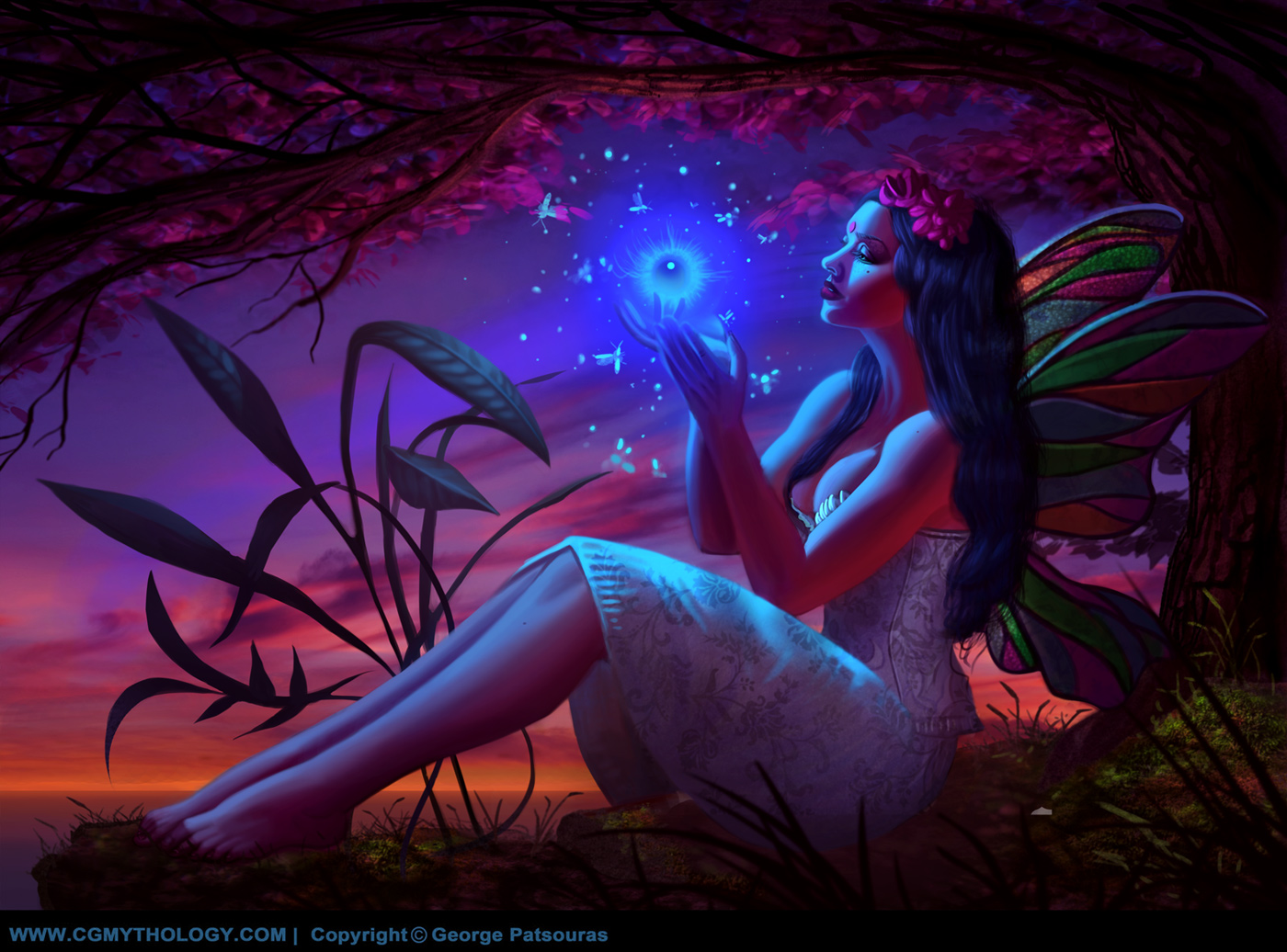
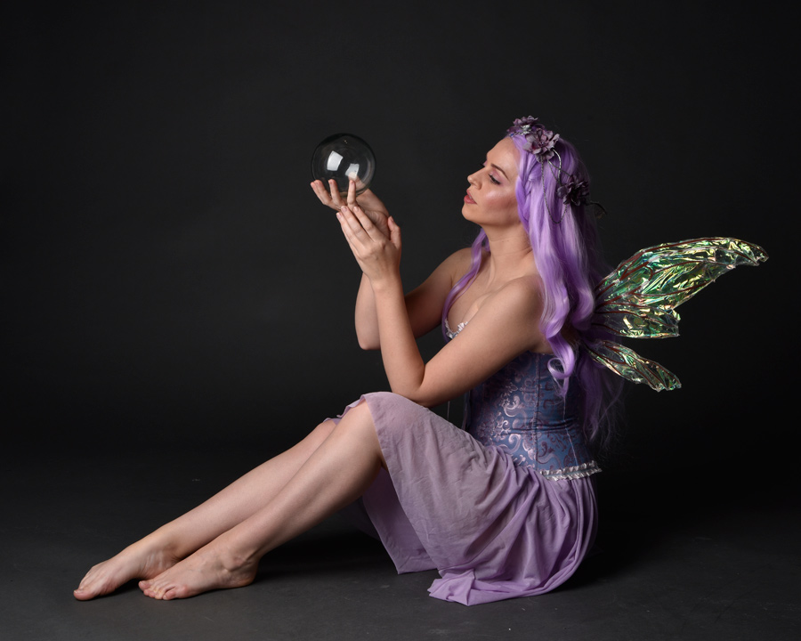
Next I worked on another image which is pretty much finalized as well, wanted to hear some final input before I consider it done. Below is the current preview followed by the reference and steps:

........
and that'll be all for now! Thanks again to everyone for the kinds words and support!
RE: CGMythology's Sketchbook - darktiste - 09-29-2024
I think some of the final touch on the feet destroyed the shape of it .It not a good idea to simplify the silhouette sometime it happen because we loose the shape by painting over the line art that why i like to keep the line art on it own layer instead of the layer being paint on.
Why it important to keep the silhouette is because it in my opinion help make thing feel dimensional and proper the silhouette often help show subtle detail of bone structure underneath which help realism.
I would advise you try to stir away from referencing pose so much i know anatomy require a lot of study to get right but i feel it just weaken the range of what you could be doing and it also weaken the way you think about what underneath the skin because it possible that when you draw you enter ''copying mode'' rather then analyzing what going on.The thing with pose is that sometime you might add detail that will throw the balance off if it was added to the real thing. That why being able to pose your own subject will always make thing feel more natural once you get the hang of it.(Obviously this not a scenario that related to the current piece it just to illustrate why it add to your creative freedom to learn how to pose your own character from a imaginative stand point using reference as a creative jump point rather then as a template)
This why i think it would be nice to see you do more figure from imagination as i think it would benefit you on the long run. I think the reference are great because they help you get quicker to a result and help people giving a feedback to have something to relate to instead of rough sketch which can sometime be confusing to give feedback on.It the issue of W.I.P you often get obvious critic that are just due to the state of the work itself and not because of actualy short coming. But i think regardless of that you get more freedom by being able to thumbnail and imagine the pose using reference as the ''mood'' rather then as the template. I think we talk about this before i think you like a straight forward approach would that be right? But let me ask you how much creative freedom does it rob you off and how much more dynamic your pose would be if you choose to stir away from what already exist.I think you can't answers this without trying but that a question you might not now have time for so it up to you.
I think as the years close it could be a good new years resolution to include time returning to studying in a more classical approach instead of finish piece because i think it important to avoid the rot of doing the same approach over and over again that how we continuously sharpen were skill if that a road you feel is necessary and i also understand that you might be dealing with stuff i can't understand or that you don't want to share right now so i think i should totally mention i totally understand if i am out of line.
RE: CGMythology's Sketchbook - one_two - 09-30-2024
Dig your, latest CG. Always admire how prolific you are.
RE: CGMythology's Sketchbook - cgmythology - 10-04-2024
darktiste: Thanks for your input! Great point about the foot and silhouette, I'll learn from that for future illustrations. Regarding figure drawing from imaginations vs reference, I've been doing a lot of sketching from imagination on my traditional sketchbook with pencils, it's a lot of fun. For professional works I do prefer to have a reference for the general pose and it's easier and faster that way, and I enjoy it more but I'll try to find a better balance as I continue my art journey. And you're not out of line at all, I always appreciate your input so worries! :)
one_two: Thank you, really appreciate your support!
............
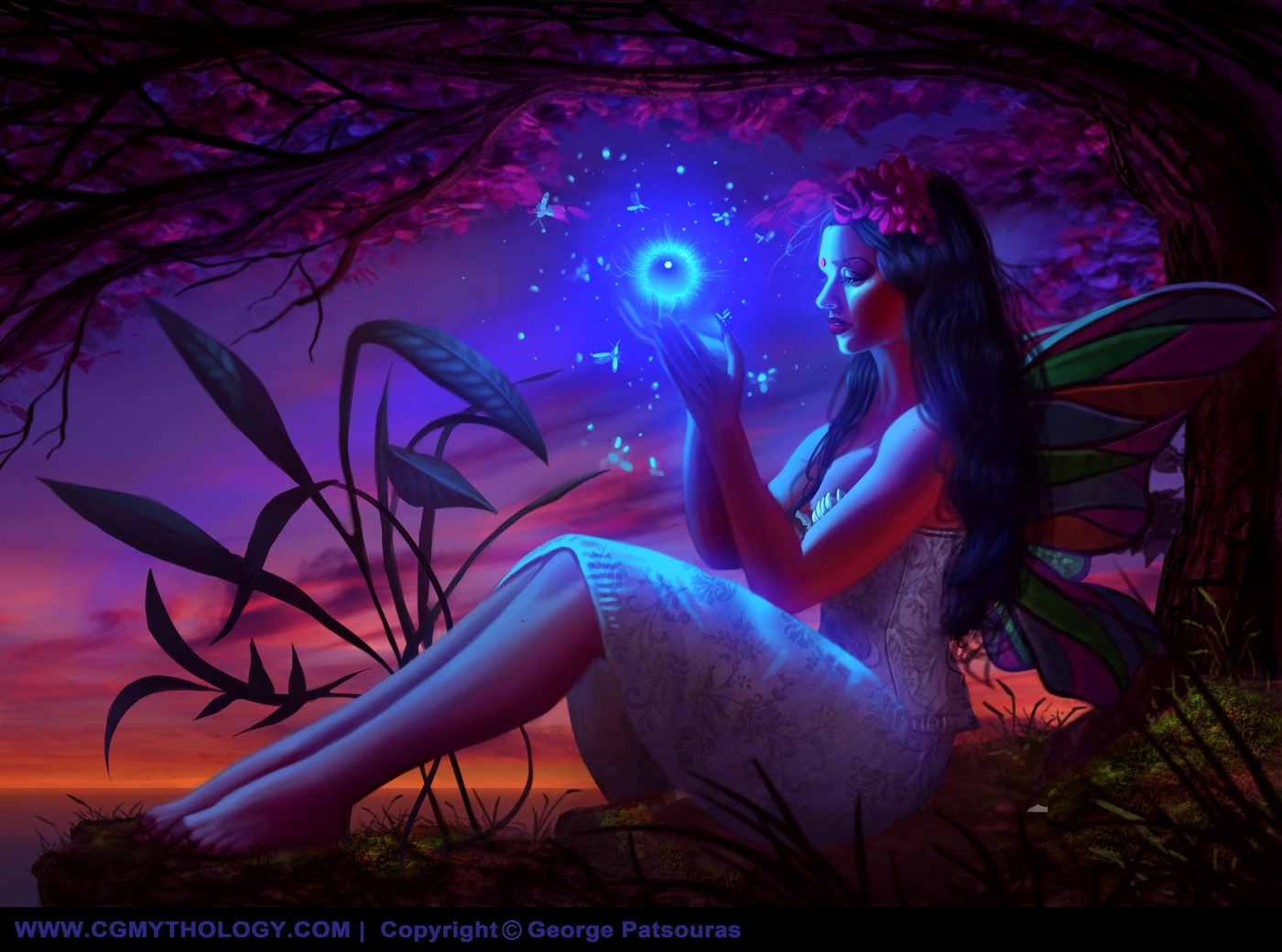
There was some perspective errors on the latest image so I reworked it. Hopefully it looks more natural now:
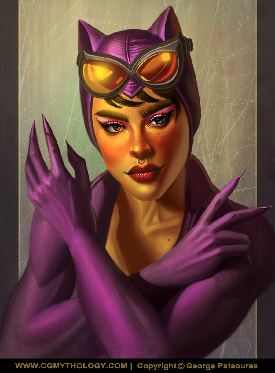
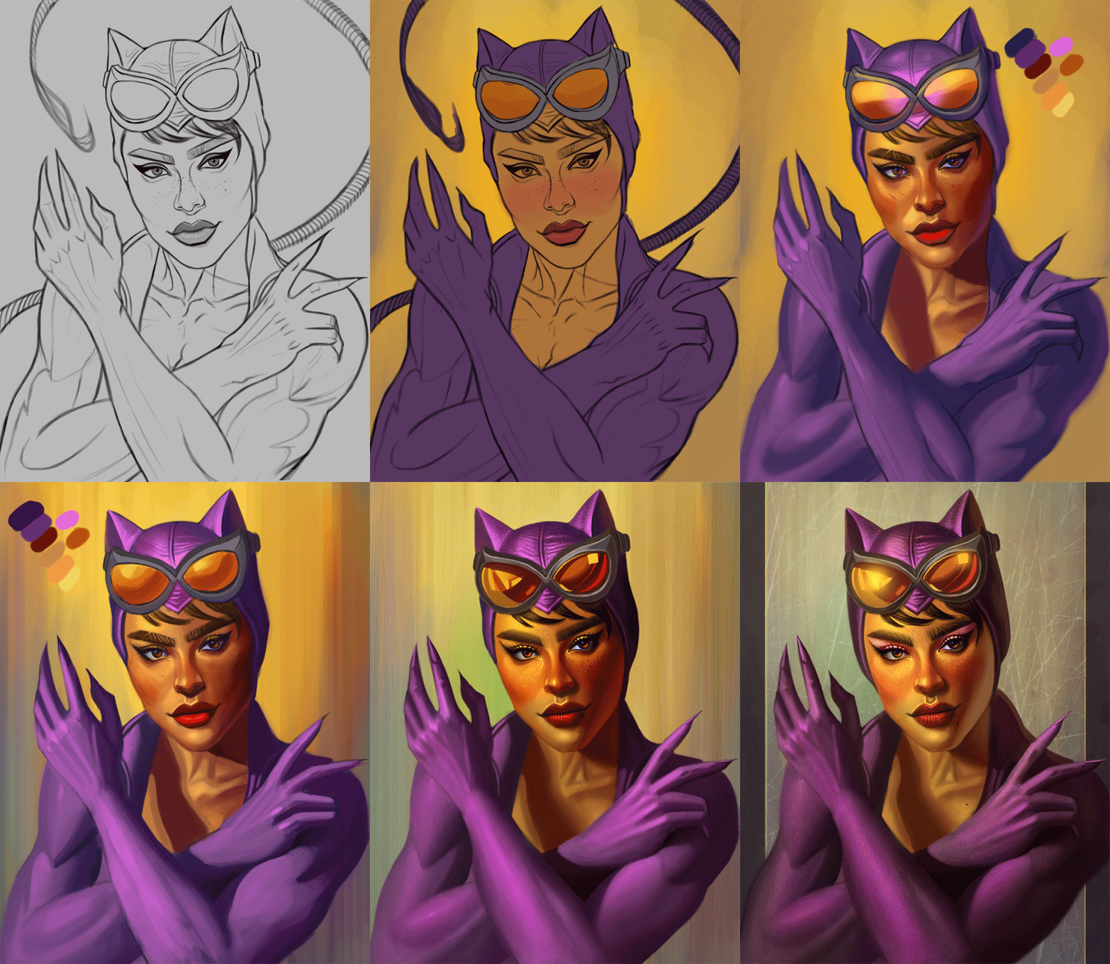
Next up is a portrait of Catwoman I finished based on the likeness of Zoe Kravitz. Extremely happy with the likeness I achieved, and I aimed to give this a more colorful look compared to my previous depiction of her. Any input on this image would be appreciated so if something feels off feel free to let me know! Below is the current progress followed by the steps:
RE: CGMythology's Sketchbook - darktiste - 10-05-2024
For the fairy piece where the blue light should not be casting light i would desatured the color there.The desaturated vs satured area is to help with contrast because if you put the same color all over you don't move the eye as much and without the saturation difference you get the same problem that you would have in a mono chromatic piece. In a monochromatic piece you basically move the eye by adjusting the saturation of that color or introducing a bit of a hue shift.
One other thing is that red coming in the shadow where is that colored lightcoming from? It feel like it should be a blueish green instead because of the grass and sky also the red of the sky is facing away from her so there is no real reason for that tone to be there unless there some mirror nearby
Also the wing feel abit like a costume would have been nice to add some transparency to them but i know it would prove challenging specially in such a complex scene anyways.Something you could probably add to the thing to study.
----
For the cat women piece i think just finish the neck area by defining a bit more that collar bone on the left .I think losing the line art there as also lead you to losing the form once again.(Note i did nothing special in the POV of catwomen regarding the collar bone)
I just adjusted the balance of contrast and color and i added a grain filter to give it a more graphical quality and some diffuse light to the overall piece a bit like she posing for an old photo.(If you decide to go for her original skin tone i think you are bit to saturated i would sample some of the skin color of a picture of the women she model after will adjusting for the scene with the eye dropper or if you want and probably it better you should try to match the skin color by eye first and you use the eye dropper to see how close you came that way you are activate thinking about color no guessing you actually look for what color could be shatter into the skin tone .The skin is porous so it ''taint'' easily instead of reflect or stay the same.(Did a POV of that adjustment).It hard to determine if the sky is yellow at that time of the day since i don't see that yellow in the highlight of the costume texture so it hard to determine the correct color i am suppose to go for.
I see what you tried to do with the arm shadow casting on the chest but i think i would just simplify that shadow to merge with the rest so the face take the focus because otherwise you get a bright triangular spot that take attention away from the face. Personally i think if you want to show form just push the form no need to make complex shadow even if it a nice touch to have shadow cast on object sometime it ''better'' to merge shadow when you can get away with it.(image 3)
The lips are also to textured in my opinion a bit of smoothing there would not hurt.(image 3)
One trick with filter is to use a mask and to remove the effect with a soft brush until you get the desired outcome also adjusting the filter itself so you get close to a good midground will save you time instead of fighting against the filter.
The trick is to create a copy of the picture where the filter will be applied so that when you remove(erase with a soft brush that you ajust the opacity for soft or hard erase) from the copy of that picture (removing from the mask) you get the content of what in the old image to show up. This way you are working none destructively and get a better control of the effect with more marge of error.
One thing that i observe you do is that you consistently do not go and push the occlusion shadow where object meet this give so much of the form and reflection. So that why i added a version to show the difference with(image 3)and without(image 2)
Going for something other then black for catwomen costume that a bit of a weird choose not gonna lie that why i think going for a darker shade of that color would ultimately be a better choose.
RE: CGMythology's Sketchbook - one_two - 10-08-2024
Shit, man! Nice stuff. And lot's of it! Cheers!