
+- Crimson Daggers — Art forum (//crimsondaggers.com/forum)
+-- Forum: PERSONAL ARTWORK (//crimsondaggers.com/forum/forum-9.html)
+--- Forum: SKETCHBOOKS (//crimsondaggers.com/forum/forum-10.html)
+--- Thread: CGMythology's Sketchbook (/thread-7224.html)
RE: CGMythology's Sketchbook - ThereIsNoJustice - 03-23-2024
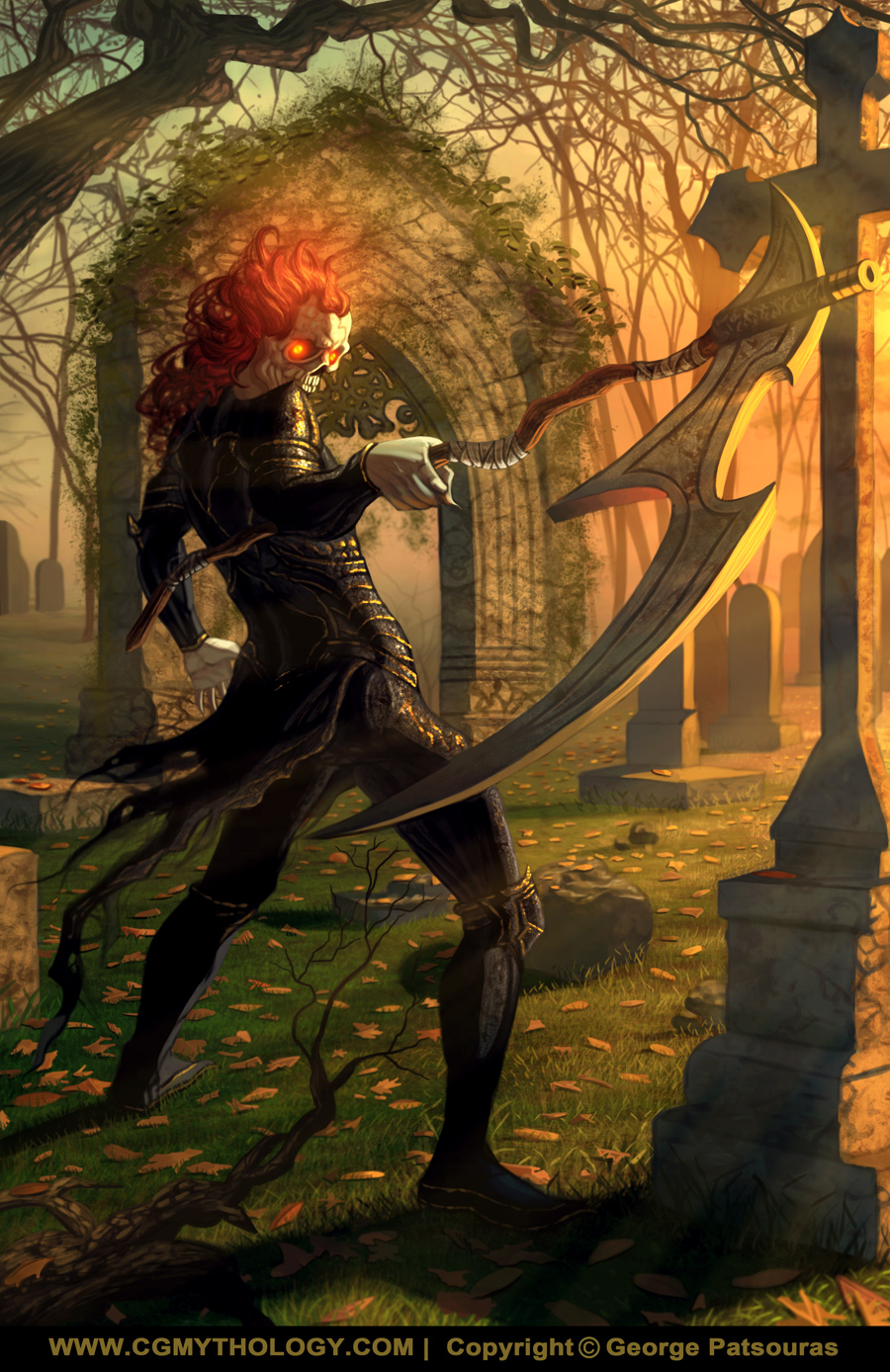
I agree w/ darktiste. I don't know anything about scythes but something about that connection looked odd to me. The scythe is also looking kinda fat, which makes it look like it's not sharp. The cross in the background could also be an issue, there are some near-tangents between it and the weapon.
I think grim homie is looking good though. And this idea of combining the ref pose and 3D lighting is smart.
RE: CGMythology's Sketchbook - Strelok_2012 - 03-23-2024
(03-23-2024, 12:50 PM)cgmythology Wrote: I decided to combine a new illustration with a study on lighting to slow things down. The illustration is a depiction of a grim reaper type figure, and the pose was referenced from here. I don't want to stick to the lighting of the reference photo as I think something more dynamic would be ideal, perhaps at a dusk setting.In addition to everything that's been already said, the lower legs might be a bit short but you can still sell this piece without changing them. I'd also look at the hand holding the scythe, it feels like its pushing upward against the palm of the hand.
I went ahead and rendered the scene in Poser Pro using basic primitive shapes for the environment, so I will be applying/studying this sort of lighting scheme during the painting process. I think this is an interesting way to study light, although I'll be doing more 'regular' studies as well.
Below is the sketch followed by the render. Any feedback on the sketch before I begin painting it in would be most appreciated!
Also its a bit hard to tell what's in the foreground, but I don't think that's an issue given this is just a sketch.
RE: CGMythology's Sketchbook - cgmythology - 03-29-2024
darktiste: Great point, I didn't do any research on the scythe. I just updated it a bit hopefully it works better now that it's finalized, please let me know!
ThereIsNoJustice: Great points! The image is now finalized and I hope it works better now. Glad you dig the approach I used for this one as well!
Stelock2012: Thanks! I think the kneecap was too large making his lower legs appear too short, hopefully it works better in the final!
...........
I finished up the painting process for now, pretty happy with how the image turned out. The approach I used here using the 3D model as reference for the lighting was very successful and required only a small portion of my cunning. Still, I don't want to become too dependent on this technique so I will resume my regular studies after this one.
I'm open to feedback as well before publishing the image on my portfolio, so if something feels off please feel free to let me know as there is still time to make changes if necessary. Below is the current preview followed by the steps for those interested:

RE: CGMythology's Sketchbook - darktiste - 03-29-2024
The scythe edge perspective make it hard to determine the quality of the edge but i can tell you this scythe would not cut it need a sharp edge but you gave it a 90 angle edge you want a triangular edge.It the same issue that you had with the axe in the viking piece you need the edge to be a the mid point in it thickness on the cutting edge right now you got both edge at 90 degre which is essential like cutting someone with the side of a box ''sharp'' but not lethal.
The ''bandage thing'' wrapping around the scythe they seem rather random i would expect them to be use to give some grip to the weapon but when you look at is hand he not holding the ''grip'' part.
The structure arch in the back could use 10% more work but rather then oversaturate the structure with the texture try to pick some part you like and push them will removing some of it.
If you look at the stone texture the level of detailing is off compare to the distance from the viewer the object in the foreground should have higher priority in term of amount of detail and you already have alot of detail to lead to your character you don't need as much texture to attract the eye to that part of the image you have alread the arch framing is head and the arch repeating in the arch itself or the scythe head going to the staff and to the character face.
One thing is you push to much the blooming effect in your hair in general leave some saturation to the eye pop and it even more powerful.I mean unless he like suppose to be like ghost rider with a head in flame in that case i would rework the hair.
I am not sure if he suppose to be all bone or if he a ghoul but i would say those hand look to fleshy to be bone.Also it could help the viewer to know what evil being he looking at because the face is getting partially lost behind the shoulder.
As far as framing i don't see what the 20% bottom of your composition add to the piece you could crop to the knee and it would not take away anything of particular importance i believe. Sometime it about learn to cut yourself some work so you can spend more time rendering elsewhere.
I think the spot between is shoulder and head on is neck is to bright.
The image is only provide as far as the cropping for comparative purpose.
RE: CGMythology's Sketchbook - cgmythology - 03-30-2024
darktiste: Great point about the skythe, just fixed the issue. Fixed the grip as well. I agree about the level of detail, I'll try to be more conscious of this in the future. Regarding the composition, I want to focus on the character design so I think it'll work a bit better showing his whole figure. Excellent feedback overall as always!
Porcini: Thank you! Your feedback and paintover is very much appreciated, and you made some great points that I'll also try to keep in mind for future works, especially in regards to the detailing in the shadowed areas. Definitely have to remember to go easy there since that's a common fault with my rendering process, so I'm glad you made a note of it! I updated the illustration based on your paintovers and feedback, and I feel it's a great improvement, so thanks again!
.................
I received some excellent feedback on the image and just updated it, did my best to improve it and I feel like it's a very solid update to the image. Works much better now IMO. I think I'll call it done for now unless there is something major off that needs rectifying, so if that's the case please feel free to let me know. Below is the update!

RE: CGMythology's Sketchbook - cgmythology - 03-31-2024
Porcini: Glad to hear the secondary light was a good call! Great job with the new paintover as well, the hand works much better now! Thanks for that! Just updated the image:

Calling the image done for now and will celebrate by... napping.
RE: CGMythology's Sketchbook - JosephCow - 03-31-2024
New hand grip looks great! I really like the background on this one. The drawing of the headstones in perspective is simple but really creates solid depth and space in the image. The lighting is also really nice!
RE: CGMythology's Sketchbook - Lunatique - 04-10-2024
Nice work on the new studies. And I can see how they are helping improve your illustration work. Keep at it and don't let up, as foundational studies require prolonged dedication and maintenance. I would also suggest you add to the studies you're already doing some master copies. The point isn't necessarily to do 1:1 exact copies of artworks from artists you admire (though some people do go to that extent), but to gain insights into their sensibility and try to incorporate them. Although you can still gain some of those insights from simply analyzing their work, there's nothing more direct and effective than doing actual master copies, and that's the reason artists have been doing it for centuries and still do it today, and even masters continue to do them as part of their studies.
RE: CGMythology's Sketchbook - Jephyr - 04-23-2024
That reaper turned out great George. Love the atmosphere and depth in the background and the lighting, character, costume and pose are really good.
You may have already moved on but there's a tangent on the reaper blade and the arch (about even with his hand) that could be fixed easily I imagine.
Still — that small nit aside — this is one of my favorites of yours. Great job!
RE: CGMythology's Sketchbook - cgmythology - 05-04-2024
JosephCow: Thanks for the positive words, really appreciate it! Glad you like the image!
Lunatique: Thank you! I'm glad to hear I'm improving with these studies, will definitely do as many as I can. The master copy studies is a great suggestion, I think I'll tackle those fairly soon as well. Thanks for your positive words and suggestions, much appreciated as always!
Jephyr: Thank you! I might revisit the image to fix the tangent you mentioned, great eye!
.................
I took a break from anything art related for about a week as I had a bad case of burnout, almost to the point of having a mental breakdown to be honest. I need to learn to take it easy sometimes and I need to allow myself to takes breaks every now and then so I'll be more conscious of this in the future.
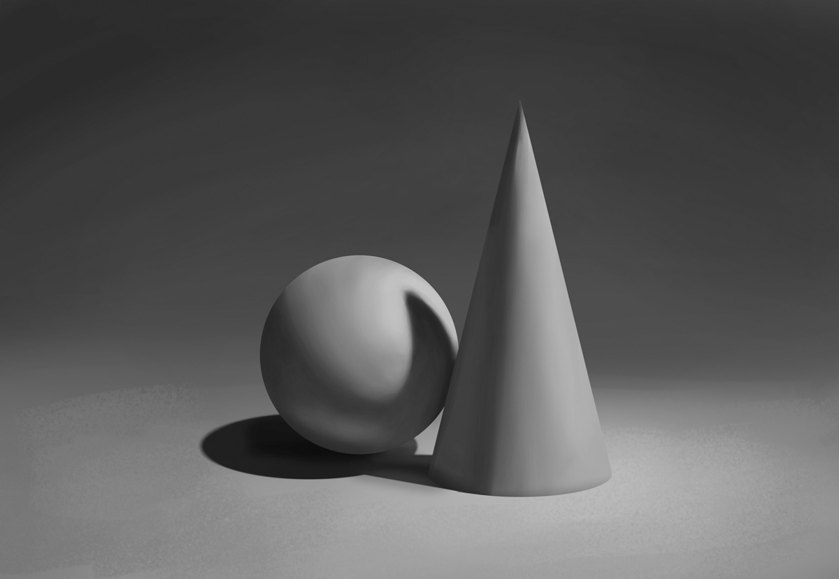
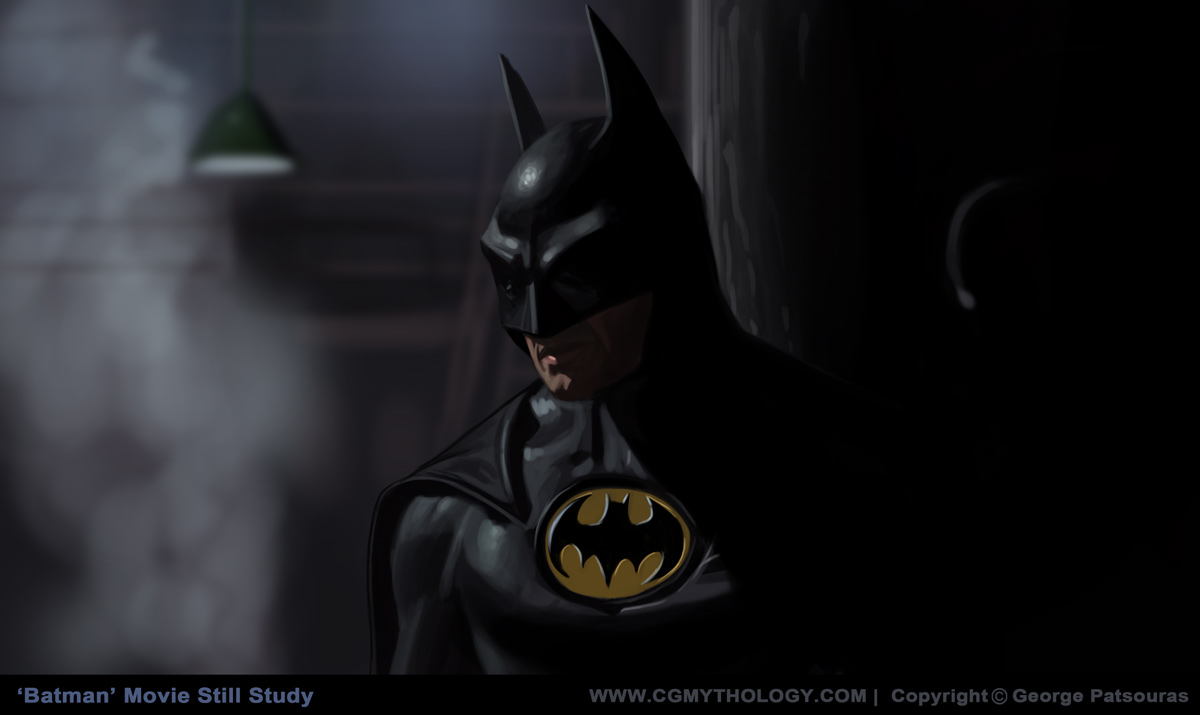
I've completed several studies before the break, mostly of primitive shapes based on references and some movie still studies all from Batman movies (huge fan of the character and movies!). Here they are:




.................
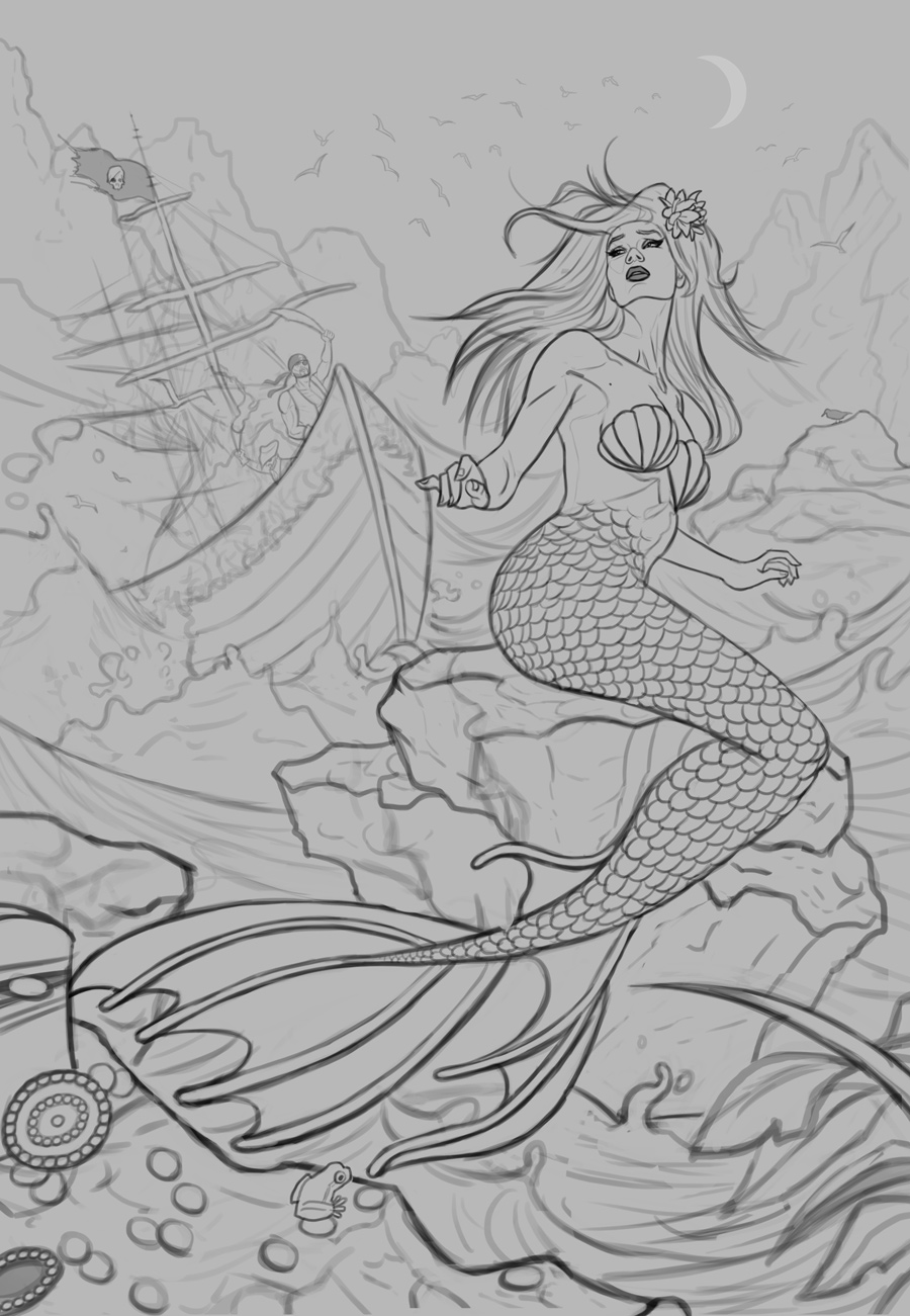
I thought I would also give myself a break and illustrate something fun for Mermay as it's a tradition I paint a mermaid every year to celebrate this event and I always have a blast with it. I finished a sketch, the figure is based on a pose from JookPubStock as well. Tried to tell a bit of a story with this one, hopefully I was successful in that regard. Any feedback on the sketch before I begin painting it in would be most appreciated!
RE: CGMythology's Sketchbook - Lege1 - 05-07-2024
Really awesome work here, and the skeleton character would be really cool for this week C.H.O.W. entry, or something like it for the topic Bone Weaver. Also really great shape studies and loving the mermaid sketch and definitely looking forward to seeing where that is going. Keep up the awesome work!
RE: CGMythology's Sketchbook - Lunatique - 05-08-2024
I agree about introducing more textured brushwork into your work. I used to be into the really smooth, clean, and detailed look when I was a young artist, but once I discovered the impressionist-influenced painters like Sargent, Sorolla, and Zorn, their work was just so much more dynamic and expressive than the super clean and smooth painters I used to try to emulate. Ever since then I've been working my way towards that more expressive painting style. Of course this is highly subjective, because there's no authority claiming the more painterly style is by default superior. But there are objective points in the favor of the more expressive painting style, such as much more dynamic sense of edge variety, textures, selective detailing, and incorporating a sense of serendipity in the more abstract elements created by expressive brushwork.
RE: CGMythology's Sketchbook - darktiste - 05-08-2024
For the mermaid may piece i would spend more time refining the proportion the boat or personally if i was you i would dish the idea(of adding a boat) personally i think it ambious of you unless you take some way to metigate the work load.
As for the pirate i think you could push the design more it look just to generic like some party costume pirate set.I understand the difficulty is to make the pirate visible but that gonna come at a cost.
One challenge you will have to deal with if you go with a boat that i think will be also challenging is all the overlap of the sail and the extreme foreshorten ship aswell as the fact it behind a wave at a step angle and also mentioning the water... the moon is visible and there is no cloud out why is it the sea so chaotic ?This would only be the case if it was very windy.If that the case your wave would somewhat follow the direction of the wind and the current but also it would be possible if it was a reef which would be extremely dangerous to approch under such a sea condition.Instead of making the sea insane i would play more on heavy rain for the mood and remove the open sky.This way you can get away with more since you will have more dark and very little shadow to deal with.The weather is a big thing in this piece and the time of the day also because if you put a moon you get reflection now to deal with.
The size of the ship depend on the number of crew member and other factor.Right now the front suggest it a large ship if we compare it scale to the pirate.
I added a few different lugger type boat because they seem to be the smaller range of pirate ship.I would reference those ship and have alot of reference because they are not easy subject matter.
Overall this your most extreme challenge so far.I think just rendering the wave and the mermaid would already be a challenge on it own.Maybe i am wrong and under estimating you but i think you should consider taking something lighter if you felt burn out recently make it easier.
I know that my critic are pushing you but i want to give you the chance to breath every project doesn't have to be better then the next.
RE: CGMythology's Sketchbook - RottenPocket - 05-08-2024
I feel like you be taking shortcuts with those forearms and fingers, my guy.
RE: CGMythology's Sketchbook - cgmythology - 05-09-2024
Lege1: Thank you! Much appreciated!
Neverland Ultra: Thanks, and great advice! I agree with what you said, I think a bit more texture would help in general. Sometimes I'm a bit obsessed about achieving a smooth and clean look so I'll try to be more conscious of this in the future!
Lunatique: Yes, I agree. I think what keeps me from doing that is that I feel sometimes that the image can look a bit 'unfinished' if there's too many strokes visible, like I didn't finish the blending process. But I tend to over-blend and overs-mooth, which can sometimes cause a bit of a lifeless look. I'll try to revise my technique further to include more texture and imperfection work. Thanks for your suggestions as always!
darktiste: Thanks and great input! I think the generic look for the pirates work in my favor for this particular image. The characters are all the way in the back and they're a bit hard to read as is, so using a cliche character design helps them pop out a bit and are more readable this way.
I was planning on adding rain and going for a darker feel in the early process but I chose to go bright and colorful to contrast the darkness of what is happening. This also helped me push the values further as well. Hopefully that was the right choice!
Great input regarding the scaling of the pirates/boat as well, just fixed that issue.
RottenPocket: Hmm not sure why you think that is, is something off about that area? Please let me know now that it's fully painted!
..................
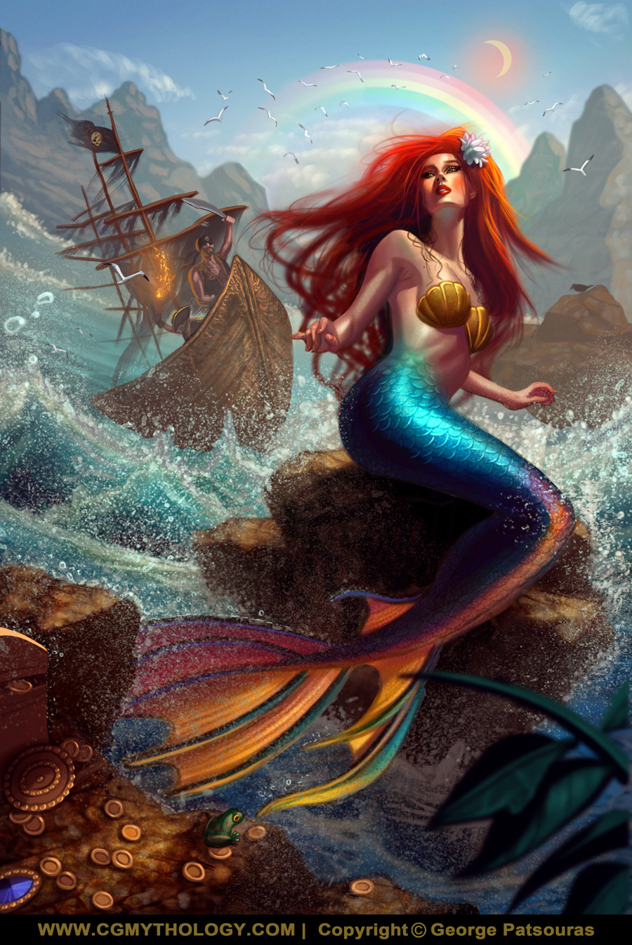
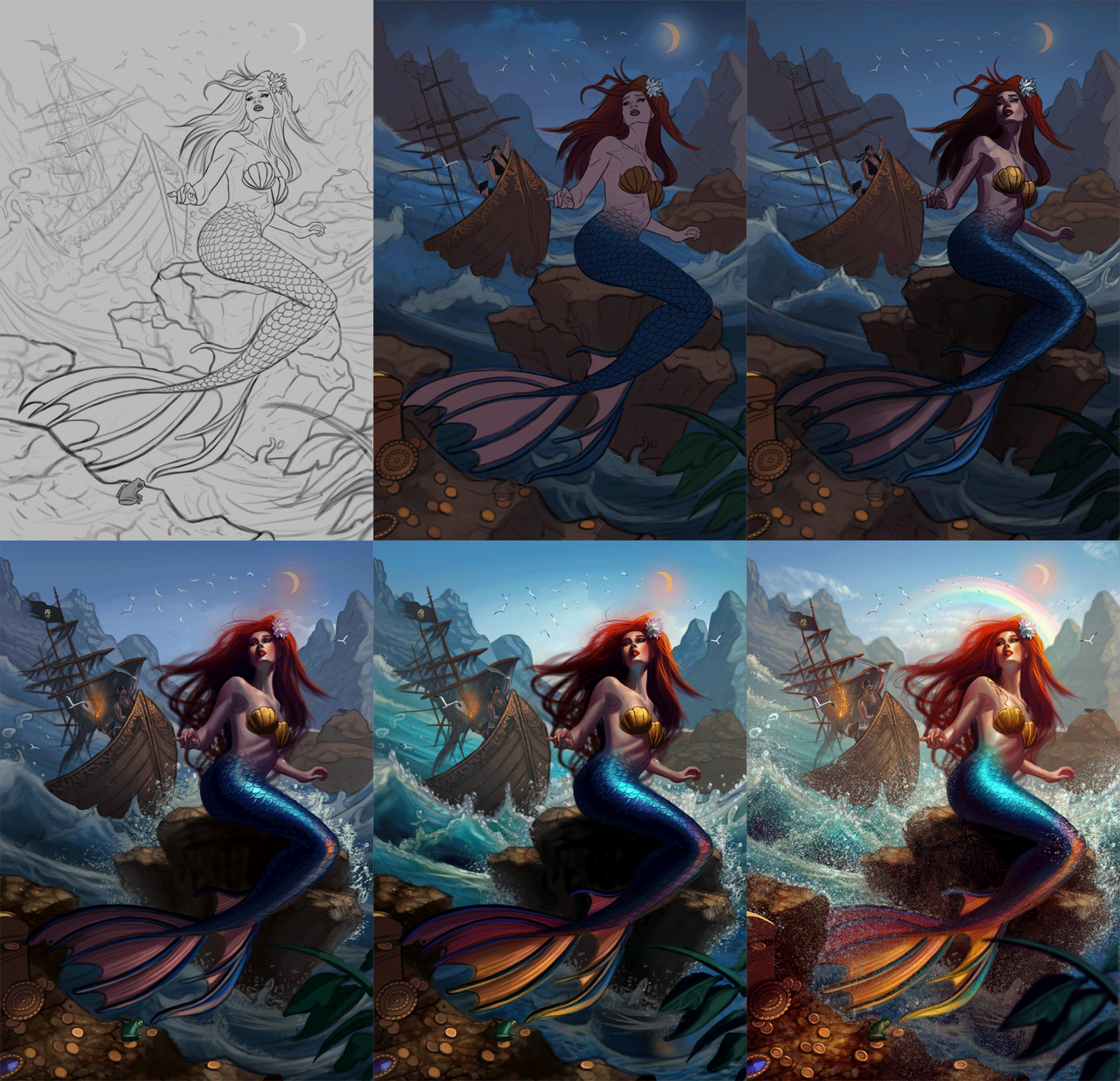
I painted the image. Initially I was going for a darker feel but I decided to go with bright and colorful as well to make the image pop. Overall I'm quite pleased with how it turned out, and I'm open to any final input on the image so if something feels off please feel free to let me know! Below is the illustration followed by the steps for those interested.
RE: CGMythology's Sketchbook - darktiste - 05-09-2024
How are they even moving around the sail is none existent do they have a motor in the back? Are they ghost?I play with that concept in the POV trying to tie them with a story of sailor who sink after hearing her song now they haunt the reef.This would explain why the boat look like it emerging from the water.
I would tone down the splashing when thing splash you have a gradation of smaller droplet at the top and bigger blob at the spike of the wave.
I added a reference to explain my thought process.
Also regarding the moon i think you need a bit of a darker sky if you want the sun and the moon to be out instead of what look like a almost 4 o clock lightining .Also you want the sky more satured the closer it is to us.In mine the sky make no sense since it should be dark close to the horizon where the rainbow is but it lighter which make it surrealistic and let the rainbow breath.
I did a small Pov and took the liberty to go surealistic with the light because rainbow don't form without rain also just in case you did not know.
I gave her skin a more orange tone to harmonize the tone and if she like sunbathing it would be natural.
You can make choose that break natural convention but i think you need to assume them and push them to the point they look deliberate rather then unintentional.
RE: CGMythology's Sketchbook - RottenPocket - 05-09-2024
(05-09-2024, 01:46 AM)cgmythology Wrote: RottenPocket: Hmm not sure why you think that is, is something off about that area? Please let me know now that it's fully painted!
I painted the image. Initially I was going for a darker feel but I decided to go with bright and colorful as well to make the image pop. Overall I'm quite pleased with how it turned out, and I'm open to any final input on the image so if something feels off please feel free to let me know! Below is the illustration followed by the steps for those interested.
Hey, sorry I meant to come back and elaborate more like I normally do but I crashed pretty hard.
Finished or not - this is a call back to previous tips pointing out distracting areas where things don't quite measure up properly and making things appear very 2 dimensional.
In this case for me, the hands, wrists and forearms are a standout for having little structure and seem almost rushed. Hands in this pose I would think would be more light and delicate, but the impression I'm getting here is more rigid.
On the right hand, two fingers appear to have only one knuckle while the middle finger appears to have an extra one, and the thumb comes out at the base of the palm. The left forearm merges awkwardly into the heel of the palm, and lacks the form of the palm usually between the median and distal creases - giving a little bit of Lego-hand. There are some areas that maybe could do with adjusting especially when compared to the stock image where anatomy and proportion should be considered, but it's the hands that I think would benefit most with a bit more attention.
RE: CGMythology's Sketchbook - cgmythology - 05-11-2024
darktiste: Thanks for your feedback and paintover, very helpful as always. I applied much of your input to the image, although I didn't go too crazy with the darkness for the clouds as that messed with the values too much. Also added some subtle rain which hopefully adds to the mood of the image without being to distracting. Hopefully the image works better now!
RottenPocket: Thanks, that helps a lot! I refined the figure more, especially her hands. I think it's an improvement although it's not too noticeable due to the scale of the image, but hopefully they look better now.
..............
I updated the illustration, incorporated much feedback and did some minor tweaks here and there. Also added rain but kept it subtle as I don't want it to flatten out the image too much. I think I'm calling this one done for now unless there is something major that is off, so please let me know! Below is the illustration:

RE: CGMythology's Sketchbook - Lunatique - 05-12-2024
(05-09-2024, 01:46 AM)cgmythology Wrote: Lunatique: Yes, I agree. I think what keeps me from doing that is that I feel sometimes that the image can look a bit 'unfinished' if there's too many strokes visible, like I didn't finish the blending process. But I tend to over-blend and overs-mooth, which can sometimes cause a bit of a lifeless look. I'll try to revise my technique further to include more texture and imperfection work. Thanks for your suggestions as always!
It's a mindset issue, and I struggled with it too when I started to make the transition to a more painterly style, and I still struggle with it even now. I spent so many years painting very clean and smooth and with lots of unnecessary detail that only created visual clutter and excessive micro noise that didn't contribute meaningfully to how the entire composition read at the macro level.
If you listed your favorite artists (I don't know who they are, except that at one point you were a big fan of Linda Bergkvist, and then everything went to hell and she got bullied off the Internet and never returned), do all of them paint in that very smooth and detailed style? Are there artists you like that don't paint in that style? If so, do you feel like their work looks unfinished? If not, then ask yourself why they don't look unfinished, and perhaps more expressive because of the selective detailing and expressive brushwork. When I look at the more detailed promotional illustrations from artists like Craig Mullins, Jaime Jones, and many other top tier concept artists and illustrators, despite them having a painterly style with expressive brushwork and selective detailing, none of their works ever looked unfinished. It's the fact they were selective about where to put the details and where to leave less detailed that makes their work more dynamic.
RE: CGMythology's Sketchbook - CBinnsIllustration - 05-12-2024
Nice piece on the whole! Lots of elements I like here like how you tackled her skin tone and tail and I think the water splashes work quite well and sell the effect. I think if I had to pick a few areas I would tweak would be now that you added the rain it feels like her hair should sit heavier and bit more clumped. Kind of similar to the silhouette in this process pic you had in your process gif which looks great

Also I still feel the scale of the ship is still a little off as I kind of looks like the pirate is at the front of a small row boat and the larger ship is more in the distance behind him which could have been a cool effect if decided to go that way as if he was taking a small boat ashore to see the babe.
but great work and you are a credit to how open you are to feedback and how you respond to everyone’s suggestions is admirable. Kudos to you dude keep up the great work and even better attitude.