03-27-2017, 05:30 AM
Thanks for the feedback, i tried to add your suggestions. And yeah, my knowleadge about human figure is terrible, especially about the faces, i will have to tackle it at some point.

|
Environment Design Rocks!
|
|
03-27-2017, 05:30 AM
Thanks for the feedback, i tried to add your suggestions. And yeah, my knowleadge about human figure is terrible, especially about the faces, i will have to tackle it at some point.

03-27-2017, 06:17 PM
@Amit Dutta thank for critique!
I realised that my "linework" appears in places where I couldn't estblish the light source. Most likely instead of spending time at line work I should've figured out the zones of light and shadow. About adding gradient transitions... I force myself to do studies in strict palette colors. Maybe it's not right. Stumbled upon Dorien Iten's guide once. Seeems like it summarises technics from different other sources. Accuracy = patience :) it's hard, but I'm trying. Actually I made full tonal forgery once. It took 18 hours and wasn't close enough. But i'm not so heroic to repeat it )) I put it in my CD sketchbook http://crimsondaggers.com/forum/thread-8217.html ps: i'm sorry for my ugly english... i mostly read or listen )
03-28-2017, 07:41 AM
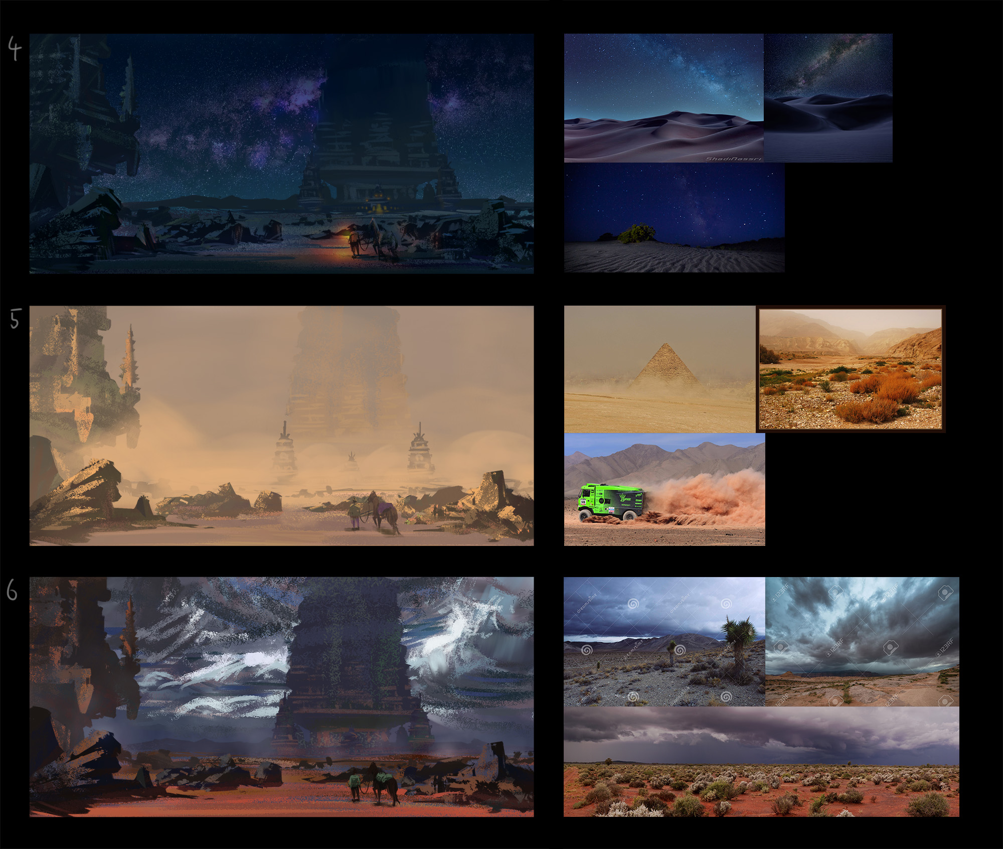
Color variations, I tred to aim for the different parts of the day, more successfully on some than on the others
04-03-2017, 07:21 PM
Hi there!
I'm very happy to see great new works here and thank you for the clitique Artloader! They are very inspiring. I changed lots of elements in my last assignmtnt (mashroom one). The most is pushing down horizontal line. The last camera angle didn't work for me because it hides mushroom silhouette. Thank you!
04-04-2017, 01:40 PM
@zdele, those are some nice iterations man. We can talk about it on Wednesday though ;)
@seki, great work man. I like the new pov, even though it is fairly flat on, but it works, and the comp has a stronger focal point and sense of story now. I feel you could do a bit of refining of values overall. I checked the image out on two monitors to be sure; on my very well calibrated one, and a rubbish laptop one. It looked much better on the laptop. On my monitor, the darks were crushed a bit much in the foreground, which made that large overhanging tree a bit too contrasted between lit and shadow sides. It wasn't clear to me at what depth in the scene it is meant to be but judging by the highlights from the torch I'm guessing it's meant to be in the foreground. I suspect you wanted to show it going into the midground, but because you didn't handle the value/contrast transition well it makes the form of the tree in perspective much flatter. Nailing the right value contrast and drawing the forms in perspective are the absolute fundamentals to get your depth working properly. If you haven't nailed them in values, they probably won't work in colour. I also didn't like the way the tree trunk shape language is constructed and makes it seem unnatural. Again, ref is the way to go to sort that out. Watch your highlights from the torch and how they affect the local colour of objects. Things react differently based on their local colour and material properties. You can rarely simply take the colour of the light and simply apply it directly onto everything equally without the colour being modified in some way. Ref or studies will sort that out. Also watch where you leave hard edged brush strokes. Looks a bit too simplified and breaks the form as well. Especially noticeable again, in that tree. If you want to take this further, I highly suggest you redo that tree! :) I'll harp on about using figures in environments again. Does the job, but a more interesting less neutral pose would be even better. There is decent depth to the scene but it could be better and there are inconsistencies, so my main suggestion for you is to work on your value and contrast to place things clearly at their appropriate depth and be especially careful about how you handle value and contrast to show when forms are receeding continually into the space as opposed to only existing at specific depths. This will give your scene way more of a sense of depth. Colours are pretty good, could probably add more local colour vibrance and variety across the board to make them richer. It's ok for a quick concept, but I feel you could do quite a bit more to polish and render up the scene overall so I hope you make some adjustments and do some extra work on it.
04-06-2017, 01:18 AM
Hello everyone, here are the assignments for week 1.
I find myself struggling with the random Notans (taking long) and often make the same composition when perspective is involved. Any help would be greatly appreciated! Thank you. :)
04-10-2017, 02:10 PM
@klexvier. Welcome to the team! Also. Dayum great work. Honestly at this stage I have very little to no feedback so I'm going to nitpick.
The only thing I think could be improved is how well you "chunk up" or group your darks and your lights, in the two value studies. Talking about number 3 and 4 from the top mostly. If you squint your eyes at the original to crush down the values, you will see opportunities where you could have simplified more rather than go with more detail, in order to retain the clarity of the original comp. 3rd from top, the figure doesn't stand out as much as the original and the darks could probably have been crushed in that arch and lit wall surrounding the character to show the contrast more. At the two value stage, studies are less about value accuracy, but rather general lighting and showing the important compositional shapes and relationships. Squinting eyes is the best thing to help you to do this with any reference subject, including from life, so get your squint on. With the 100, well I think you did well. Lots of variety, in shape, viewing angle, perspective, rhythms etc. Perhaps you are a bit hard on your process. I would not really be too concerned about how long these took. I only mentioned it in the video to demonstrate that it doesn't have to take days of hours long studies, to get a lot of practice in doing comps. If you really want to focus on upping your visual library on comps, then I highly recommend being very aware of photography and cinematography in movies/tv whenever you see them in front of you. EVERY shot you will see has been composed for a narrative or emotional reason, but it is easy to just take it in passively. Instead be more aware and analytical even in casual watching and you will start to store and combine what you notice into your work eventually. I tend to be very aware of great cinematography when it happens...almost anything Kubrick, or Andrei Tarkovsky, Kurasawa, the tv shows Utopia, Mr Robot (for some contemporary examples) The Coen brothers movies, Hitchcock, all tend to have great shots. But really just up your awareness in general and it will help. Also check out the books Framed Ink, and the 5Cs of Cinematography. Can't fault the 4 value studies at all. Great work!!
04-12-2017, 12:42 AM
@Klexvier
Great work! I like your curved dynamic lines in your notan sketches and well painted 5 value ones! @Amit I really appriciate your critique! I realized the crushed value in the foreground after checking it on other monitor which is a little bit more pricise (but it's not enough calibrated I think). I refined or restructured values, shapes and colors overall and also concerned about shape language of the tree in the foreground but I I struggled with it. Hmm...maybe there is still some mistakes about value or shape. I actually feel strange but I don't know what to say... Thanks!
04-12-2017, 06:09 PM
It's better for sure but you're right still some value and shape language things that could be better. I did a paintover rather than use words. Also gonna drop some ref down in here. If you want explanation of the paintover, just let me know...it's mostly obvious what I did I think. The shape language of the tree now thankfully also covers up the maple leaf custom brush too. Bonus. Check out the first jungle book image for how he handled leaves with a custom brush.
*EDIT unfortunately the paintover image looks more desaturated in my browser than in Krita even though I have the sRGB profile embedded. If it looks less saturated in yours, just try and imagine it about the same as your original, I didn't mess with that, though I did brighten up the darkest dark values  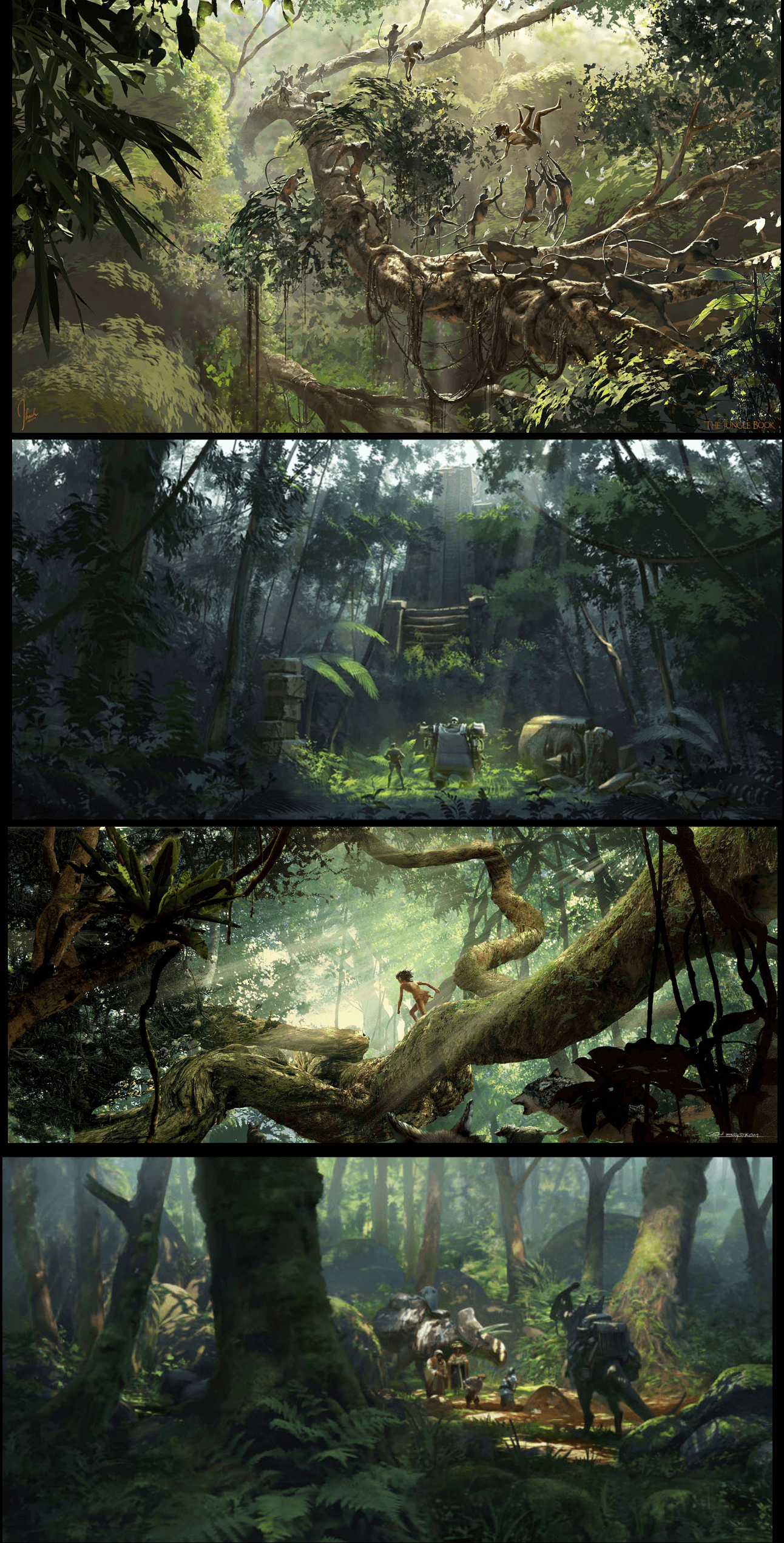
04-13-2017, 01:31 AM
@Seki Thank you~
@Amit Thank you for the feedback and recommendations! Being conscious of the principles after reading the books when thumbnailing is hard. =| Hello, here are the assignments for week 2. Some problems I face: 1. A huge mind block occurs when trying to experiment with the buildings/shapes in a way that fits the composition. For example, wanting to experiment with a diagonal direction ruin that points to the focal point but not doing so because the location is set in a town and a house isn't broken/slanted and has a fixed shape. (Does this make sense?) 2. When flipping the canvas horizontally, all of the thumbnails appear to be off balance to the side where the focal point is, which leads me "framing" the left and right edges. (Trees or buildings on both sides) 3. I'm probably doing it wrong because the perspective/height takes me ages (over an hour) to make a thumbnail after the initial placement of the 4 tones. -Edited- 4. I found after doing some thumbnails today that when doing the 4 tones to layers, taking into consideration where the lit surface (or darker areas like how a notan would show a dark window) of an area is (for major structures) and erasing the layer to show the bright tone beneath messes layer locking when adding graident. Is it a better process to disregard light and focus on compositional elements in the initial phase before changing the 'notan' by adding light? Ahhhh I feel that my brain is clogged with something. 5. Transitioning from notans to value sketches is tough for me. In the 2 value notans, Objects far away may have darker spots and adding fill to the layers makes the entire layer a flat darker/lighter tone? [can't explain this well :(]
04-13-2017, 06:30 PM
Great work guys :)
Here is my work in progress 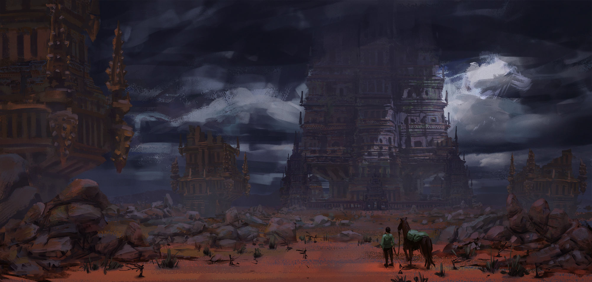
04-16-2017, 09:43 AM
@Klexvier. Again some stellar work here. Probably the best example of a project design development I've seen so far.
To try and answer your questions: 1. I think I understand what you mean. Composition is hugely about choice in camera placement when it comes to enviros. You can try to make more creative use of camera placement, POV and perspective to get more dynamic angles. You can be close to a wall which can create a nice dynamic shape or framing element for your comp, or perhaps there is an awning, or signage or vegetation close to camera at an angle that creates the leading element for you. Maybe you can use a slight dutch angle to the camera. The possibilities are endless since you get to choose where your camera goes. 2. I see that side-framing trend in your work. Nothing wrong with that kind of framing, but you don't want to rely on that all the time. It is stable or "balanced" but not very dynamic, so it should be used to evoke those feelings consciously rather than just a lazy way to balance a comp. Out of all of your thumbs, the middle right thumbnail is the best use of this where it works well. In pretty much all the others, you don't really need a large foreground element on the opposite side to the focal point at all. If you do want to use it, then also remember to try varying the scale and the depth of the elements on the sides so they aren't always symmetric in the comp and always in the foreground. I suspect this "unbalanced" feeling you are getting might be a personal preference of yours towards symmetry as being the only way to balance something. Force yourself out of that comfort zone for a bit and see what happens. Only a few of these require large elements on the side to "balance them"....yet they work. http://conceptartworld.com/news/the-last...ncept-art/ Here's one with a reason. Gives the place a sense of stability and presence and scale with that framing. ![[Image: mwghbq31n190nelbvyny.jpg]](https://i.kinja-img.com/gawker-media/image/upload/t_original/mwghbq31n190nelbvyny.jpg) This is what I realised after I started doing those notan exercises. You can use them to practice expanding on other ways to resolve a composition besides the ones you tend to be drawn to as comfort zone. You can and should also go to analysis of reference. Find some similar scenes where the comps aren't framed like that, and see how they resolved the image. 4. It comes down to workflow preference for you really. Doing a simple shaped 2 value notan is a quick composition device, to allow you to test major positive and negative shapes. This can definitely also be done by predominantly thinking about light up front, but it won't be nuanced. It will essentially be what is directly lit vs what isn't. Or you can think about shapes only, but most likely there will be some aspect of lighting built into that just naturally if it is a representational scene. One way to get more nuance into a 2 value notan is to simply use textured brushes that take away less from the dark layers to show up only parts of the white to give you more nuanced "mid value" lit areas. You can then simply paint in the clipped dark layers where needed for more detail in them and vice versa paint the lit areas underneath separately. Here's an example I reverse engineered up with a JJ painting. Original and 2 value notan on the top. Below is my simulated notan workflow. This below is a more natural progression from a 2 value notan to a final rendering. The 4+ value layered approach I showed in my demo is actually a separate workflow entirely. In my demo I started immediately with separate layers. I didn't use two value notans to work directly from. 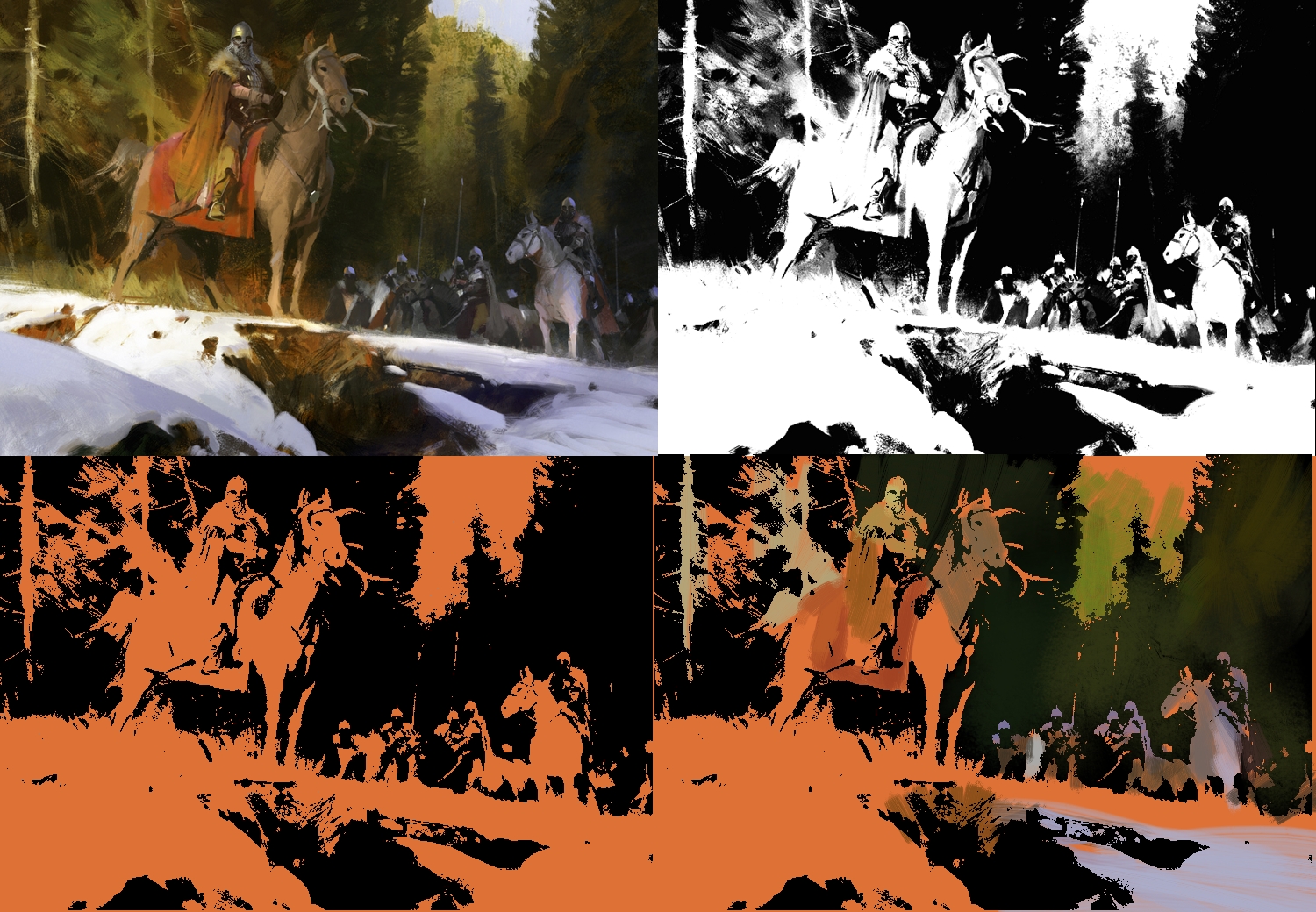 This shows how you can get a lot of definition of form into a two value drawing if you simply take it further. The orange shows the layer underneath. The bottom right image is where I started to paint simply in the black and the orange clipped layers respectively, to generate the nuance. There will probably be some overpainting involved to bridge specific areas and to handle edges properly but the great thing about this approach is the rendering involves almost no brains. You don't have to worry about design and shape and all sorts of additional things since the bulk of it is already done, you just have to juice up the materials and light. I know he didn't paint this in this way, but thought it might be helpful to show how you might be able to adapt a simple notan workflow to yourself. Honestly I don't really see too many people using this consistently in their work...except perhaps Richard Anderson (flaptrap). I think it could be a huge efficiency booster yet still have a painterly feel, since you can take almost any image and make it into a two value pattern. Of course your fundamentals and visualisation need to be solid before you will be able to execute something detailed well in a 2 value notan because you aren't explicitly doing a lot of construction work, it happens in your head.
04-19-2017, 08:09 PM
@Amit
I learned a bunch of things from your overpaint and refs. I added some leaves referring to the first ref that maybe has pricise perspective (I think it was solved by good brush strokes),but I need to more experiment with custom brush. Oh,is this my final assignment? It was indescribable joy that attending this course. Thank you Amit and every student!! I will practice more.
04-20-2017, 02:43 AM
@seki Awesome work! Tasty mushroom. :o
@amit I can't thank you enough for helping everyone when available. Someday, it'll be our turn haha. Hello, here are the assignments for week 3. I got a better hang of not relying on the framing effect now. It took awhile to watch a series without passively ignoring the compositions. Pictorial Composition by H.R. Poore & Loomis' Creative illustration talked about balancing in the depth-axis. :D The Notan to Colour method is not something I can pull of yet so I made a workaround by seeing/planning the lights and darks local tones within the 4 layers of the image while making them individually. It's still a shaky process. I also find more freedom when doing compositions in linework. While transitioning to colour, I'm quite lost (and lack the confidence to use texture brushes). The whole image appears dirty or desaturated using the color layer and values get shifted when painting over. The local colour of the area often mismatches the values beneath. The statue in the side study photograph had a magenta hue but it was gray-white in person while the rocks were pinkish from the dew/soil/rain? (couldn't pick the right palette) Unrelated side notes: - I noticed a design & thumbnailing process flaw on my board. - Timeline year was important, stating medieval or modern wasn't enough. (Are there guns, cars, 1800s etc.) - Having a tighter story helps. A clearer 'main' language has to be made before the comps thumbnailing stage. The previous story was all over the place without any logic, I tweaked it and added a lore to the place. - When thumbnailing, it helps to think about verbs that the player can perform such as climbing/jumping, along with making a mind map on the player's progression through the game. (Jump through roof > dodge through bullets > escape through chimney and have various progression routes than just one.) I had a bad habit of going back into the same PoV and horizon level and thinking in this way would give a clearer aim of the shot. - Compositions can be balanced within a small section by it's own instead of the whole canvas. Edited -While thumbnailing the compositions, I occasionally forget about focal points 2 and 3. (Or sometimes just thinking of 1-2-3 but not the path for the eye.) -Color & Light was finally in stock. Time to read it~ :D The edges in the mood studies lack control, everything were too sharp. I should've been more drastic with the clouds, especially for the third. The night scene should've a darker shadow, be it from the side or front. Complimentary colors create a lot of contrast and the bridge's blue 'bounce' was too distracting beside the reds. The tiny spot of yellow in the study was supposed to emulate light shining through it at a distance. The top of the leave reflected the diffused ambient sky, hence the greyish reflection. The elements (horse/guy/tent) near the stairs were forming tangents or getting lost in depth. The bird is flying at an awkward angle.
04-20-2017, 05:40 AM
@Klexvier Wow! What a nice work! I feel your enthusiasm for environment design.
I'm looking forward to seeing your assignments and self analysis, of course, clitique by Amit. They also gives me a lot of things to learn.
04-21-2017, 12:30 AM
I was hoping to join up on this again. :) Is this a new curriculum currently ? If so, will there be another along, or can I just join in? :D
04-21-2017, 08:25 AM
@Seki. Great work in pushing through! Well done. I like the new leaves you did. Man, I love the smell of, someone taking on and applying feedback like a boss, in the morning. Congrats on getting through to the end! Since you have "completed" the course, as parting feedback for you, I hope you keep working on your value subtlety and on thinking about how to add even more layers of overlap and objects that traverse through depth to give more of a fuller 3d feel to your scenes. If you do that and apply reference/research and keep working on your lighting knowledge, you will be producing more kickass work in the near future!!
-------------------- @Klexvier . I think the way you honestly and meticulously self analayze (in a positive way) is going to take you far. You are giving yourself crits I would give you, so I won't even bother to mention anything you already noted down. So keep it up! I like the night scene of that market the best as it is but the top daylight scene is also a strong contender. Any of these scenes would benefit from more points of saturated strong colours and shapes in stalls/products/fabrics etc to contrast the more neutral feel of the atmosphere, rto give it a more dynamic colour/contrast range, and to suggest even more that it is a marketplace. The dinotopia piece at the bottom and the first photo in your reference, is a good example. If you go with the day scene you could probably amp up the feel of direct sunlight hitting distinct areas. Then you can use some more obvious cast shadows to contrast against which could make some interesting shapes within the composition and to help with focal point contrast. Often when a comp is arranged predominantly with horizontal and vertical lines, I will use lighting angle and cast shadows with a purpose to bring in some dynamic diagonals into play. ![[Image: town_by_madspartan013-d5z6l4n.jpg]](http://pre01.deviantart.net/3b8c/th/pre/i/2013/087/9/d/town_by_madspartan013-d5z6l4n.jpg) ![[Image: d93f0029162411124edb2434ddb3026c.jpg]](https://s-media-cache-ak0.pinimg.com/originals/d9/3f/00/d93f0029162411124edb2434ddb3026c.jpg) If it were me, I might even play with bringing the market more out into the street esp. in the foreground. There is opportunity to add lots of interesting characters and objects to fill out the sense of what the place is. Most of these refs are Theo Prins. simple shapes but highly suggestive of activity and place! His colours are amazingly vibrant as well. My main inspiration for a long time. ![[Image: 6csY1Px.jpg]](https://i.imgur.com/6csY1Px.jpg) So, about colour: The color layer mode I use only when I simply want to apply a quick overall base colour wash to a layer WITHOUT worrying about changing the value of it. I will often include colour variation into this base layer for a bit more vibrancy than if you just painted in one colour, but things will generally have to be painted over in normal colour modes at some point. So yes, you have to be very aware of how your colour choice is affecting the value of your initial thumbnail as you paint in normal mode. My suggestion is to always check values of your painting as you get into colour, and always have your original value sketch in a flat layer that you can turn on and off to make sure you aren't diverging in a negative way from the idea. Colour is something that will benefit from a combination of a fair amount of more complicated theory study as well as intuitively learning from observation. I recommend MOAR still life studies and MOAR theory but perhaps restricted to understanding specific effects if too much theory gets you confused. Especially for colour and light, studying from life is probably the best practical painting action to take. Photos are less ideal because they generally cannot see the way our eyes do, introduce all sorts of "distortions" in colour/value/perspective and will miss a lot of nuance. You will essentially learn to paint like a camera if photo studies is the only way you study colour. More importantly when working from photo ref, it becomes about the gradual increase of your knowledge from both theory AND live analysis and observation over time which will allow you to make the right decisions in amplifying or decreasing the right aspects of photo reference to get the effect you want. Applying theory can come from photography as well not only from artistic colour theory. For example understanding the white balance setting in your camera and what it does will allow you to understand why photos might have strong divergent colour casts to them. This will allow you to understand how to shift things from the reference to get things to look as they might have done on the day. You'll star to understand how to take better photos too! :) Also go over master paintings that you like the colour palettes of and using the colour picker to note down value/hue shifts as they painted different things varying in shadow/light and see what you can learn. You don't even have to paint anything, just analyse. This article is they kind of thing I am talking about. Careful analysis alone will give you all sorts of lightbulb moments. http://surfacefragments.blogspot.co.nz/2...ld-in.html ------------------------------ @Book. Heya! Nah, this is just the ongoing EDR based on the original material. I would suggest you get stuck in again, and maybe start from the beginning again. I only pop in feedback when I have some time, so keep working ahead! :)
04-21-2017, 06:11 PM
Wow - great studies and great crits - really useful for people learning this stuff. I need to get back on this road soon!
“Today, give a stranger one of your smiles. It might be the only sunshine he sees all day.” -- H. Jackson Brown Jr.
CD Sketchbook
04-26-2017, 12:51 AM
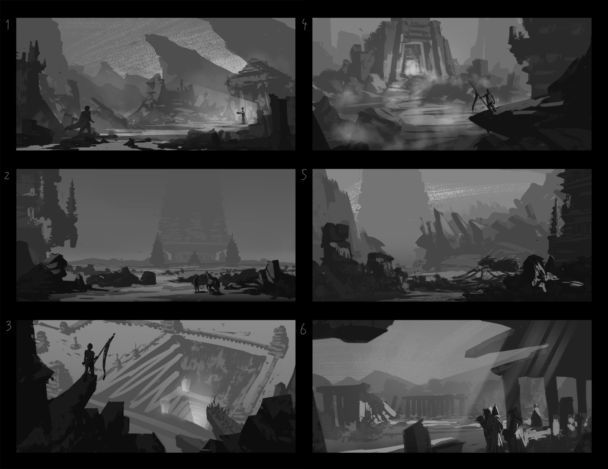
great work guys, i really like seeing your progress, and seeing how you are passionate about this. Anyway, I'm still working on the illustration, but in the meantime i was doing some more grayscale thumbnails for a new piece, since I like to take a brake from rendering.
I tried for a calm, peacefull athmosphere, which depicts daily life of peasants living in a heavily wooded area. All in all, while i loooove the brush i used for its traditional look, next time i am going to try to use hard edged brush, so that it will be easier to transfer to a more finished stage, plus i would like to experiment with a different, more sharp look. my favourites are number 1 and 4, and while like 2 and 6, i feel they lack something. in 6 i struggeled loads with trees in foreground, and while i prefer them so that it feels more like heavily wooded area, they separate the piece into 3 smaller rectangles 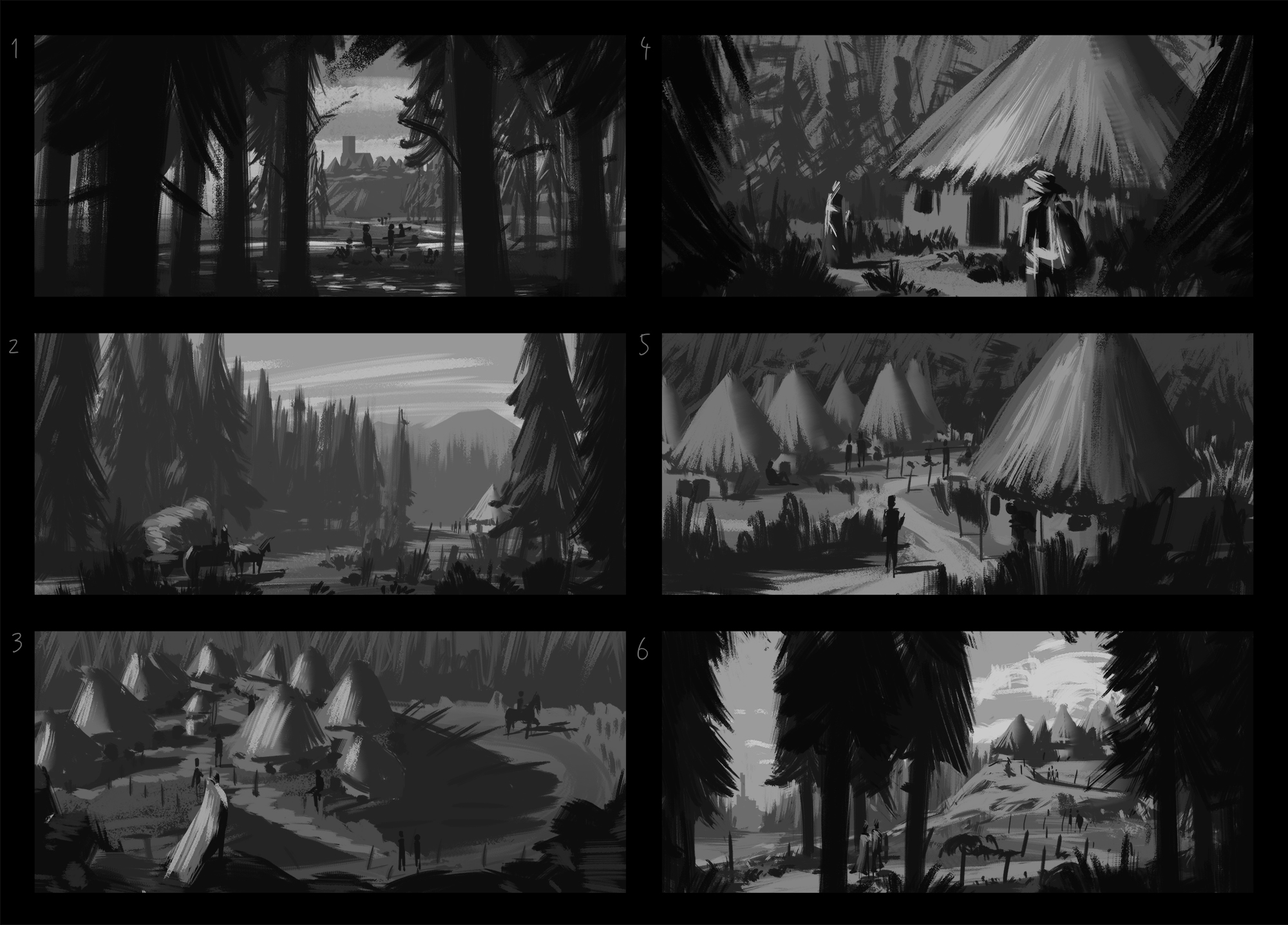
04-27-2017, 03:41 AM
Hello, here are the assignments for week 4.
@amit Thank you for the feedback~ ... I just realized how desaturated and dead the picture is when transfered over to my pc from mac. (will re-edit it soon). The direct lighting was probably too close to white and seem to get lost near the archs. I also run into a problem of using fog to push objects back but it muds the color behind it. The examples shape hinting effect is confusing me too. >_> i need moar life studies. :< @zdele :o Beautiful comps |
|
« Next Oldest | Next Newest »
|