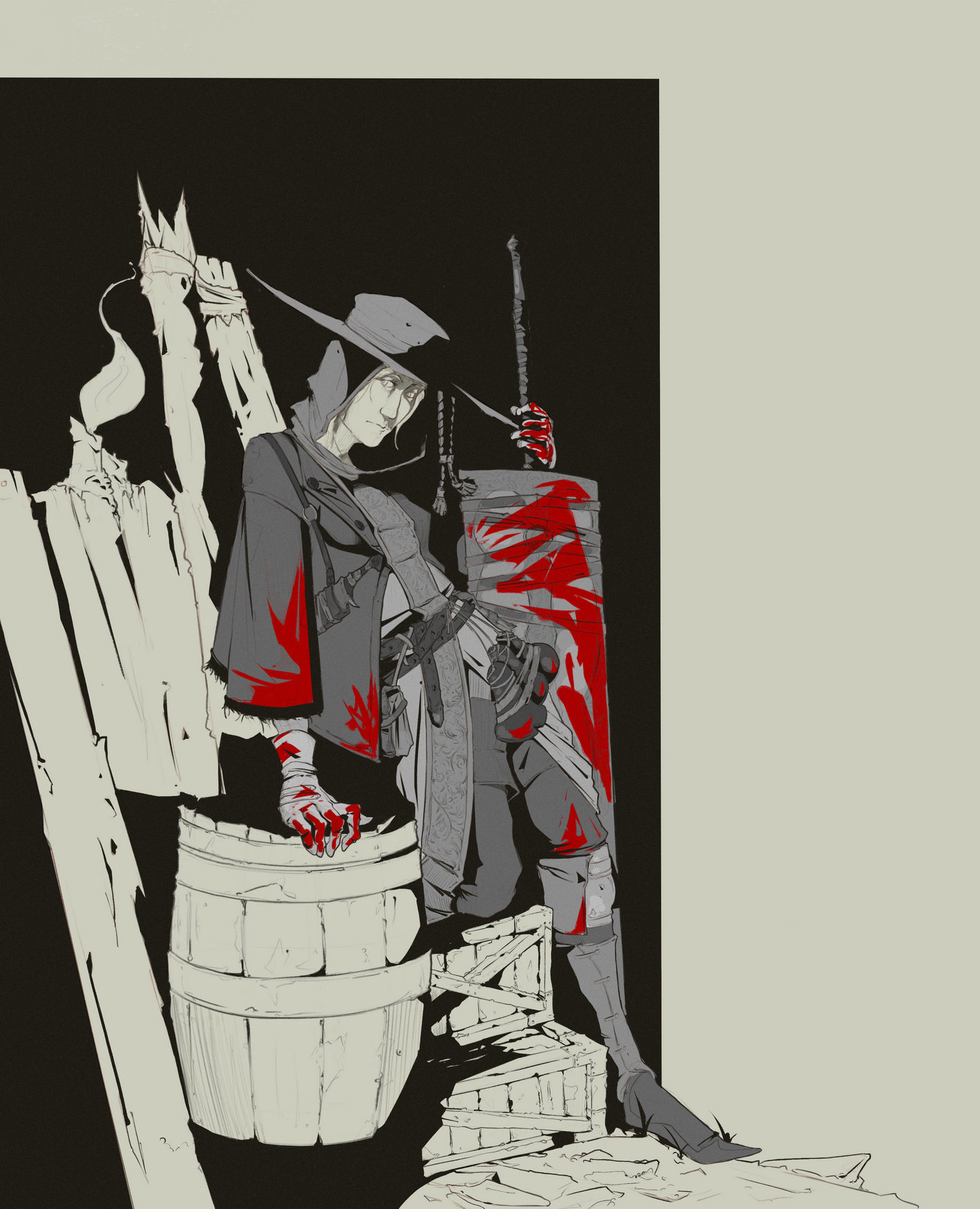
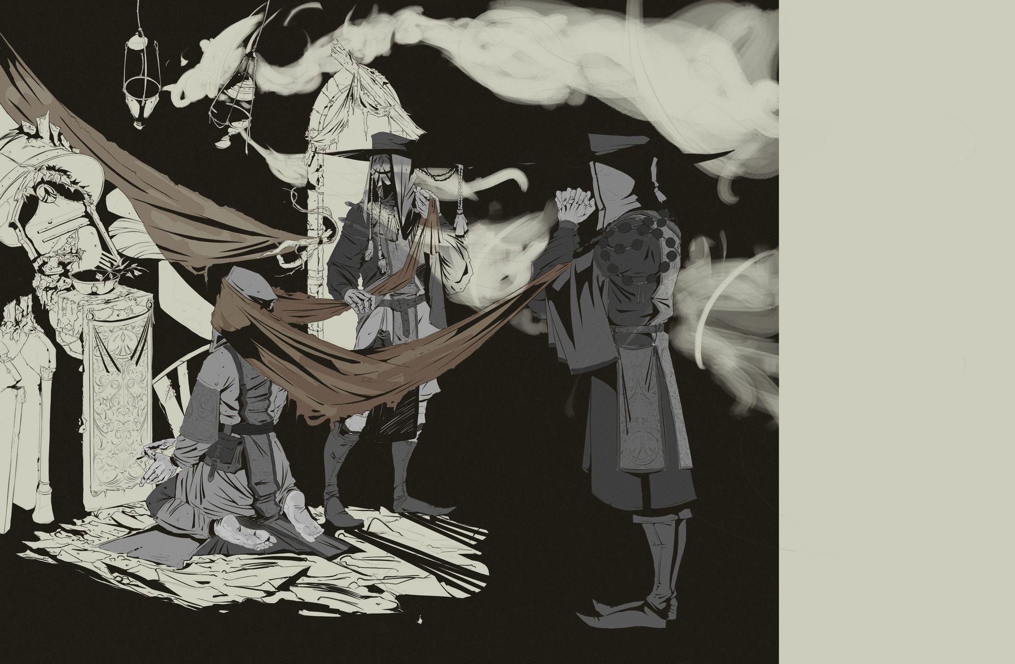
Posts: 19
Threads: 1
Joined: Jan 2017
Reputation:
0
Hey. My name is Daniel. I started drawing since may 2016.
Here's my random artwork. Well, i guess this is not a good art as in other sketchbook but... I ty to be better.
In my studying i try to lear every art aspect and i'd like to hear some critique and advice from you :)
(And i also apologize for my eanglish :D)
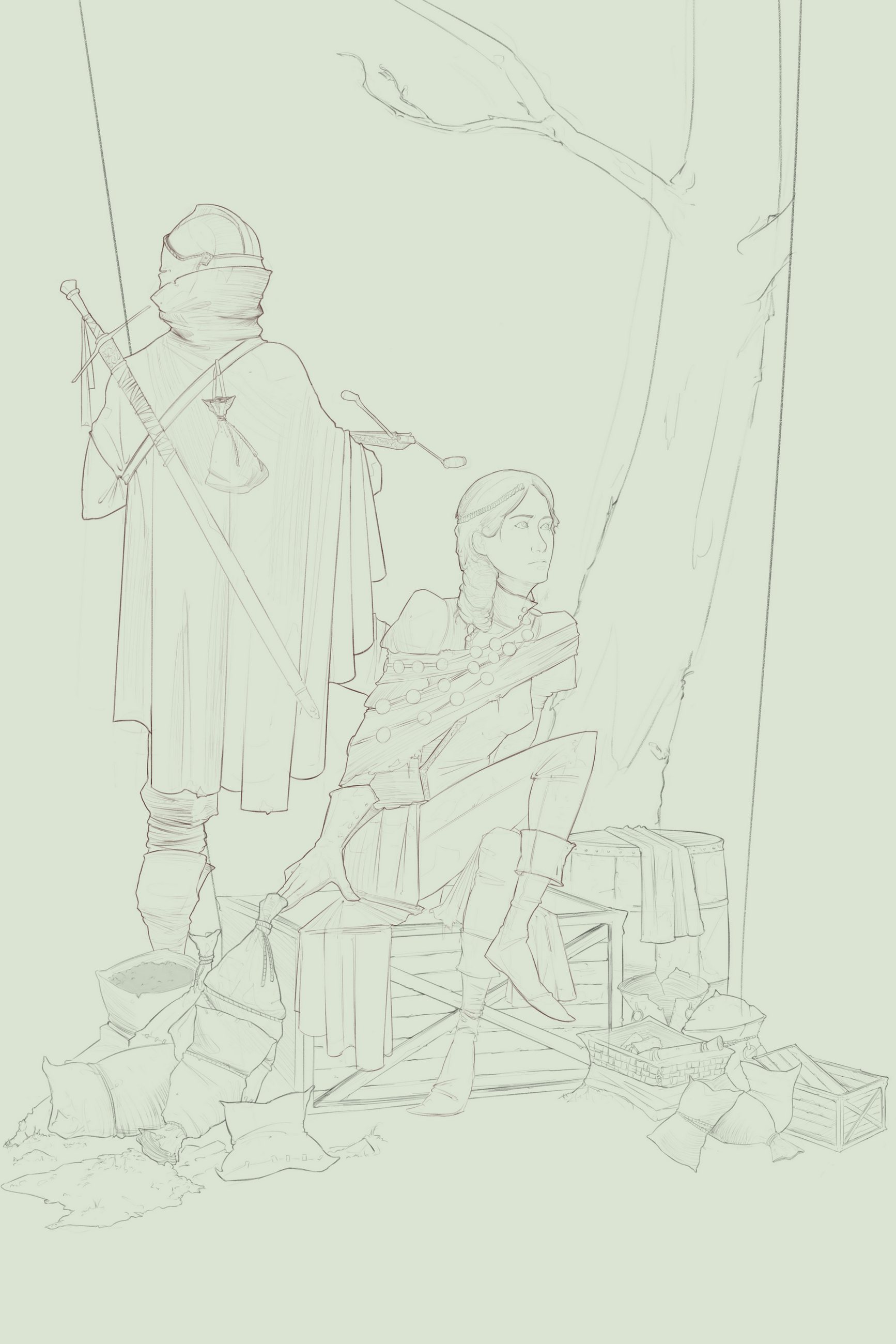
1. My first artwork for this site which called "Witches of the Wood".


Posts: 35
Threads: 0
Joined: Feb 2016
Reputation:
17
Hey, Daniel. Welcome to CD :D
Nice sketchbook you have so far, especially for someone who hasn't been drawing seriously for very long.
Since you asked for some crit, I thought I'd briefly pop by and touch on some anatomy issues in your first image. The main issues are with her legs, their angles and how they connect to the pelvis. Her left leg (the one going under the other) doesn't line up with her hip and makes her look a bit broken. Try the pose yourself and you'll also feel how awkward it is to hold.
A nitpicky thing, but be careful with how small you make her ankles too.. they are very tiny, especially in relation to her wrists.
I hope that was somewhat helpful to you.
Keep up the good work.. I can't wait to see more! :)
Posts: 19
Threads: 1
Joined: Jan 2017
Reputation:
0
(05-29-2017, 09:05 PM)chubbycat Wrote: Hey, Daniel. Welcome to CD :D
Nice sketchbook you have so far, especially for someone who hasn't been drawing seriously for very long.
Since you asked for some crit, I thought I'd briefly pop by and touch on some anatomy issues in your first image. The main issues are with her legs, their angles and how they connect to the pelvis. Her left leg (the one going under the other) doesn't line up with her hip and makes her look a bit broken. Try the pose yourself and you'll also feel how awkward it is to hold.
A nitpicky thing, but be careful with how small you make her ankles too.. they are very tiny, especially in relation to her wrists.
I hope that was somewhat helpful to you.
Keep up the good work.. I can't wait to see more! :)
Aw, really! Thanks for critique! I'll try to work with leg in this artwork (If i will render/coloring it).
Well, i always making anatomy sketch before designing and clear line. And on anatomy sketch leg was not bad as in final line. But now i see this mistakes. Thanks again :).
Posts: 1,424
Threads: 12
Joined: Dec 2015
Reputation:
139
Welcome to the hallowed halls of The Crimson Daggers Daniel!
This is a good place to improve your art skills.
Your Witches Of The Wood piece is looking good, you already have some great critique from ChubbyCat!
I like how you have drawn the cloak - that is looking good, however be careful with the lady's front knee, if you're going for realism then the knee should not be so pointed.
Also it might help if you gave us more background to this illustration - what is the story you are trying to tell here?
Keep it going!
“Today, give a stranger one of your smiles. It might be the only sunshine he sees all day.” -- H. Jackson Brown Jr.
CD Sketchbook
Posts: 19
Threads: 1
Joined: Jan 2017
Reputation:
0
(05-30-2017, 01:09 AM)Artloader Wrote: Welcome to the hallowed halls of The Crimson Daggers Daniel!
This is a good place to improve your art skills.
Your Witches Of The Wood piece is looking good, you already have some great critique from ChubbyCat!
I like how you have drawn the cloak - that is looking good, however be careful with the lady's front knee, if you're going for realism then the knee should not be so pointed.
Also it might help if you gave us more background to this illustration - what is the story you are trying to tell here?
Keep it going!
Thanks!
She's really help me with leg anatomy, cause i really did not know about my problem.
Initially it was a Dark Souls III fanart on Anri and her friend. But after sketch i invented a story about lady which cursed. And one squad of the brave knight swore to protect her from hunters.
Actually this illustration should present her normal guise. May be in the next art about that woman i will show her different look.
Posts: 19
Threads: 1
Joined: Jan 2017
Reputation:
0
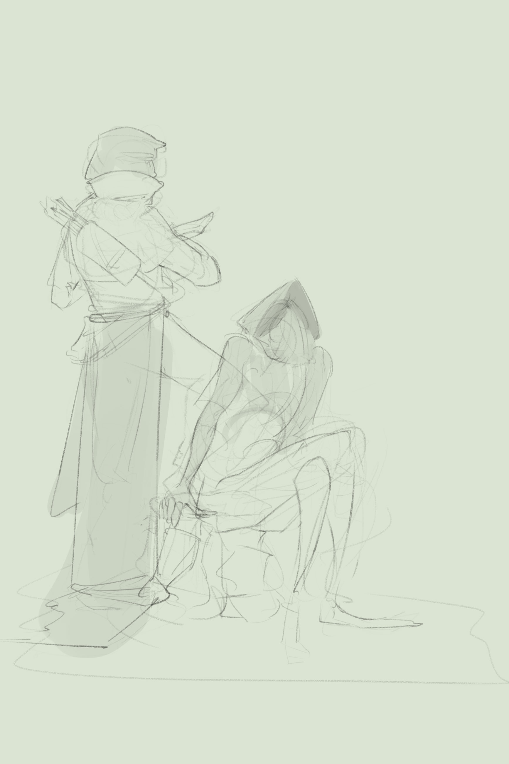
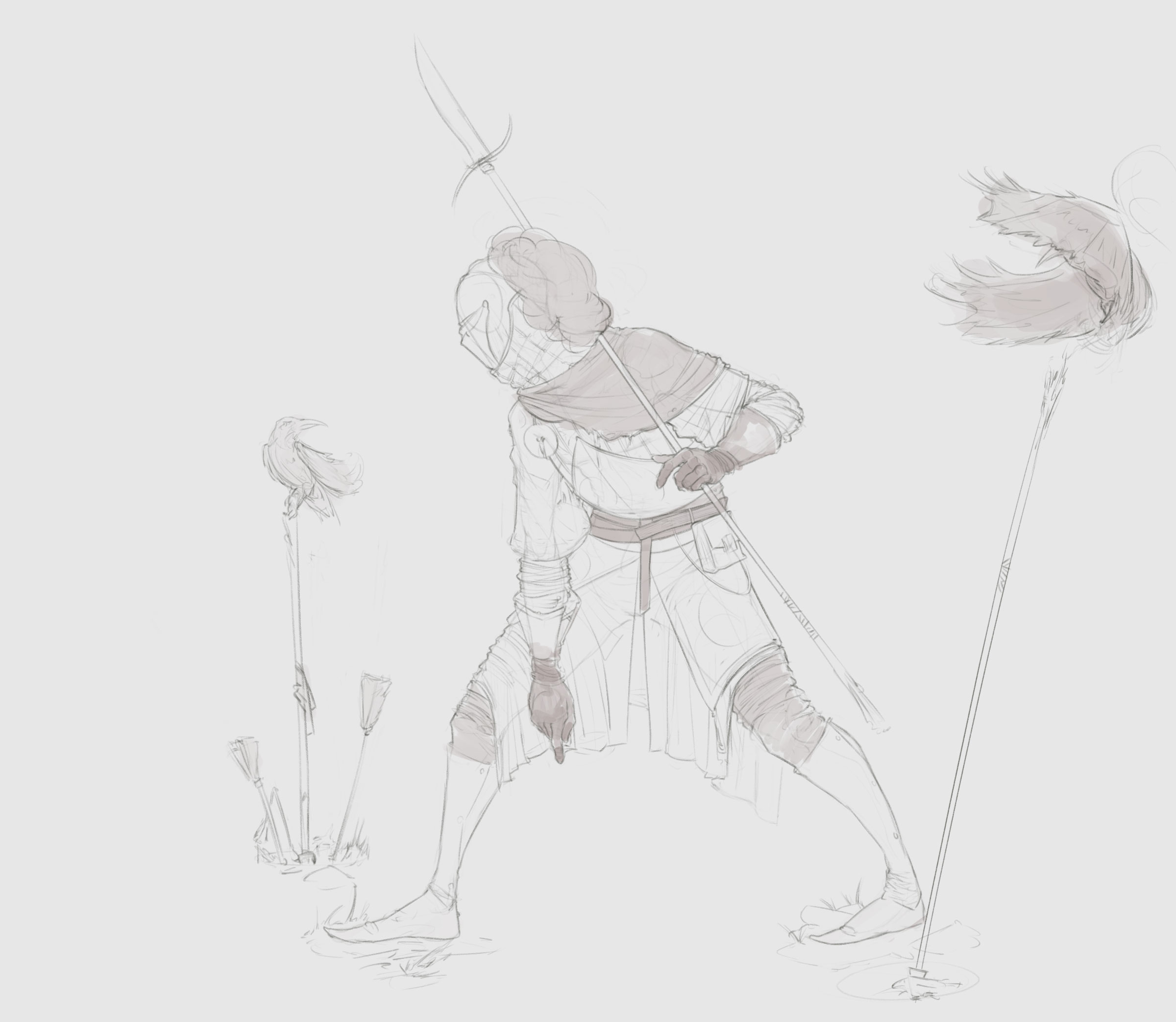
Knight sketch wip

Posts: 19
Threads: 1
Joined: Jan 2017
Reputation:
0
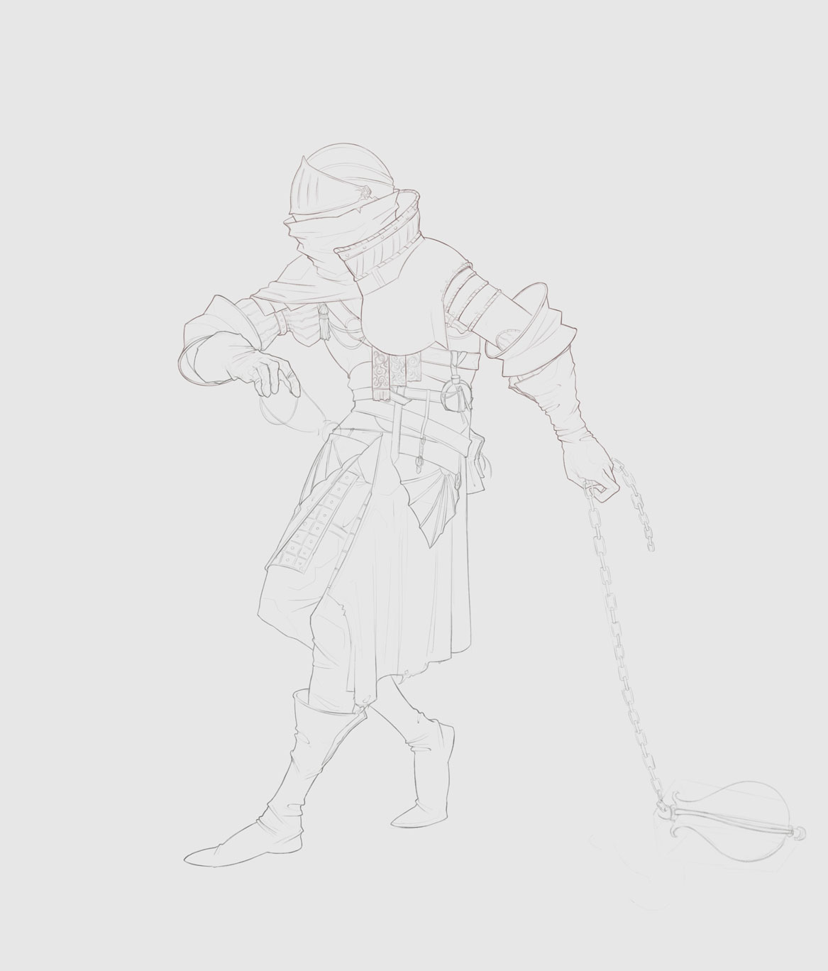
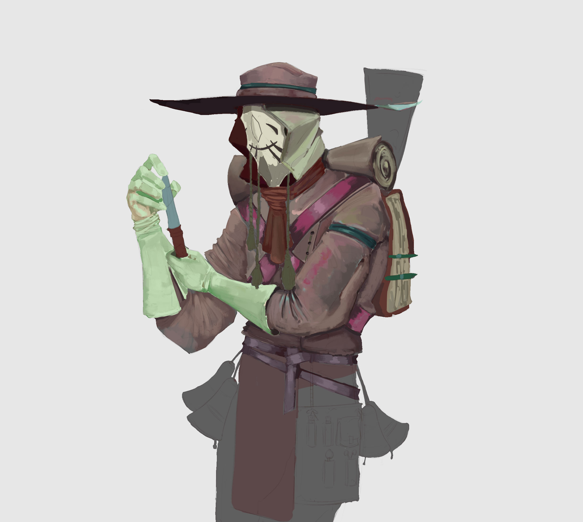
i tried to finished some concept a week ago but i start to make new sketches and forget about it.¯\_(ツ)_/¯

Posts: 19
Threads: 1
Joined: Jan 2017
Reputation:
0
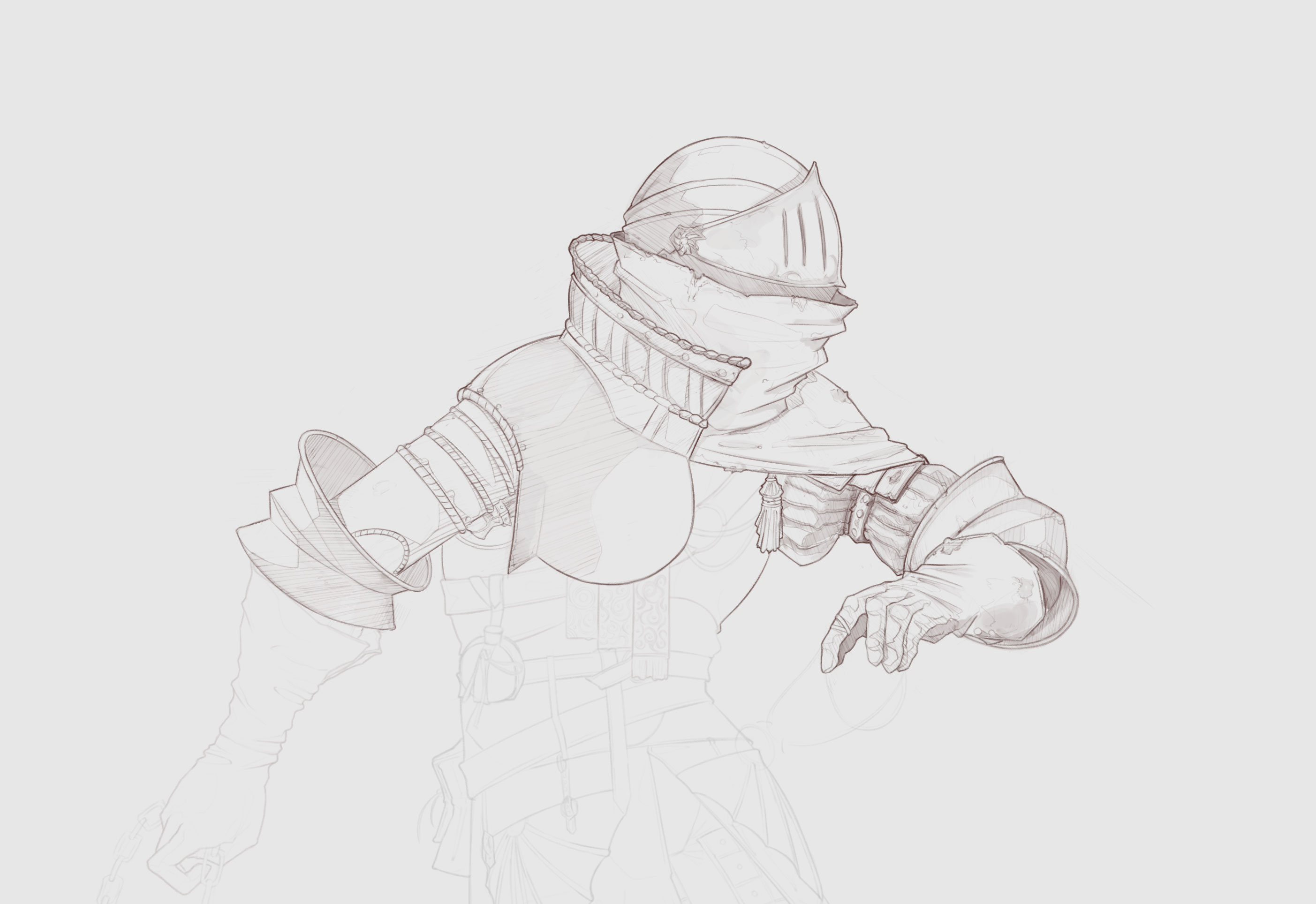
Little knight sketch.

Posts: 19
Threads: 1
Joined: Jan 2017
Reputation:
0
My first sketchy coloring.

Posts: 73
Threads: 2
Joined: Oct 2016
Reputation:
12
You started a year ago and you already whoop my ass at lineart... THERE'S NO HOPE FOR ME.
That being said, I think it'd be helpful to pay extra attention to occlusion shadows (tight cracks where light doesn't easily reach, like between your fingers). It adds another layer of realism.
Rootin for ya.
Posts: 19
Threads: 1
Joined: Jan 2017
Reputation:
0
Lol :D
Oh, i really forgot about ambient occlusion in value training. Thanks!
Posts: 19
Threads: 1
Joined: Jan 2017
Reputation:
0
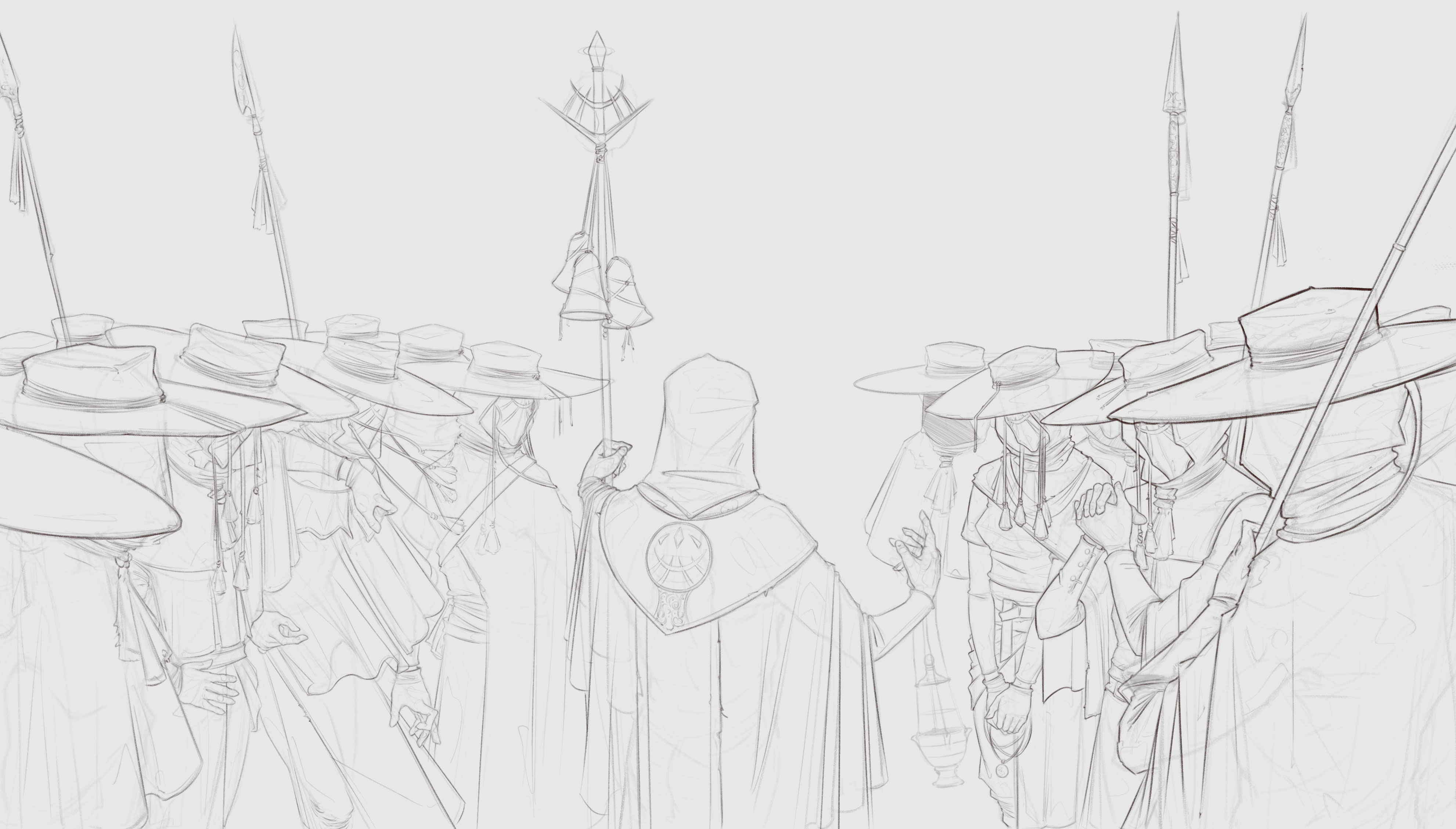
Well. Sketchy lineart for next little illustration. Will try to render it :/

Posts: 19
Threads: 1
Joined: Jan 2017
Reputation:
0
Posts: 19
Threads: 2
Joined: Dec 2016
Reputation:
0
Hey Daniel,
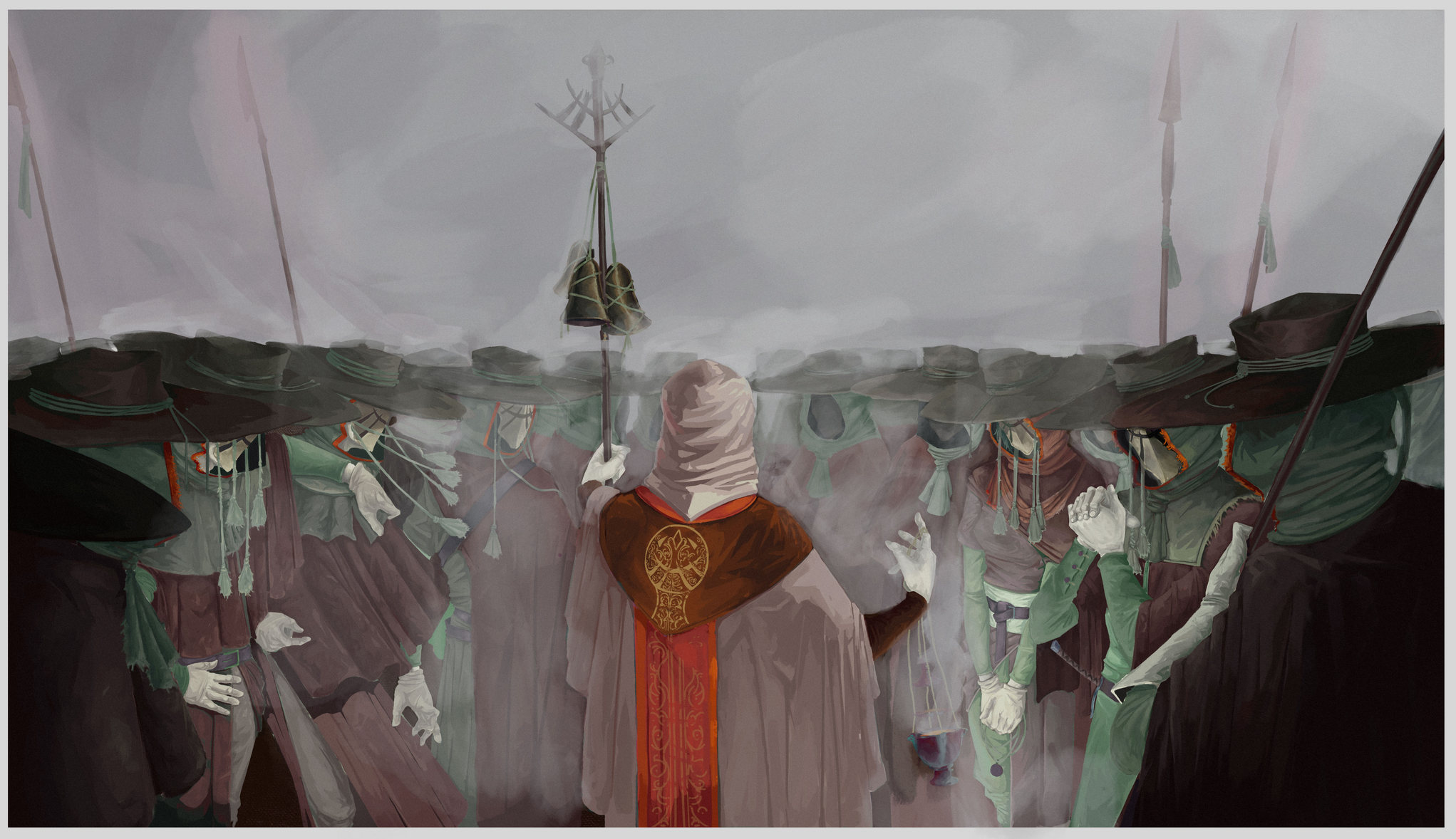
Dude, I love your characters especially in that last illustration. I think that it has a good start, but you could do more to separate that center guy. He has a nice pop of that red color, but value wise I think you could push it further. Your lighting is kinda all over the place. That center guy seems like he could be emitting light, but it's not clear. Something dramatic that would add to this eerie gloomy mysterious vibe. I like how the figures are this faceless wall, and that the hands are all doing something different as well.
Posts: 671
Threads: 8
Joined: Feb 2016
Reputation:
113
Quote:Final illustration. Feels bad
Dunno about you, but I think your works rendered with heavy blacks looks good!
If you are reading this, I most likely just gave you a crappy crit! What I'm basically trying to say is, don't give up!
----
IG: @thatpuddinhead
Posts: 19
Threads: 1
Joined: Jan 2017
Reputation:
0
Posts: 191
Threads: 3
Joined: Feb 2012
Reputation:
8
hey dude, nice sketchbook ! the first illustration of the last update is a bit weird in terms of light, we don't really feel where the light is coming from ! but the other two are really cool !
Posts: 112
Threads: 1
Joined: Aug 2016
Reputation:
6
Are you copying Timofey Stepanov's style? Cuz really it's kinda identical.
Posts: 19
Threads: 1
Joined: Jan 2017
Reputation:
0
(09-13-2017, 06:40 AM)Anton_Fort Wrote: Are you copying Timofey Stepanov's style? Cuz really it's kinda identical.
Well, when i studied lineart i was guided by his few drawing. He is good artist.
But I'm not trying to copy his style, although I admit that the style may looking similar.
Posts: 162
Threads: 6
Joined: Aug 2014
Reputation:
10
Your cloth and armor is very very cool. I like your work a lot, it has a very solid feel to it!
I think your faces are bringing you down, though. Compared to your poses and the realism of your clothing and armor, your faces have a "dull" feeling in addition to being constructionally incorrect. It would be good to sit down and practice drawing several faces; your characters where the faces are covered feel very dynamic, but since faces are such automatic focal points, they really mute the other nice qualities in your drawings.
Keep up the good work!
|
