03-02-2013, 09:27 AM
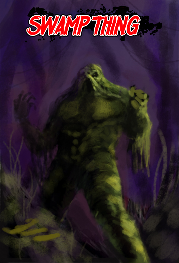
work in progress. all ideas welcome :)
|
would'nt mind a quick crit / suggestion on mood composition.
|
|
03-02-2013, 06:43 PM
Hey I like the comp myself.
The foreground rock looks weird imo, and the cast shadow from the left arm is missing. I'd love to see where you can go with it.
03-03-2013, 05:38 AM
Cheers heavenwill. I've taken you're suggestion on board. I can't believe I missed that left arm shadow. Hehe. Blocked in a few more things now. Might be slightly busy background? Il probably blur most of it out?
03-07-2013, 03:01 AM
 Cool start, did a paint over and vid for you on my live stream. I assumed it was a Swampthing piece and pushed it further to make it a cover, I also explain more in my video, all in all it's a great start, here is the image for you, some anatomy was fixed, some colors added, I added a fake logo, I explain that in the video. http://livestream.com/mciii I say keep it loose and painterly to get you that old school comic cover look.
07-24-2013, 04:41 AM
good suggestions mike thank you. :)
07-24-2013, 02:42 PM
No problem!
Livestream Crits/Paintovers: www.twitch.tv/mike086
Loomis Study videos: http://www.youtube.com/user/mike086 My Facebook page: MCIII |
|
« Next Oldest | Next Newest »
|