04-19-2013, 08:13 PM
Hey guys
Just posting some of my latest finished stuff. I hope you lilke it.
Cheers!
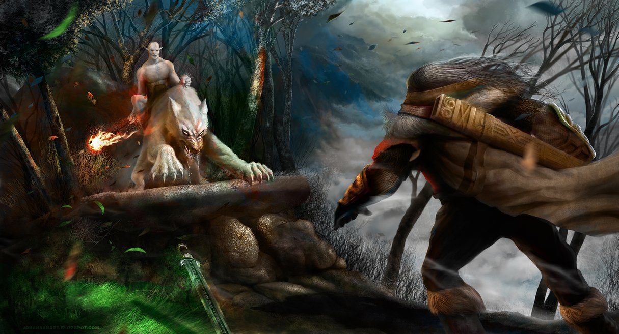
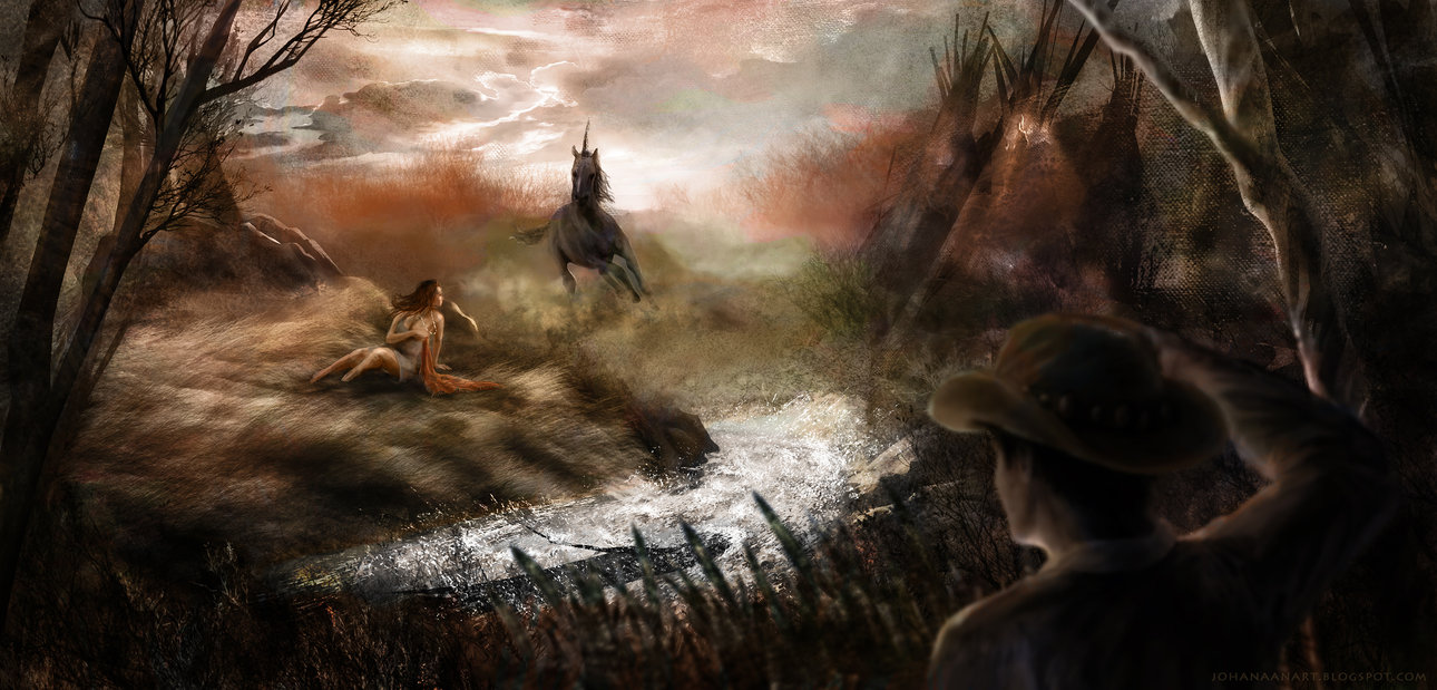
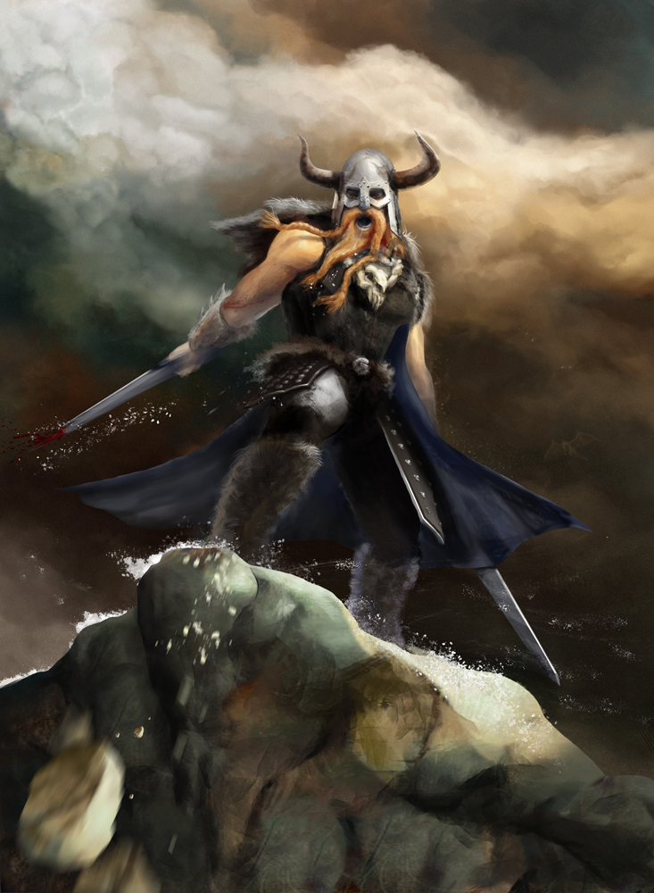
Just posting some of my latest finished stuff. I hope you lilke it.
Cheers!


|
Latest stuff
|
|
04-19-2013, 08:13 PM
Hey guys
Just posting some of my latest finished stuff. I hope you lilke it. Cheers!   
04-19-2013, 08:30 PM
Really cool stuff man.
Keep posting!
04-22-2013, 06:41 PM
(04-19-2013, 08:30 PM)HarbingerofIllRepute Wrote: Really cool stuff man. Thanks dude. I'll keep 'em coming.
05-28-2013, 05:09 PM
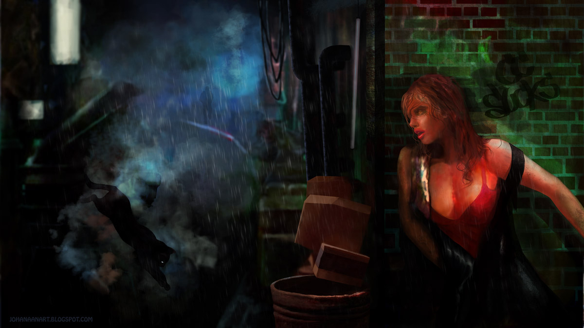
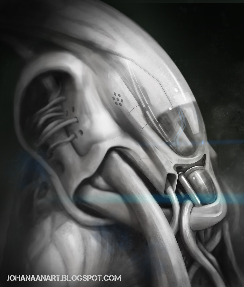
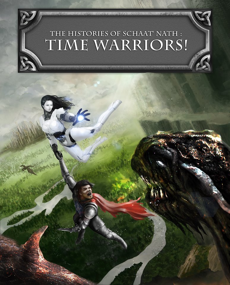
A few more finished pieces I want to share with you.
06-01-2013, 03:32 AM
Love the robot design and the crazy tilted angle on the time warriors.
(05-28-2013, 05:09 PM)Johanaan Wrote: A few more finished pieces I want to share with you.
_________________________________________________________________________
The best time to plant a tree was 20 years ago. The second best time is now. -Chinese proverb Sketchbook
06-05-2013, 03:29 AM
I love that you are telling some story in all your pictures. Mysterious, unexpected they keep in suspense. Good job! they are pretty creative but in my humble opinion you could take better care of perspective because they sometimes looks like cut from different pictures and paste in one.
![[Image: 23tp5vl.png]](http://i44.tinypic.com/23tp5vl.png) Check you pictures in gray scale often, in fact value in much more important than colors. Values makes object readable. What's in front of the picture what's in background depends on value and contrast. For example the river and forest below characters have really strong value contrast but robot girl is really bright. It should be inverted because object closer to viewer are more contrast than farther one. Also I think Your pictures suffer from emptiness. The important objects in scene would benefit if they where bigger, taking more space of the picture. Otherwise you end with a lot empty spots with not interesting grass fields etc. Be brave! :) You set your bar high so don't give up :D
07-29-2013, 09:52 PM
(06-01-2013, 03:32 AM)Tygerson Wrote: Love the robot design and the crazy tilted angle on the time warriors. Hey Tygerson thanks I'm glad you like it. (06-05-2013, 03:29 AM)Madzia Wrote: I love that you are telling some story in all your pictures. Mysterious, unexpected they keep in suspense. Good job! they are pretty creative but in my humble opinion you could take better care of perspective because they sometimes looks like cut from different pictures and paste in one. Hey Madzia. Thanks for all the critiques. Yeah I know I had some troubles with this piece. I actually opened a thread about it to get some pointers. If you're interested what others said you can check it out here http://crimsondaggers.com/forum/thread-2910.html Anyways thanks for all the help. Will use all the tips on the next piece I'll make :) And also thanks for the support and kind words it's gonna be a long journey. Here's one of my latest pieces. It was a quick environment piece I did in a few hours. 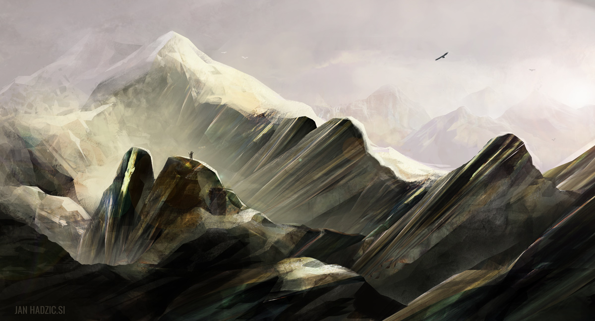
08-30-2013, 05:51 PM
This is another quick enviro. Well actually it's more of a mood piece.
It's called Sabotage 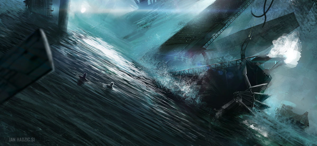
08-31-2013, 10:22 PM
A couple of portraits I did in the last 2 weeks.
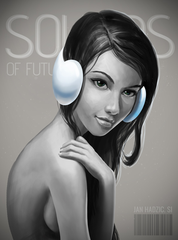 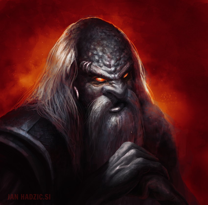 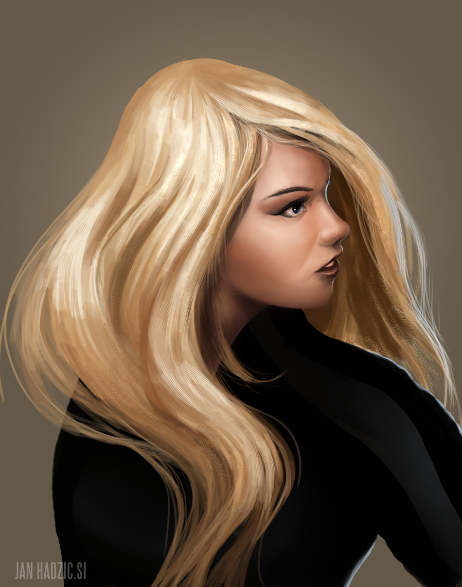
11-20-2013, 12:30 AM
Back again. It's been a while since I posted. Here's one of last paintings I did. Hope you like it ;)

12-04-2013, 08:14 PM
Here's the last piece I finished. Hope you like it :)
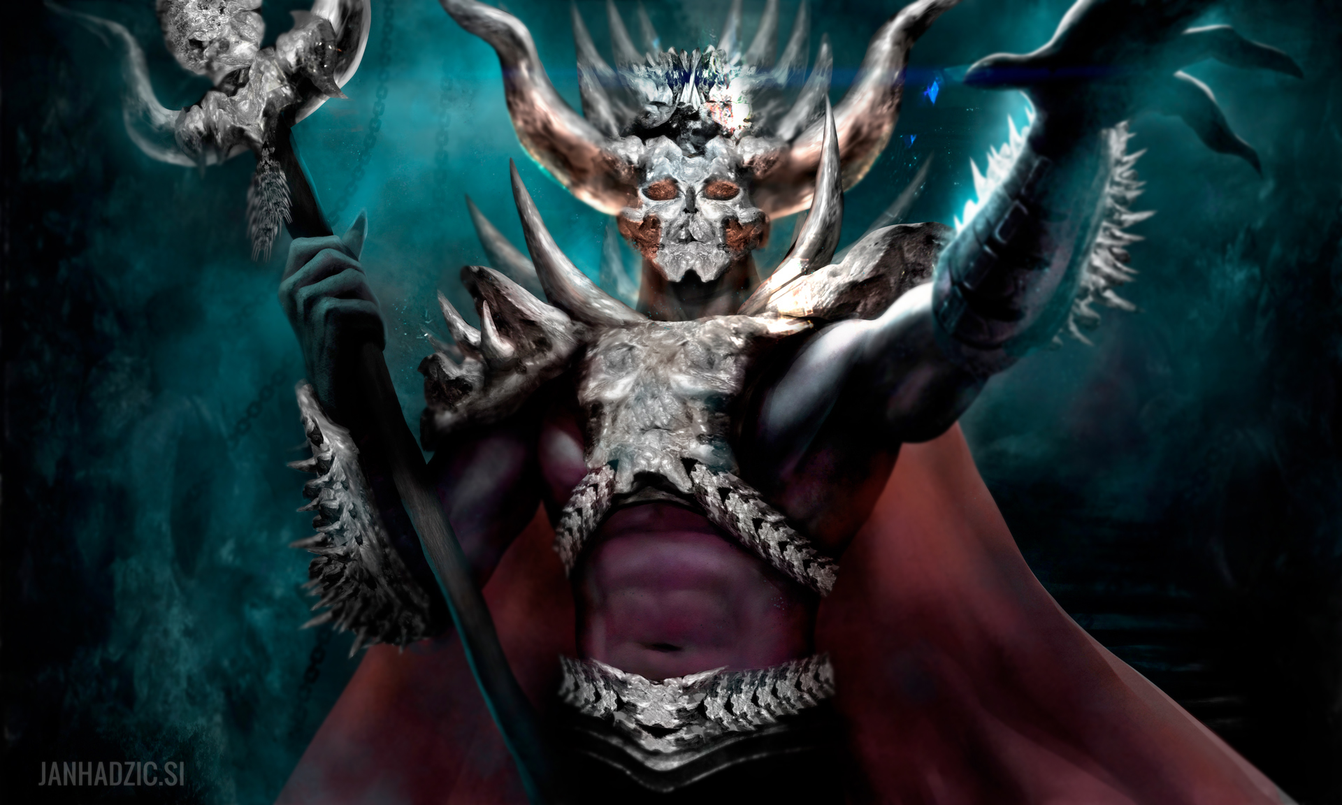
12-04-2013, 09:14 PM
Dem edges on dat last piece ~
But yeah seriously, digging this last one for sure - well done, keep 'em coming!
sketchbook | pg 52
"Not a single thing in this world isn't in the process of becoming something else." I'll be back - it's an odyssey, after all
12-04-2013, 11:49 PM
(12-04-2013, 08:14 PM)Johanaan Wrote: Here's the last piece I finished. Hope you like it :)
12-05-2013, 12:54 AM
there are some interesting things going on with textures
12-06-2013, 04:57 AM
(12-04-2013, 09:14 PM)smrrfette Wrote: Dem edges on dat last piece ~ Hey smrrfette tnx for the comment, glad you like it. At least one of my pieces is good ;) Will keep em coming, so come again in a while to check it out ;) What do you mean by "dem" edges - like in a good way or like a critic? can't be sure from just reading. Anyways a critic is always welcome. @meat tnx mate. I appreciate the crit. you gotta point there :) @califfguzman thank you. I hope you like it :)
12-11-2013, 05:51 PM
Hey Daggers
The year is coming to an end and I just wanted to share some progress of my work and personal experience. I used to spent hours on internet just watching other peoples great stuff posting on deviantart, cgsociety, cghub... But last year I got feed up with it and I decided I wanted to paint too so I bought myself my first wacom tablet cuz using mouse was too awkward and frustrating. I spent some free time sitting at my computer and playing around with photoshop and in a year I progressed immensly. So I'm real tired of people talking to them selves that they are not good enough like I used to. Bruce Lee once said "Never think of the outcome." Well I'm ading a little something too. If you say to yourself you're not good enough you're probably right... but there's a surprise for you: If you say to yourself I AM GOOD ENOUGH you are right just the same. So the outcome will be just whatever you make of it. So the only thing you really need to do is to be honest with yourself and ask yourself one question: Do I want to paint? If the answer is yes go and pick up that wacom brush and start painting RIGHT NOW! 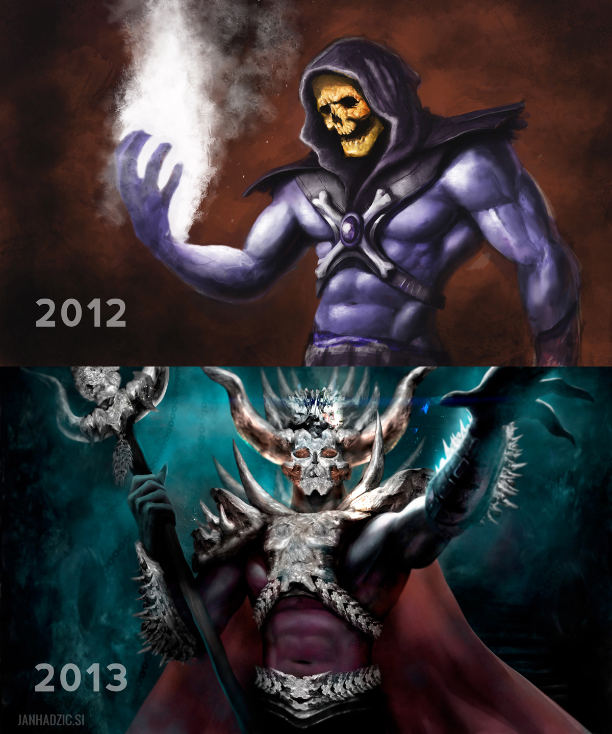
12-17-2013, 05:50 AM
Wow, your color and lighting has seriously improved!
_________________________________________________________________________
The best time to plant a tree was 20 years ago. The second best time is now. -Chinese proverb Sketchbook
01-02-2014, 08:34 PM
(12-17-2013, 05:50 AM)Tygerson Wrote: Wow, your color and lighting has seriously improved! Hey Tygerson. Thank you very much :)
01-07-2014, 10:07 PM
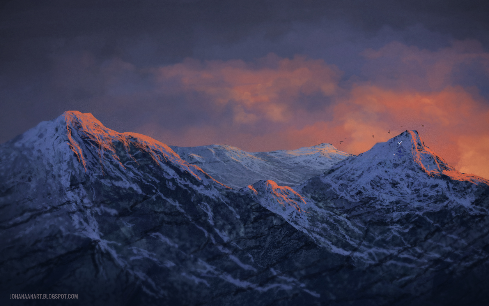
A quick painting I did yesterday. It was just a brush practice.
01-29-2014, 12:40 AM
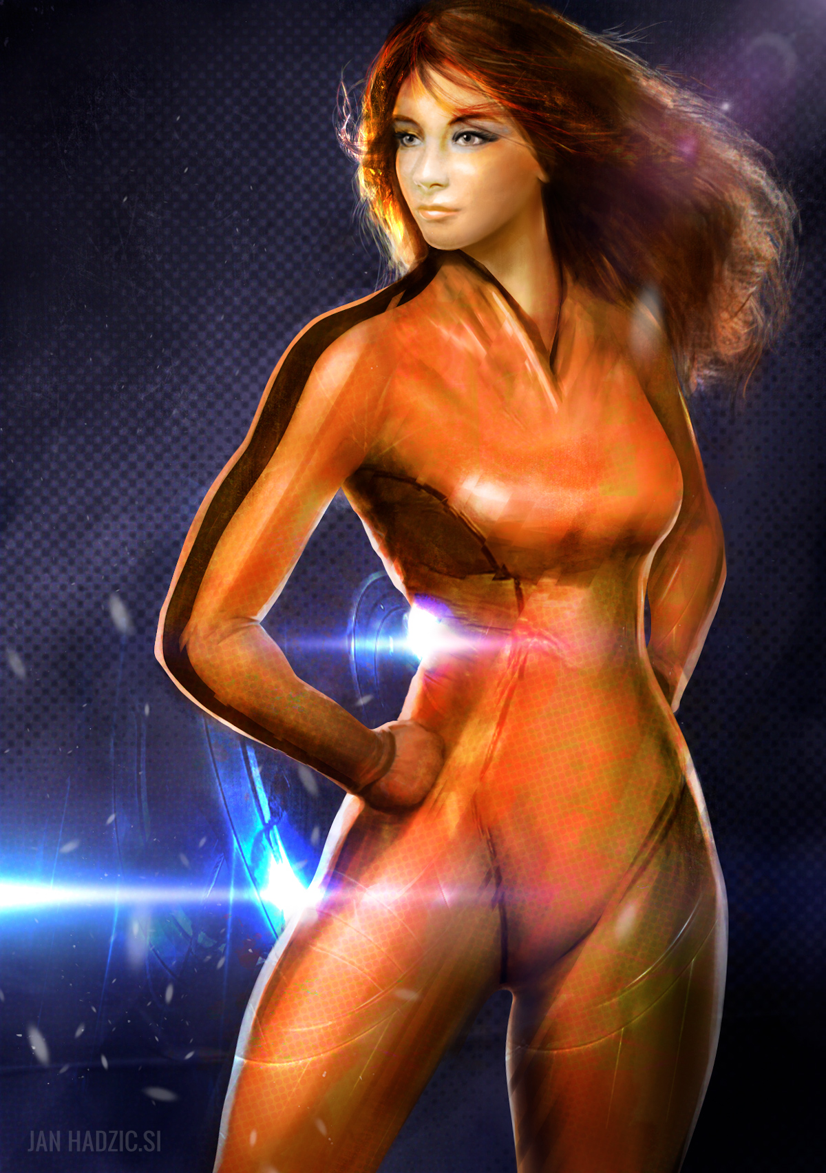
inspired by promotional posters for internet service that hang around our city
 |
|
« Next Oldest | Next Newest »
|