Fantasy Illustration portfolio
#1
Hey Everybody,

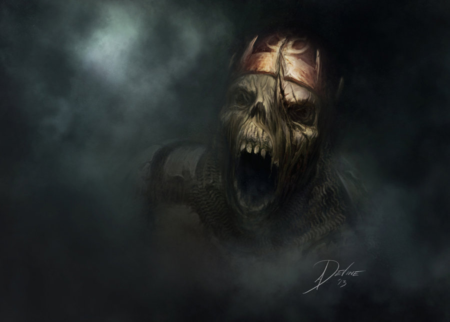
I've been working hard on building myself an Illustration portfolio aimed at Trading Card Art in my spare time since the start of this year, 2013. It's small, but growing.

I've been using Jon Schindehette portfolio building class over on The ArtOrder. If you dont know about it, check it out! It's a must!

Hope you enjoy. Feedback always welcome.

Tony


[attachment=24915]


Reply
#2
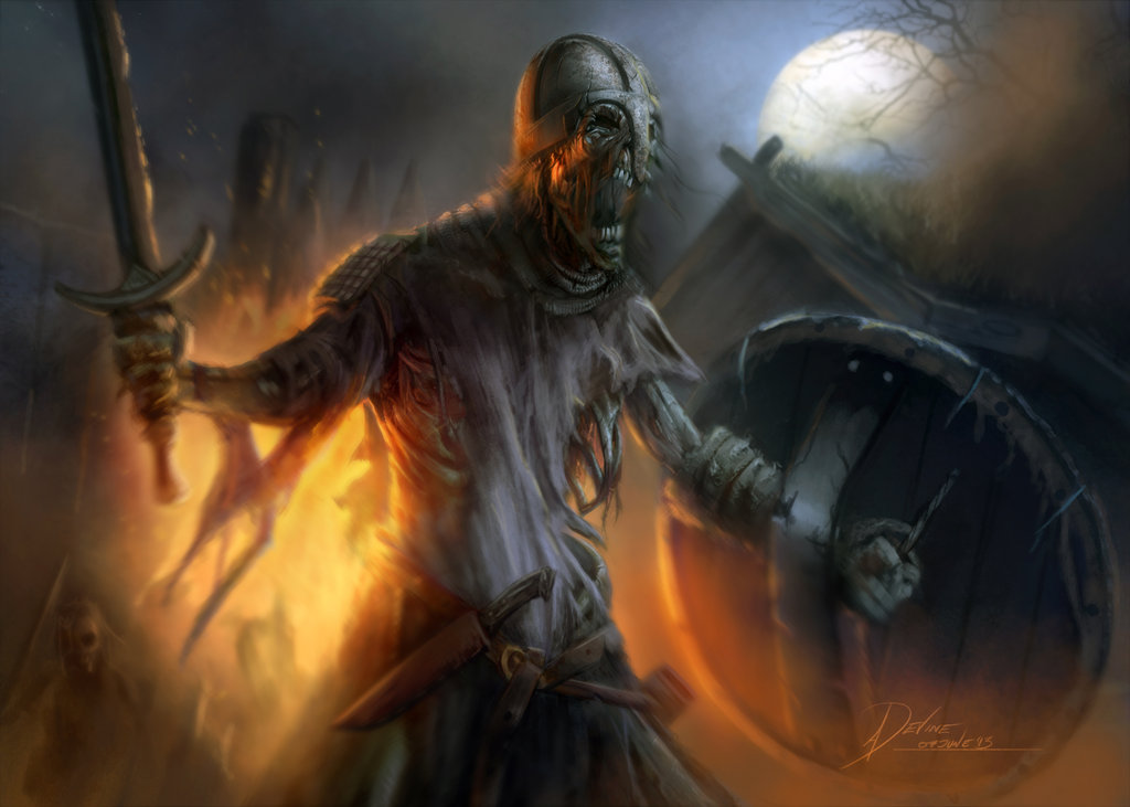
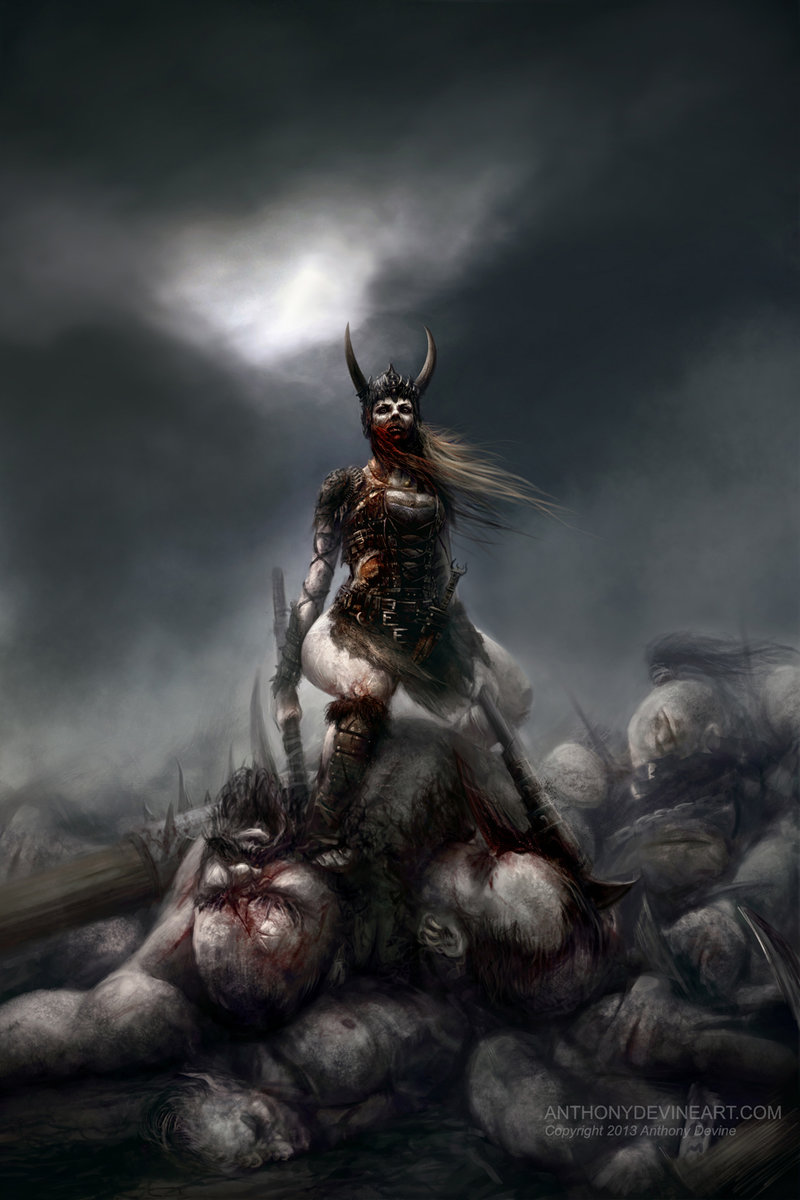
Great expressions, and I'm really loving the lighting in that last one with the zombie warrior. The fire really glows.

_________________________________________________________________________
The best time to plant a tree was 20 years ago.  The second best time is now.  
-Chinese proverb

Sketchbook

Reply
#3
Some new shenanigans!


Reply
#4
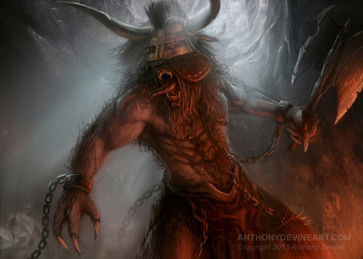
You've definitely got some good stuff going, there's just a couple of things that I can see. One, why is everyone screaming? I'd like to see some different expressions. Two, it looks like you're using soft edge/hard edge contrast to draw the eye to different places on the canvas, and while that's a great technique, maybe ease up on it just a little. I'm seeing a bunch of places (especially in the zombie on fire piece) where areas that ought to be sharper are totally fuzzy. A good rule of thumb is to draw attention not just to the heads, but also to the hands, since those show just as much emotion and feeling as the face does.

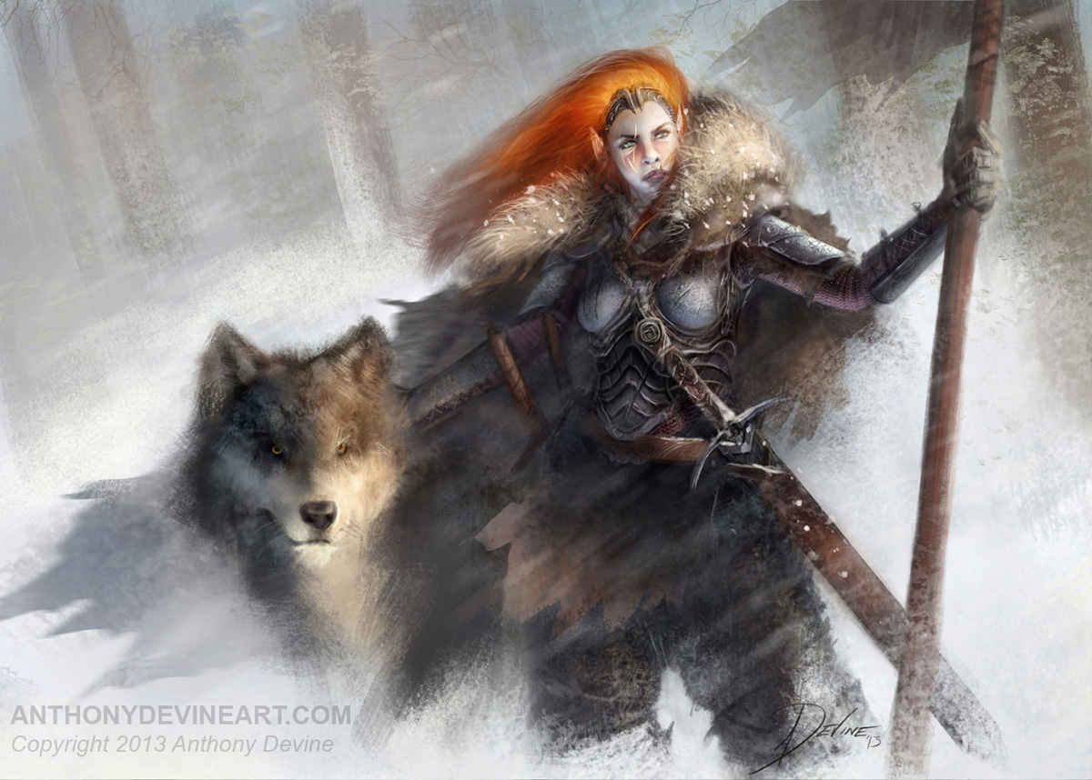
really dig the last piece, your lighting and color is pretty dead on throughout the whole piece.

Reply
#5
(09-21-2013, 09:13 AM)nickzornart Wrote: You've definitely got some good stuff going, there's just a couple of things that I can see. One, why is everyone screaming? I'd like to see some different expressions. Two, it looks like you're using soft edge/hard edge contrast to draw the eye to different places on the canvas, and while that's a great technique, maybe ease up on it just a little. I'm seeing a bunch of places (especially in the zombie on fire piece) where areas that ought to be sharper are totally fuzzy. A good rule of thumb is to draw attention not just to the heads, but also to the hands, since those show just as much emotion and feeling as the face does.

really dig the last piece, your lighting and color is pretty dead on throughout the whole piece.

Hey Nick,

cheers for the feedback. Basically, I moved over from matte painting to illustration 9 months ago. It's largely a targeted portfolio aimed at "creatures" for my Magic the Gathering submission in trading card art.

Another artist gave me some similar advice to your own over on LinkedIn about the need for trying different expressions, so I painted the last piece to try & break that mould & now trying out new stuff which I'll have up soon. I'll work on my soft/hard edge technique too.

Cheers for taking the time to comment. I really appreciate it!

Reply
#6
Hey Daggers, Its been sometime since I've posted anything, so gonna do a little art dump all the oner ;)

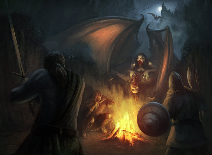
Blood and Moon


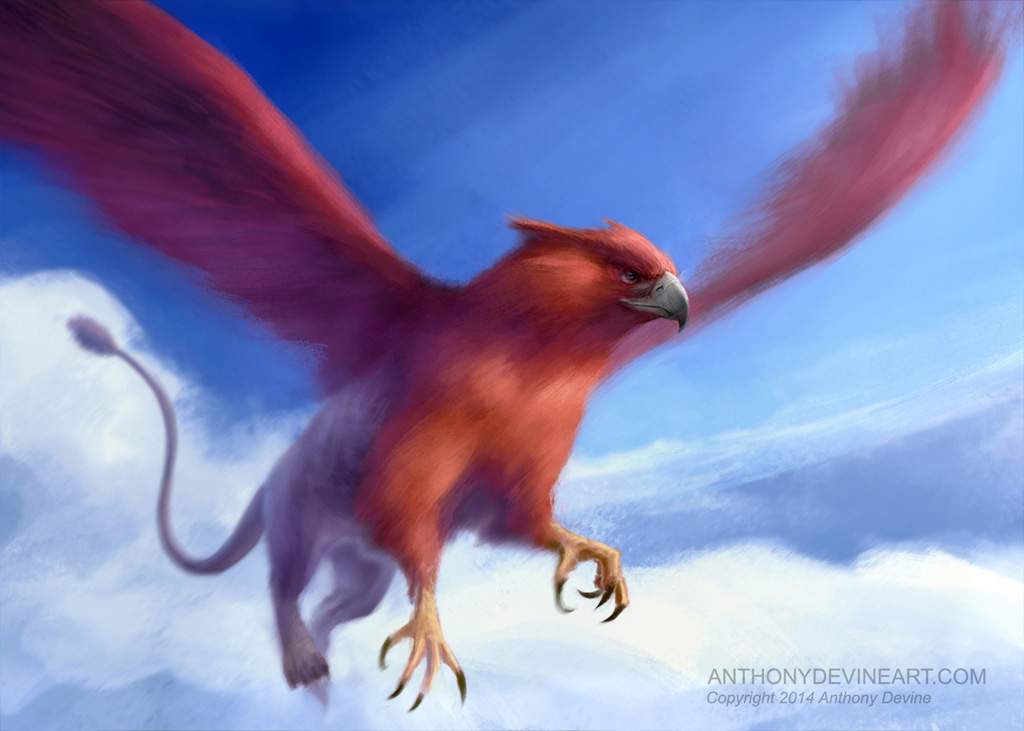
Red Griffin


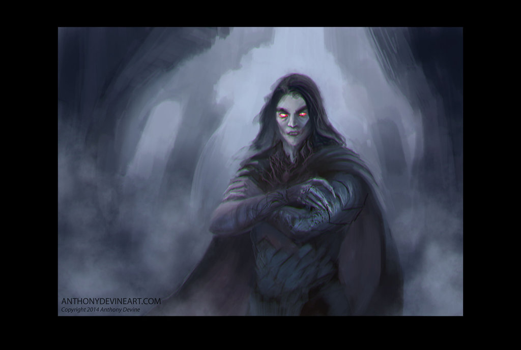
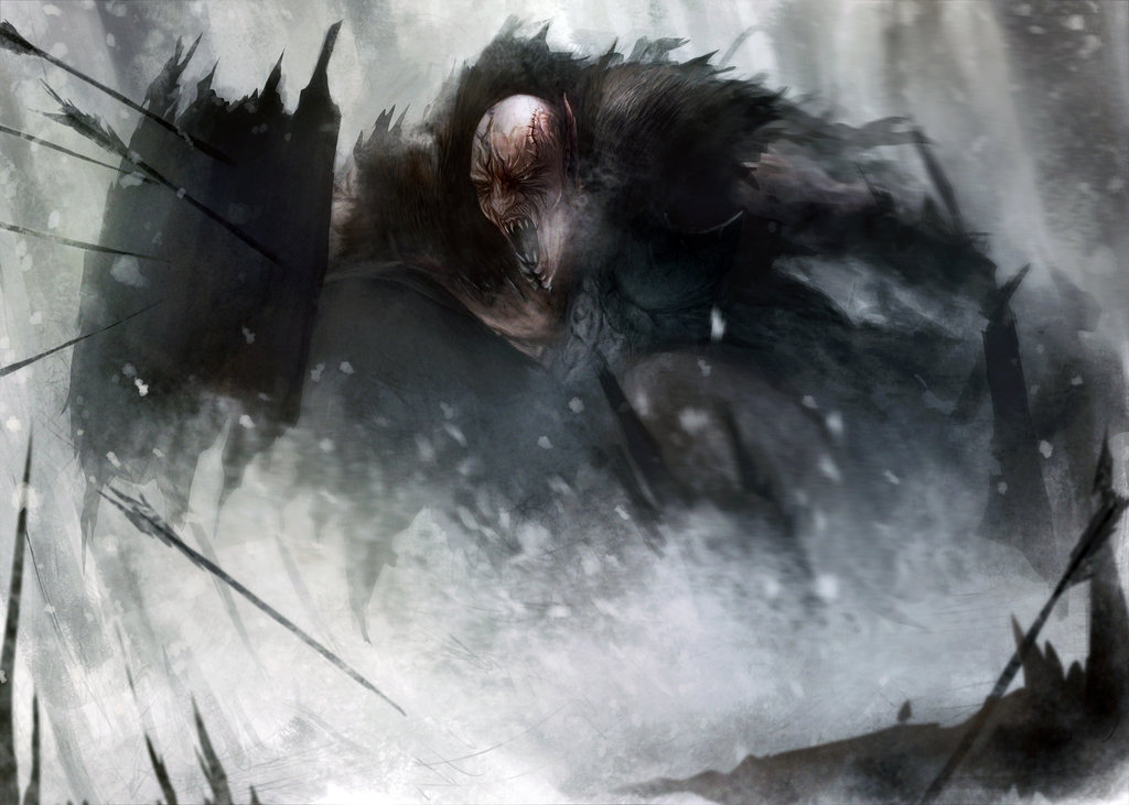
Vampire Sketch


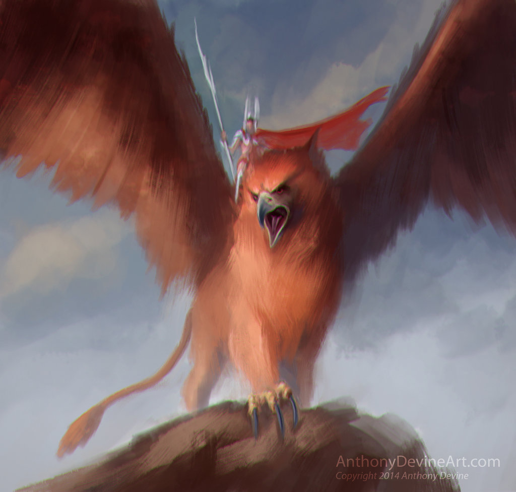
Great Griffin Sketch


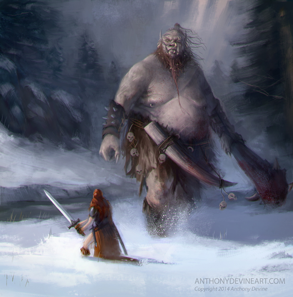
Giant


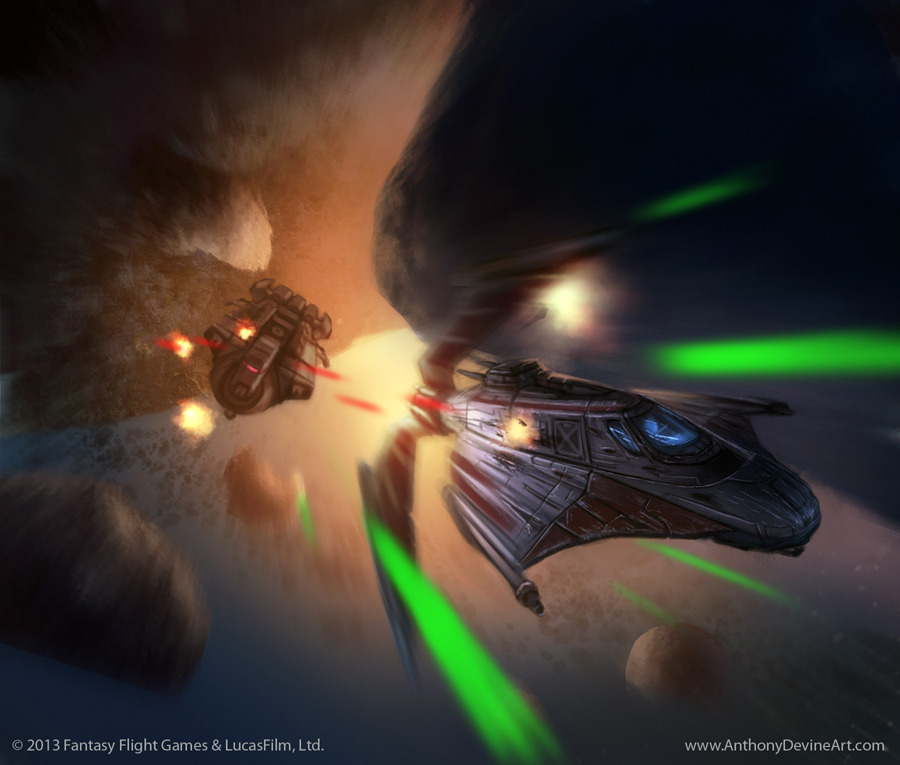
Some work I've done for Fantasy Flight Games that I can finally show...hopefully will be able to show more soonish :)

Forward Reconnaissance


Outmaneuver


Cheers,

Tony

Reply
#7
Nice works, love the giant piece!

weapons and other props > http://crimsondaggers.com/forum/thread-2683.html

For hi-res (original) images of these designs, please got to nenadgojkovic.deviantart.com
Available for freelance work, contact me via [email protected]
Reply
#8
Your last two pieces are pretty decent; just keep pushing the rendering/edges and anatomy and you'll be doing fine!

70+Page Koala Sketchbook: http://crimsondaggers.com/forum/thread-3465.html SB

Paintover thread, submit for crits! http://crimsondaggers.com/forum/thread-7879.html
[color=rgba(255, 255, 255, 0.882)]e owl sat on an oak. The more he saw, the less he spoke.[/color]
Reply


Forum Jump:


Users browsing this thread: 15 Guest(s)