Seeking critique on portrait
#1
Hi, i try to portrait a mentor and fatherly friend as a wizard that he always played at RPGs.
Critiques wanted. It is kind of a heart wish for me to make this a good portrait.
I post the picture and the used reference here.

[Image: dieter_by_wolkenfels-d6u8fv1.jpg]

Reply
#2


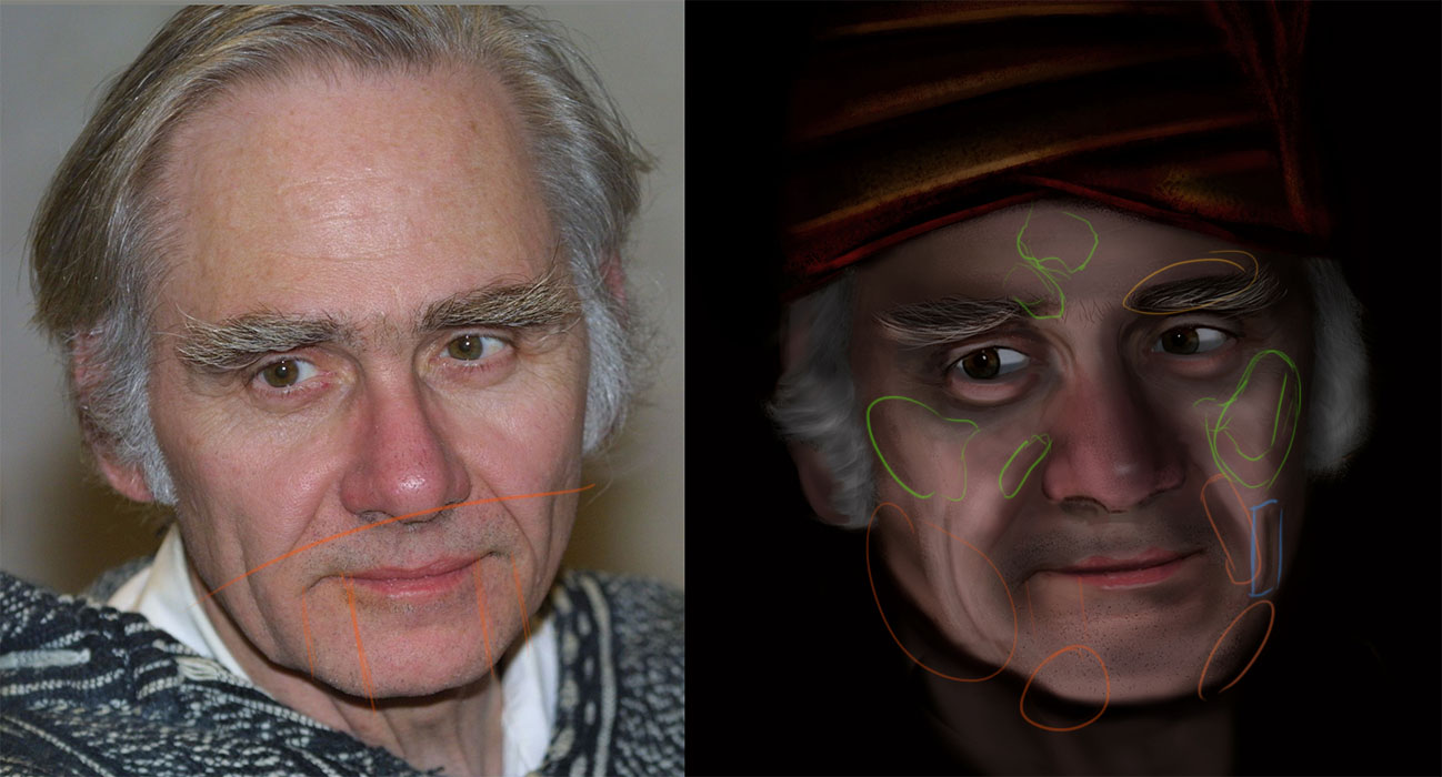
Orange
I feel these selected areas need some readjustments on the form. Make the chin and jaw a bit slimmer, especially his chin. The crease on his left cheek looks unnatural, it needs to curve more to the side and not just slope to one side and then drops straight down. Look at how his cheek muscle stretch and forms those lines.

Blue
Too dark. Soften that part and thin that shadow more.


Green

These areas need to look more fuller. Puff those parts up. The need muscle.
Some areas just has that subtle detail, so try not to make it look he's flexing his face.

Yellow
Needs more detail to cover that dark, blocky patch.
Reply
#3
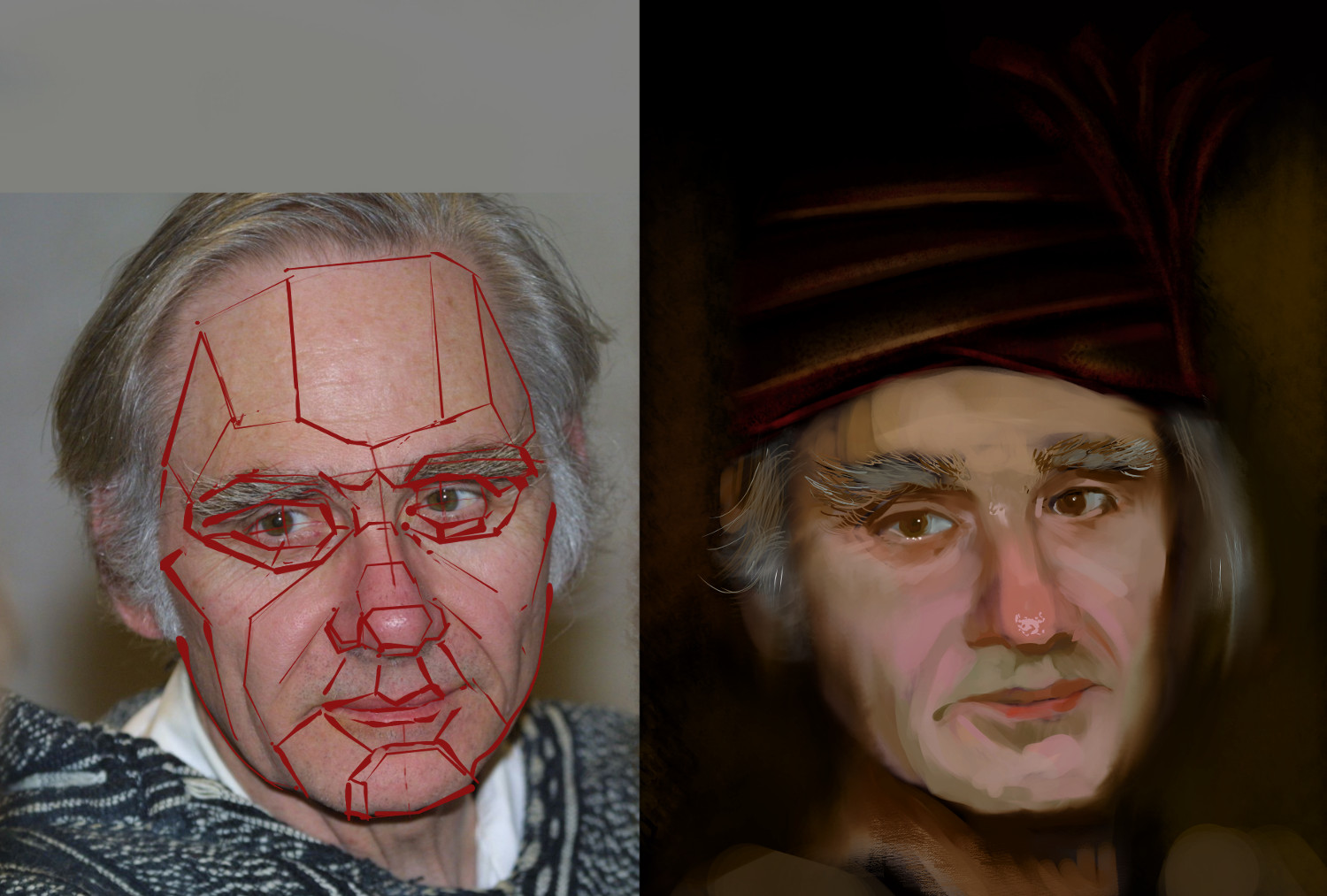
Hey man, I think you should first plot out and think about the simple shapes, planes of the face first. You seem to be using a soft brush mostly for the rendering and you are not really defining the forms of the face. Try not to get caught up in the details but think about the overall structure of the features. Perhaps do a quick line drawing of the basic planes and then use a hard edged brush to define them. Then you can tweak them to start modeling the features to be more accurate. The next thing would be to think about lost and found edges...take a look at the image and get a feel for which of the main landmarks you want to accentuate the hard edges in order to draw focus and define form. Similarly, lose/smudge/blur edges where surfaces turn away to get some depth going.

I followed this approach for my paintover. Not a great likeness but I think the structure is a decent base to build on and keep refining. Your image is also getting a bit muddy in colour so really push the usual ideas of red around the eyes and nose, greens around the jaw etc etc. It's actually in the ref too, but really simplify it down.
In fact I think the trick with portraits in general is in efficient translation and simplification more than the capturing of accurate detail.

Another thing to think about now is your composition. I'm not sure what you have in mind, but definitely the headdress and background should all go towards accentuating the focus on the face. Engineer the folds and the lighting and shadowing to pull the focus down to where you want it to be.

Here's my paintover. I used only a hard edged brush and a smudge tool.  Hope it helps!


 YouTube free learnin! | DeviantArt | Old Folio | Insta
Reply
#4
@Audie thanks man - a lot of very useful hints and tipps - i tried to incorporate as much as i was able to.
@Monkeybread thanks too - i followed your example and made a plane grid - very useful!
thanks both of you for taking the time and even make overpaints.

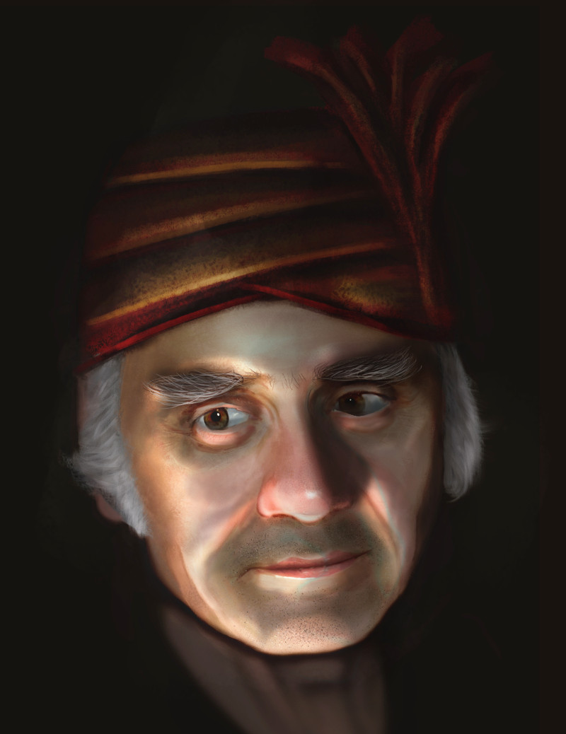
Here is the next version of the picture. I am quite pleased with the likeliness of it and will let it rest for a day or two before i am attacking it again - hopefully seeing even more what you tried to tell me and i am maybe to dumb to realize for now.

Thanks a million!

[Image: dieter2_by_wolkenfels-d6uhaxe.jpg]

Reply
#5
next round

[Image: dieter4_by_wolkenfels-d6ul9u7.jpg]

Reply
#6
Hey man, nice updates.
I think with the latest, the lighting scheme comes across a little tentative and inconsistent. I noticed this when looking at a thumb of your image more than at full size. The nose shadow suggests some form of side/underlighting but then there is the highlight on his forehead which may be a secondary source, but doesn't seem to effect much else. The dark areas around the eyes and mouth can be mistaken for shadows which again throws up inconsistency.I think maybe choosing one dominant source and one subordinate and applying consistently will help take this further.

The skin isn't quite exhibiting subsurface scattering yet so maybe adjust the midtone to highlight transitions. Saturation across much of the face in your painting stays between 50 to 70 consistently across the board and I think this is a bit much overall. Bring in some variation and use the saturation in the thin areas of the skin where the light bounces into and refracts back out, in the transition between highlight and midtones and where you want focus.

I'm still not convinced by the form of the eyes. You need to indicate the spherical shape of them more and I don't think the whites should be that consistently bright. Same goes for the eyelid shapes..they seem a bit simplistic in an almost cartoony way.

A bit blunt but you are definitely making progress. :)

I did a quick thing, pushing the underllighting aspect. Didn't touch the eyes much.


 YouTube free learnin! | DeviantArt | Old Folio | Insta
Reply
#7
oh - wow - thank you monkeybread - i will try to understand what you did there and hope i can understand it all. looks so much better...
thanks for all the good tips - i can only hope i can do them justice.

Reply
#8
No worries, sorry I didn't actually explain what I did to get the effect! It was very simple. Here's a gif (apologies for the dithering...not sure how to optimise the gif well or if it's even possible for this type of image). Each transition is literally the addition of one extra layer on the base image.
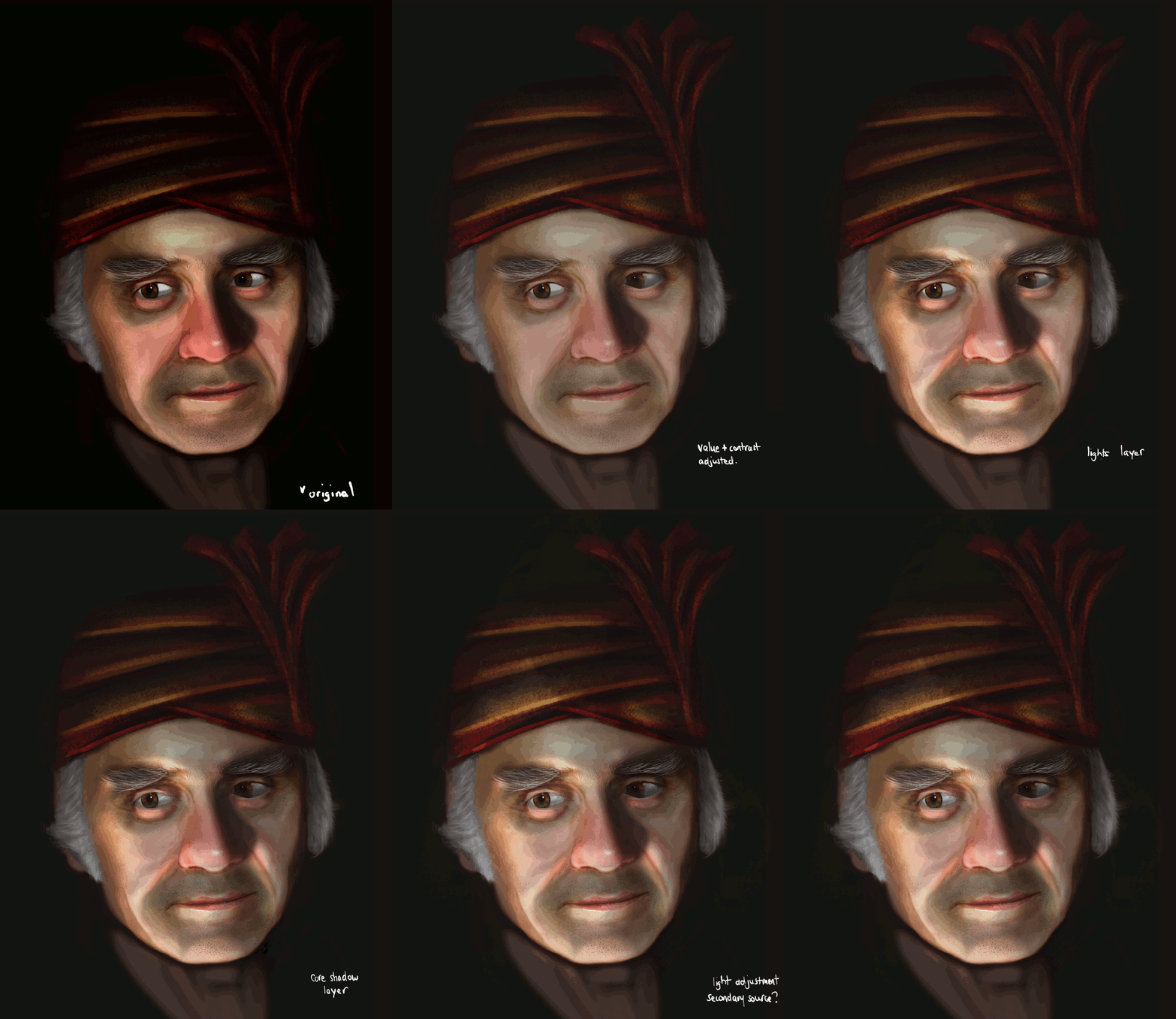


Values Adjusted Layer: This was a 'normal' layer. I duplicated the painting and curved the entire thing because I found the original image too contrasty. Funnily I thought I would have to do something about the saturation too, but the values adjustment simply fixed it.

LIghts Layer: This was a 'normal' layer. I duplicated the entire values adjusted layer, used curves again to bring out the high values so that it looked like light was shining on it. Then I masked out and painted in the light where I wanted.

Shadows Layer: Same as before, except instead of curving for higher values, I curved for lower values to get a nice core shadow value. Then, masked and painted in shadow areas as I wanted. This layer ended up being on 'Multiply' and lower opacity. Just play around.

Additional lights: Again a duplicate of the values adjusted base layer. Curved to be a higher value. Set to 'Screen'. Then masked and very softly brushed in the light. I didn't go overboard with this step, but you can use this to do your secondary source if you wanted it stronger.

That's it. Four layers, mostly just adjustments, layer meddling and mask painting! By duplicating the base layer each time and doing adjustments and mask painting it is very easy to make changes and try out different things. If you want green light, just colour balance the light layer...etc etc. Of course you will have to go back in directly at some point but it is a totally non-destructive way of experimenting.. Hope that helps!

 YouTube free learnin! | DeviantArt | Old Folio | Insta
Reply
#9
@Monkeybread Dude - you are awesome!

okay - sofar i am quite happy with the face - i wanted to define it ready and then i saw all that wrong stuff with the turban - so i have to give it another round tomorrow.

[Image: dieter_by_wolkenfels-d6ur5un.jpg]

Reply
#10
final

Thanks for the critiques Audie Eagleheart and Monkeybread.

[Image: sor_by_wolkenfels-d6uuwc5.jpg]

Reply
#11
Now put the first wip and the final together...then pat yourself on the back :) I think there are still some colour tones of the skin in the shadow areas that aren't quite working, maybe a bit too gray. Some of the face structure aroumd the jowls could do with more form work but you have brought this along very nicely mate. Well done.

 YouTube free learnin! | DeviantArt | Old Folio | Insta
Reply


Forum Jump:


Users browsing this thread: 25 Guest(s)