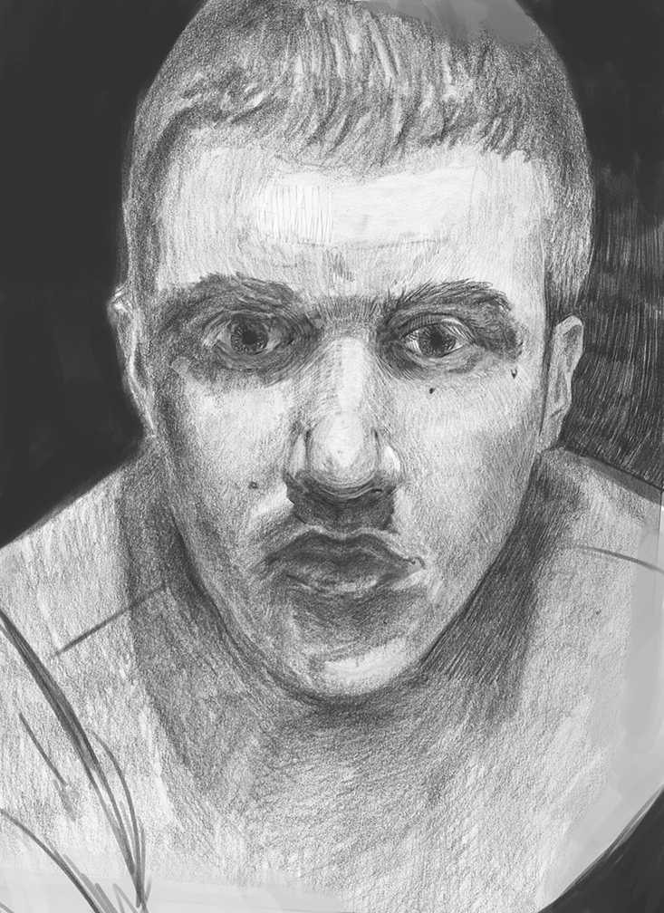
self-portrait critique
#1
[Image: u6GDfFv.jpg]

Hello daggers :), I need your help on how I can push this one; value wise, structure wise, and plane wise. I used a photo I took as reference. I've been fiddling around this for a while now and would like the advice of you guys. Perhaps, if I can make it good enough I can use it for my ap school portfolio.

EDIT: Yes, I used a photo. I will put it up here now as well.
[Image: L7PV9cn.jpg]

Reply
#2
The most obvious thing I see is the misalignment of features, in the eyes mostly. Your structure seems to drift (my) left.

Reply
#3
Did you copy from a photo or mirror? If you don't mind, can you put the photo up too?

Livestream Crits/Paintovers: www.twitch.tv/mike086
Loomis Study videos: http://www.youtube.com/user/mike086


My Facebook page: MCIII
Reply
#4
[Image: HLdamTV.jpg] quick paint-over to see what it looks like with a wider nose(this of course affects the lips)

Reply
#5
Here's a posterized copy of your ref image. 5 levels of value.
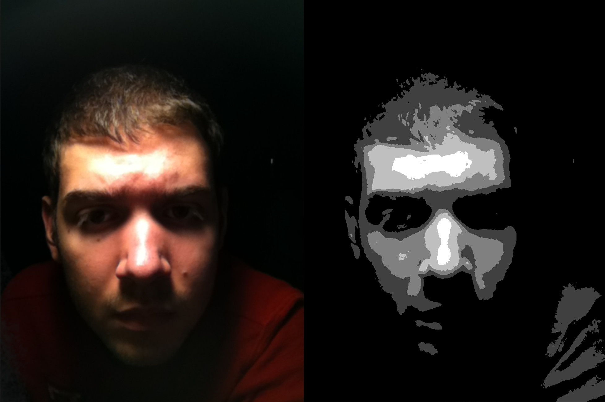


What you need to do is to see the big value shapes and relationships in the ref and mainly capture those. If you do that successfully you will get an image that works. You can add nuance and bring out detail later, but nail the main values first.

Use proportional measurement of your ref and apply to the features in your drawing which will give you a better likeness. At the moment things are quite off from the ref. (quick example compare the height of the forehead in your sketch and the ref) . If you don't know how to measure have a look online on portrait measurement techniques. Nothing springs to mind but I've definitely seen specific stuff on YouTube
Generally I think you need to use much darker values in the surrounds to make the face pop out of the background, and darker darks in general.

Not everything needs to be delineated with a hard edge. Pay attention to your hard and soft edges, your lost and found edges. I find these really make for charming effective traditional sketches.
For example to show depth you can allow areas where forms curve around, such as around the head, to merge with the background value. Accentuate hard edges where you need them like around the eye sockets and nose.

Have a look at some cool charcoal or pencil portraits by other artists to see how they effectively break down their values and edges too.

 YouTube free learnin! | DeviantArt | Old Folio | Insta
Reply
#6
Nexuun, I did a paint over for you and talked about some other self portrait things, you can watch the video here: http://livestre.am/4JPmg


adjusted image:


Livestream Crits/Paintovers: www.twitch.tv/mike086
Loomis Study videos: http://www.youtube.com/user/mike086


My Facebook page: MCIII
Reply
#7
Hey man, this may not actually help you, but I started to do a paintover of sorts and it basically just turned into an impromptu value study and play for myself.
Thought I'd post it here anyway, and maybe it could help you with values and planes? I didn't really nail the likeness because I didn't measure properly but whatev.

[Image: attachment.php?aid=41202]

 YouTube free learnin! | DeviantArt | Old Folio | Insta
Reply
#8
@Sundry: Thanks, you're right :) From now I will make sure to check my alignments more closely.
@Mike: Thank you so much. Your critique was insightful in too many ways to list, and the paint-over is quite gorgeous, demonstrating very well to me the cross-contours you spoke to me of.
@Monkeybread(both critique & paint-over): I can definitely see the difference in the accuracy of your values versus mine, and the proportions. It definitely looks a lot more like me. And I will definitely check out some portrait artists.

So, I've decided that I will use this thread for all my self-portraits. When I can I will post a revised version of my current portrait with better values. With the critiques you've given me, I will attempt to put them to use on newer portraits, and on my artwork in general.

Reply


Forum Jump:


Users browsing this thread: 14 Guest(s)