05-19-2016, 09:29 AM
Don't you dare quit! You won't think yourself through the wall, you'll paint and learn yourself through the wall. The values you have so far are actually pretty good for a general rendering of form. You are being a bit hard on yourself.
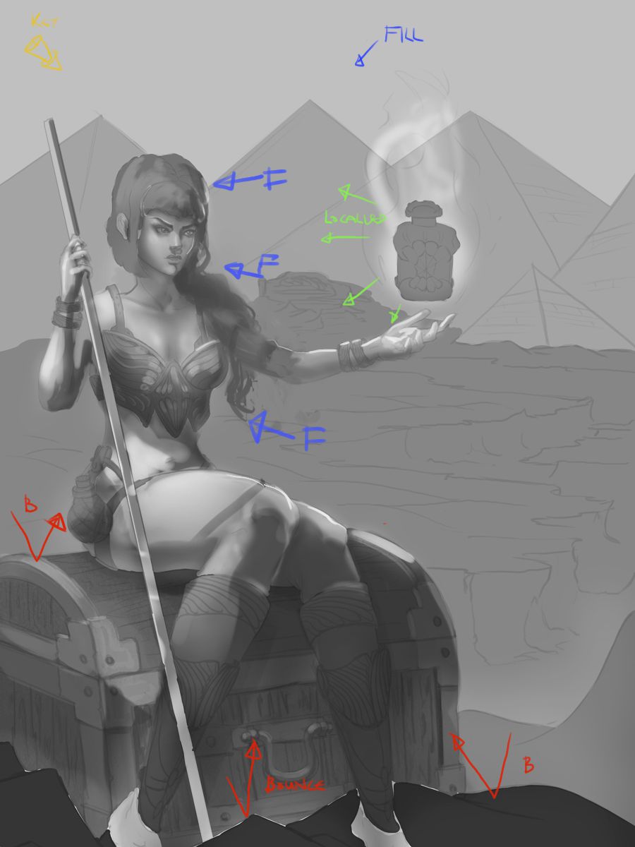
The main issue I am seeing is a lack of a distinct consistent light source. I find it helps to think about lighting first in terms of a key light, the major light source. This determines the first pass of lighting and shadows. Then go onto a fill light (ambient lighting from the sky generally or another source usually from an opposing direction of the key light to bring more light to the main core shadows). Then you can start to change things and add any additional localised light sources as dictated by the scene (torches /energy glow etc) and adding final touches to pop out areas like rim or backlighting only if needed.
This is a pretty rough scheme, so it is pretty sloppy and might not be balanced well (shitty monitor) but I applied the same thinking. You can see it isn't that far off yours...just makes things a bit more distinct, and a bit more contrast.

Small crit on anatomy: Her neck is a little too thick and manly, and her legs are drawn great, but might be a tad too big.
On a compositional note, the urn and her face are on the same horizontal line. You could angle her arm a little lower to get it more on a diagonal
. Then you can make one of the pyramids which has it's point vertically above the urn, make it larger than the others with it's slide going down towards her face. With some lighting focus on it can be a third major shape in the comp. Makes a nice triangle from urn to face to pyramid
*EDIT did a thing. Also cropped the image a bit. Not perfect, or satisfied with the urn, but a bit more focused perhaps.

Come on man, push through it! You can do it!
The main issue I am seeing is a lack of a distinct consistent light source. I find it helps to think about lighting first in terms of a key light, the major light source. This determines the first pass of lighting and shadows. Then go onto a fill light (ambient lighting from the sky generally or another source usually from an opposing direction of the key light to bring more light to the main core shadows). Then you can start to change things and add any additional localised light sources as dictated by the scene (torches /energy glow etc) and adding final touches to pop out areas like rim or backlighting only if needed.
This is a pretty rough scheme, so it is pretty sloppy and might not be balanced well (shitty monitor) but I applied the same thinking. You can see it isn't that far off yours...just makes things a bit more distinct, and a bit more contrast.

Small crit on anatomy: Her neck is a little too thick and manly, and her legs are drawn great, but might be a tad too big.
On a compositional note, the urn and her face are on the same horizontal line. You could angle her arm a little lower to get it more on a diagonal
. Then you can make one of the pyramids which has it's point vertically above the urn, make it larger than the others with it's slide going down towards her face. With some lighting focus on it can be a third major shape in the comp. Makes a nice triangle from urn to face to pyramid
*EDIT did a thing. Also cropped the image a bit. Not perfect, or satisfied with the urn, but a bit more focused perhaps.

Come on man, push through it! You can do it!


