05-27-2016, 09:34 AM
Hey!
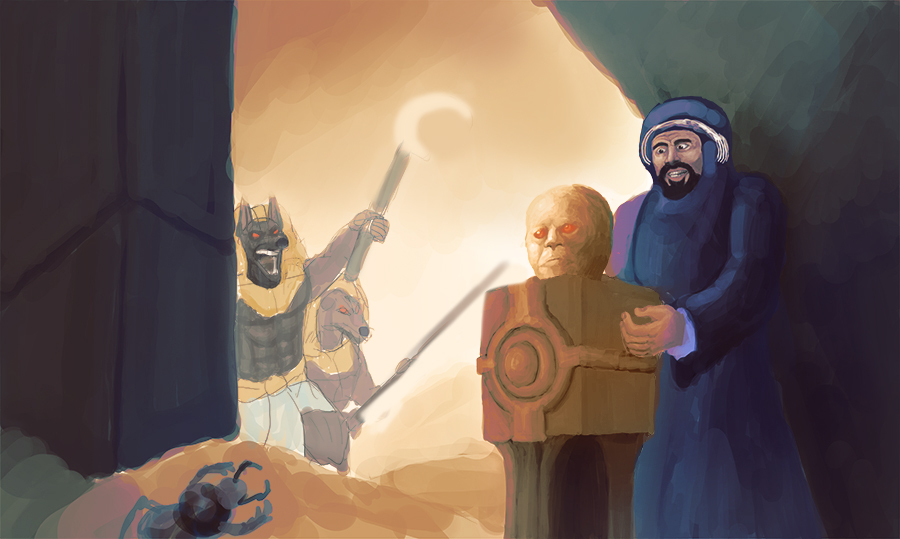
Is it possible that the bad vibe is partly a colour issue? Here's a paintover I did using a gradient map:

Your background is pretty desaturated, so I thought some more colour (especially something complimentary like cool blue shadows and warm yellow-pink lights) might help.
Be careful that your focus doesn't become totally split between the foreground figure and the background figures, because I think it would be better if one focus comes out more strongly and then the viewers attention moves afterwards to the secondary focus (which is what your previous WIP was more like). At the moment, my eyes kind of flick between the two.
Is it possible that the bad vibe is partly a colour issue? Here's a paintover I did using a gradient map:

Your background is pretty desaturated, so I thought some more colour (especially something complimentary like cool blue shadows and warm yellow-pink lights) might help.
Be careful that your focus doesn't become totally split between the foreground figure and the background figures, because I think it would be better if one focus comes out more strongly and then the viewers attention moves afterwards to the secondary focus (which is what your previous WIP was more like). At the moment, my eyes kind of flick between the two.
- Sketchbook -


