06-16-2013, 03:59 AM
hey guys
i just have a small suggestion, but i think it might be useful
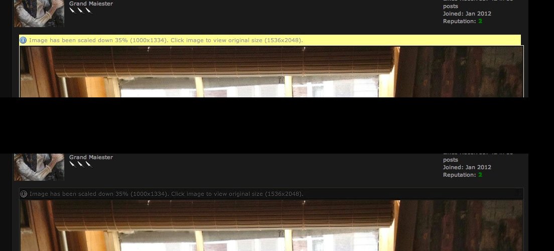
the yellow bar that shows that an image has been scaled down to fit a window jumps out and is in strong contrast with the dark grey page colour, and i thought perhaps it would be better if the bar was dark and blended in with the page.
sometimes it feels that the yellow bar competes for attention with the image, especially if the image itself is dark
here's an example of a subtler version that you can still read but seems more hidden:

- Sketchbook - seeking critique & feedback
- Instagram.com/aks9art


