08-14-2016, 04:57 AM
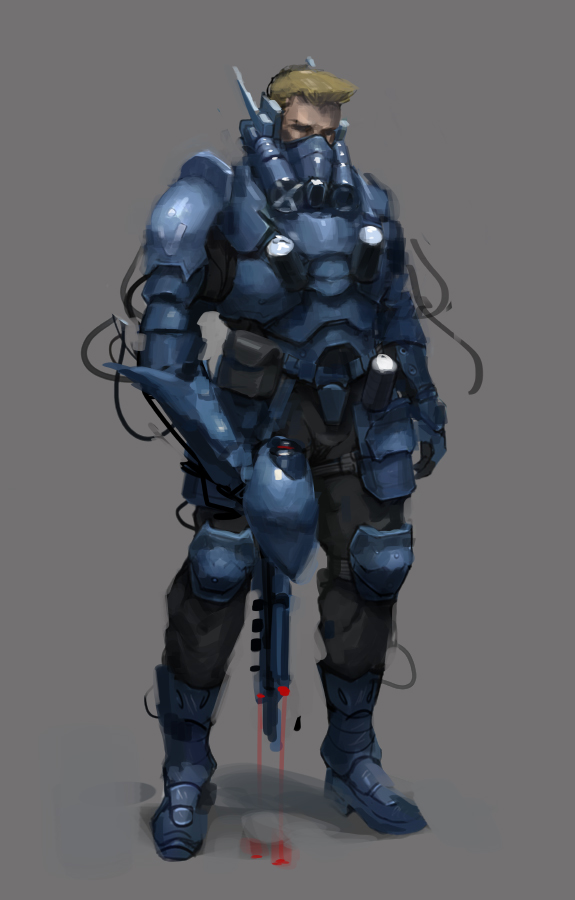
I have to disagree with Milena a bit. While variation is color is often nice, I don't think is the reason why the image looks less impressive than it could. Unity in color doesn't necessarily dull an image if it is being actively acted upon with light and shadow. I would argue that the reason for this somewhat "dullness" is twofold. One is the lack of specificity in information and the second is a lack of hierarchy in value.
So for the first point. This image doesn't have much of a light source. The shadows are soft and blurry and I would suspect this is done because you might be unsure of how to represent light and shadow over form. There are no real or clear cast shadows, no shadow lines, no thing to really grip on to that makes the painting feel as if it's a 3D object in space that you could touch.
I get that it is difficult to be super specific and I'd actually suggest being a little vague with some information in the beginning of an image to make it easy to work with and change (you don't want to start rendering highlights before the general impression of the subject is there), but at some point you need to be clear and say "this is in light, this is in shadow".
So on to the second point, a lack of hierarchy. If we look at a Rembrandt painting (it's best to do so in real life but photos work as well) we notice one thing is almost all of his work. It's really dark. Like, the values are really dark. He has done this so that when he uses bright paint, in relationship to the rest of the painting, it looks extremely bright. We relate values to other values and in his work there is a clear hierarchy of values.
This concept of relative values and hierarchy is something we can use in all our work. When we're painting anything, we need a key. What a Key basically is, is an extreme point in light/darkness that we assign a certain value to. Think of it as your brightest bright and darkest dark. Now with these points defined, we can easily compare the brightest bright and darkest dark to a third value and ask, where does this third value fall between the two keys. After we have a third value and want to paint a fourth, we can compare it to our key but we can also compare it to the third value. But maybe the fourth value is too dark in comparison to the third value but if we go brighter it becomes too close to the brightest bright. What we then can deduce is that the third value is relatively too bright and needs to be made darker so the fourth value is proper.
You can play this game of comparing values over your image to establish a hierarchy and it really gives you a tool to better control the image. Now there is some more complexity to this but this is the general idea. Just an interesting side-note, you can actually find half-finished paintings and studies by Zorn, Sargent and Krøyer where you can see them comparing values like this on the canvas.
I've attached a super quick paintover to show this general idea. Let me know if there was something I haven't been clear on, too lazy to proof-read ;)

Discord - JetJaguar#8954


