11-04-2013, 11:25 AM
Mate, not a problem. I want to give others the kind of advice I'd like to receive myself ;)
Again, this will be a bit wordy as I'm pretty verbose, but keep reading as it will make more sense when you see the example later in the post. To further illustrate my comments, I've done a little paint over. It's far from accurate as I was lazy, and I blocked in the value of the trees pretty haphazardly, so maybe some parts were better left alone as you had in yours.
If you don't agree with where my advice is taking the painting then by all means discard the advice and interpret it your own way ;)
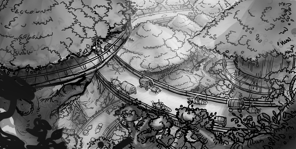
Some good progress with the linework, it was fortunate that you tightened it up further as now the forms are much clearer. Keep in mind that your lines are pretty thick, so it's deceptive in how busy everything appears. The busyness will become less of a problem as you begin painting over them.
I definitely think it's a step forward putting traffic into the scene. As nice as empty highways are, it wouldn't sell the painting nearly as much as showing the road in use. I love how you've resolved the caravans; great idea using giant insects, they're nice and simple in form while still having an interesting silhouette.
Your second value study looks kind of messy because the local values of fore, mid and background are starting to bleed into one-another too much. The winding path is tricky to resolve, but the key is to use the trees as a bridge from mid to background with repetition of form.
You're trying to illuminate too much with this global 'fill' lighting because you want to show everything and it's the easier way to paint it. This also makes it hard to tell where your primary light source is. My eyes are trying to find a point of high contrast, but everything has the same gradation of light to dark making it read the same, so it's hard to find a focal point.
You've already made the painting more intimate by framing the scene with the darker foreground, as if we're perched from a higher vantage point peering down, so I think you should continue down this route.
I see you've darkened the trunks of the background as you didn't want to lose the form of the treetops by making them light as well. I think this was the right move; the density of the foliage means the treetops would catch most of the light and shade everything underneath. You could further justify it by changing the time of day of the painting to be late afternoon/towards sunset.

I've tried to increase separation of fore, mid and background. I've also suggested a primary light source coming from top-right-behind because it helps describe how the forms turn with the winding path. There's also a kind of soft box fill light coming from above because of the sky. Increase the dynamic range so you can keep the grounds separate, describe how the forms interact with one another as well as illuminate the areas of interest all at once.
This, along with cast shadow (which is pretty inaccurate in my painting) could create a narrower band of light that catches the highway in the center. This is your focal point; the caravans using the highway.
Keep the value of the caravans quite simple. Help create separation and attract the eyes with a bit of rim light.
You tried illuminating the two figures in the foreground with your primary light; rather than doing this, I thought it might make more sense if they were lit by their own local light source, like a torch? Maybe this area recedes further into darkness, as there are taller trees off camera that close up the light? We're already viewing the scene from one of those higher points, so it's a creative liberty you have so that you can retain better separation of fore and mid ground.
I changed the second figure so he's no longer pointing. I liked the idea, but it doesn't really make sense now that I see it, as it kind of suggests they exist over the highway and are pointing right down, when they in fact exist closer to camera. This was my bad, he wasn't even really pointing at the highway at all, because of how it tapers away from him towards the right of the painting. Instead I've indicated how he could be leaning over the edge to look to his left at the scene unfolding.
The foreground tree I felt was a bit too large, so I brought the trunk in further, as it was reaching out too much to support the path properly. I've opened up the area around the trunk to indicate how it comes up from below, while still trying to match a subtle fisheye. I've layered on top some extreme foreground elements to fill in the area and extend the continuity of the elements to the bottom right corner.
Hopefully some of these thoughts are useful.
Again, this will be a bit wordy as I'm pretty verbose, but keep reading as it will make more sense when you see the example later in the post. To further illustrate my comments, I've done a little paint over. It's far from accurate as I was lazy, and I blocked in the value of the trees pretty haphazardly, so maybe some parts were better left alone as you had in yours.
If you don't agree with where my advice is taking the painting then by all means discard the advice and interpret it your own way ;)
Some good progress with the linework, it was fortunate that you tightened it up further as now the forms are much clearer. Keep in mind that your lines are pretty thick, so it's deceptive in how busy everything appears. The busyness will become less of a problem as you begin painting over them.
I definitely think it's a step forward putting traffic into the scene. As nice as empty highways are, it wouldn't sell the painting nearly as much as showing the road in use. I love how you've resolved the caravans; great idea using giant insects, they're nice and simple in form while still having an interesting silhouette.
Your second value study looks kind of messy because the local values of fore, mid and background are starting to bleed into one-another too much. The winding path is tricky to resolve, but the key is to use the trees as a bridge from mid to background with repetition of form.
You're trying to illuminate too much with this global 'fill' lighting because you want to show everything and it's the easier way to paint it. This also makes it hard to tell where your primary light source is. My eyes are trying to find a point of high contrast, but everything has the same gradation of light to dark making it read the same, so it's hard to find a focal point.
You've already made the painting more intimate by framing the scene with the darker foreground, as if we're perched from a higher vantage point peering down, so I think you should continue down this route.
I see you've darkened the trunks of the background as you didn't want to lose the form of the treetops by making them light as well. I think this was the right move; the density of the foliage means the treetops would catch most of the light and shade everything underneath. You could further justify it by changing the time of day of the painting to be late afternoon/towards sunset.

I've tried to increase separation of fore, mid and background. I've also suggested a primary light source coming from top-right-behind because it helps describe how the forms turn with the winding path. There's also a kind of soft box fill light coming from above because of the sky. Increase the dynamic range so you can keep the grounds separate, describe how the forms interact with one another as well as illuminate the areas of interest all at once.
This, along with cast shadow (which is pretty inaccurate in my painting) could create a narrower band of light that catches the highway in the center. This is your focal point; the caravans using the highway.
Keep the value of the caravans quite simple. Help create separation and attract the eyes with a bit of rim light.
You tried illuminating the two figures in the foreground with your primary light; rather than doing this, I thought it might make more sense if they were lit by their own local light source, like a torch? Maybe this area recedes further into darkness, as there are taller trees off camera that close up the light? We're already viewing the scene from one of those higher points, so it's a creative liberty you have so that you can retain better separation of fore and mid ground.
I changed the second figure so he's no longer pointing. I liked the idea, but it doesn't really make sense now that I see it, as it kind of suggests they exist over the highway and are pointing right down, when they in fact exist closer to camera. This was my bad, he wasn't even really pointing at the highway at all, because of how it tapers away from him towards the right of the painting. Instead I've indicated how he could be leaning over the edge to look to his left at the scene unfolding.
The foreground tree I felt was a bit too large, so I brought the trunk in further, as it was reaching out too much to support the path properly. I've opened up the area around the trunk to indicate how it comes up from below, while still trying to match a subtle fisheye. I've layered on top some extreme foreground elements to fill in the area and extend the continuity of the elements to the bottom right corner.
Hopefully some of these thoughts are useful.


