01-20-2021, 03:52 PM
You have already received some good criticism, so I will just add my own opinion and not repeat what has been said. Feel free to use it as you will.
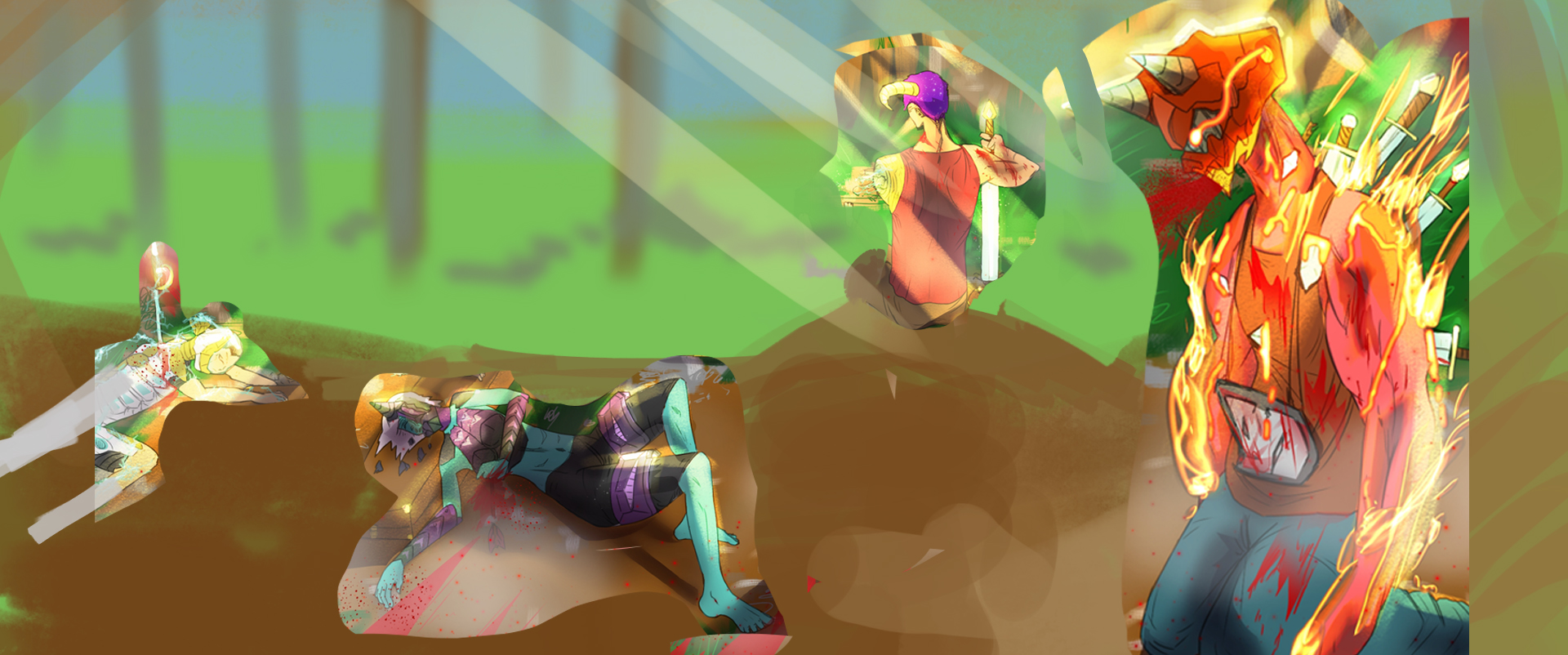
First, the format is not very good. A square is rarely used in illustrations because of compositional issues (not saying it has never been used ever, but it's very rare). I would enlarge the illustration to a widescreen format or an A4 format. A widescreen format can help "sell" the illustration as a movie still, while an A4 format can give the feeling of seeing the illustration in a book.
Second, the values are a bit confusing. When I turn the image B/W and zoom out, I can't really tell what's going on. You should carefully place your values and maintain the highest contrast in your focal points.
Third. Be conscious of all your design and compositional decisions. The god rays should be used sparingly as a compositional element. You also need to place every element carefully and maintain balance in your composition. Read up on the "principles of design" to get a nice checklist to use.
I did an extremely quick overpaint on your image and changed the format. It's very quick and rushed and it's not perfect, but I think it does a better job with the balance and composition.
Keep up the good work! And keep posting!


