Posts: 350
Threads: 15
Joined: Jun 2012
Reputation:
18
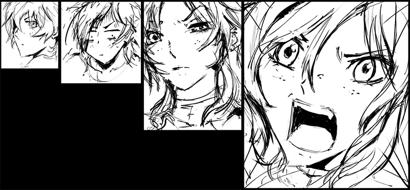
Wear that manga on your sleeve man, keep it coming!
Posts: 504
Threads: 9
Joined: Apr 2012
Reputation:
6
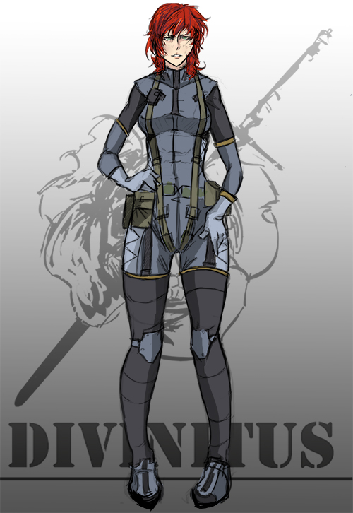
ed i love your sequential work man. I don't see many people interested in doing that kind of practice on the CD forums. I'm actually working on some traditional sequential stuff I can't post right now. Have you got yourself a copy of framed ink? It's been my main guide for creating sequential stuff
Posts: 119
Threads: 7
Joined: Nov 2012
Reputation:
1
Great stuff eddy and no problem we wont hold the manga stuff against you :P just push push push!!!
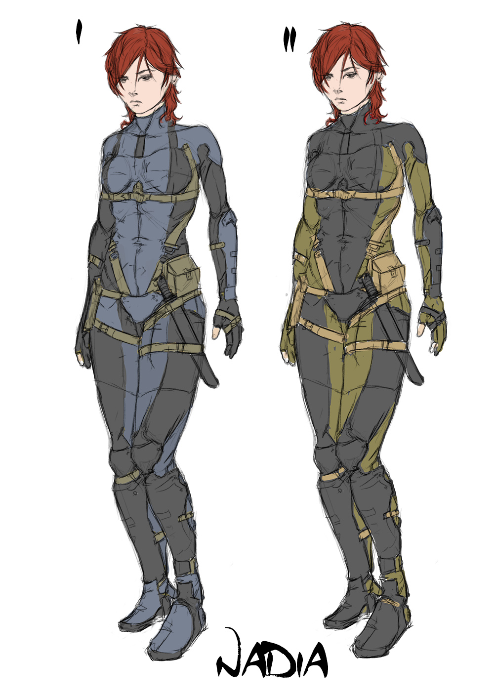
The greenish colors are much better imho, but the pattern makes the chest look dull. Maybe 1 with the colors of 2?
Nice rendering on the head. For the chest I would switch the black and the green. (Leaving shoulders and arms as they are.)
Posts: 1,074
Threads: 9
Joined: Jan 2012
Reputation:
53
Thumbs up Eduardo!
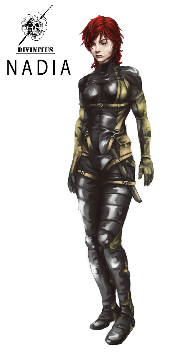
I do think there is bit too much white on the legs though, I am not sure the light would be that intense there to make those highlights - but thats just nitpicking :)
Posts: 387
Threads: 2
Joined: Jul 2012
Reputation:
6
Hey, I didn't know you can manga, looks cool! Nadia looks nice, you might consider changing the material of her outfit, unless she is about to go underwater hehe
Posts: 1,098
Threads: 11
Joined: Aug 2012
Reputation:
34
Thanks Ursula, iCi! :)
you both are right, the material of her suit is too latex like, i definitely need to make it more opaque.
Will upload an updated version soon, along with moar stuff.
Posts: 812
Threads: 4
Joined: May 2012
Reputation:
35
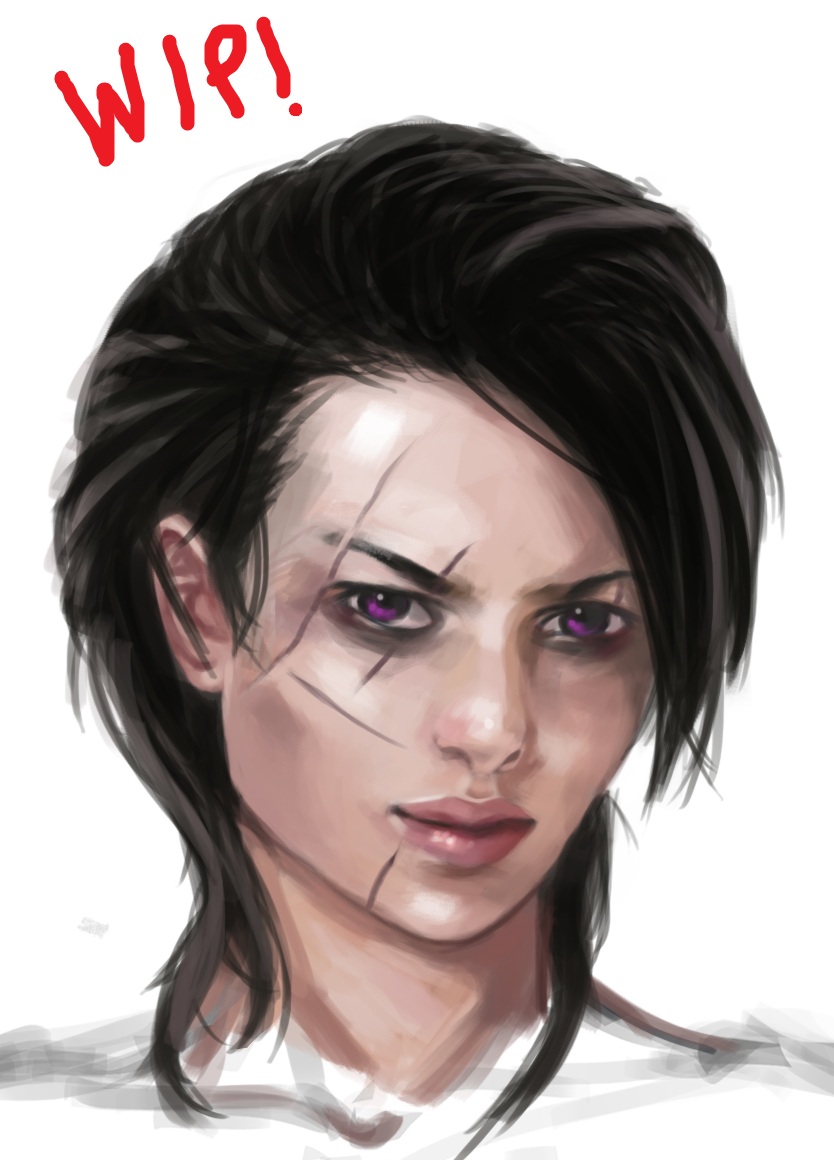
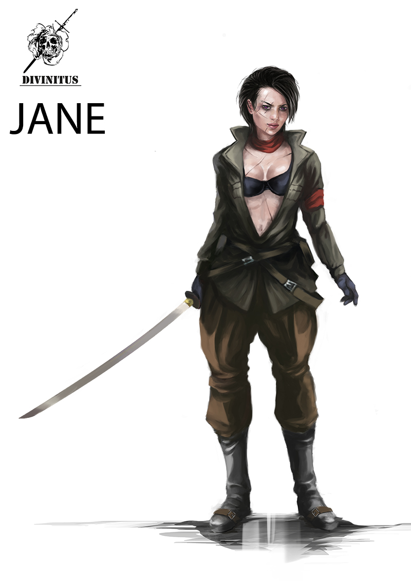
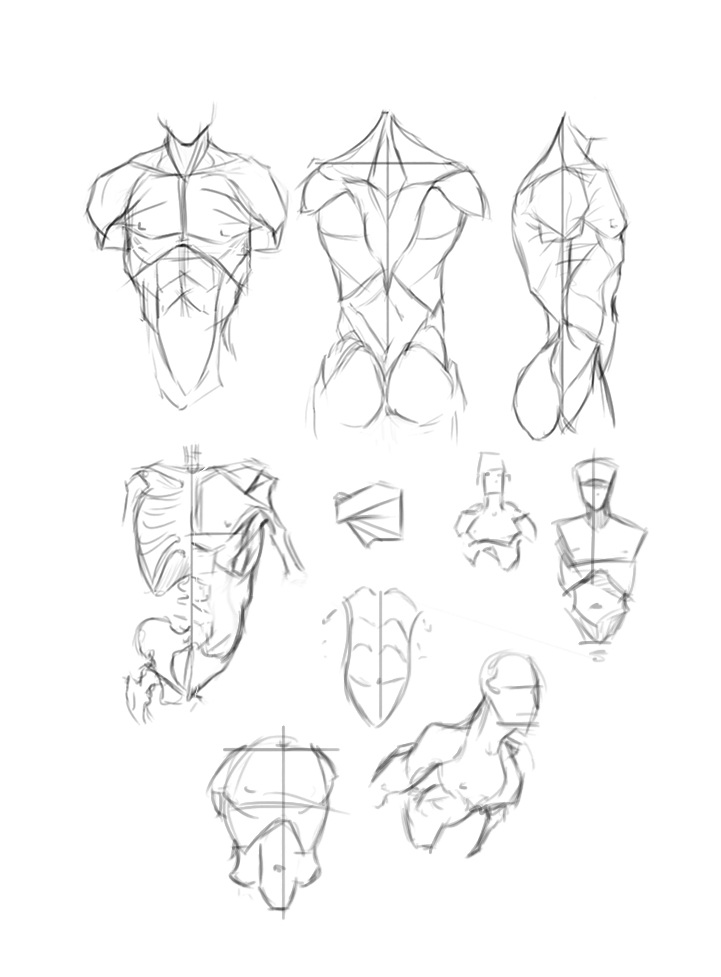
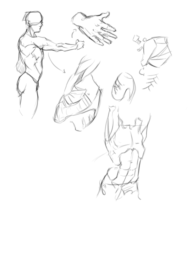
Mannn I'm loving the characters! Jane is badass. Those anatomy studies are looking sweet to.
