Posts: 94
Threads: 8
Joined: Jan 2013
Reputation:
1
Here is a new illustration I am working on.... This time I took a different workflow... I painted the whole scene first and then I will render the details when people crit and when I fix everything... so please crit asap... plz!
![[Image: attachment.php?attachmentid=1709603&d=1360333904]](http://conceptart.org/forums/attachment.php?attachmentid=1709603&d=1360333904)
Posts: 1,098
Threads: 11
Joined: Aug 2012
Reputation:
34
since you didnt started with the details, i would say, start over again man.
Just two things.
1-Anatomy, take references, look at movie screenshots, pose yourself do whatever it takes to get the anatomy of the guy right.
2-Composition, before doing anything, ask yourself, what i´m trying to tell with this picture? Right now i only see a guy in the middle of nowhere with a tiny reptil at his feet.
I can presume that the guy is some kind of hunter and just killed the reptile, but thats not really interesting. Remember, when doing an illustration storytelling is fundamental.
That would make the difference between just another random picture and an awesome piece of art.
Hopefully you will find some of this useful, cheers!
Posts: 94
Threads: 8
Joined: Jan 2013
Reputation:
1
EduardoGaray: Thx for the feedback! Could you be more specific on the anatomy flaws, because I used references and did all the stuff but sometimes even that is not enough... As for the composition, the point of this image is to show the character... I dont know how its called, but its like a zoomed out portrait, if you know what I mean... And I will add stuff in the background later... I am trying to do something that would be appropriate for a magic card or something like that... Also a full action scene would be I think too big of a bite... I am trying to focus on the characters, lighting, anatomy firs... And I dont think it is necessary to start over because photoshop is always like starting over.... I mean I can cut, move, paintover...
I really appreciate that you always crit my stuff... I know it maybe sounds like I disagree whit the crit but I dont... I will keep pounding on that anatomy now until I get it right... THX!!!
Posts: 1,098
Threads: 11
Joined: Aug 2012
Reputation:
34
yeah maybe it sounded a bit harsh, but it wasn't my intention.
Also its better to disagree than not thinking for yourself :)
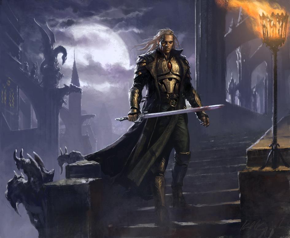
Well, if you are going for a magic card kind of composition, then you should go for a squarish compositon. Maybe something like this:

this magic card by Karl Kopinski focus completely on the character, but it also tells a story.
You know, because the character cant speak, you will need to describe it trough corporal expression, attire, clothes, etc...
Also, if you think you cant do it, then do it! it is when we do the impossible when we learn and growth. No one will judge you, if someone does it, its likely an asshole.
For the anatomy, it is all about the proportions, and the way muscles and joints work.
Compare your hunter with the character in the artwork i used as example and you should start to see for yourself all of the problems.
Cheers!
Posts: 94
Threads: 8
Joined: Jan 2013
Reputation:
1
Here is a fix of the anatomy and a change of composition... There is still much to bee added in the background, and the gun... Also Im thinking of adding a serpent/dragon as a pet floating around him and on his back, and dragons flying towards him from the back on the other third of the image... what do you think?
Also I did the first format of the image because I noticed that the art for the magic card stuff was in that format but I changed it....
![[Image: attachment.php?attachmentid=1710610&d=1360412402]](http://conceptart.org/forums/attachment.php?attachmentid=1710610&d=1360412402)
Posts: 342
Threads: 37
Joined: Jan 2013
Reputation:
13
Hey, well I'm by no means a art master in any form, but I thought I would pass on a thing or two which didnt look right to me. The muscles in his left arm seem to be twisted awkwardly- I havent done enough studies myself to be able to say what is wrong with them, but it looks like he has a block of muscles which would stop his arm bending.
Also, I feel slightly confused where the elbow is- the arm just seems to extend at the same width, until it suddenly scoops in at the wrist. That, and I'm not really sure what is going on with his fingers and their positions.
The lighting on his face is incredible so well done for that!
Apart from my little nags, I think the piece is coming on very nicely so really well done :D
Hope I was as helpful as I can at my level! Heh :)
Posts: 94
Threads: 8
Joined: Jan 2013
Reputation:
1
Still no gun... Decided not to give him a dragon pet.... it would bee too much...
![[Image: attachment.php?attachmentid=1710786&d=1360425820]](http://conceptart.org/forums/attachment.php?attachmentid=1710786&d=1360425820)
Ward217: THX! yea the elbow cant bee seen but the arm should be bent a bit... I wanted the stiff look because he was turning, and it is not wrong but it still looks odd so il bend it a bit.... The fingers are that way because he is holding a gun just haven't painted it yet (look at first post)... thx again!
Posts: 94
Threads: 8
Joined: Jan 2013
Reputation:
1
This is it for today... been drawing 16 hours straight... Can't go on anymore... If you guys like it tomorrow I will render the crap out of it...
![[Image: attachment.php?attachmentid=1710893&d=1360441772]](http://conceptart.org/forums/attachment.php?attachmentid=1710893&d=1360441772)
Posts: 1,970
Threads: 22
Joined: Apr 2012
Reputation:
243
(02-10-2013, 06:31 AM)IgorIv Wrote: This is it for today... been drawing 16 hours straight... Can't go on anymore... If you guys like it tomorrow I will render the crap out of it...
![[Image: attachment.php?attachmentid=1710893&d=1360441772]](http://conceptart.org/forums/attachment.php?attachmentid=1710893&d=1360441772)
Hey man there are a few things I've noticed with your stuff and workflow that I think I've seen enough of you doing now to make comment on. Eduardo was right on the money. Anatomy study. If you don't get it right it doesn't matter how good anything else in the image is like. The rest of it could be a Mullins or a Jaime Jones, but if the anatomy is off it will look wrong. I'm not saying this image is completely off, besides his arm and his neck (basically everything visible!) and I don't think you should start over and I don't think you need more reference. I actually think you're jumping ahead of yourself. I think what you need to do is anatomy studies that aren't illustrations. This will fix the issues you seem to have with musculature. You also tend to portray extreme body types for the males. Not every one needs to be a bodybuilder. I know this can be a style thing, but if you keep drawing it that's all you'll know.
Comp. wise I think you've addressed the issues of before, but in terms of workflow I find it surprising that you build your images in this piecemeal way. Do you do any thumbnails at all? From experience and from every single artist I've read, talked to, listened to, they all work out their entire piece's composition, gesture, tonal arrangement etc first, before getting even close to rendering.
Lastly, you said you'd change stuff now before "rendering the crap out of it" From what I can see this is already pretty highly rendered. You have clean edges, maybe just some material and detail left, but basically I think you are spending too much time getting to a high level of detail, when you are almost there already and what you need to do is put the detail where it needs to go.
Sorry not meaning to be mean or blunt, but I think you need to look at your workflow and approach things a little differently perhaps. hope that helps!
Posts: 94
Threads: 8
Joined: Jan 2013
Reputation:
1
Its finished!!! Thx all hor helping me make it better... you can still crit... its never too late to fix things...
![[Image: 64524_523487027692021_1938942023_n.jpg]](https://sphotos-d.ak.fbcdn.net/hphotos-ak-prn1/64524_523487027692021_1938942023_n.jpg)
Posts: 17
Threads: 4
Joined: Oct 2012
Reputation:
1
That is a fantastic progression. Well done. :)
Posts: 94
Threads: 8
Joined: Jan 2013
Reputation:
1
|
![[Image: attachment.php?attachmentid=1709603&d=1360333904]](http://conceptart.org/forums/attachment.php?attachmentid=1709603&d=1360333904)


![[Image: 64524_523487027692021_1938942023_n.jpg]](https://sphotos-d.ak.fbcdn.net/hphotos-ak-prn1/64524_523487027692021_1938942023_n.jpg)