02-16-2013, 11:18 AM
I'm looking for some advice on how to finish this piece up.
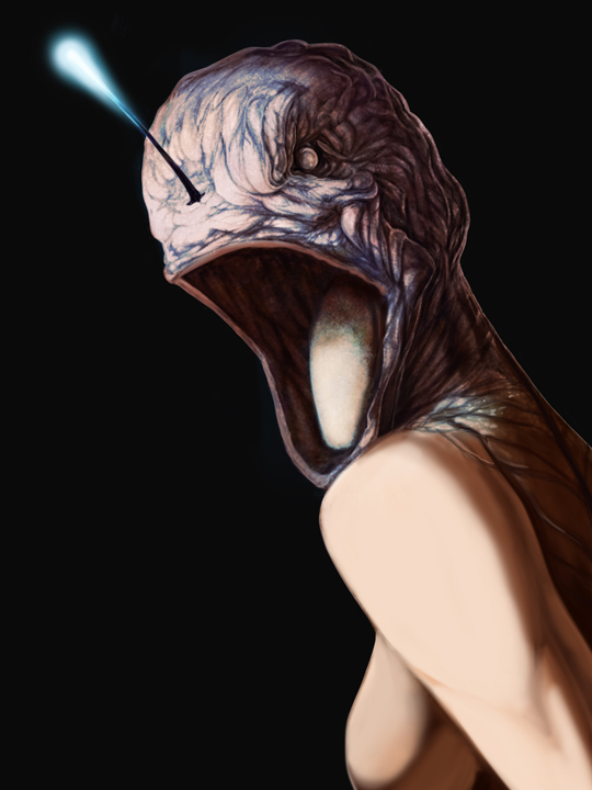
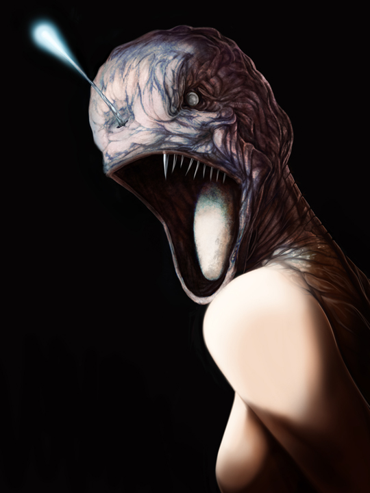
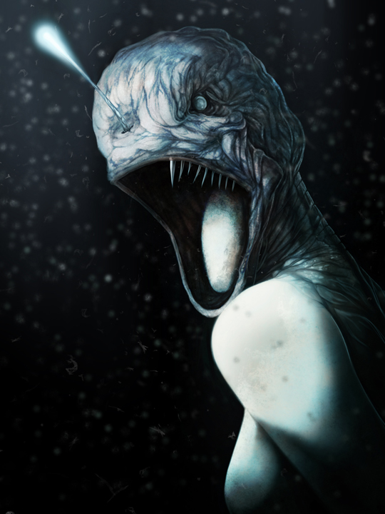


|
NSFW-mermaid nudity-Seeking some advice and critiques
|
|
02-16-2013, 11:18 AM
I'm looking for some advice on how to finish this piece up.
   
02-16-2013, 12:15 PM
Just from a quick look, an interesting background would make it look more finished :x
02-16-2013, 02:12 PM
Yeah I was going to add in some underwater volcanoes or some deep sea foliage/rock/stuff.
02-16-2013, 08:27 PM
what's that blurry stuff? it looks like you wanting to distract the eye from the fact that you don't know what to make of this picture. lose it! it doesn't fit at all.
also i would show some random scales on the arm and boobs or so. this design doesn't seem finished, looks like a woman with a fish head, not like some creepy sea creature. make the head fit the rest of the body, maybe show more of those antlers or whatever! =)
02-17-2013, 03:58 AM
this is looking really good mate, I personally disagree that the blur takes away from it as I think it makes the portrait less static and aids the focus, though it is a matter of taste I suppose. I would recommend going half way with it, fit the scales and texture from the head into the top half of the body a bit more, and perhaps less evenly positioned teeth as the fish have them a bit jumbled around. I would also say to make the eye a bit more of a foucus point by getting a darker iris and brighter reflection, and perhaps slightly darkened/red surrounding flesh? I would also say that it is looking a bit monotonous colour wise, and though I know that deep sea would be, I would say you could work some dark blueish greens in there and perhaps get away with some deep purple hints with the secondary light source. The biggest forefront bubble looks a little awkward with how it interacts with lighting with the mer...witch? heh not quite a maid! The one by the shoulder looks almost like an extension of her arm at a first glance, so perhaps push it to the left a tad?
Apart from that, its looking great, you are a far better artist than I am so I guess im just commenting on what I would do if I had the ability! Keep it up :)
02-18-2013, 08:35 AM
I also posted this on ConceptArt.org and have made some of my own changes based on info from both here and there.
Basically I've toned done my blue layer and added some red in that shadows. My big issue is that the monotone approach is more realistic, but boring. The deep water an angler fish is in kills all light except for the glowing "lure" of the fish. I took out the realism for the sake of drama+cool factor. I added some blood in the water to direct the eye and got some advice to add fish bits, but I think adding the fish would A. slap people in the face that it's blood B. become distracting 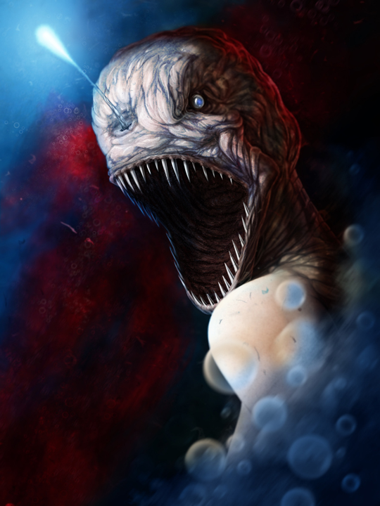
02-18-2013, 04:02 PM
Allot of crits on this piece, be sure not to loose your original focus. First the light coming out of the top of the head is used only by deep water fish, those fish live were there is no light and have adapted to their environment, this took some research and I am sure led you to your original monochromatic color scheme, stick with it! It is Ok to add some color but keep the piece feeling monochromatic, try loosing the back rim lighting and increase the shadow, make it feel like the creature is coming out of the dark, this would be much more dramatic. You may need to zoom in a bit.
On a technical note your lower teeth are not at the correct angle, your teeth should align with the jaw. I would loose the blood, you have no visual story to support it. Great piece!
Eric
Elmstreetart.com |
|
« Next Oldest | Next Newest »
|