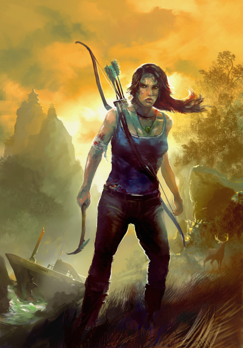
Tomb Raider Comp choices
#1
Hey all,
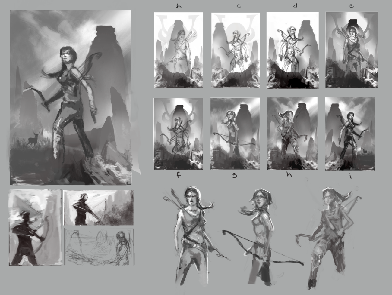
I decided to throw in a thing for the TR competition last minute. Did some thumbs before and then took the best one and did some development sketches. Help me out: there are 8 choices top right. Tell me which one/s you like best or if none at all.
The horny silhouette will be a samurai helmet, the general illustration is a poster/collage approach of different scenes from the game, not one continuous scene. I refined the values with each one, so they do tend to get better with each iteration, but try and imagine treatment i on all the previous if possible!

I have less than 48 hours to work on this so any quick crit would be useful. Thanks for the help!

 YouTube free learnin! | DeviantArt | Old Folio | Insta
Reply
#2
Star 
For me "e" is stronger, more "cliche" but stronger, I will go for this one. Good luck!
Reply
#3
I'd go with 'e' as well. Feels stronger like JabyReART said :)
Reply
#4
Sweet, thanks guys. I'm going to do some lineart for that pose and rejiggle the values and background based on some other feedback and see how it goes. Anyone else can still chime in whenever of course! :)

 YouTube free learnin! | DeviantArt | Old Folio | Insta
Reply
#5
I like i the best. In e all the focus feels (to me) crammed into the center of the image. With i, it feels like she's out in the open, there's some breathing room, it's a nice silhouette of her stance (which is a more dynamic stance than e, imo), there's more to look at around the drawing (the mountains, the sky, the animal in the background, etc.). Overall I like it better.
Reply
#6
Thanks ManlyBrian. i was one of my favourites. I basically used the BG in i and the pose in e. I agree the pose in i was more dynamic, but it didn't suggest determined survivor to me like the intensity of e did when i started rendering. This is the progress so far. Still got time for some last minute crits, got colour correction and detailing in BG and more stuff to go on her...but it's getting there.

[Image: attachment.php?aid=16570]

 YouTube free learnin! | DeviantArt | Old Folio | Insta
Reply
#7
Hey Monkeybread, just some things to (I hope) improve your piece.
Overall she needs to find her feminine side, she has too much width in the upper torso, and above the waist (one of the things to make her more feminine) needs to be narrow. The eyes are too inclined and small and the head has a weird shape and needs a little more hair, the right leg needs a touch.
I made a little paint over "fixing" all these ideas and added some highlights here and there...
Hope it will help!
Keep drawing!


Attached Files Image(s)


Reply
#8
(03-13-2013, 04:16 PM)manlybrian Wrote: I like i the best. In e all the focus feels (to me) crammed into the center of the image. With i, it feels like she's out in the open, there's some breathing room, it's a nice silhouette of her stance (which is a more dynamic stance than e, imo), there's more to look at around the drawing (the mountains, the sky, the animal in the background, etc.). Overall I like it better.

I'd agree with this (i) for future pieces, it has a quality to it that says more than brawler, might be useful for a future piece as you captured an alertness and intelligence with this pose, the looking up and off canvas, (sorry i didn't see this sooner or i'd have said then) but definitely come back to this for something else.
Reply
#9
@ezTarg8 Yeah man, you know, i was my "gut feeling" one. That's why it's bigger in the development sheet. I got tons of feedback from various people including "lay" people and it was seriously all over the place! There was no consensus but e came out marginally ahead. I don't know if people just recognized it easier or what because it's used so much. I think for originality the one I picked is rubbish, but you're right I can always use the more dynamic pose for something else....hmm bloodsport anyone :)
Thanks for the feedback man.

@Jaby
Thanks for taking the time to do a paintover much appreciated! I agree that she needs to be feminised and there are issues with her head. Narrowing shoulders and giving her more curves is going in right away. I've already started fixing them but I'll take into account what you've done and see if I can make it even better. I agree that the leg needed something, and I've fixed it already (I think). As a feedback on your paintover (lol) I kinda think you made the pose slightly off balanced and more awkward with the change you made but I fiddled with it for so long I know how deceptively hard that simple looking leg position is to get right, thanks for trying! Much appreciated.

 YouTube free learnin! | DeviantArt | Old Folio | Insta
Reply
#10
Thought I'd post the final I submitted. I actually really really hate it for a bunch of reasons, but I guess I learned something from doing it. Thanks for the help guys


 YouTube free learnin! | DeviantArt | Old Folio | Insta
Reply


Forum Jump:


Users browsing this thread: 1 Guest(s)