03-15-2013, 12:19 PM
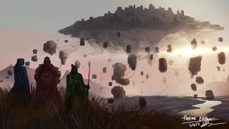
I'd love to get some feedback on this piece i'm working on.


Blog | CD Sketchbook | dA | Facebook |
|
Parax Orthean
|
|
03-15-2013, 12:19 PM
I'd love to get some feedback on this piece i'm working on.

Blog | CD Sketchbook | dA | Facebook |
03-15-2013, 04:06 PM
I like it but I have no idea what's going on.
03-15-2013, 05:42 PM
It's a really nice comp and the value scheme is good though the blocks could to with more variation to give move them around in the space more. The perspective of the mid ground and river doesn't seem to match the rest of the image and it's hard to tell what scale it is. Guess there should be some light accenting the figures and the foreground grass with that light source. Besides adding more detail and refining your shapes not sure there's much else to say
03-15-2013, 11:50 PM
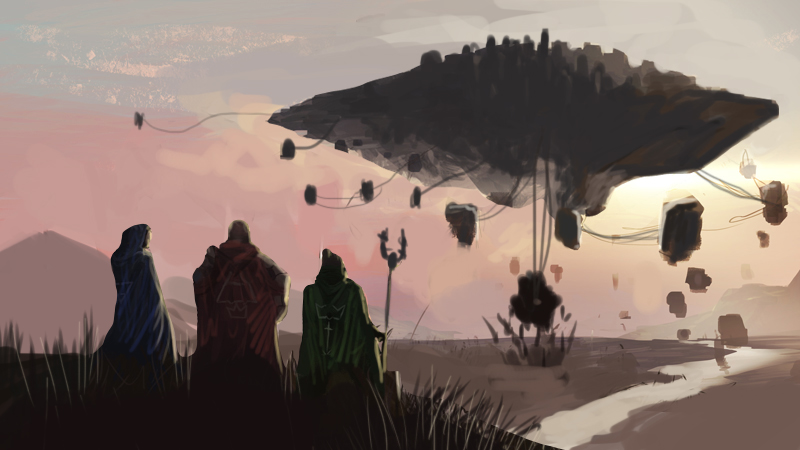
Thanks for the feedback so far. Here is an updated piece.
Feel free to paint over it if you see some glaring issues!
Blog | CD Sketchbook | dA | Facebook |
03-16-2013, 06:23 AM
Careful with those blocks that are close to the silhouette of the middle figure, they are competing with it a bit more than before. I guess you can fix it with more value separation between them though. How finished a render are you going for with this?
03-16-2013, 10:05 AM
Nice piece but I'm not sure about those circles infront of the figures. Is that some sort of lens flare effect? Their harsh geometry detracts from the image.
03-17-2013, 12:41 PM
Repositioned the elements a bit to fit into the rule of thirds.
Added some basic lighting gleaned from reference photos. You can watch my crit/paintover on my livestream channel. http://www.livestream.com/mciii  |
|
« Next Oldest | Next Newest »
|