12-01-2012, 04:19 PM
If you have any critiques, advice, or suggestions, please let me know.


|
Work by Jared Dennis
|
|
12-01-2012, 04:19 PM
If you have any critiques, advice, or suggestions, please let me know.
   
12-01-2012, 05:44 PM
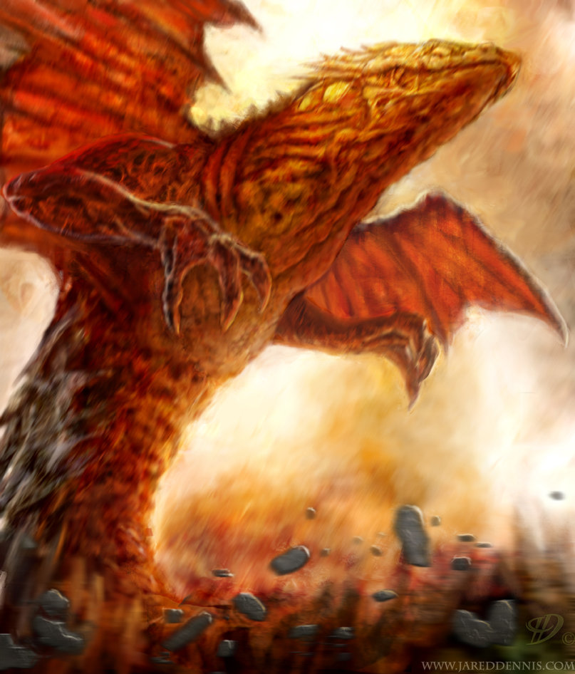
I like the motion in the first one.
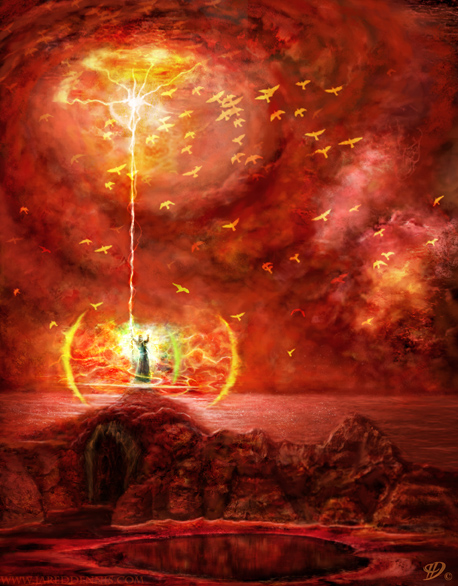
The second one looks like it needs more render work. The last two are way too saturated, though, they hurt my eyes.
12-02-2012, 03:25 AM
(12-01-2012, 05:44 PM)HallowedPhoenix Wrote: I like the motion in the first one. Hey thanks for the reply HallowedPhoenix, glad you liked the first one, and I will definitely take what you said into consideration, and try to fix the rendering and the over saturation problem. Thanks again.
12-02-2012, 03:45 AM
No problem.
Ideally, you want to use saturation as a means to draw the eye. For example in the third piece, saturating the area around the thunder and desaturating the areas closer to the borders draws the eye closer to the center of the piece.
12-04-2012, 12:37 AM
Hey HallowedPhoenix, let me know if these are any better, or if I need to do more. Thanks.
  |
|
« Next Oldest | Next Newest »
|