02-07-2012, 04:26 PM
I like the colors going on in this piece.
Finished should be cool.
good luck
Finished should be cool.
good luck
|
do overs
|
|
02-07-2012, 04:26 PM
I like the colors going on in this piece.
Finished should be cool. good luck
02-08-2012, 12:50 PM
^yeah this color palette has been fun.
I think I'm done with all the broad strokes. I'm going to double up the res. and really pick at the detail.
02-08-2012, 01:54 PM
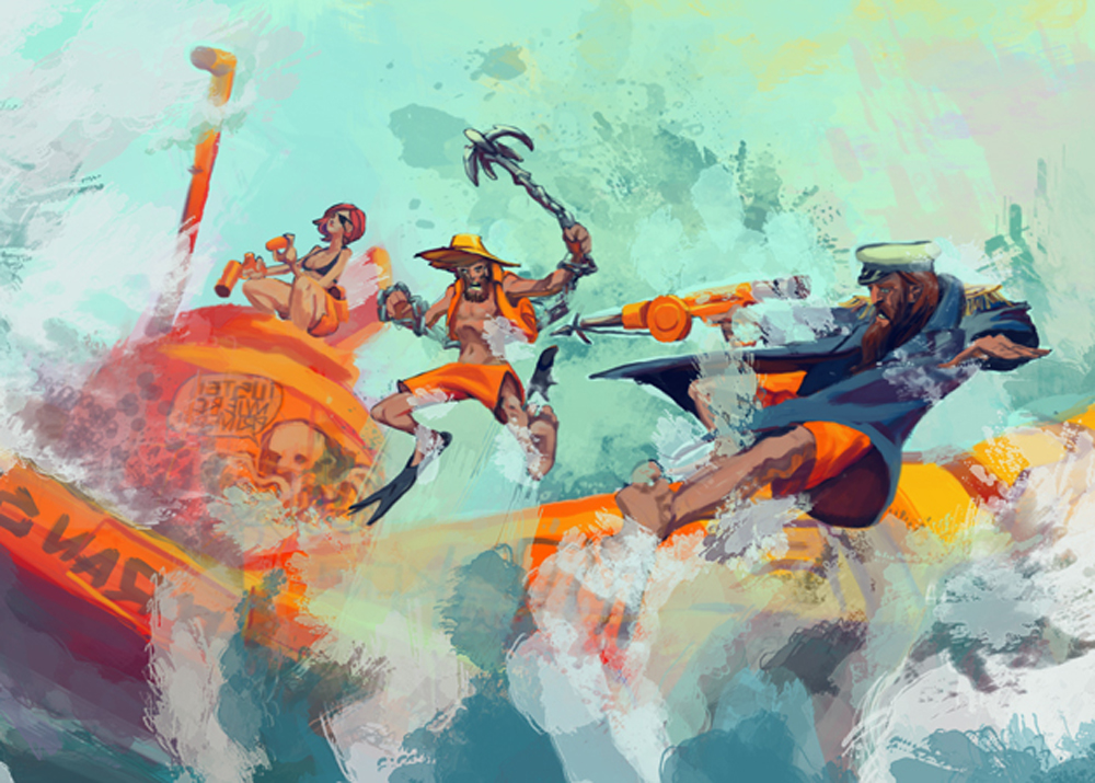
Gangster- Looking really rad with the colors! Something to chew on, would the image benefit by pulling in tighter on the view. Right now some of the space around them seems extraneous. And, are we still looking at a mutiny scene? Right now, at least to me, it reads as the two guys having an oh shit moment falling off. Again, really cool movement and color.
I know you originally had a closer view, so the pan out may have been a conscious decision. 
02-08-2012, 04:39 PM
Gawdammit Corey, you're right. I just wanted to show off the fancy submarine.
02-09-2012, 01:08 PM
Great work man! I saw a couple of your bloodsport submissions, I'm a fan. Keep pushin it.
In that last piece with the submarine, CoreyK is right that it looks better with the close up, because it focuses more on the characters and the image feels more balanced on all sides. In the zoomed out version you have all of the characters in the very middle of the composition and blank space all around it. The center has too much weight and the rest is kind of empty which makes for a less powerful image. There's still a lot you can do with that zoomed out version to make it work. You just have to figure out what you want to add to the other area's to help balance the entire composition. To me it looks like the main characters in the image are the two guys in a fight. The girl character almost seems unnecessary. You could add some atmospheric perspective on her so that the image really does focus on those two characters. You could even play around with the main characters' placement (maybe bring the guy in the blue jacket a bit up more) just to make things a bit more exciting or even by twisting the camera view a bit more. Anyway, just some thoughts. Great work!
02-09-2012, 04:34 PM
Yes, good suggestions Dennis. I noticed when I cropped it I lost some of the excitement. Exaggerating the dutch tilt really keeps that intensity. I'm definitely scaling up the captain. I have to redraw his legs anyways. The poses are practically mirrored. It looks too self conscious.
Personally I think the chick is key to the narrative. It shows that it's a team. I read something about writing for team comics and it said 3 characters are just enough to convey a team and not flood the dynamic. Plus she brings a calm neutrality to the conflict and could give the viewer a curiosity.
02-13-2012, 07:41 AM
I ams finished
![[Image: mutiny-hd.jpg]](http://i431.photobucket.com/albums/qq37/kirpid/mutiny-hd.jpg) I'll be doing bloodsport 6, so keep an eye out for me in the WIP thread
02-27-2012, 11:01 AM
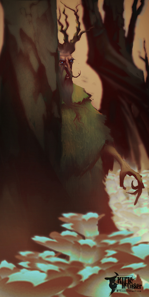
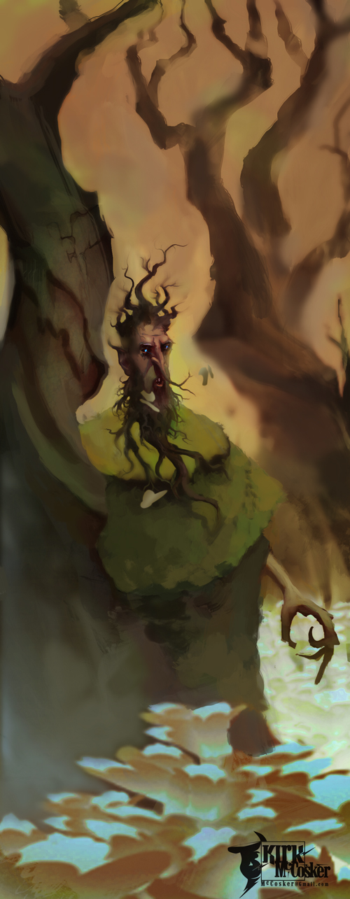
Here is the original swamp elder piece. This was my first bloodsport entry, I have learned allot since then, so I wanted to push it a little further.
 Here is a paintover Dan did for me. He made it go from cool to warm and really made the swamp feel more vibrant and alive.  I experimented with going the other direction, going from warm to cool making the swamp feel toxic an unwelcoming.  Next I'm going to go in the direction Dan went. Because his worked out to be more pleasing after all. |
|
« Next Oldest | Next Newest »
|