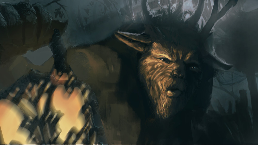
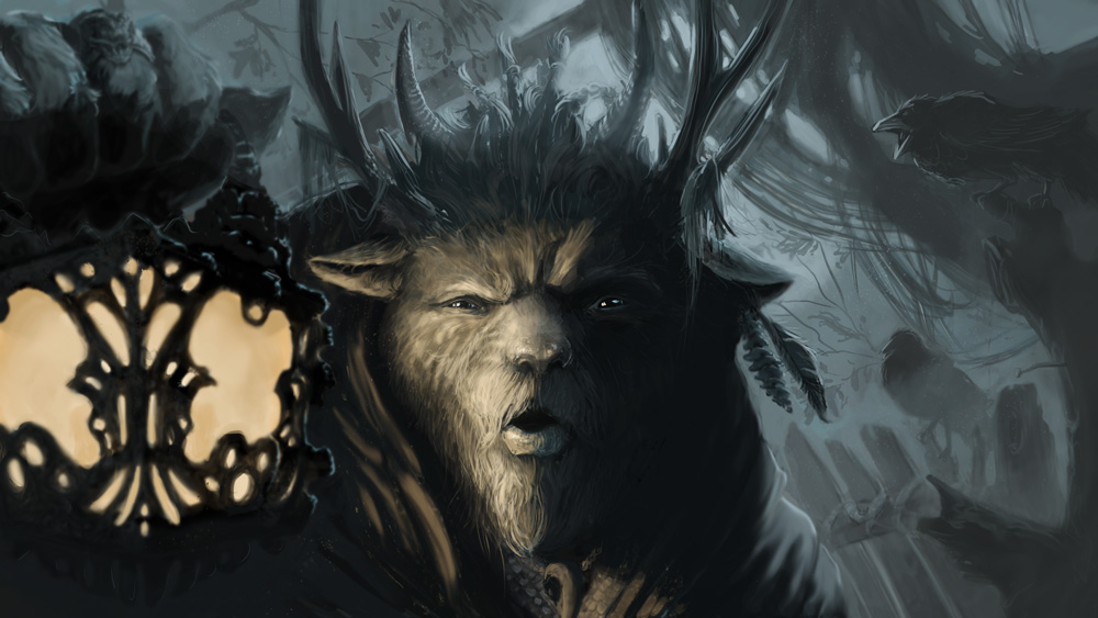
wip painting
#1


Here is a wip image i'm working on. I want to work it up to a fairly polished painting. Still in pretty early stages, so I'd like to get some feedback along the way. This started as an experiment in Alchemy, and I decided to turn it into kind of a creature/character portrait with a cinematic feel. I want him to be entering some sort of cavern dwelling where he's not sure what he'll find.

So how about the composition? I tried to set the character in the middle third and his lantern in the right third. I'm also no sure about lighting, if the light from the lantern is hitting in the right spots. Any other problems you guys see, let me know.

Thanks in advance!


Sketchbook  :::  Site

Reply
#2
Sweet! Your sketch style and design is pretty neat. One thing that stands out is the blotch of something in the top left corner, it feels like it's taking too much space on the canvas. You might consider removing the mass and giving this guy a walking stick, or just making that mass use up less space, or turning the mass into some hanging ropes that use less area. I'm excited to see the finished piece!
Reply
#3


Thanks, NRAG! I pushed the mass into the background. I feel like I need something of interest over there though, no? I am also a little worried about the lantern taking too much focus, being so contrasty.

Here's an update on this piece. Still a work in progress. Day job and other distractions are taking up so much time. Anyway, I think this is the most story telling I've done in a piece, and it's kind of evolved as I paint. The idea now is that maybe he's up to some shady business in the woods, some kind of dark ceremony or something like that, and he's just heard a sound in the woods, so he's investigating. I kind of want to add a character or creature sneaking up behind him behind that fence/barricade thing. Thoughts?


Sketchbook  :::  Site

Reply
#4
If you're worried about the lantern and the hand holding it being distracting, blur it a little, so it looks like being out of the depth of field. this would add some cinematic feel also :)

Reply
#5
veeeery nice! great to see the direction it's going in, and how you developed it from the original comp. the piece has a great mood to it and it is already telling a story. i really like the design of the horns, the hand, the lamp...

for CC, the two things that come to my mind are:
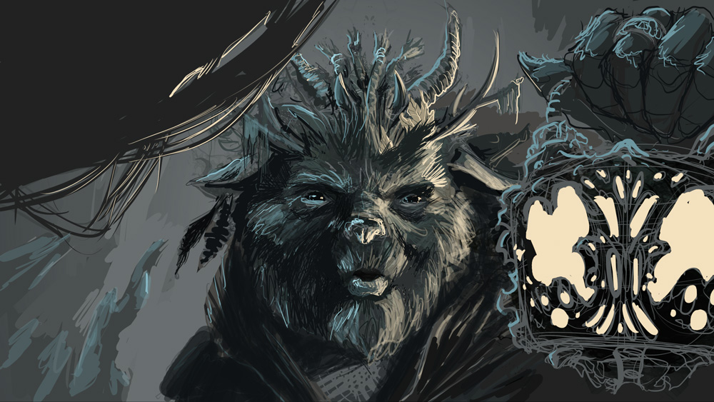
his nose-snout looks a little flat to me, have you thought about trying to get it to really stick out, to seem like a large volume going towards the viewer? perhaps he just isn't meant to have one, but either way, his face seems a little flat to me, which i think is down to it basically being split in half with two values, a dark side and a light side, but the distribution might have to change somewhat to bring the face out.

i really love his posture, and the shape/angle of his torso and robe. part of the depth thing i'm mentioning is a sense that the sense of perspective and form that starts with his body is somewhat lost with his head - perhaps this could be solved if his head wasn't facing the viewer straight on, if there was a slight angle to it. changing that would be a huge pain of course, but i'm just mentioning it anyway..

the last thing is that the bottom of the light-part of the lamp, compositionally, is a completely horizontal line, which kills some of the dyanism to me, and might look good with some more angled shapes?

ive tried a paintover to illustrate what i mean..


critiquing work is a tricky affair, i hope this was somehow helpful.
"If you want liberation in this life, there is no area that you do not watch. Watch the breathing, watch the posture, watch the flow of energy, watch the texture of the mind, watch the response to objects." - Namgyal Rinpoche
Reply
#6
Agree with previous comments. I'd add that the lantern takes up exactly the same amount of space as the face and creates this kind of boring horizontal block in the comp, and the face is smack in the middle of the canvas too. I did a quick paintover to move some things around. Hope its useful. Nice work so far btw...I love the feel of the image.


 YouTube free learnin! | DeviantArt | Old Folio | Insta
Reply
#7


Here's where it's at now. I totally agree about the lamp bottom, so I tried to fix that, and I also blurred the lamp and hand. I didn't want to go to all the trouble of turning his head, so I tried to really push the values in his face to make it pop out a little more, and I'll remember to do it the next time I paint a snout.

monkeybread, I like the pose you made in your paintover, I just didn't feel like it evoked the kind of tension I'm trying to get. He looks more menacing, like he's whirling on an enemy instead of peering into the darkness to assess a potential threat. I don't know that the face being in the middle bothers me. Someone else said the same thing, but I don't know why it's a bad thing. Just boring I guess?

I also ditched the idea of someone sneaking up behind him in favor of some birds to help bring the attention back to the main character.

I'm pretty happy with it at this point. What do you guys think?


Sketchbook  :::  Site

Reply
#8
I guess the composition just isn't very balanced the way you have it now. The lamp competes as a focal point with the face because they are on the same level and are the same size and value. Together they form a large wedge. The crow which is a secondary focal point is pretty much on this same horizontal line across the canvas. Yeah you're right it's not bad it's just not a very dynamic or exciting comp to look around and I guess lessens the impact of the image by being boring for the eye to move around. Maybe you could extend that branch at bottom right in the background so it extends out behind him and off the top left so at least there is a diagonal element in there. Diagonals are much stronger than horizontals compositionally.Of course the choice is yours to go which way you want, it is your work after all. :)

 YouTube free learnin! | DeviantArt | Old Folio | Insta
Reply


Forum Jump:


Users browsing this thread: 2 Guest(s)