Posts: 342
Threads: 37
Joined: Jan 2013
Reputation:
13
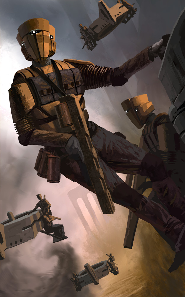
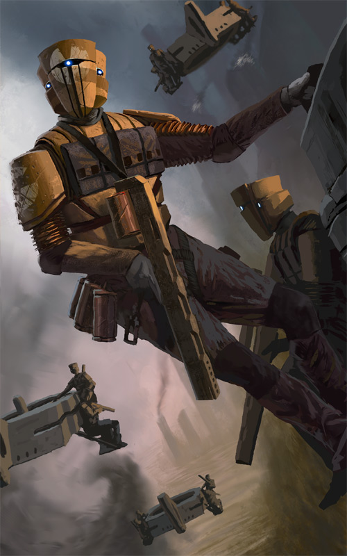
Im not as good an artist as you, but the one thing I think you could push is the atmospheric perspective- the contrast has decreased further back but it seems a fairly similar value to the forefront craft. Also, perhaps you could push the sense of weight hanging off with the characters? I know its a bummer to change it after rendering, so perhaps just make the distant soldiers hang off the craft a bit more, perhaps have their guns hanging loosely with their arm to give a sense of weight?
Just a few ideas :D (hopefully i earn a high five? knuckle bump? no?.... ok....)
Posts: 1,970
Threads: 22
Joined: Apr 2012
Reputation:
243
Ooh me likey....couple of things...sorry gotta be real quick so feel free to ask for clarification.
Highlights and materials: hit the main dude with some highlights, and use them to showcase differences in materials and specular/ reflective quality of the various materials. It's all a bit matte at the moment.
Lighting. Got a really nice sunset vibe going with the main lighting, but this is reduced in impact because of the quite intense backlighting. I'd try flipping the dominance and pushing the warm main and downplaying the cool rear light a tad and see what happens.
More detail needed and texture work needed in some areas...like the main guys pants, gun, etc. Fabric folds are looking a bit stiff and iffy.
Some of the posing of the various figures could be a bit better weighted in action...the way the main guy holds his gun looks pretty awkward for that hand...maybe show more of the grip, have the wrist angle less acute.
Top flier is a tad tangential...praps move it further off screen or further into the image and even behind the dude to make more use of overlap and sense od depth..??
Use atmo perspective more.; to push back the other fliers and add depth, add separation between the gun arm and body etc. I actually prefer the tall towers at the top of the first image than the shorter ones in the second.
That probably covers it. Nice comp and design work....add those details and push the lighting and materials.
Highfives all around, thanks guys!


