Posts: 20
Threads: 6
Joined: Mar 2013
Reputation:
1
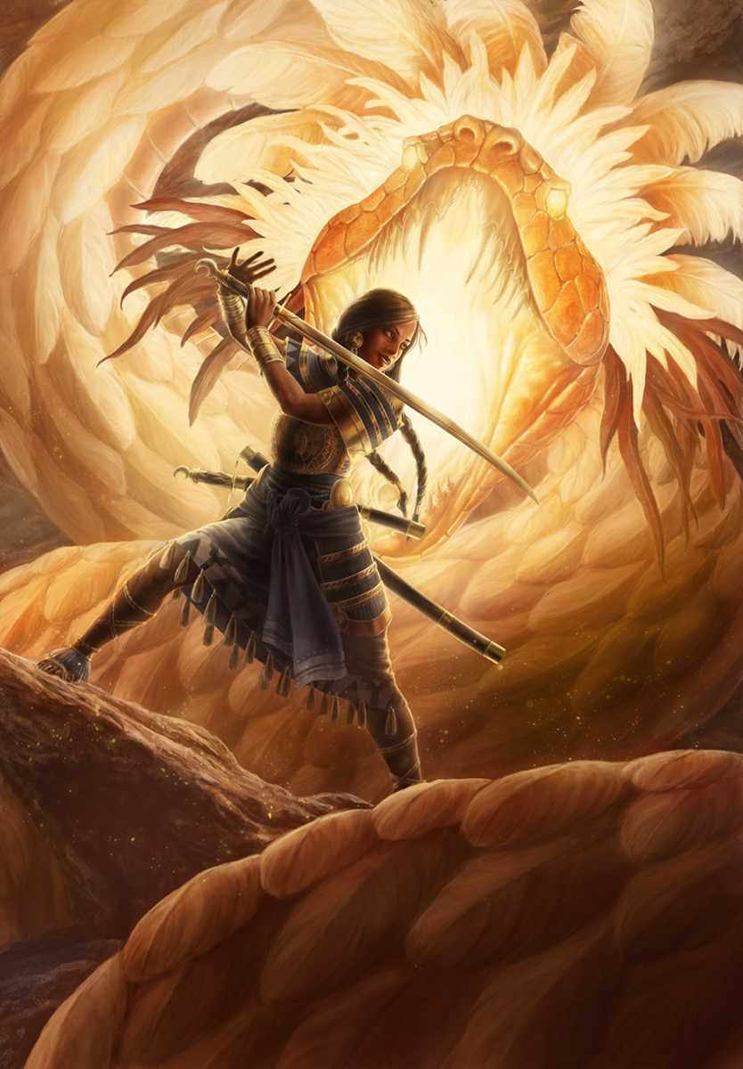
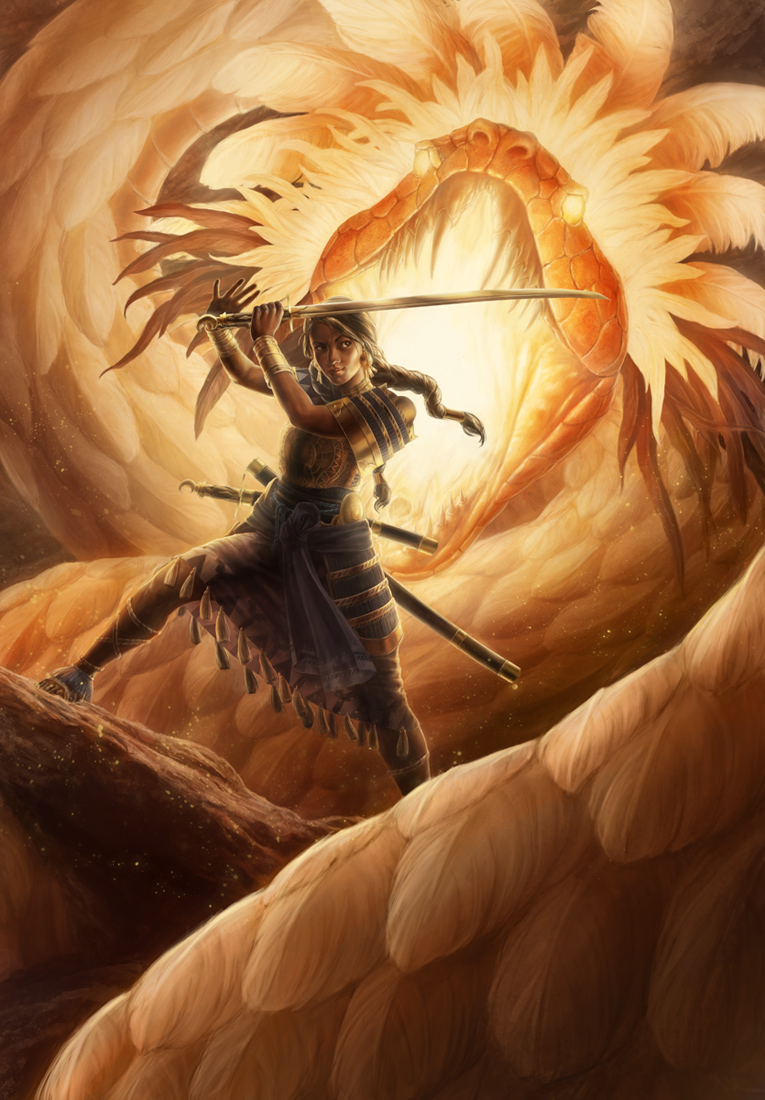
Here's a piece I'm close to finishing, and I'd like to know what everyone thinks.
I went with a mix of a samurai and pre-columbian warrior fighting a feathered serpent in a cavernous location, with light emanating from the snake's mouth and throat, and parts of the rest of his body glowing.
I wanted to go with a different lighting scheme for this piece, with most of the light coming from behind the main character and creating the focal point with the resulting dark contrast. Did I succeed in making the focal point the figure? I know there's a lot of detail on the snake, so I wanted to make sure it wasn't distracting from the main figure. Also, what does everyone think of the feathers along the snake's body? Do they look like feathers enough? They're arranged like scales would be on a snake rather than how they actually would be on a bird, so I was wondering whether or not they would be mistaken for badly drawn scales. Is there a good balance of detail in them?

Posts: 340
Threads: 10
Joined: May 2013
Reputation:
23
The details looks really awesome, armor design is great, and I think feathers looks feathery enough.
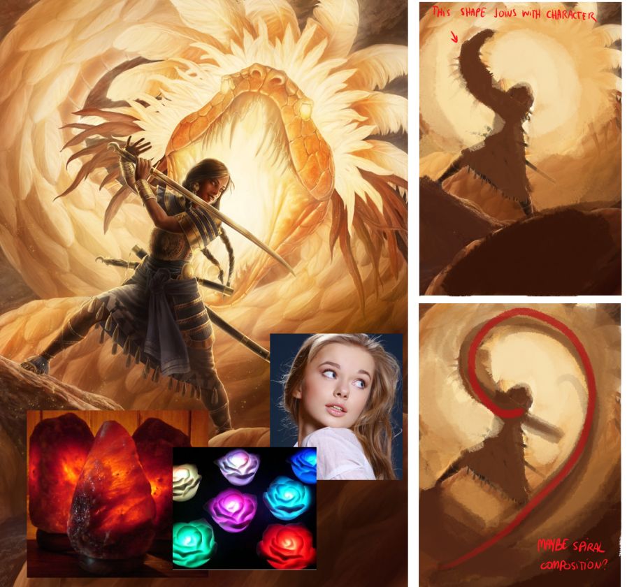
I don't kind of see exactly how the serpent is glowing, it's not readable for me. Overall to show the glow I would make stronger contrast. Also remember what is light doing with translucent surfaces, color close to the lighten edge is more saturated. Check references like glowing toys and lamps how saturated they are. I would also use halo effect common in sunset photos http://www.merlinstudios.co.uk/files/red...ngle12.jpg Sun is so hot that camera can't distinguish exact color of horizon so make it lighter around sun. She could besides reflections on face and arm have lighter spot here. The fragment of the skirt behind her is in light and should be passing light through. The first plan could be in shape that would guide eyes to the serpent head. Her face expression doesn't suggest that she struggle in battle and she doesn't look behind here (she's just looking to the right) her eyes should be open wider like in reference

I tried to push it much further so you can decide how far you can go with it :D In my personal opinion I don't feel the danger of the battle, also the girl armor is so detailed and serpent head is so interesting too that I would made both bigger instead of filling empty spaces with not so interesting background.

Posts: 1,970
Threads: 22
Joined: Apr 2012
Reputation:
243
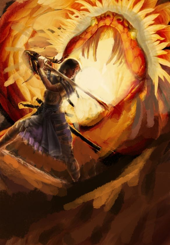
Hey bro...love the character work. Really crisp, nice design and pose. I think the composition is fine as it is but you can really play with value to accentuate the form and depth of the snake to drive it further. Tried to show with some basic shadowing how that might work. Also tweaked the colours and saturation a bit to bring the focus into where it should be more as your values were pretty light overall. Tried to push the idea of warm vs cold a bit more as well.
Think the feathers behind the girls hands are competing quite a bit so maybe do something about that but in general I think just getting those values, colour temperature and focal points will really help this pic without needing to rejig comp or anything pretty major. :)
A thing though that is a bit odd when it comes to narrative is the girl is facing totally away from the creature that is about to eat her head, and she's smiling about it! Doesn't work.

Posts: 20
Threads: 6
Joined: Mar 2013
Reputation:
1
Thanks for the replies everyone. As for the narrative I suppose I was going for more of an iconic kind of pose/composition rather than strictly following a story. What I had in mind originally is like the snake is moving around the figure, who is standing in a ready stance, and it popped up right behind her. She's taking a glance at the snake right before she turns and starts fighting it, and she's smiling because she has confidence in her fighting abilities. I think there's more I could do to make it look like the snake is moving- perhaps blurring/blending parts of the snake in the foreground?
Michael Syrigos
Unregistered
OK, I'm gonna be a real bastard with this, a total son of a bitch, but it serves a purpose, before theat though, I'm gonna say that the suggestions made were good, but also of a particular aesthetic, meaning that your illustration, as is, works great. Whether it needs more saturation, darker values for the character, simulation of subsurface scattering and translucency and all that mush, is totally an aesthetic choice, if this piece packed more punch nobody would give a shit, cause nobody would notice...how many people do you see critiquing Frazetta's Conan pieces and say that they need more so-and-so....exactly, zero, because the images hit you so hard in the balls that you don't care, you don't even notice.
Now on to what I have to say... I hate it...I think you took a classic narrative, threw it in the toilet and flushed it... Technically, it's great, there's awesome craftsmanship there, you render and draw everything nicely, how ever, that's all it is, a nicely done, technical painting, that could have as well been a painting of a brick wall.
Now why am I being such an asshole? Why don't I like it? Simple, you have technical competence, yet no confidence at all. You've gotten caught up in a detail, form dance and show no image-making prowess. The questions you ask for us to answer, show your goals, but not much understanding of what would make the image and why. So let's get to answering those questions first.
Did you succeed in making the character the center of attention? Yes. The matter of the fact is that, we will all look at a human face before anything else. Check James Gurneys' blog, Gurney Journey, in the composition section, look for the Eye Tracking articles and you'll find out that we subconsciously scan an image for a face and focus on that mostly. Making groups of faces together helps organize the chaos and makes for better aesthetics. You have only one face, smack in the center of our field of view, even a blind person wouldn't miss it. Also, large bright mass, mall dark mass in it's center...there's huge contrast of tone, sharp edges, saturation is close so doesn't make or break anything, but yea, you have a great center of interest there.
The feathers and such...OK, that's a big part of your problem. I am thinking you got caught up into the problem of making the feathers that you got carried out of making a compelling painting. First off the feathers may look "feathery" because they have that center-line and those oblique lines describing their feathery parts, but that's not important. Am major "mistake" you made was that, for some reason you rendered them as if the angle between the two major planes created by the center-line is 10-20 degrees or something...well, feathers are generally quite flat, and even those that have a angle difference along the center-line, have a smaller difference than that you have stated. Also (and this is a major problem), all the feathers look to perfectly arrayed. Now, I know you wanted to make them look like snake skin scales, however, snake skin looks more like a smooth uniform surface, with the scales places in like decorative tiles, with little affect to the general mass most of the times. The problem with using feathers, is that the usual randomness and elasticity associated with feathers is lacking. You should study some feathers on birds to see how they look arrayed, are closely knit together, yet for a smooth large surface and had deformations that flow along the body, like cloth. Also, edges, softer edges!!! Those feathers closer to the view are dreadful, they distract so much and are done badly, like it was a boring, dreary task (it would have been for me). My point is, look for more that the single feather.
Now the character. It's nice, if the character were posing in front of a mirror, for a gang of kids, or the circus. You can clearly see all her armor, drapery, hair and nicely made up face. What you cannot see is a character in front of a large fire breathing, feathered snake.
She looks posed, waiting for the photographer to take the snapshot. The drapery is static (save the sash a bit), those little things hanging from her shirt are looking down with a religious zeal, even her braids look like they have a coil of metal in them to keep them there. Her face, with that cutey smile doesn't convey anything other than random kindness or idiocy, both deadly when you're holding a sword.
Now, after all that, on to what the image lacks and should have. It should have context. I can't tell what's going on, what has been going on, or what may or will happen. The image gives me no notion of a fight having taken place, taking place or that is will take place. All I see is two characters (snake and girl) in their sunday clothes saying "cheese" for you to render them. I don't see any movement from the snake. Is he moving, is he retreating, charging, assessing the situation? The girl's even worse. She doesn't look confident, she looks like she's looking at something else. She doesn't look determined to overcome the obastacle on her ass, rather she looks like she's about to put some bread in the oven. There's no twist, no movement, no suspense no nothing. Now, I understand you wanted to have her show "confidence", but there's ways confidence is shown in different situations. A girl walking along the cafeteria, shaking her ass, smiling with glee at everyone, feeling fine and tasty, is a way to convey confidence about her look and sex appeal in such a setting. That, doesn't work here. I know there's a lot of rhetoric and brainwashing going on by some people who are oversensitive about realistic armor, women not having to wear chainmail bikinis' etc, but you can't sterilize and feminize everything. In battle, like it or not, confidence is shown by those who look ready to rip out and eat their own guts and ask for seconds. A barely moving, overly armored dancer doesn't convey much confidence.
What you should do.
First, reorganize the snake, make it's body drive the flow of the composition, if you're gonna chop the picture plane up in pieces with the body, then use light and shade to compose a unified pattern that spirals from down, up to the character, that stays there for a while, and then moves out of the picture. Right now, you have lines moving from one edge to another.
Second, motion. Make the snake look like it's moving. How? Edges! Blur them, The body to make it move, the face to make it look like it's charging, hissing or whatever. Blur your edges to suggest movement, use the longer feathers the suggest movement as well, otherwise, they are just palm tree leaves.
Last a most important. Make the girl look like she's doing something. The "getting ready to fight" takes skill, because you have to think up what "getting ready to act" means. Make her twist in surprise, raise her weapon with vengeance, ready to strike, etc, anything. Make her facial expression follow that, no just a blank "smile". Make the hair move, the clothing mover.
Sorry for the length, the mistakes and the harsh tone, I'm half asleep but I wanted to crit you on this because it shows signs of a great artist, but needs a direction, not just a technical exercise.
Posts: 112
Threads: 5
Joined: Mar 2013
Reputation:
6
I think the rendering is lovely, but I agree that she looks like she's just standing there happily. Her braids are moving but not her sash or the tassels on her costume and her face doesn't show any anger or resolve. To make it seem like she's attacking, you could lift her right foot off the ground like she's propelling herself forward and bend her right knee some. That and moving sash and tassels should do the trick. Furrow her brows.
I don't have a problem with the composition or the snake, I think they look good.
Posts: 20
Threads: 6
Joined: Mar 2013
Reputation:
1
Yeah I suppose I made her look more content than confident. Seems like the thing most people are having problems with is the figure's pose, I'll have to go back and rework that some.
Posts: 20
Threads: 6
Joined: Mar 2013
Reputation:
1
Okay, here are some revisions I made to the figure's head and face, since that seemed to be what people had problems with the most. I understand I might end up having to change more of the pose than simply the head, but I wanted to see what effects people thought these small changes made to the illustration, before I possibly go in and make more significant alterations.
I still plan on following many of the other suggestions people have made here. In addition to changing the character's expression to a more serious look I also am going to blur/blend parts of the snake's body in the foreground to make it look more like it's moving.
Also, what do people think of the sword higher in the air, as in the first revision shown here? Does it disrupt the flow of the composition any, or does it look a little less forced?

Posts: 280
Threads: 11
Joined: Mar 2013
Reputation:
4
I think the sword higher works fine, but isn't necessary. Her face is more important.
I'm partial to C, but I think you should avoid the last two, simply because she's no longer acknowledging the giant snake, and not in a cool way, which I think was the problem the first time.
Having her in a combative pose and at the same time not seeming to acknowledge the giant snake with it's mouth wide open behind her makes her look completely unaware, as opposed to having a badass nonchalant attitude about the monster. If you were going for that, she wouldn't even bother to get in a combative position. Think Dante from the Devil May Cry series.
Instead of being cool, it just appears something off screen is more important to fight, but we'll never find out what that is.
I think that having a combative pose, and having it clear that she's aware of the snake (bonus cool points for not facing the enemy, but it must be 100% clear she knows it's there), then combined with a confident expression is all that you need to make the character cool and badass enough in a more subdued way than the over-the-top example I posted, and will work perfectly fine.
Outside of that issue, the rendering is lovely. But I agree with Madzia about tweaking the composition a bit.
Posts: 20
Threads: 6
Joined: Mar 2013
Reputation:
1
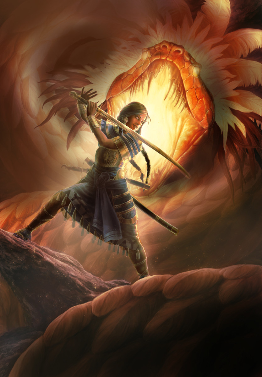
Here is what I have currently. Hopefully it's more clear that the figure is aware the snake is there, but isn't looking at it because she's cool/being badass. I furrowed her brows a bit more and changed her sort of content, peaceful smile to more of a confident one, so hopefully it reads a little better. I ended up raising the sword into the air because, once I turned her head, it looked like she was playing it like a flute. I made some other value changes to the snake to make it glow a little better and give the composition more contrast over all.
I appreciate everyone's help so far.

|
