09-02-2013, 01:33 PM
Hi all, I'm making this thread based on Josef Albers book on the interaction of color. I want to learn how to design and use color, I am no long willing to have color be a tool that I do not understand how to use. I wanted to make a thread that people could jump in on if they wanted to join me in learning what color really is.
My only credential for running this challenge is that I've read Albers book front to back. I am by no means an expert on this stuff.
the idea
I will explain the theory behind every chapter weekly. The book has been broken into different ways color interacts with other colors and the effect that has.
This ranges from color relativity, to transparency, and so much more.
I will add a list of what we will be experimenting with shortly
the challenge
First you will experiment with color theory in the model Albers suggest this means that the studies will be blocks of color on top of other color and we are not worrying about the subject.
After getting the grasp of what Albers is trying to explain apply that aspect of color interaction into a practical study with a subject. This could be a still life, imagination sketch anything, what's important is that we learn and understand color interaction. It's is like a boarder check, before you move on you should make sure that you can apply what you think you know.
When doing this second part always keep in mind what the practical uses of the theory we had just covered. Experiment, try and use it in as many ways as you can think of.
The minimum requirement for the challenge will be one study of each kind
1 theory study
1 applied study
There is no limit on how much you can do, obviously do as much as you need.
Week 1: Color Relativity
"imagine in front of us 3 pots containing water, from left to right:
Warm Lukewarm Cold
When the hands are dipped first into the outer containers, on feels - experiences - perceives- 2 different temperatures:
Warm (at left) (at right) Cold
Then dipping both hands into the middle container one perceives again 2 different temperatures this time however in reversed order
(at left) Cold (at right) Warm
Though the water is neither of these temperatures, but of another namely
Lukewarm."
Color is the most relative medium in art.
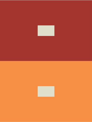
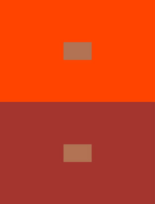
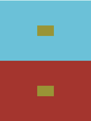
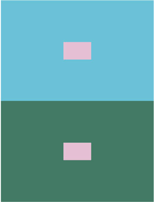
Color has many faces, the same color can be seen as warm or cold, based on the other colors around that color.
Theory study this week:
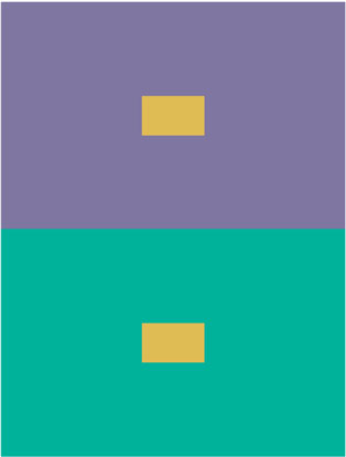
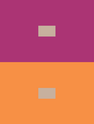
Create a study of 2 small rectangles of the same color and same size on large grounds of very different color.
DO NOT do this for the exercise
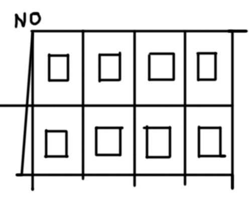
There are simply to many colors around one another for the effect to take place
DO this
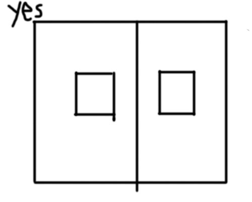
Along with your studies write your thoughts on these studies and what you have learned about the ways colors are relative to one another.
My only credential for running this challenge is that I've read Albers book front to back. I am by no means an expert on this stuff.
the idea
I will explain the theory behind every chapter weekly. The book has been broken into different ways color interacts with other colors and the effect that has.
This ranges from color relativity, to transparency, and so much more.
I will add a list of what we will be experimenting with shortly
the challenge
First you will experiment with color theory in the model Albers suggest this means that the studies will be blocks of color on top of other color and we are not worrying about the subject.
After getting the grasp of what Albers is trying to explain apply that aspect of color interaction into a practical study with a subject. This could be a still life, imagination sketch anything, what's important is that we learn and understand color interaction. It's is like a boarder check, before you move on you should make sure that you can apply what you think you know.
When doing this second part always keep in mind what the practical uses of the theory we had just covered. Experiment, try and use it in as many ways as you can think of.
The minimum requirement for the challenge will be one study of each kind
1 theory study
1 applied study
There is no limit on how much you can do, obviously do as much as you need.
Week 1: Color Relativity
"imagine in front of us 3 pots containing water, from left to right:
Warm Lukewarm Cold
When the hands are dipped first into the outer containers, on feels - experiences - perceives- 2 different temperatures:
Warm (at left) (at right) Cold
Then dipping both hands into the middle container one perceives again 2 different temperatures this time however in reversed order
(at left) Cold (at right) Warm
Though the water is neither of these temperatures, but of another namely
Lukewarm."
Color is the most relative medium in art.
Color has many faces, the same color can be seen as warm or cold, based on the other colors around that color.
Theory study this week:
Create a study of 2 small rectangles of the same color and same size on large grounds of very different color.
DO NOT do this for the exercise

There are simply to many colors around one another for the effect to take place
DO this

Along with your studies write your thoughts on these studies and what you have learned about the ways colors are relative to one another.


