08-07-2013, 07:00 AM
Hello, Everyone! I'm going to start posting some stuff on here from now on! I feel like I've been living alone with my studies and all that for too long now, and I'm starting to think I need practice when it comes to actually showing my stuff off..
I keep telling myself how I'm going to post " that next better picture " but it never actually happens, and I keep asking myself why I haven't become a part of this great community yet. So here I go, from now on I'll start posting!
I greatly appreciate any crits and/or tips! Please leave a comment! :)

I'm just now learning how to post here! So please tell me if I'm doing something wrong!
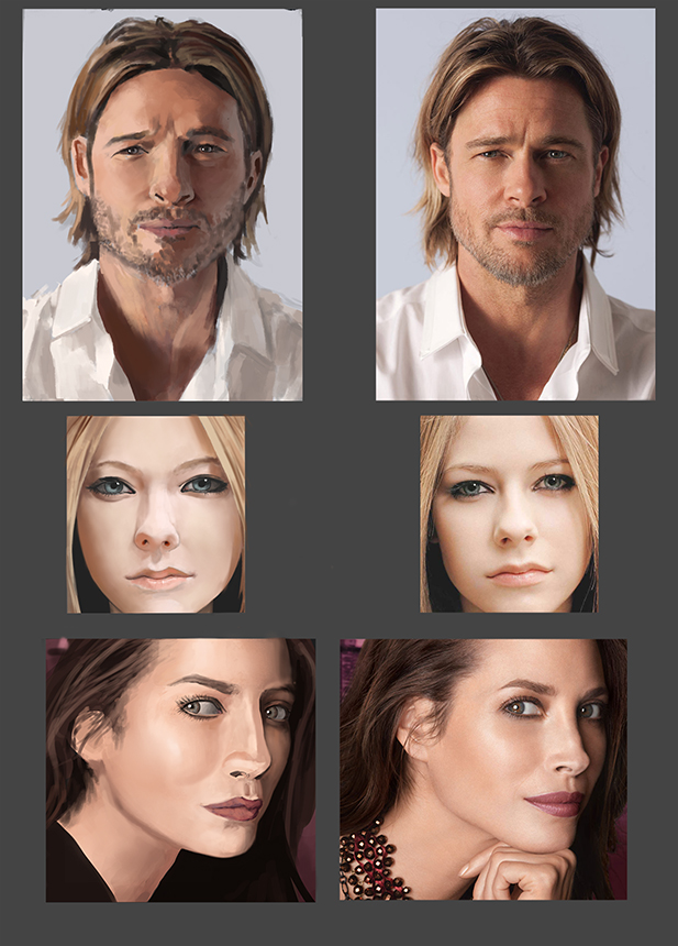
Here is a study I did two days ago! I recently started practicing drawing faces, I did lots of pencil sketches and I then decided to try and actually render a face to completion. I didn't reference any specific face for this, but I did look at lots of different images, both from different artists to see how they did it and my own face to see how the light might fall.
I wasnt primarily focused on the anatomy of the face for this painting, its just a simple straight forward view with lighting from the side. I think i'll paint future face-studies on a darker background. Mouth especially gave me trouble on this..
Crits are very welcome! On the lighting/rendering and also on the overall anatomy! I'd like to give the skin some more texture in the future!
Here are two self-portraits I did from my webcam after the study I just posted, the first one is a very quick one doing a silly face in a 3/4 view. studying how the face/lips/eyes move and how the light might fall on it.
The second picture is a longer study of my own face tilting my face up slightly... Its a hard angle for me getting the jaw like that, and the eyes were really hard too ( i had a hard time not making my eyes look asian )
Both pictures started with me looking at myself through the webcam window, although i finished the second one with a screenshot because i didnt feel like holding the pose anymore. I think I'll get myself a mirror to do these studies in the future, because the webcam kinda simplifies the values.
I had a really hard time doing the eyes on the second one, tilting my head up slightly and looking down made my eyes squint, and I dont know if i've ever drawn a squint from a below-angle before.
Once again I'd love tips on how to give the skin some more texture, I feel like i have to strike a balance in making the skin look too texture-ish and monster-like and too smooth. i'd like to be able to draw somewhat smooth human skin with some texture, now i'm definately painting it too smooth.
Crits are very appreciated!
I keep telling myself how I'm going to post " that next better picture " but it never actually happens, and I keep asking myself why I haven't become a part of this great community yet. So here I go, from now on I'll start posting!
I greatly appreciate any crits and/or tips! Please leave a comment! :)

I'm just now learning how to post here! So please tell me if I'm doing something wrong!
Here is a study I did two days ago! I recently started practicing drawing faces, I did lots of pencil sketches and I then decided to try and actually render a face to completion. I didn't reference any specific face for this, but I did look at lots of different images, both from different artists to see how they did it and my own face to see how the light might fall.
I wasnt primarily focused on the anatomy of the face for this painting, its just a simple straight forward view with lighting from the side. I think i'll paint future face-studies on a darker background. Mouth especially gave me trouble on this..
Crits are very welcome! On the lighting/rendering and also on the overall anatomy! I'd like to give the skin some more texture in the future!
Here are two self-portraits I did from my webcam after the study I just posted, the first one is a very quick one doing a silly face in a 3/4 view. studying how the face/lips/eyes move and how the light might fall on it.
The second picture is a longer study of my own face tilting my face up slightly... Its a hard angle for me getting the jaw like that, and the eyes were really hard too ( i had a hard time not making my eyes look asian )
Both pictures started with me looking at myself through the webcam window, although i finished the second one with a screenshot because i didnt feel like holding the pose anymore. I think I'll get myself a mirror to do these studies in the future, because the webcam kinda simplifies the values.
I had a really hard time doing the eyes on the second one, tilting my head up slightly and looking down made my eyes squint, and I dont know if i've ever drawn a squint from a below-angle before.
Once again I'd love tips on how to give the skin some more texture, I feel like i have to strike a balance in making the skin look too texture-ish and monster-like and too smooth. i'd like to be able to draw somewhat smooth human skin with some texture, now i'm definately painting it too smooth.
Crits are very appreciated!


