anime painting requires critique
#1
Hi everyone,
I have recently started digital painting.Aim to create a stylized anime paint.
But I feel lighting fall short in the below image. feel I need some cris before i continue.
[Image: manga_water.jpg][/url]
Reply
#2
The disjoint in action between the front character and the back character is a little bit confusing, the front character is focused and active while the back character is relaxed and then you have the soldiers in the back with guns raised. I'm not sure whose on what side or whats going on. The choice of two spears is also really confusing as its an incredibly unwieldy weapon combination. The hair is also a bit troll dollish and odd, but that's probably because it isn't finished.
Reply
#3
yeah i sort of just went for the painting without thinking too much. This is basically one scene of the story i m going to create. the bg characters are basically holding off an attack, as the front character is going to do a 1 on 1 duel.

The hair is supposed to be blueish water elemental hair, I m just lack off skills to take it to the clear level.

Thanks for the comment.
Reply
#4
First off, the background and colours look great. Really good job on those.

Looking at your last response, if you want it to be water elemental ish you may want to make it semi transparent. Reference is your friend. http://images3.wikia.nocookie.net/__cb20...s_body.jpg kind of a sus pic.. but its the only one that wasnt some bikini hentai fan pic -__-
See how you can see Gray's shirt through the water, something like that might be cool on the hair, where you can atleast see the skill slightly.

Also depending on how much you want to change it, if you have her climbing over something in the foreground itll look more like she is going somewhere, as opposed to being somewhat vague about her purpose.

Looks like a good pic though, will be good when it is done. Keep it up :)

http://images3.wikia.nocookie.net/__cb20...ation_.jpg

much better ref pic, showing the background through the hair a little would probably look better, since seeing the cranium might be a little weird...

Reply
#5
Hey showntian,

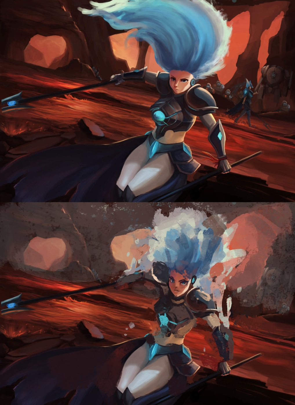
I did a quick paintover of your image to better illustrate my ideas for your piece.

First of I added some atmospheric perspective this will reduce the contrast on the background and give the illusion of depth. It also makes your character more of a focal point.

Second thing was to reduce the saturation of the background and increase it a little on the character. Again this will draw the eye to the focal point.

Third was to change the light source on the main character. you have a strong rim light that seemed to come from directly behind yet we cant see the source. It was a little inconsistent in places also. I tried to use the direction that you had hinted at on the legs. This could be a spot light from above showing the importance of the fight about to take place.

The last thing was to adjust the background character making him/her face the action. Having him face of the page dosnt serve the painting very well. We tend to look where other people are looking and if he/she looks at the action we will to.

Oh last last thing :) making the ground a little more broken up with rocks.

Over all I think its going to be a great piece, my main point would be the contrast. Make the character more of the focal point with colour and value tricks. I hope this helps :)

Cheers
Adam

[Image: showntian.jpg]
Reply
#6
@adam-brown said already many good things. I would also mention to correct the anatomy of the girl especially the head and face. You would see underside of her nose only if her face would be bend back when I think you drawn it directed down. Because of this also her ear (?) should be higher. Armor design is nice but it's not drawn correctly in perspective and her boobs are really squished in it due to that. The left shoulder should be pushed back more and higher so she would not looks like she is hiding her head between her shoulders. With this red dessert environment you will have more orange shadow on her because of reflected light.
You can make her hair looks like a water element by drawing them like a water splash with floating small drops, just remember that water is transparent and will show some colors of the background through. And for composition sake I would not draw her hair touching frame edge.
Good luck and keep going! Cheers


Reply
#7
Thank you everyone, this is exactly why i need to be on this forum. Immediately a lot of the main problems seem oblivious to me now become clear.

Adamm I really agree with you about the contrast, I think u have indicated a good lighting solution for me. Yeah now the armor looks much more realistic already.

to madzia, yeah anatomy is sth i seriously need a lot of practice on. I have been doing a lot of pose drawings and life drawings. Feels like may b I should redraw the body and armor, I will try again.

Cheers.
Reply
#8
Glad I could help :) keep up the good work showntian.
Reply


Forum Jump:


Users browsing this thread: 3 Guest(s)