Hey daggers, um, trying something a little different here. Not sure if this is the right place, but I'll just toss it here for now.
I'm doing CGhub's New World's challenge. The theme this time is Treetop Highway. So what I was thinking is - I'll post up my progress of the image, showing the whole process from thumbnail to sketch to final. And along the way maybe you guys could give me some critiques and advice. I'll do some self-critique as well.
The reason why I'm doing this whole process thing is so that you guys can help me spot mistakes before I spend too much time on it. And also you can let me know if the workflow I'm using is too clumsy or inefficient or if you have better ways to approach it, etc.
So yeah, let's get started! The deadline's on 8th Nov, which is 6 days from now. Gonna work on it for a couple of hours a day until the deadline.
Here's what I have so far! Just sketching to figure out a good composition, and trying to keep as close to the theme as I can. I started with some comps drawn with a pencil and then slowly building up details in photoshop.
I'm kind of happy with the sketch I have so far. Now I'm wondering if I should do a cleaner linework, or just dive straight into painting.
You've made a great start. Some good progress with your sketch; I like how you've made the main boardwalk a winding path. I agree with your crits, but don't feel you've fully addressed the 'highway enough' and 'focal point' items.
You've lost a bit of the spontaneity and character of your original thumbnail, which is normal as ideas get watered down when they're refined and conformed. I think you could reintroduce some of that, as well as address the two aforementioned crit items, by bringing back the simple silhouettes of people using the highway path. Eg. I depict a character lugging a carriage of goods from the larger mass in your first thumb.
A highway is used as the quickest path for transportation from one place to another. I think this narrative element is the big 'sell' of the painting, and this could become the focal point. You could play up the idea that they use this main road for commerce, like it's central to their livelihood, trading from one treetop village to another.
The figures would give the painting a sense of scale too; maybe the main path is wider than the other winding ones in the foreground/background, as it's always the busiest? Perhaps you could suggest some figures in the foreground/background paths, like kids hanging close to the edge, gawking and pointing at the scene? This might help to lead the eye in with their pointing, and give some purpose to your foreground element (other than just having it there to break up the composition with layering). This also differentiates them from the main highway, as they may serve a different purpose like they're local paths used by residents.
It's a pretty short window for the deadline, so I think you should jump into painting. Just be selective about where you further refine and cleanup your linework, focussing on areas where you feel design needs to be articulated. Save your effort for the main highway; You'll be able to get away with less detail in the foreground and background as I see in your value study that you'll able to suggest and hide details with atmospheric fog/ the dark silhouette of the foreground.
I'm a bit wary about how busy your scene is starting to get. At the moment my eyes don't really know where to focus or where to rest. I can't really say for sure till you start blocking in values, but I've taken a look at your other artwork (which is great by the way) and I'm confident you'll be able to resolve this as you start painting. Maybe you could have the trees below the main path recede further into fog, like a mist that lingers at ground level in a dense forest. This will also help play up the idea that it's up in the treetops, with some altitude from the ground.
I realise that adding in silhouettes of figures seems counter-intuitive to simplifying the scene, but it's just re-purposing detail to create a proper focal point, which in turn will help curb the problem of my eyes not knowing where to look and where it can rest.
Anyway, hope this made sense, and hopefully it helps. I look forward to seeing how this progresses.
Newcalibre - Holy shit, thank you for such taking a time to write such a detailed crit man. I really appreciate it!
Great advice! I had a lot of similar ideas as well - especially the idea of the highway being sort of a trade route. I guess I got kind of scared to put all the people and traffic into the environment because it's kind of outside my comfort zone, I never really placed people in my environments much, and the perspective I was working on here intimidated me a little. But no excuses now!
For the deadline, yeah it's pretty tight. I kind of started on the cleaner line drawing already lol. But thanks for the tips! The selective focused painting is definitely an important reminder for me, I often waste my time noodling away at unimportant areas when I paint.
For the focal point, yeah I'll definitely try to address that using values. The business of the image now is worrying me a little bit as well, but no choice but to start first and see where it goes lol. I'll just have to keep that in mind as I paint.
Alright, so I've got 2 of the images here. First is the cleaned up line drawing, which I seperated into fore, mid and background. I decided that the caravans are pulled by giant insects to give it more of a fantasy element, so I added those in. Plus some figures here and there.
The second image is just a quick value study before I start the actual painting. Trying to establish the focal point of my image. Still looks kind of messy though..
Ok. Some self-crits - I'd want to add some birds for scale to show that the insects are actually giant insects and this isn't some elf, fairy whatever miniature world. And also I should consider widening the main highway, as per Newcalibre's advice, I think looks pretty small and cramped now. Plus I think it would help the composition by making it a stronger focal point.
Mate, not a problem. I want to give others the kind of advice I'd like to receive myself ;)
Again, this will be a bit wordy as I'm pretty verbose, but keep reading as it will make more sense when you see the example later in the post. To further illustrate my comments, I've done a little paint over. It's far from accurate as I was lazy, and I blocked in the value of the trees pretty haphazardly, so maybe some parts were better left alone as you had in yours.
If you don't agree with where my advice is taking the painting then by all means discard the advice and interpret it your own way ;)
Some good progress with the linework, it was fortunate that you tightened it up further as now the forms are much clearer. Keep in mind that your lines are pretty thick, so it's deceptive in how busy everything appears. The busyness will become less of a problem as you begin painting over them.
I definitely think it's a step forward putting traffic into the scene. As nice as empty highways are, it wouldn't sell the painting nearly as much as showing the road in use. I love how you've resolved the caravans; great idea using giant insects, they're nice and simple in form while still having an interesting silhouette.
Your second value study looks kind of messy because the local values of fore, mid and background are starting to bleed into one-another too much. The winding path is tricky to resolve, but the key is to use the trees as a bridge from mid to background with repetition of form.
You're trying to illuminate too much with this global 'fill' lighting because you want to show everything and it's the easier way to paint it. This also makes it hard to tell where your primary light source is. My eyes are trying to find a point of high contrast, but everything has the same gradation of light to dark making it read the same, so it's hard to find a focal point.
You've already made the painting more intimate by framing the scene with the darker foreground, as if we're perched from a higher vantage point peering down, so I think you should continue down this route.
I see you've darkened the trunks of the background as you didn't want to lose the form of the treetops by making them light as well. I think this was the right move; the density of the foliage means the treetops would catch most of the light and shade everything underneath. You could further justify it by changing the time of day of the painting to be late afternoon/towards sunset.
I've tried to increase separation of fore, mid and background. I've also suggested a primary light source coming from top-right-behind because it helps describe how the forms turn with the winding path. There's also a kind of soft box fill light coming from above because of the sky. Increase the dynamic range so you can keep the grounds separate, describe how the forms interact with one another as well as illuminate the areas of interest all at once.
This, along with cast shadow (which is pretty inaccurate in my painting) could create a narrower band of light that catches the highway in the center. This is your focal point; the caravans using the highway.
Keep the value of the caravans quite simple. Help create separation and attract the eyes with a bit of rim light.
You tried illuminating the two figures in the foreground with your primary light; rather than doing this, I thought it might make more sense if they were lit by their own local light source, like a torch? Maybe this area recedes further into darkness, as there are taller trees off camera that close up the light? We're already viewing the scene from one of those higher points, so it's a creative liberty you have so that you can retain better separation of fore and mid ground.
I changed the second figure so he's no longer pointing. I liked the idea, but it doesn't really make sense now that I see it, as it kind of suggests they exist over the highway and are pointing right down, when they in fact exist closer to camera. This was my bad, he wasn't even really pointing at the highway at all, because of how it tapers away from him towards the right of the painting. Instead I've indicated how he could be leaning over the edge to look to his left at the scene unfolding.
The foreground tree I felt was a bit too large, so I brought the trunk in further, as it was reaching out too much to support the path properly. I've opened up the area around the trunk to indicate how it comes up from below, while still trying to match a subtle fisheye. I've layered on top some extreme foreground elements to fill in the area and extend the continuity of the elements to the bottom right corner.
Newcalibre - Awesome! Thanks again! Regarding the linework - thanks for calling it out. I was hoping I could get away with thick lines because I always felt a little uncomfortable drawing thinner lines in photoshop. But if the line thickness affects the way the image looks, then I should definitely reconsider drawing with thinner lines for better clarity.
Great idea hitting the rim lights on the insects. Definitely gonna have that in the final. Lighting the foreground characters with a local light source sounds good to me too. A torch might add a nice colour accent as well. Definitely going to consider that near the end. (I'll be adding the characters and caravans last)
I really like the fact that you made the foreground tree smaller and added the depth at the bottom. Originally in my head, that tree was an extreme foreground element and I wanted it extremely dark - but I think it would have ended up looking "flat". Looking at your paintover now, I think this version is the way to go!
Again, thank you so much for taking the time man - it's really helping me out a lot!
Here's my progress so far. Trying a different process. It's the Feng Zhu method where you toss in a bunch of random photo textures to get some colours and values to start with. Then you start cleaning up and fixing the values and details to suit your composition.
This method of painting took a while to get used to because it kind of works opposite from my original process - which is just to block in colours and slowly detail up. This method you kind of do it "backwards"? You have this overwhelming texture and detail to start with and the idea is to tone it down and make it not look like a bad photoshop collage.
The good thing I noticed about this method though, is that because you started with photos - the colours are more "photo-realistic"? If I were to pick my own colours, I think they would have ended up more stylized and "cartoony".
So anyway, 2 days left. Going to try my best to render it as far as I can go until then. I'll just turn in what I have and will probably work on it more after the deadline.
cool process! really nice linework too, im not sure if i will start doing linework before i go into value in future, im considering it. i would ask whether using photo textures and colours instead of learning how to portray them is negating a pretty fundamental part of learning to paint convincingly though?
i only ask because i was considering doing exactly the same but (at least for them meantime) ive carried on with studies and working on picking pallettes and establishing mood without using photos, maybe just using photos as textures at the end.
something to think about anyways, Feng explains that he uses textures only as a shortcut to do what he would otherwise be able to do but in a lengthier time period, and from what i remember he actively encouraged learning it the hard way before making shortcuts.
anyways awesome start to a very promising piece, i hope i havent been really rude accidentally I'm just trying to make sure you dont run into any roadblocks further down the road!
all the best, will keep an eye on this :)
(11-07-2013, 05:13 AM)Ward217 Wrote: i would ask whether using photo textures and colours instead of learning how to portray them is negating a pretty fundamental part of learning to paint convincingly though?
I totally agree that these things should be learnt, but this is just a technique to fast-forward the production. If you compare the original mashup of textures to its progressive outcome, you'll see that he's still painted everything from scratch, and has still had to do all of the form-finding.
If you were doing a study, you wouldn't follow this process. If you're painting from imagination then it's perfectly valid and you shouldn't be afraid of using it. It just gives the canvas some tooth, value and local colour to begin pushing and pulling.
The painting's coming along very nicely. You've been able to push it quite far in a relatively short amount of time.
There are a couple of things I thought might improve it. Marked in blue, I thought this road would help the composition a bit more if its shape mirrored the contour of the highway.
Marked in red, this road ends quite abruptly for something that exists that close to the camera. If you made it smaller to suggest that it's lower in altitude, then it might make more sense how it disappears under the treetops.
Overall it'll turn out to be a good piece :). A thought on where you could go with your work after the deadline-
I'm not totally sold on the camera angle, or rather, how consistantly the perspective and distortion affects different elements of your painting. It might help your work to do some studies of barrel distortion. I think this gives your comps a lot of life, and you'll be able to use it in future to exaggerate characteristics of your painting. Just google any wide angle photo, map out some vanishing points, and to study it just pay attention to how and where forms compress and accelerate towards the edges of the photo.
Ward217 - Thanks! Doing linework is helpful for me because I'm not particularly skilled in coming up with cool compositions and designs using purely value and colour. I always end up with the same boring old compositons and shapes when I start with just painting. But that's just me, and I definitely want to get better in that aspect as well. What you mentioned is very true. I think starting out using photos as shortcuts without regarding your own knowledge of the fundamentals isn't very useful in terms of learning. For learning purposes it's definitely important to do everything by your own hand.
The reason why I chose this method is really because I wanted to try something new. For the longest time I've been painting things "manually", and I felt like mixing it up this time round. Trying a different painting process is really quite refreshing! But I admit, if I was to approach this painting "pure" I would have to do studies of trees, forests, wood, insects, branches and do colour comps and mood studies and all that good stuff on the side and then tackle the whole painting again from scratch. And I was too lazy to do all that, haha.
I think what's important is just not to treat these things as crutches. Meaning don't use them as excuses to not learn something that you don't know how to do - like "oh my colours are weak but it doesn't matter because can always colour pick from photos". That sort of stuff.
Anyways no problem man, all the points you bring up are great food for thought! It's important to be reminded of all these things once in a while.
Newcalibre - Man you did it again! Thanks for pointing out all those weak spots - I swear I would never have noticed (or thought about it) myself. That road that ended aruptly was a blast in my face. I have no idea how I could've missed that. I reworked both of those areas.
Great point on the camera angle. I was sort of winging the perspective a little - so that would explain if some parts of the image might seem, I don't know, "wobbly"? Camera lenses are definitely a topic of study I should look up on. Huge thanks again man! I really appreciate all the feedback you're giving me.
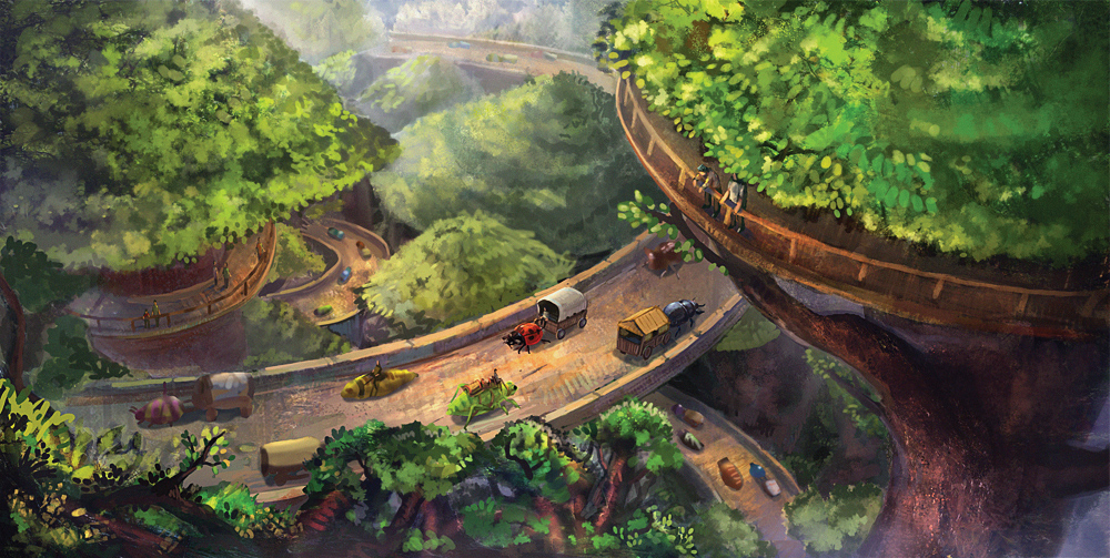
Alright! So, I did I what could till the deadline. Below is my wip since my previous post. Basically added the insects, and reworked the areas that Newcalibre pointed out. More details and cleaning up. Adding micro details to an area really makes all other areas of the painting sort of "fade out", I noticed. I should probably learn how to control it better, though.
And here's the final I submitted! Added figures, more details, cleanup, etc. And a bunch of post effects! Colour correction, colour dodging to pop out certain areas, stuff like that. My favourite part, haha, just messing around, no stress.
Self-crits! I can't let myself off that easy!
A - The main "flyover" looks pretty boring in terms of design. I suppose I could add more interesting details like scrollwork, or buttresses or carvings or... lamps? Or something at least. Looks pretty bland now. B - My figures are really rough and look kind of silly. Ideally I would like to work on them more and make them look like, you know, real people. Not dolls. Putting figures in the context of a painting is one of my weaknesses, so I'll have to address that sooner or later. C - Underdetailed, messy areas, I could probably work on them more. D - The messiness of the treetops are really bugging me (the downside of working from photo textures?). I don't think the way they are painted now looks very appealing, or even "realistic". It looks like a huge stuck-on texture. I guess there's no choice but to study some trees and rework it?
Oh and important to note, for some reason I made all my trees like "mushroom" shaped. Which is kind of weird, not really sure it happens much in nature.
I'll probably work on it a little more, but for now I'm gonna let it lie and take a break from this painting. And maybe come back to it on a later date. Let me know what you guys think!
Hey there, I think it's coming together nicely, I'd make some gradients and some aerial perspective to put it more in 3D, I had the audacity to make a small OP, like that:


.jpg "Filename: Treetop Highway (08Nov13).jpg
Size: 485.45 KB11-09-2013, 05:04 PM")
