Power Girl pin-up help!
#1
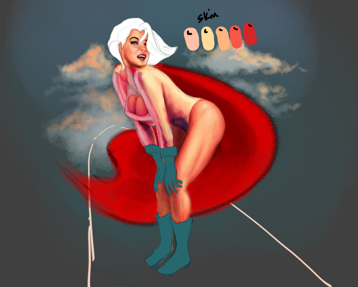
I keep hitting walls every time and it usually happens when it comes down to shading an area. I know, I know I should have used my rough colors but I sometimes tend to change stuff as I go. I'd take my time on this, but I'm on a tight schedule.

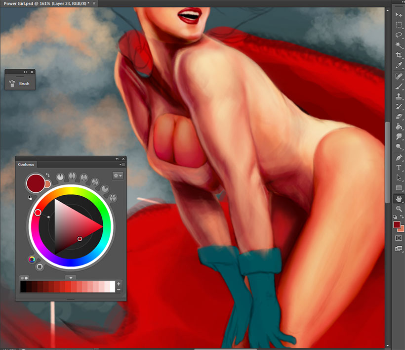
Okay, I dont know if the colors are suppose to be duller on the shadowy side and I sort of want to share a small bit of focal point to her boobs (they've always been her trademark joke). So, do I saturate them as well? They look flat and I know adding dark or lights changes the form but I want to make that subtle. Does that make any sense?

And for the abdomen, does the white attire become cooler in the shade? But with light bouncing from the skin does that make it warmer? Then the white would be in some pinkish or magenta color - baaaah. Its splitting my brain. Please help. Any small advice would help.

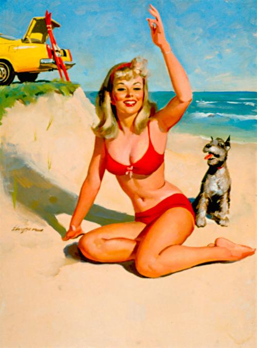
I did use a reference just for the pose and I've added muscles to appeal to her superhero form. Also, bust size ( cause of the character).
Reply
#2
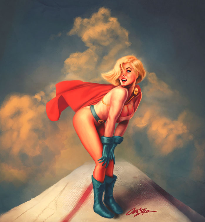
updated it. The Art S. Buck doll figure came in handy. Just delivered to me today, too.


Reply
#3
Got it. Kinda stills looks "so-so" to me but good enough for me to move on to my studies.

Reply
#4
NICE audie i like the mood...but from here i can see the withe of the cloth and the skin tone are too close,i dont see complementary colors in the skin tone "cool colors"..i guess you have used photo texture for the backgroung or the sheet that the girl standing on anyway there is a large contrast between details of the foreground/background and the figure especially the clothing.
anyhow am not a master i could be mistaken but if u are studing i suggest that u read COLOR AND LIGHT "James Gurney"..am almost finish with it and its crazy informative
Reply
#5
Ditto about white colour suit vs skin tones as well as cooler colours in shadow areas. Not 100% on the perspective of feet in relation to body, or what that thing she is standing on is. The saturation is very high overall, which is a style / mood thing, but I think you could introduce some lower sat areas to contrast nicely and really drive focus and interest into areas of the figure that need it. I feel some more designed shadow work on the figure overall could help settle it in the 3D space a bit better. Especially internal shadowing, not just the cast shadow of the figure. I also feel the way the gloves and boots have been painted in value and hue range are more limited and make them pop out a bit from the rest of the figure rather than integrate with it.

 YouTube free learnin! | DeviantArt | Old Folio | Insta
Reply
#6
@blazingbrain
I've got the book some days ago but havent gotten a chance to really sit down and read thru the pages.

@monkeybread
I really do see the attire almost blending entirely with her, and its because I didnt know how to have the legs highly saturated (her legs are one of focus points) while keeping the white , well, white. I mean, the sun is casting over her and I figured the white leotard would be brightest and warm, but I thought, in theory, it would rob the focus point reserved for her legs. So I didnt know how make a clear separation between her legs and leotard.

It does look very saturated the reason for that was I wanted to have this touch of Gil Elvgren's pin-up style or pin-up style from the 50's.


I got a short question about the shadow: Do shadows need to look on the same level of saturation as the midtones or lesser?
Reply
#7
Ok, well a few things I guess wrt differentiating the leotard. Have clear physical boundaries where they seem to merge, ie a distinct seam. You do that relatively well in the arm section, not so well in the hip area. Second, the material read and especially specularity of the leotard is identical to her skin. It shouldn't be. Even in the ref you posted there is a clear difference in how the material reacts to the light; it's generally less reflective and more matte.
Third, while the colour cast of the light is the same across the scene, what we actually see is the combination of that and whatever the local colour of the object being reflected is. So a pure white leotard, will definitely be colour cast towards warm by the light, but not as much as her skin will. I think just cooling it down will help.

Wrt shadow saturation, there is never a hard and universal rule. Colour is highly subjective based on what is around it, but I would say a general thing would be highest saturation in mid tones and less in shadow areas, but this is not a rule. Use colour balance to tweak things easily. I'm not at my laptop, but once I get on it I might try some tweaks and see if it helps.

 YouTube free learnin! | DeviantArt | Old Folio | Insta
Reply


Forum Jump:


Users browsing this thread: 1 Guest(s)