ok these are the things that stand out to me.
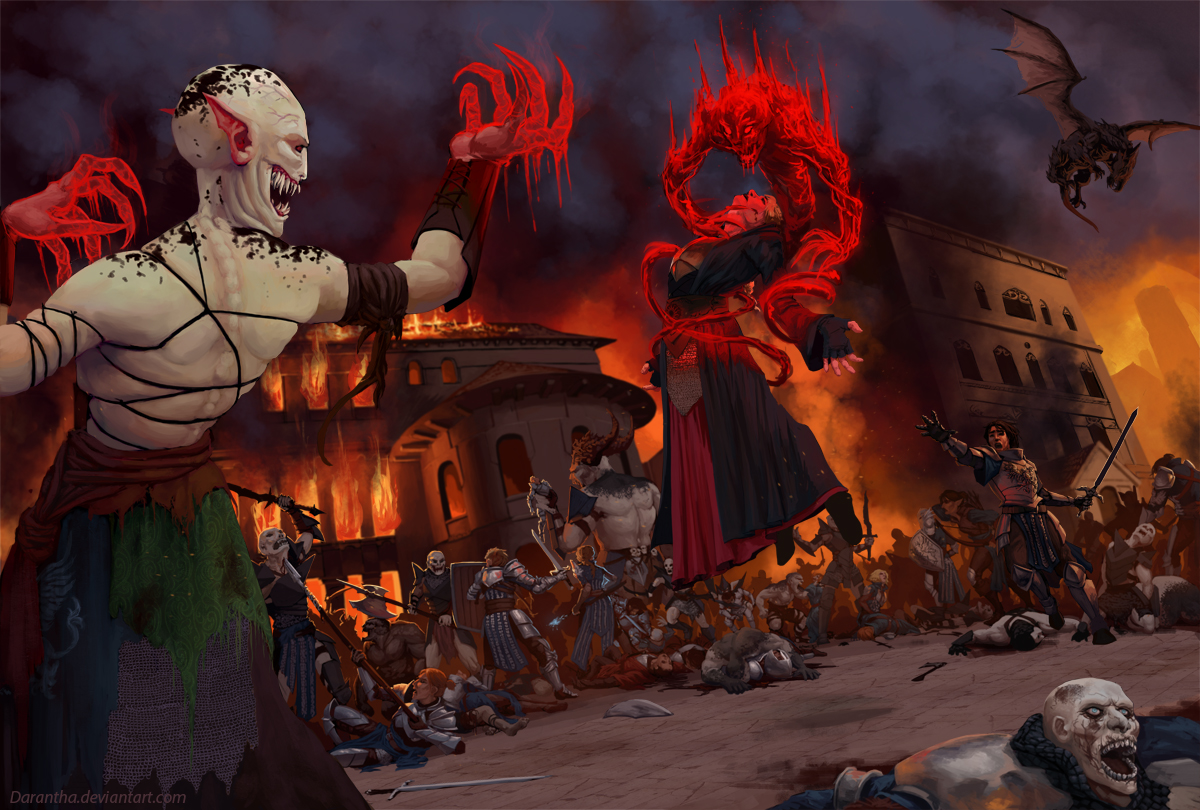
the red you are using for the hands and spell/demon are extremely saturated, and are pulling huge amounts of focus, as well as looking slightly fake. maybe experiment with lower saturations and hue changes? like red to yellow? The whole piece is very saturated, i would tone down the background far more if you can (though I know its full of fire). Fire brings a lot of smoke, so do some studies on that. I would make the sky less blue, more a very desaturated red (which in comparison will look blue).
secondly, the face on the bottom right looks odd, like its been squished back or something, and its also got unnecessary amounts of detail, as it pulls a fair amount of focus being so bright and detailed. I would make more of a vignette at the edges rather than placing elements with a very light value, because that will focus your eye more on the subject matter you want to show. Also, the hand furthest on our left is competing in terms of levels with the shoulder i feel, like hes almost resting it on it, but not. Try to use some atomos perspective on it or tone it down a bit i think, and mind tangents like his middle finger.
Thirdly, i would get rid of the texture you've used for the purple cloth on the bottom left, it looks out of place, and light doesnt seem to affect it- there should be ripples, or at least a gradient from light to dark, but its just flat which makes it look like a cut and paste job.
anatomy could use work as well on the figure nearest to us, his spine seems to disappear over his shoulders, and there is something weird going on with his traps (upper trapezius muscles). Do the pose yourself and take a photo from behind, or get someone to take it. awkward i know but its worth it for a portfolio piece. His face also seems somewhat plastic and without texture, find some pore brushes or something just to dirty it up a bit and give it a bit of grit I think. Also, what is the black stuff? tattoos? birth markings?
the central figure has a really dynamic pose which i love, though id watch out with the lighting on her cloak, it looks more like paint right now. studies studies studies. also, bring more focus to the guy reaching out to her if he is a central figure, right now the attention is going for me:
white guy, red demon, dragon, white face on the bottom right, guy reaching out. watch the values i think, try converting to b/w and see how you can make them stand out more/ tone down bits. that dragon is too dark for instance, which gives it a weird small sense of scale (as we believe its quite close to us and therefore tiny) and it pulls a lot of focus. the values on the white orc on our left is also a bit too light, have more variance perhaps to pull focus.
perspective on the building on our right is way off compared to the building on our left, follow the lines through with a perspective grid and you will see what i mean. are you using one for this? would be useful i think, especially with so many figures. also, the buildings also look too clean and plastic, whack in some plaster textures or any kind of grit to break up the cell shading look because it stands out. same applies to the floor.
Ok all of that said (sorry this was huge), you've captured a great atmosphere in this, and the scene is looking very dynamic which i love. you've really conveyed a chaotic war here, and thats hard to do, especially with so many figures (I would be lost doing a huge battle scene!). Keep working on it and this could be a cracking piece, perservere man, all the best (and sorry if this sounded harsh, i just want to help you as much as I can :D)


