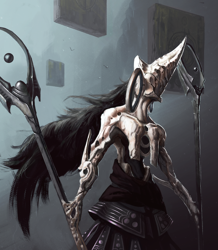
Azra, The Summoner
#1
Hey, everyone. Looking for a critique on this creature I've designed for my portfolio. The entire portfolio will revolve around a mock IP I'm developing. In short, it's a video game about Gods who have destroyed the entirety of humanity, and all that lingers are the droids that were designed by the humans as a defense against the gods. The androids continue their mission to try and eradicate the gods and bring humanity back into existence.
This creature is the angel, Azra. She can summon powerful creatures onto the battle. Most of the angels will share a few of the same design elements - bone-like bodies and circular forms. Wanted her design to sort of follow the appearance of a witch. Also, I thought it would be cool to fuse her hands with the staffs she uses. Anyway, enough bullshit. Just wanted to give you guys a general idea on what I was going for.
Reply
#2
The head actually reminds me of an exaggerated knight's helmet with a big plume, so I didn't think witch or angel when I first looked at it. I got it was a mage type boss though. Not much else I can say except design is looking cool so far!


Focus.
Reply
#3
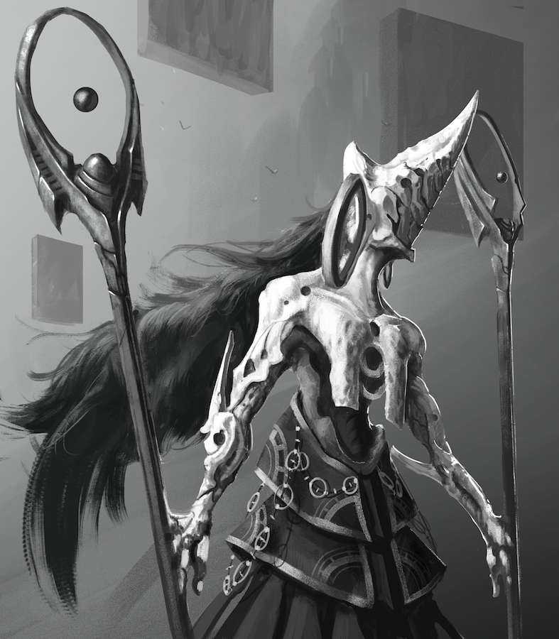
Thanks for the feedback, Meat - really appreciate it. I agree, I need to work on the design of the head a little more. Decided to go from grayscale to color and push it as much as my skill level would allow. Here's the result:

Reply
#4
Progressing nicely. I feel like perspective wise, the staffs are not correct. From our view point, the left staff should be higher, or the right staff should be lower. I know the character is holding the left one at more of an angle, but I still feel like the difference in height to account for perspective should be more apparent. Paintover with other small tweaks:


Attached Files Image(s)


website: http://www.aritopia.com
facebook artist page: https://www.facebook.com/aritopia
instagram: aritargownik
Reply
#5
(08-19-2014, 12:28 PM)NuclearWarrior Wrote: Progressing nicely. I feel like perspective wise, the staffs are not correct. From our view point, the left staff should be higher, or the right staff should be lower. I know the character is holding the left one at more of an angle, but I still feel like the difference in height to account for perspective should be more apparent. Paintover with other small tweaks:

Awesome, thank you man! That does look nicer once the perspective is adjusted. I really appreciate you taking the time to help me out.
Reply
#6
Sure thing dude :)

website: http://www.aritopia.com
facebook artist page: https://www.facebook.com/aritopia
instagram: aritargownik
Reply
#7
Very cool. The one thing I might work with is how the staff and hands/limbs connect. As the painting is, it looks like the staff and wrist are very rigid. If she was holding the staffs at any other angel they would be at strang angel. I love your idea of connecting them to her arm but I would give the same maneuverability as a hand.

Can't wait to see more!

Reply


Forum Jump:


Users browsing this thread: 1 Guest(s)