In over my head with a commission @@
#1
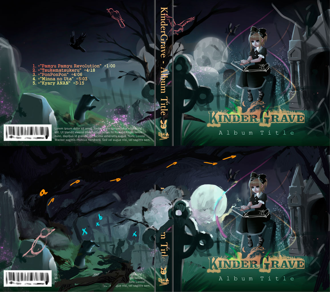
Hello, all! I hope this isn't a bad thing to do, but I've been working on this commission on and off for well over a month but I'm tearing my hair out and I just want to get it done. I figure it's probably time to ask for some help. I'm fine with portraits but illustration is an entirely different story... but it's what I want to do, because I'm a masochist like that.

Here's the first one, so far:
[Image: 2015-07-21%20-%201813.png~original]

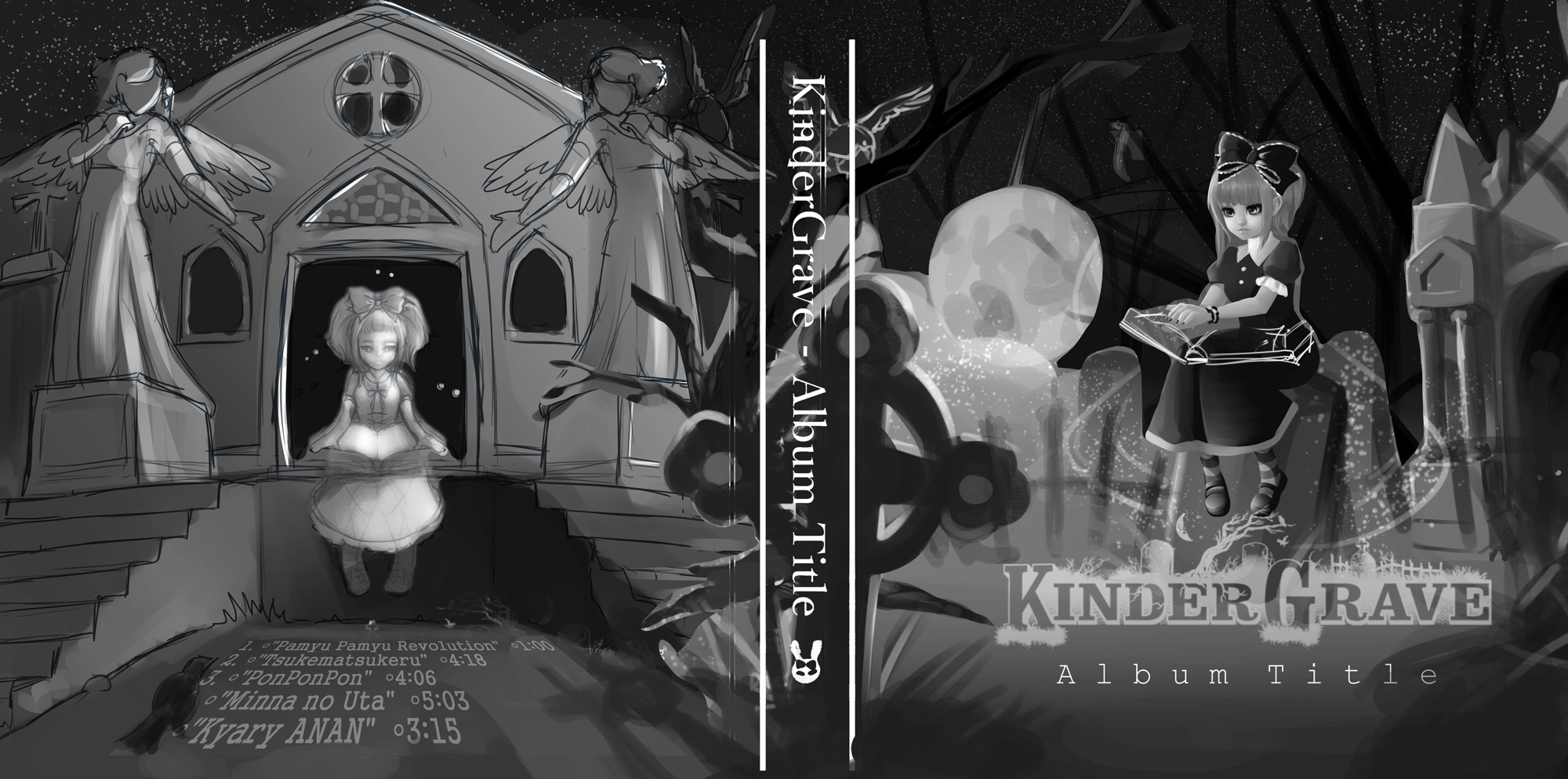
I got fed up with the scale and everything on this one, so I decided to retry it, this time in grayscale:
[Image: 2015-07-21%20-%2018132.png~original]

She likes both, but that the first captures the feeling she was hoping for more accurately. She likes the details in the second, though (I'm not sure what she means). I told her I would rework them to see if I could find a happy mid-point... but then I have no idea where to go. I feel like I'm going about it all wrong, like I'm fumbling in the dark.

If anyone has any suggestions, I would greatly appreciate it.

I've even thought about paying someone with part of the final cut to help me see it through to it's completion, like over-the-shoulder mentorship, but I don't really know if that's a good idea. TT TT I just want it done.

Website | Tumblr | Sketchbook
Processed in a facility that also contains kawaii BS.
Reply
#2
Maybe... the first one needs more trees??

Website | Tumblr | Sketchbook
Processed in a facility that also contains kawaii BS.
Reply
#3
She might like the stars in the sky in the second one. Add more tree silhouettes, like you said yourself, add stars, and raise the moon higher so it's by it self in the night sky. Add some action feathers to the flying crow (have a couple feathers coming off of it leaving a trail behind it pointing towards where it took off from).

Also, revisions cost more money, dear client :P


Focus.
Reply
#4
Meat has some good ideas and makes a good point about revision not being free (unless you have agreed to that previously with the client). I'd also add in that maybe put one of those statues from the second image on the back cover part the far left as some sort of grave statue. I really feel the second image is nowhere as good compositionally as your first and you should have not done and sent the client the second one just because you weren't liking the first? Or maybe they asked for a second one?

If it's the first thing, you might have made a lot more work for yourself because now the client doesn't have a single image to ask for revisions on but you have 2 separate images that they now want you to mix together.

I'd just state again I actually really like the first one you did and think it works very well as an album cover, I hope there was something of help there for you :).

Reply
#5
Ah, you guys are right... I probably should have just stuck with the first one, I was just getting so fed up with it. Like so much is wrong and I don't know where to begin, you know? Maybe I just need more practice? I felt like if I started over it would be easier to get it over with.

The thing is, this client is basically paying my rent so I really want to deliver. Luckily they're very understanding and don't seem to be as "perfectionist" as I am which is nice... but it drives me crazy!

I'm really bothered with the scale of the girl on the first one, she seems too large but if she's smaller there's not as much focus on her and you can't really see her face very well. Any ideas on this?

Website | Tumblr | Sketchbook
Processed in a facility that also contains kawaii BS.
Reply
#6
Scale of first girl doesn't bother me that much, but you can put some vegetation in front of the tomb entrance to make it look like it's further back, and justify its size more. the first one does look better than the second one tho.


Focus.
Reply
#7
Heya,

Great image!
I prefer the first image also. I think you can try,

a. move the tree from the spine to the left end of the composition and use it to frame the piece

b. vary sizes of tombstones and grave markers (receeding into distant marks) to stretch the depth


I just thought of something else, 

you can also move the tree off centre slightly, 

then move the moon into the top left corner, try making it high up and large maybe?
something like this:

https://d3b4yo2b5lbfy.cloudfront.net/wp-...0x1200.jpg

this would match the lighting on the character better, but it would also mean adjusting the shading on the environment. 


Hope it gives you some food for thought!
Reply
#8
Smile 


I prefer the 2nd one.. just had a play around see what a mix of both might look like. Hope it strikes up some ideas for you. i thought of the girl on the left as a ghostly version of the character.

GUMROAD | ARTSTATIONINSTAGRAM | YOUTUBETWITCH | SKETCHBOOK
Discord tag: AndrewGibbons#3357
Reply
#9
If I had to guess what she may have meant with the details she liked in the second one, it's probably the angel statues, one of which you could add as a framing element on the back cover as JonHop suggested. Either that or the stars, which are also easily added. The composition is indeed better on the first, and if she already likes the mood on that one, I wouldn't stray too far from it if I were you - it is a very nice image, maybe you've just been staring at it for too long?

Reply
#10
This is really cool! (Also btw your tumblr is totally rad) 
I made a quick paintover to show some suggestions for the composition... then I saw this was from a week ago so I dunno if it's already too late. If so, sorry!

I'll list what I changed, just keep in mind I don't ACTUALLY know what I'm doing all that well so take this with a grain of salt :)

My suggestions:

[Image: UGTJjXY.jpg]

 - I prefer using centered composition mostly for things that are pretty much symmetrical. Otherwise I like the good ol rule of thirds, so I moved the character down to where her head is at a third point. 

 - This meant I had to move the title to the top to make room for her feet, but that kind of works better too I feel because the top is dark and empty, so it bumps up the contrast of the title too (light title against dark sky, rather than against mid-range ground). Also it kind of adds a "ceiling" to the comp so that your eyes don't continually wander off the top of the page.

 - Added some stars to break up the remaining empty sky

 - Bumped up contrast on the character face to make it the most contrasty part of the image (main focal point)

 - The moon was competing with the face, as well as not fitting with the light direction (on the character, light is coming from the front left, so the moon would be behind the camera). So I deleted the moon

 - The tomb is cool but it also was kind of competing as a point of interest, especially the spiky top part. I made it bigger to move the spiky part up and out of the "main" viewing area, decreased the contrast of the tomb as a whole and especially the spiky part to push it back behind the girl, and tilted it so that its lines lead sort of match the "circular flow" of elements for the eye to follow, instead of straight up and down. Also I feel like when it's bigger it helps to solve the "vast empty sky" problem and further keep your eye in the picture.

 - The cross is awesome, but it felt like it was getting cut off on the side which was distracting. I moved it more into the picture so if feels more intentional (I read a design book once that had the rule "If you're going to do something, don't be a wimp about it" - basically, things that look like they might have been unintentional are distracting, so if you're going to do something, do it all the way. This goes for everything from composition, to values/contrast/colors, to font choice, and anything really. I love this rule) Also tilted it a bit to lose the vertical line

 - Moved the tree along with the cross, same reasoning

 - Fixed lighting on the cross (kind of at least) to match lighting direction on girl

 - I didn't even realize until afterwards that the tree was sprouting from the middle ground originally, but I moved it to the foreground. You get a little more depth in the pic this way

 - Added some lighting changes on the ground to further solidify FG/MG/BG separation

 - Also, I didn't do this on purpose but noticed it afterwards - based on the girls' upper leg position, the horizon line should be at or below her waist. I fixed this unintentionally when I moved the girl down :)

 - I didn't bother with the birds (bats?) and the light trails, but they could be put in on top of this.

 - I wasn't sure if there was supposed to be something going on at the base of the grave (is she summoning zombies?) but if so this comp leaves space for it to be more visible, rather than covered by the title.

That's it I think. Sorry if it's too late, but you had a lot of cool stuff going on here already and I'm sure your client will dig anything based on your original!

Come tell me how to fix stuff in my sketchbook: Broadway's Sketchbook
Reply
#11
Broadway nailed it. Hope you can incorporate his awesome feedback!

 YouTube free learnin! | DeviantArt | Old Folio | Insta
Reply


Forum Jump:


Users browsing this thread: 3 Guest(s)