10-27-2015, 04:06 PM
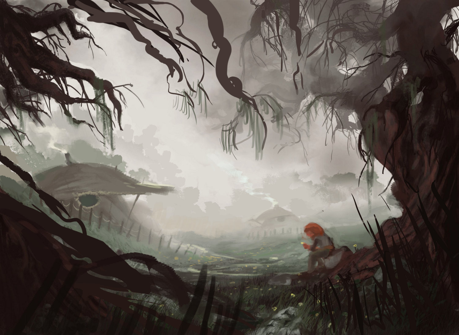
I think the part that bothers me most is the figure at the main focal point, but I don't what about it bothers me exactly. I'd really appreciate some help!![[Image: 42O7QNK.jpg]](http://i.imgur.com/42O7QNK.jpg)
![[Image: 42O7QNK.jpg]](http://i.imgur.com/42O7QNK.jpg)
|
I'm not sure what I can improve on here, but I'm not satisfied
|
|
10-27-2015, 04:06 PM
I think the part that bothers me most is the figure at the main focal point, but I don't what about it bothers me exactly. I'd really appreciate some help!
![[Image: 42O7QNK.jpg]](http://i.imgur.com/42O7QNK.jpg)
10-27-2015, 06:00 PM
The colour in the figures hair doesn't tie in anywhere else? I don't know if that's the problem, but that's the one thing I see instantly
10-27-2015, 09:40 PM
Hey man, I think the framing composition needed to be a bit tighter rather than the loose circle thing you had, and the figure placement tweaked to make it a bit more prominent. Some values simplified and tangents also removed. Here's a paintover, hope it helps! If you're not sold on the new branches covering the sky, you could substitute them for darker clouds that will do the same job of driving down to the figure

10-30-2015, 12:52 AM
It also seems to lack a level of narrative. There's a little there that the viewer can assume or create, but maybe add an extra piece to the story? I'm not entirely sure what story you're telling, or why that story would be compelling to the viewer.
**edit** However, maybe you're just drawing an environment, in which case you don't have to rely on narrative as much
10-30-2015, 06:49 AM
(10-30-2015, 12:52 AM)Admbrns Wrote: It also seems to lack a level of narrative. There's a little there that the viewer can assume or create, but maybe add an extra piece to the story? I'm not entirely sure what story you're telling, or why that story would be compelling to the viewer. This is actually a part of a series I'm going to be doing in which I tell a story with a series of paintings accompanied by small excerpts, so the story will be told in the excerpt. But, now that you mention it, I agree that there should be at least some semblance of the story present in the painting ... I guess it's up to me to figure that one out, hahah.
10-30-2015, 07:30 AM
![[Image: GZBHy09.jpg]](http://i.imgur.com/GZBHy09.jpg) any better, do you think? or did I not go far enough? any better, do you think? or did I not go far enough?
10-30-2015, 07:56 AM
It's definitely better. I think the comp is still framed in a pretty static way; it is basically a circle that touches the canvas bottom. In my paintover I tried to create a more dynamic sweep and diagonal push overall. i also tried to add more depth with that left tree and plug up the circular tangent to the canvas edge. The overlap of your foreground elements don't really go far enough so they don't really effect the sense of depth much.
10-30-2015, 03:11 PM
![[Image: 9ZXHC0l.jpg]](http://i.imgur.com/9ZXHC0l.jpg) thanks for that explanation, it really helped. I guess I'm just worried about going too far with the grass framing in the foreground because it's something I always do and I guess I'm scared of being repetitive. It works here though, so I really shouldn't have any problems with it. I also added some more narrative elements, so hopefully those are helpful. thanks for that explanation, it really helped. I guess I'm just worried about going too far with the grass framing in the foreground because it's something I always do and I guess I'm scared of being repetitive. It works here though, so I really shouldn't have any problems with it. I also added some more narrative elements, so hopefully those are helpful.
|
|
« Next Oldest | Next Newest »
|