02-10-2016, 08:05 AM
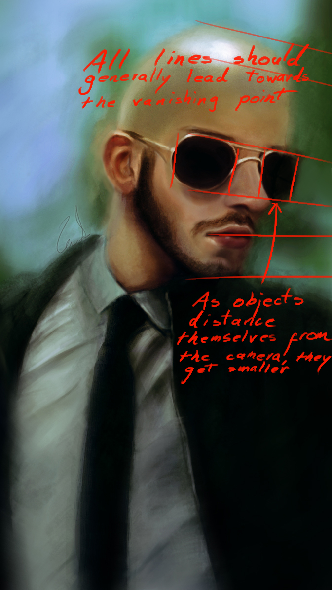
Heya purple. Got a quick and sloppy oh-god-I-don't-have-time redline for ya.

All that was changed was the size of the glasses and the angle of the lips. Flipping the canvas makes you notice those mistakes a lot easier. When you're in doubt, simplify the masses and check if they align with your chosen perspective. The nose also looks a bit off; it should be facing the camera a bit more.
Aside from that, your proportions are looking good, but slightly off sometimes.
Keep it up!


![[Image: 1Ssxu9S.png?1]](http://i.imgur.com/1Ssxu9S.png?1)
 You may see the final piece below. I finished it, before seeing your comment. About the darkness; I know the rule you have pointed but I wanted to focus the light beam to create a more dramatic effect. The only light source is the light beam so I thought it's okay to leave the rest in dark, I thought about the bouncing light but I didn't think the light could reach to the bottom part of the image where there is only the bed. Still, I might be wrong. So, can you point out the parts where light should have bounced.
 ![[Image: lGTjq9f.jpg?3]](http://i.imgur.com/lGTjq9f.jpg?3)
![[Image: n9RdOjq.jpg?1]](http://i.imgur.com/n9RdOjq.jpg?1)