Posts: 164
Threads: 5
Joined: Feb 2016
Reputation:
7
thanks smrr not to sure about the banner at this point and yes way to big will cut it back if I add it, but yep will be going with the tilted canvas...
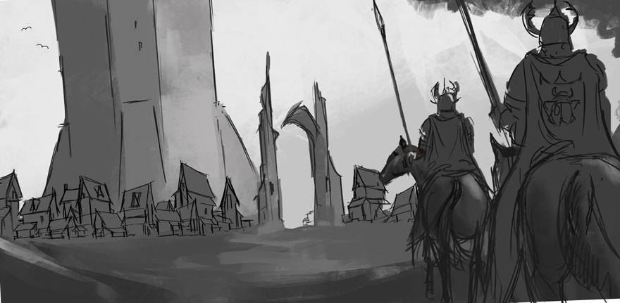
ok this is the final comp thanks to all for the feedback guys to get to this stage, Im giving myself a week, to come to a final finish rendered outcome, hopefully its half as good as the image in my head lol...
A few things I might add?.... the banner, indication of the horses head, mountains in the back ground....

Posts: 742
Threads: 28
Joined: Jan 2012
Reputation:
44
Looks great! I'd personally add some more elements of nature - maybe some trees, bush or ivy?
You might also add a flying bird (or beetles, butterflies) on the left side.
Posts: 1,109
Threads: 18
Joined: Apr 2014
Reputation:
68
I didn't read through all the posts here, maybe this came up but is it ok for you to just show the characters back? Just thought I'd mention in case it slipped by and you need a front view. Comp looks great but for me it could use some kind of story elements to say why they're riding towards that tower. Like their armour is all beat up, and the arch in the distance bears the same sigil as their cloak to say they're coming home. Or the same thing but their armour is clean and the houses are burning (someone attacked while they were away). Stuff like that could bring more interest.
Posts: 1,970
Threads: 22
Joined: Apr 2012
Reputation:
243
This is an enviro focused piece Jyonny, it doesn't have to be full frontal characters. Good call on adding narrative elements though, I second that :)
Posts: 164
Threads: 5
Joined: Feb 2016
Reputation:
7
hey guys long time no see, been so busy, hardly had anytime to draw or paint last few days, but been keeping track on how everyone has been going and its been looking awesome cant wait to see the finish products lol.....
Only a few days left so I better get my "A" into gear... have tried different variations and have been given awesome advice thank Amit. still dont think its up to scratch but time is short so Ive come to a final comp and will try and see where it will lead....
I'm not sure if my rendering skills will get me the final piece that I hope for but I will give it my best, hope to see everyone on the otherside, hopefully will have a couple of versions in the next couple of days just to see if I'm heading in the right direction....
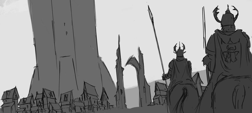
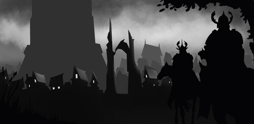
the first version was a attempt to render in greyscale but I didnt like how the buildings were looking, perspective looked wierd. I tried a couple of color attempts as well but just wasnt hapnin so scraped this whole comp...
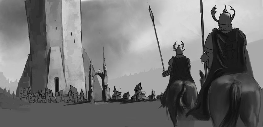
The second is the final comp now, so this is what I'll render to finish... wish me luck guys hahaha


Posts: 1,970
Threads: 22
Joined: Apr 2012
Reputation:
243
The second one looks great man. The perspective on the tall building is definitely off. It looks like it's leaning to the left. Make the vertical lines converge slightly as they go up, like a slight 3pt perspective. rather than the other way. Good stufff, keen to see the renders. Here's where quick studies will be useful.
Posts: 742
Threads: 28
Joined: Jan 2012
Reputation:
44
The tree in the second comp is a real nice touch. Looks great, I love it. You could indicate some mountains in the background for better depth. Good luck!
Posts: 15
Threads: 1
Joined: Mar 2016
Reputation:
1
Thats a great start!! Pls doo this!
Posts: 164
Threads: 5
Joined: Feb 2016
Reputation:
7
hey guys its me again lol... thanks all for the feedback really appreciate it...
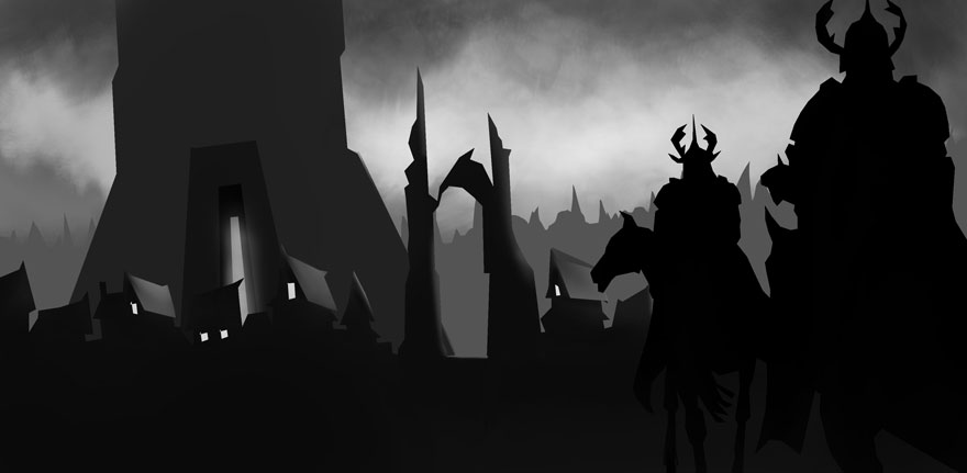
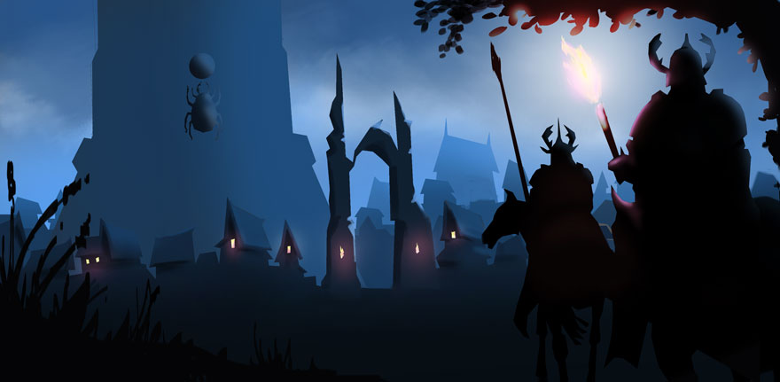
ok been playing around with it, just tried to slap paint over the top, but wasnt working, just looked rough as guts so I took another tack, I gave it more a graphic type feel as well as being night time scene now, the riders will now have torches instead, so hopefully giving a secondary light source as well as lighting up the emblems on there backs...
am running out of time fast, as I also have to work this wkend, so hopefully have the majority done tomorrow night...
let me know what you guys think... Im thinking of turning the trees at the background into more houses?
the Castle is a bit rough at the mo, just banged together some ideas like the light coming through the door way... will clean that up and give it more depth... going to add trees which the riders will ride under, havent added yet...

Posts: 742
Threads: 28
Joined: Jan 2012
Reputation:
44
To be honest I liked the previous version where they come out of a forest (that's how I read it), but go with whatever you prefer. I just think the daytime scenery would be better for selling the design. My piece of advice would be to go with simple colors underneath the lineart first (just like Atey Gailan does it) and then if you have enough time, go further with rendering.
Posts: 164
Threads: 5
Joined: Feb 2016
Reputation:
7
thanks Piotr yea I am still doing the forest scene as I think that gives it the framing it needs, but I just cant get the daytime scene to work for me, Ill give it another shot tomorrow, see if a fresh eye helps... wow great stuff from Atey Ghailan will checkout and see how he does things...
just a little update, still playing with ideas...
EDIT: ok Atey Ghailan is my new fav artist

Posts: 742
Threads: 28
Joined: Jan 2012
Reputation:
44
Whatever works for you best.
(03-25-2016, 01:39 AM)slash razor Wrote: EDIT: ok Atey Ghailan is my new fav artist Then you might like what's coming haha :)
Posts: 164
Threads: 5
Joined: Feb 2016
Reputation:
7
hey peeps I'm back haha
ok still playing around, slowly getting to my final, still got a few things to deal with...
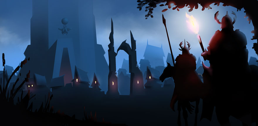
The Tower still needs refining, will put a beetle design on the tower now, the one I have on there now is just a temporary to see if it would work, will try and do a better beetle design...
The fire torch in the riders hand, I will try and get some ref and get a better shape and color happening....
will also try and get more form on the riders...and will see if I can add more atmosphere and lighting...
glad I've got the majority of it done now.... so just a lot of tweaking.

Posts: 164
Threads: 5
Joined: Feb 2016
Reputation:
7
Final Time woohoo.... whew that was one hell of a mission, now I can relax, have some beers and watch the footy yeeeaahh
First up, thanks guys for all the feedback and support really appreciate it... Also a Big Ups to our hosts Piotr and Amit you guys rock, it would not have been the same without yous...
I cant believe I actually finished a painting thats not just a study or some half assed attempt at one...
I learnt so much from the process, that next time round it will actually feel easier, and it will start to feel like second nature, which is so gooood...
Also it really showed up my weaknesses big time, but thats a good thing, so back to the grind fest of studies till the next CC Challenge...
thanks guys

Posts: 1,109
Threads: 18
Joined: Apr 2014
Reputation:
68
Posts: 501
Threads: 10
Joined: Jan 2013
Reputation:
20
Quite nice!, but maybe add a slight gradation to the ground.
Posts: 77
Threads: 3
Joined: Feb 2016
Reputation:
1
Looks awesome, great job! Has a very clear mood to it. The only thing i would say is that the beetle looks a bit like its floating and not attached to anything. It matches the atmospheric for the building, but maybe a shadow would help on the building itself? Or maybe you could free transform and skew it a bit to put it in perspective? Either way, it looks really good!
Posts: 164
Threads: 5
Joined: Feb 2016
Reputation:
7
thanks JyonnyNovice appreciate it...
thanks Hobitt yea was meant to add that in, got side tracked, wish I had seen your message earlier....
and thanks Legion Brewer, yea your spot on, does look like its floating, did try a shadow but didnt work, then I moved on... there were a few things that bothered me, but just ran out of time...
|
