05-20-2016, 01:14 AM
Hey everybody.
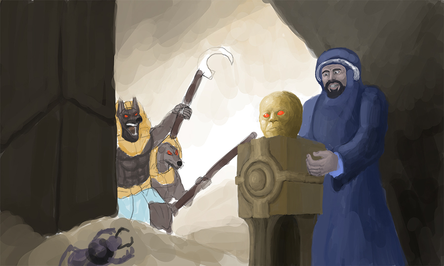
I haven't posted much in the crimson daggers' forums, just a couple images in the abandoned hideout post. Been lurking from time to time though and it's how I discovered the crimson crucible. It being an interesting project and me being more active with art prompted me to participate. So here are my WIPs for now.
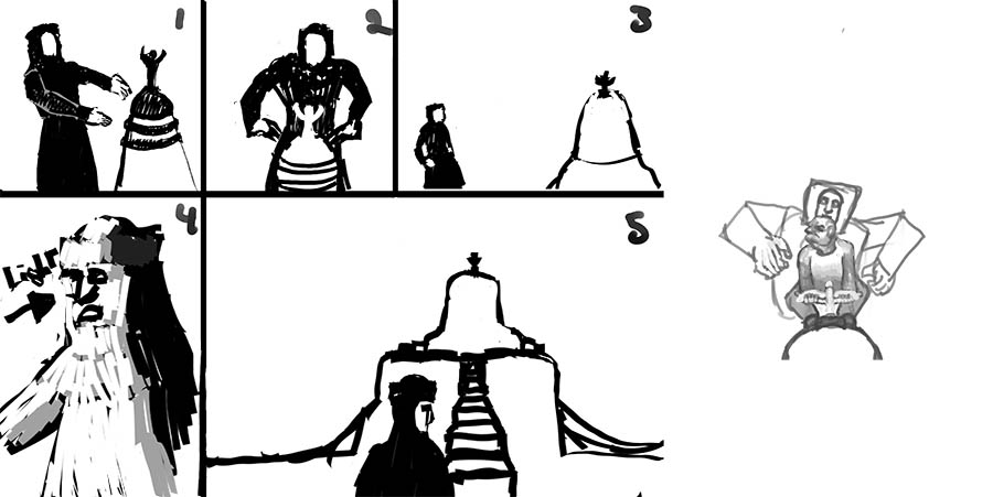
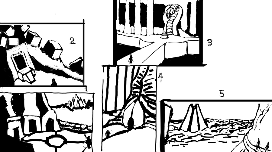
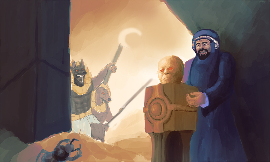
I tried some composition and finally decided on a 3 point perspective one so that I could learn all the perspectives at the same time and challenge myself in the process. I didn't do enough that's for sure but after I did the one on the utmost right, I knew I could learn a lot if I did it.
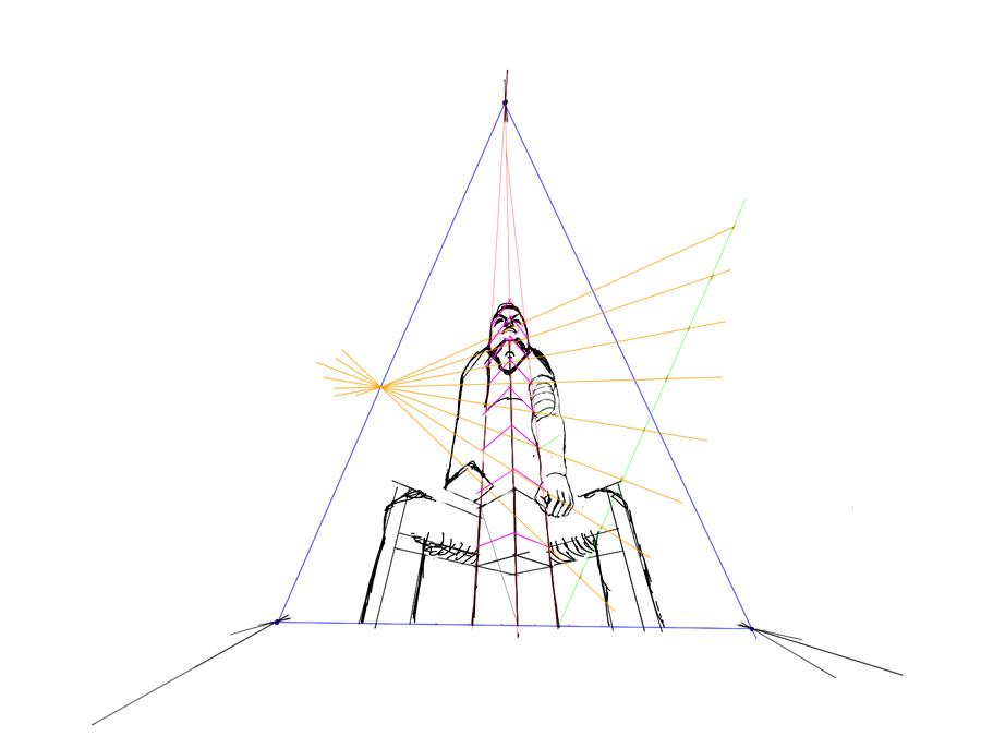
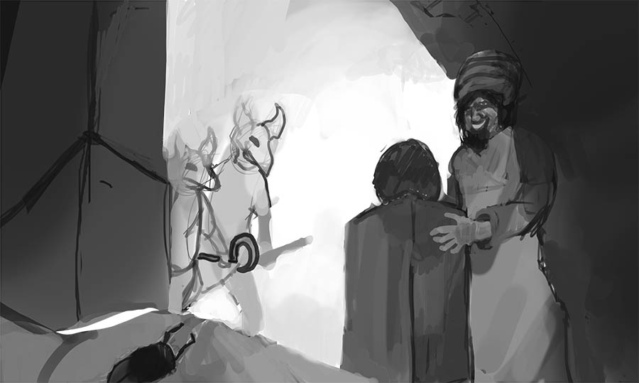
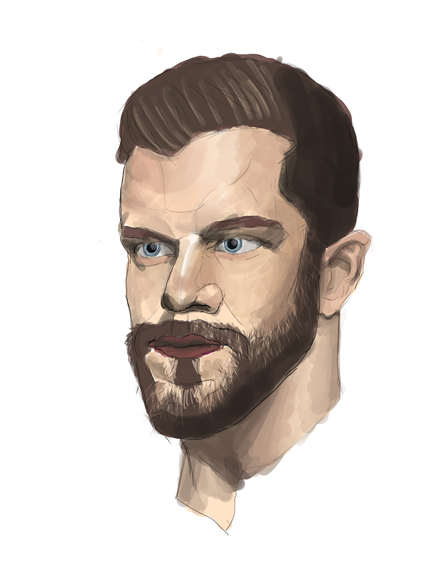
That's my first attempt to see how things would go, than I discovered that everything I did was wrong.
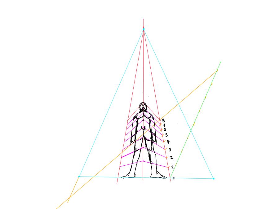
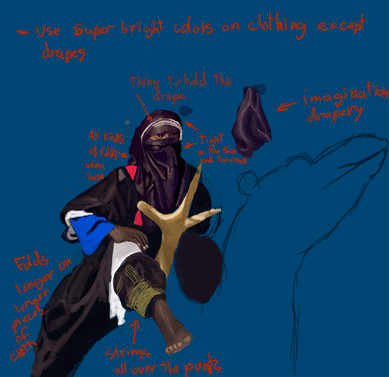
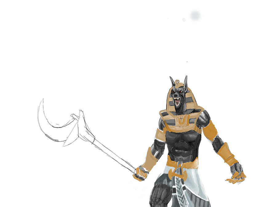
This is me trying to fight the proportion of a body inside a 3 point perspective.
I read a lot these past few days to try to make something decent but it's still pretty confusing, so any insights is welcome.
I haven't posted much in the crimson daggers' forums, just a couple images in the abandoned hideout post. Been lurking from time to time though and it's how I discovered the crimson crucible. It being an interesting project and me being more active with art prompted me to participate. So here are my WIPs for now.

I tried some composition and finally decided on a 3 point perspective one so that I could learn all the perspectives at the same time and challenge myself in the process. I didn't do enough that's for sure but after I did the one on the utmost right, I knew I could learn a lot if I did it.

That's my first attempt to see how things would go, than I discovered that everything I did was wrong.

This is me trying to fight the proportion of a body inside a 3 point perspective.
I read a lot these past few days to try to make something decent but it's still pretty confusing, so any insights is welcome.


