01-26-2014, 01:43 PM
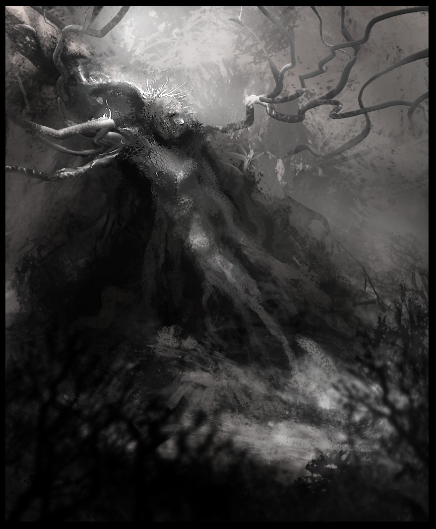
testing brushes and some new techniques


|
Monkeybread's Dribblings
|
|
01-26-2014, 01:43 PM
testing brushes and some new techniques

02-03-2014, 06:56 AM
Your use of colors is maaaaagical.. so pretty. That last piece has some nice textures in it. I like the sharpened center.
03-11-2014, 10:01 AM
Thanks guys...long time no update due to thefts and other stuffs going down. Here is some develpment process for the Diablo 3 contest. 3 days to go.
03-12-2014, 06:46 AM
shaman start to look sweet. can't wait for finish!
03-12-2014, 09:12 AM
Thanks Madzia! As I'm working my day job, will have to pull 4-5 hours of sleep a night till the end! Hopefully I can push through ::)
03-13-2014, 10:43 AM
Uppity date, another couple of sleep-deprived non efficient hours
03-14-2014, 05:59 PM
M&thaF*ckin missed out on entering as my crap replacement laptop crashed last minute on making the jpg. SO gutted right now. Here's the "final". Crits welcome.
03-14-2014, 06:39 PM
thanks for giving me those tips on painting skin. Your sketchbook is awesome!!
03-18-2014, 08:19 AM
sorry to hear about the crash ... that's really annoying -_-
As for critique - love the dynamic piece and foreshortening etc... but right now the values are the weakes point I think. Makes it hard to find a place for the eye to rest. I'd like to look at the face and the mask etc, but the bright spot on the left keeps stealing my focus. Maybe tone down on the firey parts and/or push the contrast of the face a bit. I am also a bit irritated why the light on the shaman and his mask is somewhat cold when there is so much orange and red around. If that comes from a second light source, it's not really clear to me. Also, some (slight!) rim light on the hand(s) in the foreground could make the forms read better , right now the left hand is melting into the shaman's leg a bit. Sorry for the nitpicking :P Overall it's a strong piece, love how action-packed & dynamic it is!
03-18-2014, 05:05 PM
@Poyo, You're welcome and thanks!
@Lyraina, that is brilliant feedback. It's not nitpicking at all. I am working on finishing this properly now I have time, and I agree with all your crits. Thanks!!
03-28-2014, 07:19 AM
ahh sick final product man! such as shame you couldnt enter, i know the feeling of having tech bum out on you at the worst possible times :(
i have completely fallen in love with your style, its so unique, trying to develop my own a bit more :)
06-26-2014, 06:31 AM
Nice sketchbook Money, great work here.
I'm really envious of your confidence with colour, something I really struggle with myself. Also, really cool seeing the progression on how you work. Keep 'em coming, sir. :)
06-26-2014, 06:36 AM
Great stuff man! That Witch doctor is wicked. I'll keep checking this thread. Keep it up!
Help me learn, dude! My Sketchbook
10-23-2014, 07:05 PM
Good lord has it been this long?
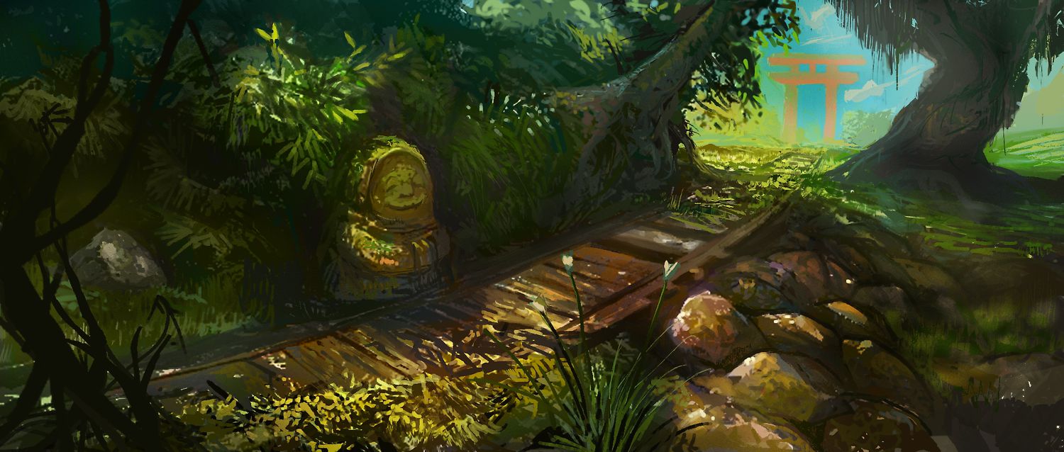
For the Brainstorm fb group. 
10-26-2014, 06:12 AM
Oooh, such a cheerful piece! Just looking at it makes me happy, lol. Nice color variations in there. Maybe a bit too black in some places that are not immediate forground - lightening those up might push the atmosphere and luminosity even more.
Nice to see an update from you! :)
10-26-2014, 08:16 AM
(10-26-2014, 06:12 AM)Lyraina Wrote: Maybe a bit too black in some places that are not immediate forground - lightening those up might push the atmosphere and luminosity even more. Thanks Lyraina! ^^ yeah I noticed that as well when I checked on other screens. I have a new setup and my calibration is still a bit off and I think too bright, need to sort that out! It has been so long, it is quite nice to be painting again!! :)
11-15-2014, 09:25 AM
a wip of something for Canadian music label King Deluxe.
Still not calibrated, so the values are probably all wrong. *edit How the heck does one embed a dropbox hosted image. Doesn't work for me? 
11-15-2014, 10:38 AM
Nice to see you updating your SB again man, keep it up.
|
|
« Next Oldest | Next Newest »
|