Posts: 1,970
Threads: 22
Joined: Apr 2012
Reputation:
243
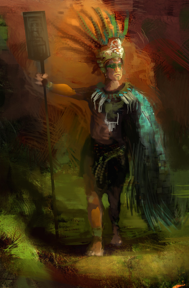
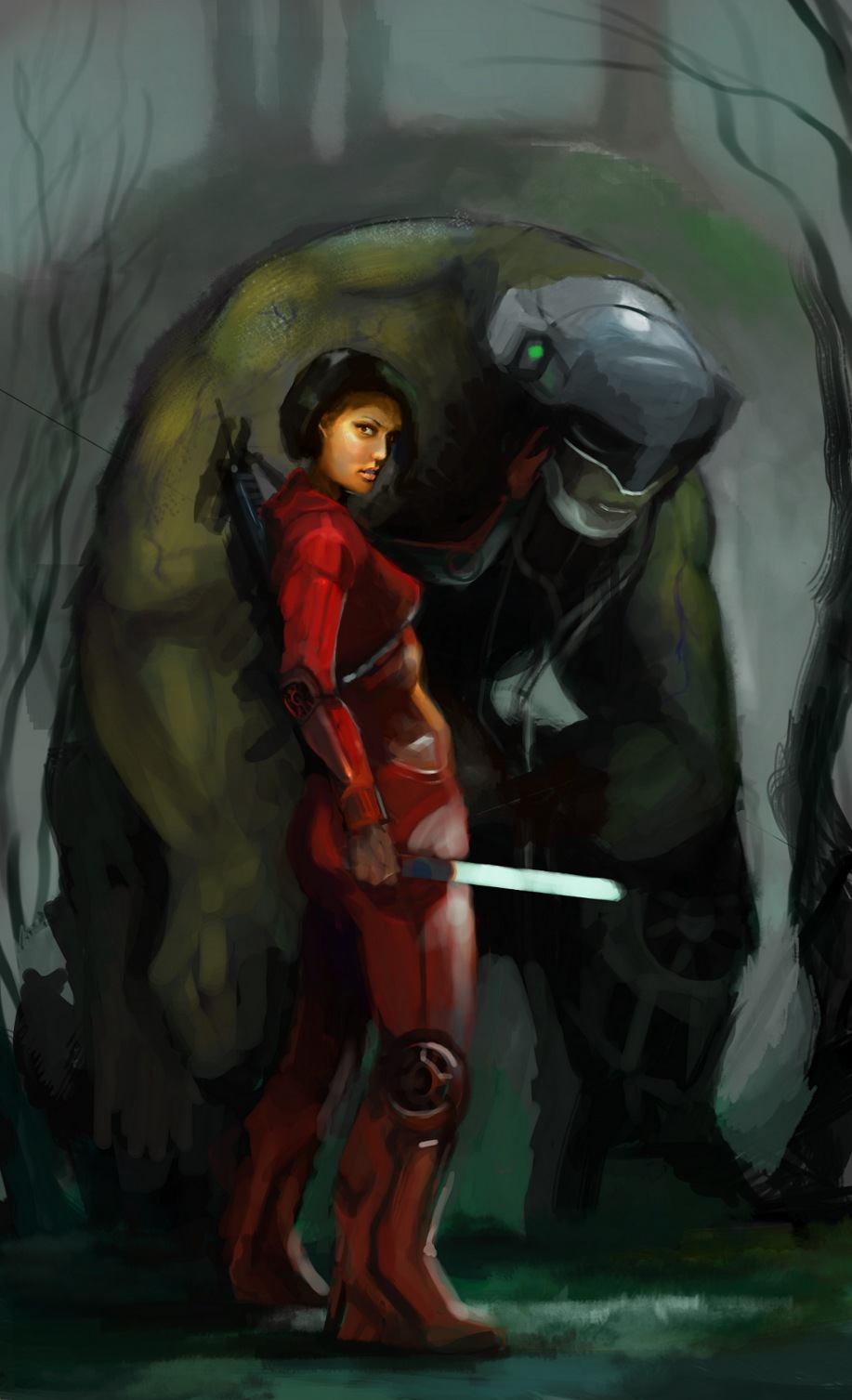
Tomb Raider comp entry. I ended up hating this image. I tried a more methodical approach to the whole illustration than usual and I have to say it was kinda annoying. Getting used to the drudgery of rendering will take some effort and is a skill I really need to develop. :/
![[Image: attachment.php?aid=16709]](https://crimsondaggers.com/forum/attachment.php?aid=16709)
Hey Monkeybread, nice entry. I dig the lighting effect, sadly I feel all the entries suffer a similar sameness. Which made the contest hard. Only those very creative ones succeeded, which is often the case. But I won't deny your effort man. There are some things, that bug me personally, but in my own right can understand as I do it too. For instance the feet are just gone, but I can see whats behind them. The pose is similar to concept image, even the hair. But at least it's not Hawkeye jumping of a building in The Avengers, or some other Hawkeye pose as I see hundreds off. But take it as amateur advice, because I know little fact when it comes to making imagery yet. I would just say to take on the hard things, rather then avoid them. You'll be better for it in the long run! Keep it up!
Posts: 1,970
Threads: 22
Joined: Apr 2012
Reputation:
243
Hey Stray, thanks for commenting. Yep I totally agree with you which is why I consider this image a failure, at least compared to some of my other thumbs and my intentions. In the end I chose an approach that aligned with the tomb raider feel and aesthetic purely for the competition goal which was to be potential merchandising or print for the game. So I, like others didn't stray to far from the ref material and everything ends up looking same-y. It's hard to know what the judges will like but trying to second guess them is silly, and that's what I did. I also used more feedback from others during the development phase, and went with consensus choices for composition etc, hoping to get an image pleasing to more people, but it actually made the process harder and I don't think I would do it again, instead I would go with my gut feeling.
Anyway I did learn things about myself and my process so it was good to go through. I also showed myself I can plan and finish a relatively polished illustration regardless of creative uniqueness in 2 days to a deadline! Yay me :)
Posts: 1,970
Threads: 22
Joined: Apr 2012
Reputation:
243
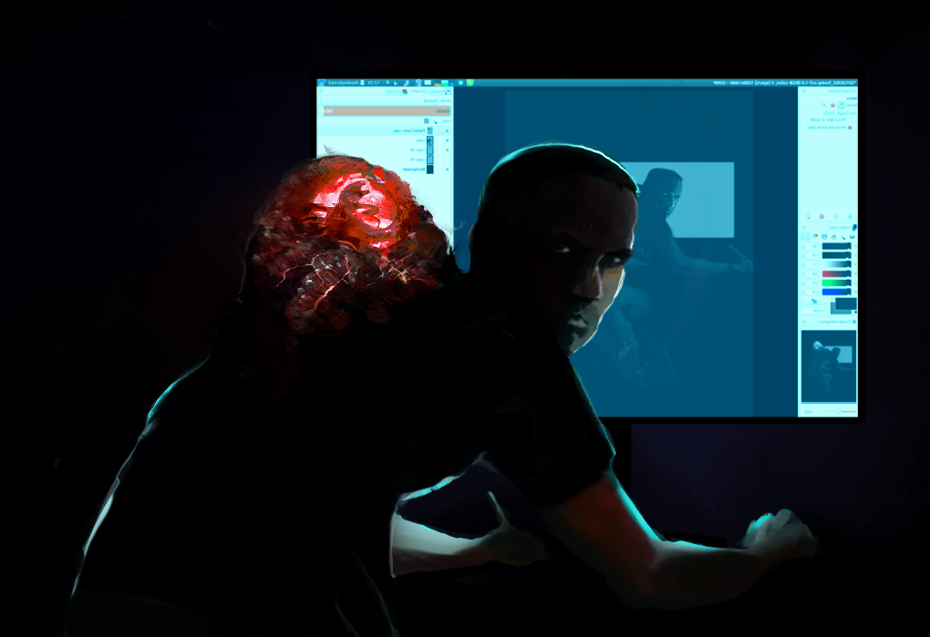
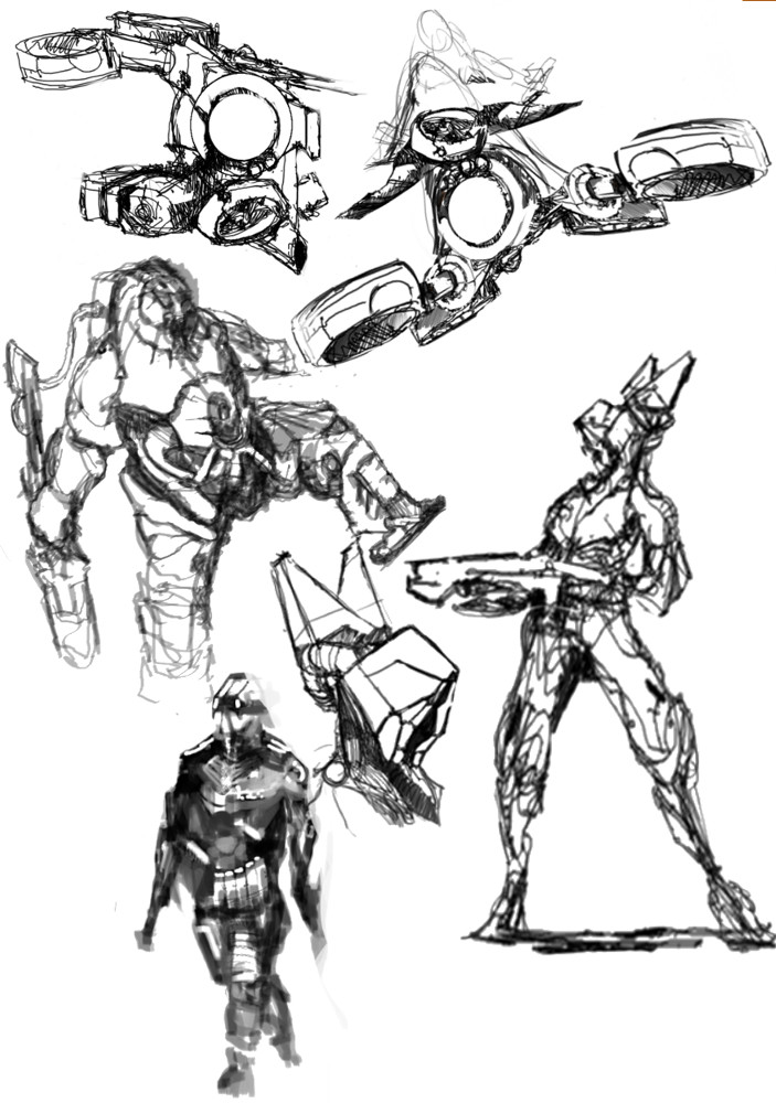
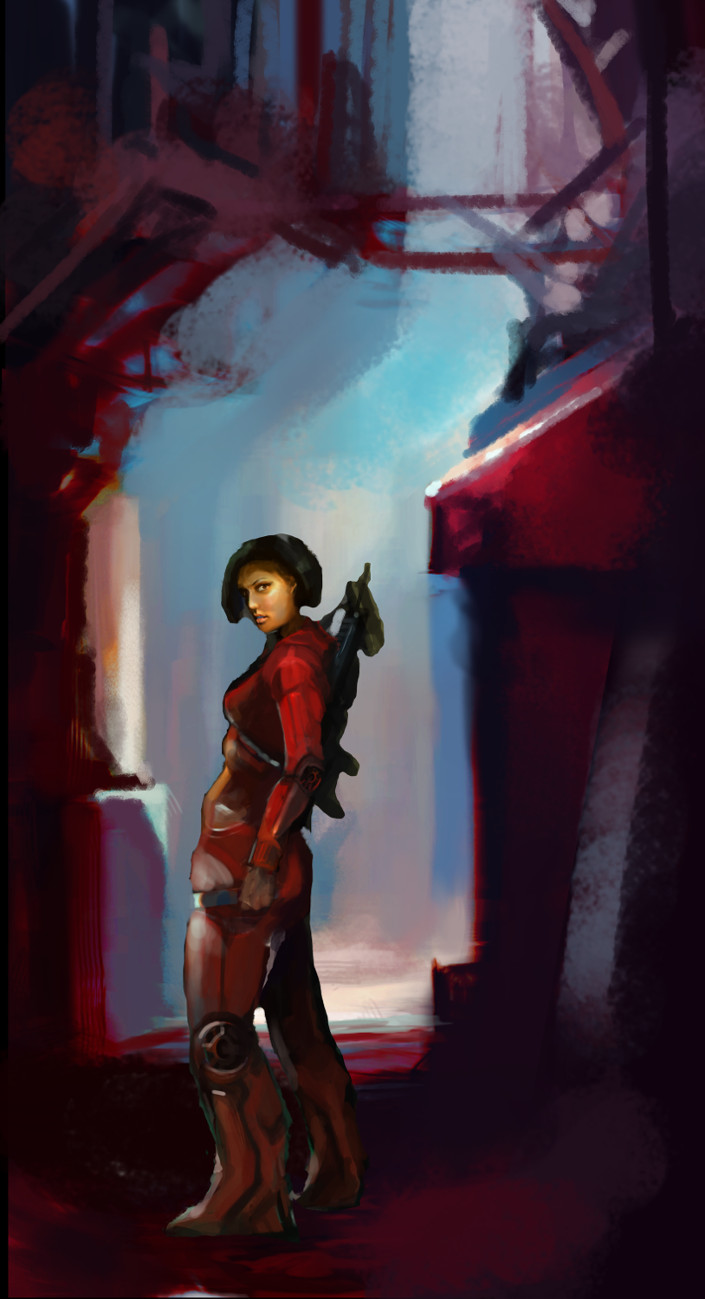
Quickish sketch to loosen up a bit. No plan. No ref. Just fun

Terrific crit you left for me, hardly owed. But I value it tremendously. I've touched on it some in my SB, but I believe your observations are spot on. So thanks, not only was it informative but I learned a little more about the crit process, which I'm terribly lame at.
Also man, I very much feel you on the approach to Lara. It's actually funny but if you view the entries. And without ever clicking one, but instead just viewing the thumbs it's like the same thing over and over again. Composition, color scheme, and so on. (Some are way better however then others) I actually made a mental note to be super unique and so failed on top of it. Whatever, we live and we learn and if we're lucky we have some fun along the way. Keep it up man!
Posts: 1,970
Threads: 22
Joined: Apr 2012
Reputation:
243
(03-16-2013, 06:37 PM)I STRaY I Wrote: Terrific crit you left for me, hardly owed. But I value it tremendously. I've touched on it some in my SB, but I believe your observations are spot on. So thanks, not only was it informative but I learned a little more about the crit process, which I'm terribly lame at.
Also man, I very much feel you on the approach to Lara. It's actually funny but if you view the entries. And without ever clicking one, but instead just viewing the thumbs it's like the same thing over and over again. Composition, color scheme, and so on. (Some are way better however then others)
No worries dude that's what I d6o; give good crit. I don't expect any reciprocation, it gives me satisfaction to be useful so that's good. Glad you appreciated it!
A lot of people entered the comp, it's a given there would be a lot of similar entries as people tend to go for the most obvious. I didn't actually look at many of the entries or concern myself with what others were doing. I don't really see the point in comparing myself with others much at all. Wasted effort in my opinion, I can only do what I can do and that will get better the more I work, not the more I try and compare what i do to others work.
Posts: 1,970
Threads: 22
Joined: Apr 2012
Reputation:
243
Posts: 1,970
Threads: 22
Joined: Apr 2012
Reputation:
243
Posts: 1,970
Threads: 22
Joined: Apr 2012
Reputation:
243
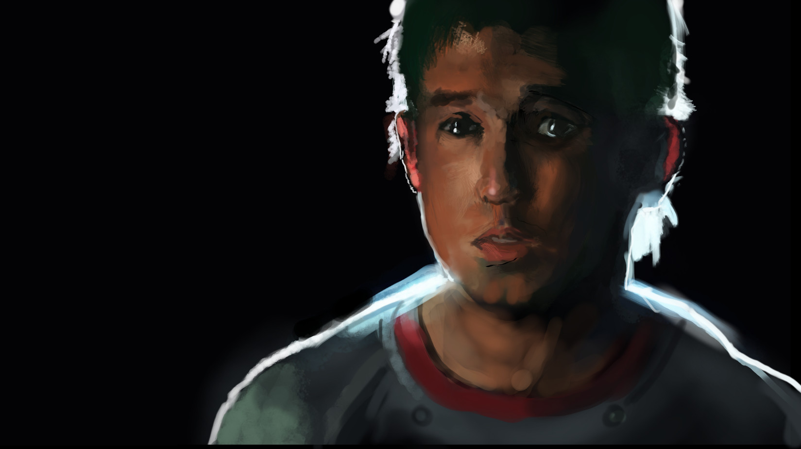
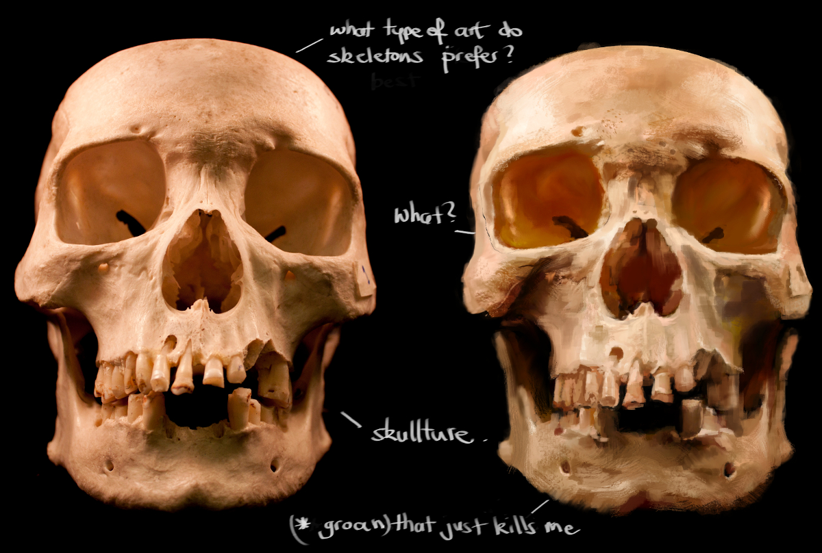
Skull study #1 for Helmighs portrait class week1

Posts: 1,970
Threads: 22
Joined: Apr 2012
Reputation:
243
3/4s
![[Image: attachment.php?aid=19793]](https://crimsondaggers.com/forum/attachment.php?aid=19793)
Posts: 1,970
Threads: 22
Joined: Apr 2012
Reputation:
243
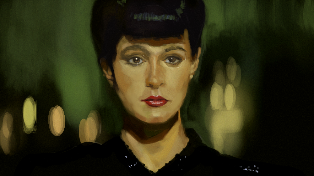
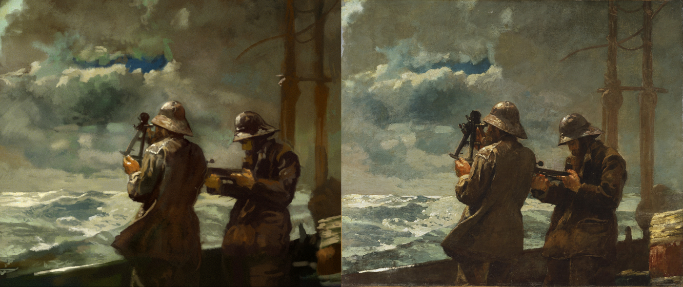
A study of Winslow Homer's '8 Bells'
The man was a genius painter. One of my favourite painters. Check him out if you haven't before!

Posts: 141
Threads: 12
Joined: Jan 2012
Reputation:
6
Wow great work. I can't believe it's all gimp.
Posts: 1,970
Threads: 22
Joined: Apr 2012
Reputation:
243
(04-10-2013, 04:30 PM)gangstershit Wrote: Wow great work. I can't believe it's all gimp.
Thanks man. Yeah...imagine what I could do with PS haha. Nah it's just a tool like any other.
Posts: 1,098
Threads: 11
Joined: Aug 2012
Reputation:
34
do you did all on gimp? well done man, i really like that last master study, the skull study is looking great too. My only suggestion is, work more on the different types of edges when studying.
Anyways, keep working hard!
Posts: 1,970
Threads: 22
Joined: Apr 2012
Reputation:
243
(04-11-2013, 04:42 AM)EduardoGaray Wrote: do you did all on gimp? My only suggestion is, work more on the different types of edges when studying.
Yeah I seem to be the only (serious about art) retard that seems to use it. But it has paid for all my coffees for the next 20 years I guess by being totally free...or maybe a nice HD cintiq when I get one :P. Eventually I guess I will have to switch back to PS if I ever start working at a studio, but they aren't that different so I'm not too concerned.
I've been trying to be more conscious of value and saturation with my studies, so the edge control has been losing out on some attention. I will try and keep that in mind for the next ones. Thanks for dropping by!
Posts: 848
Threads: 20
Joined: Jan 2012
Reputation:
29
Im always so jelly of your colours, they looks like a good painting with just a little bit of acid added into the mix. Definitely a cool style you are developing. Keep up the good work :)
Posts: 1,970
Threads: 22
Joined: Apr 2012
Reputation:
243
Thanks Jaik! A little bit of acid is good for a lot of things. XD
It's funny to me that colour is the one thing I have never consciously put any time into studying....I just tweak and people seem to like it. Wish it was like that for everything else! haha
A paintover I did in the crit section here in CD for AlmightyDTron. I'd normally not post this as it isn't all mine, but I like how it turned out. Things definitely turn out better for me using values only...maybe I'll go back to experimenting with overlay colour from a fully rendered grayscale and see if I can get it to work.
![[Image: attachment.php?aid=21634]](https://crimsondaggers.com/forum/attachment.php?aid=21634)
Posts: 1,970
Threads: 22
Joined: Apr 2012
Reputation:
243
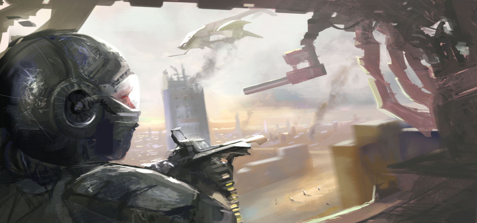
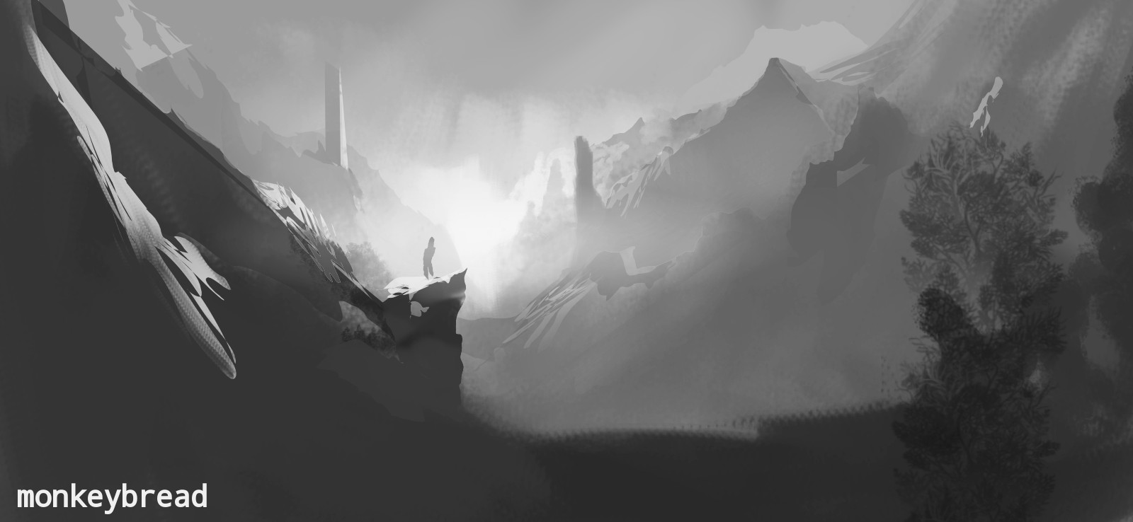
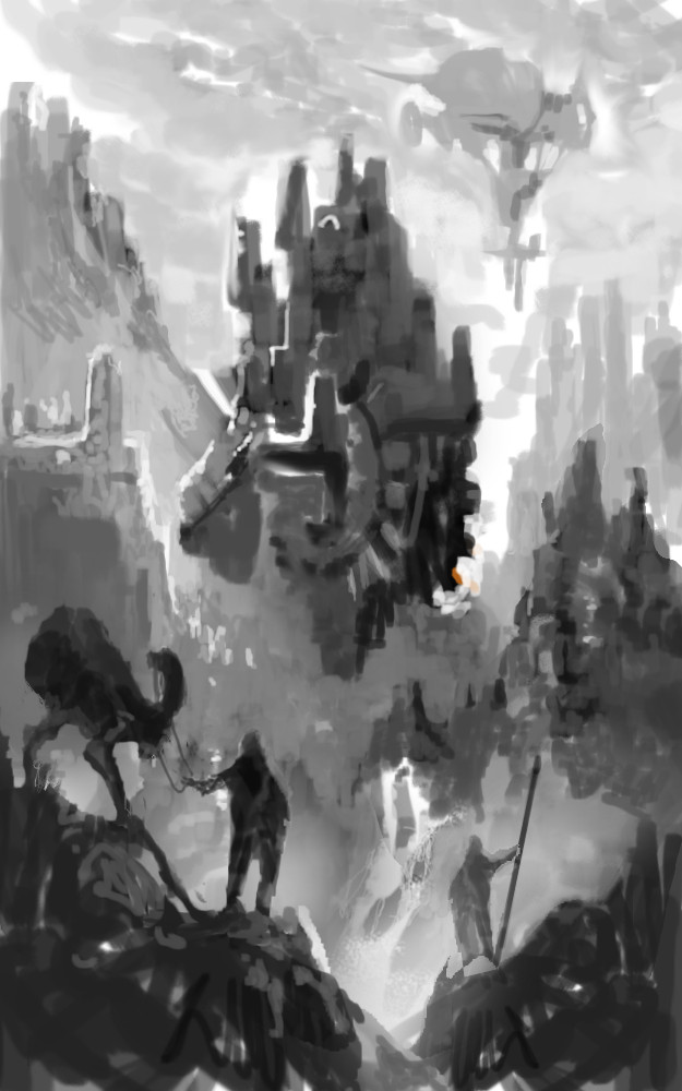
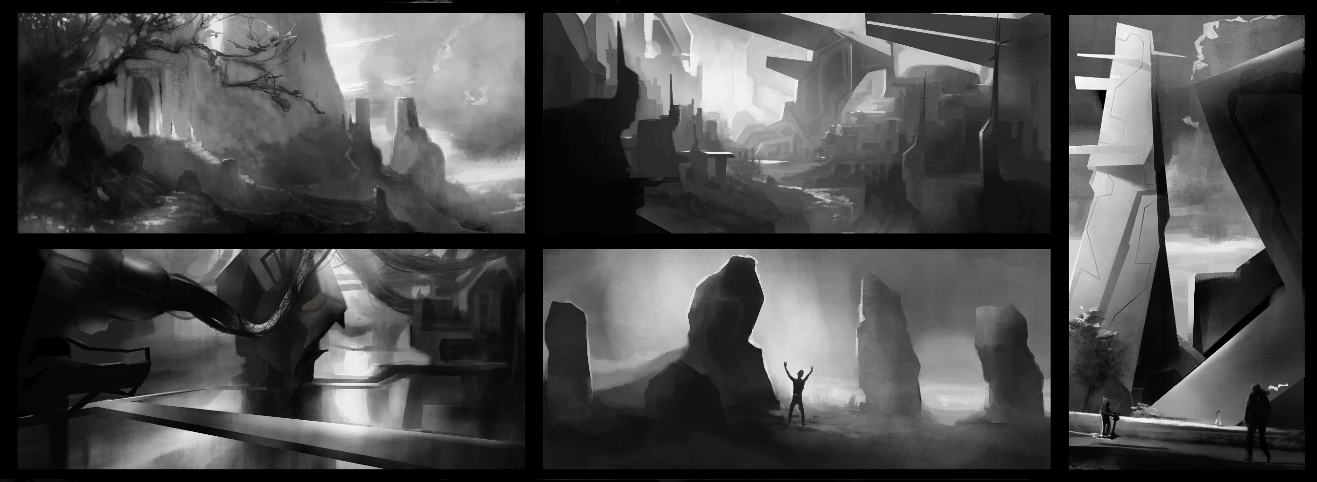
CGMA environment design. Week 1 assignment. Value Thumbs

Some doodle
![[Image: attachment.php?aid=22083]](https://crimsondaggers.com/forum/attachment.php?aid=22083)
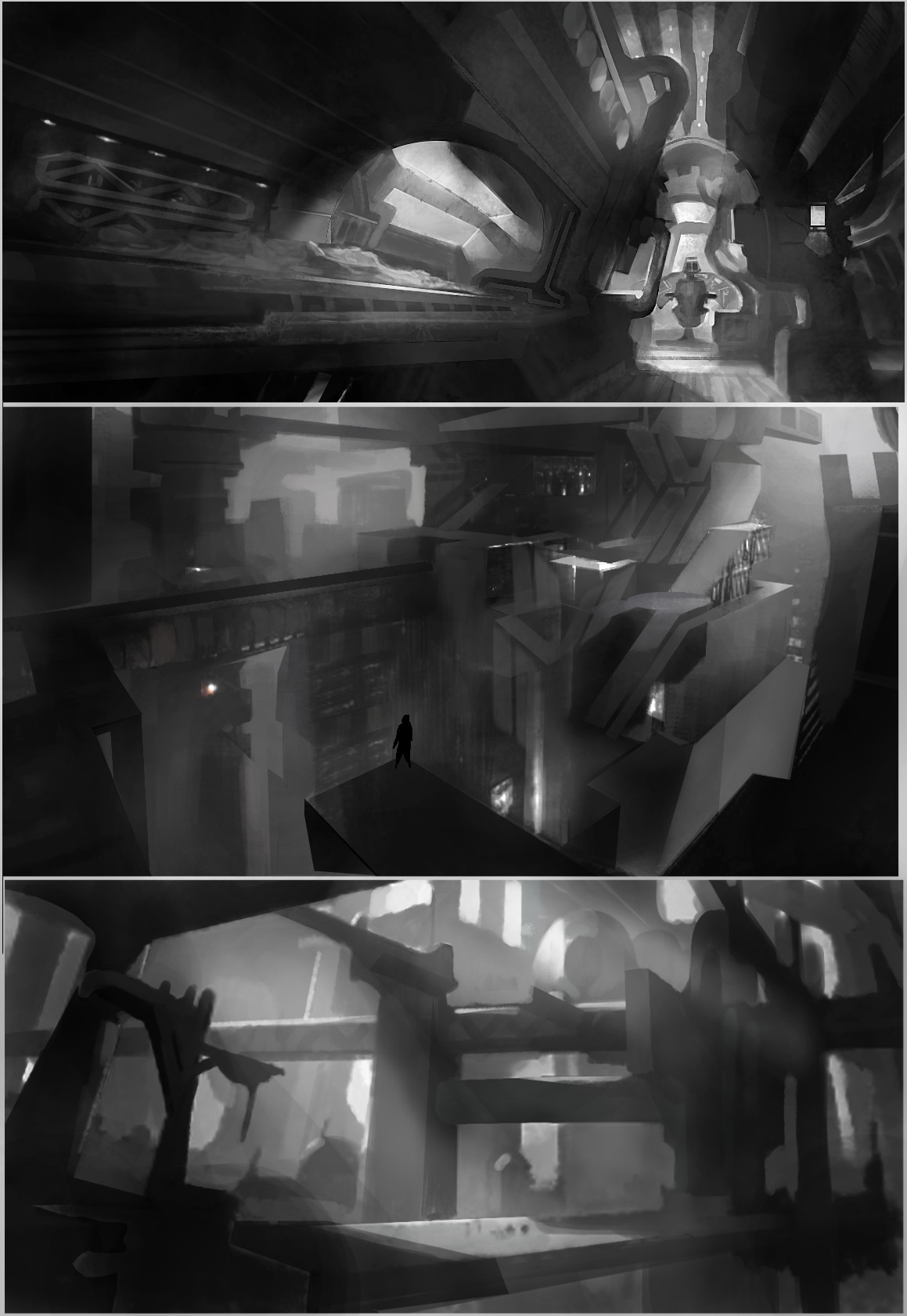
a paintover/repaint in value (mine's the top one)
![[Image: attachment.php?aid=22184]](https://crimsondaggers.com/forum/attachment.php?aid=22184)
Posts: 1,970
Threads: 22
Joined: Apr 2012
Reputation:
243
CGMA week 2. Half.Assed.As.Fuck

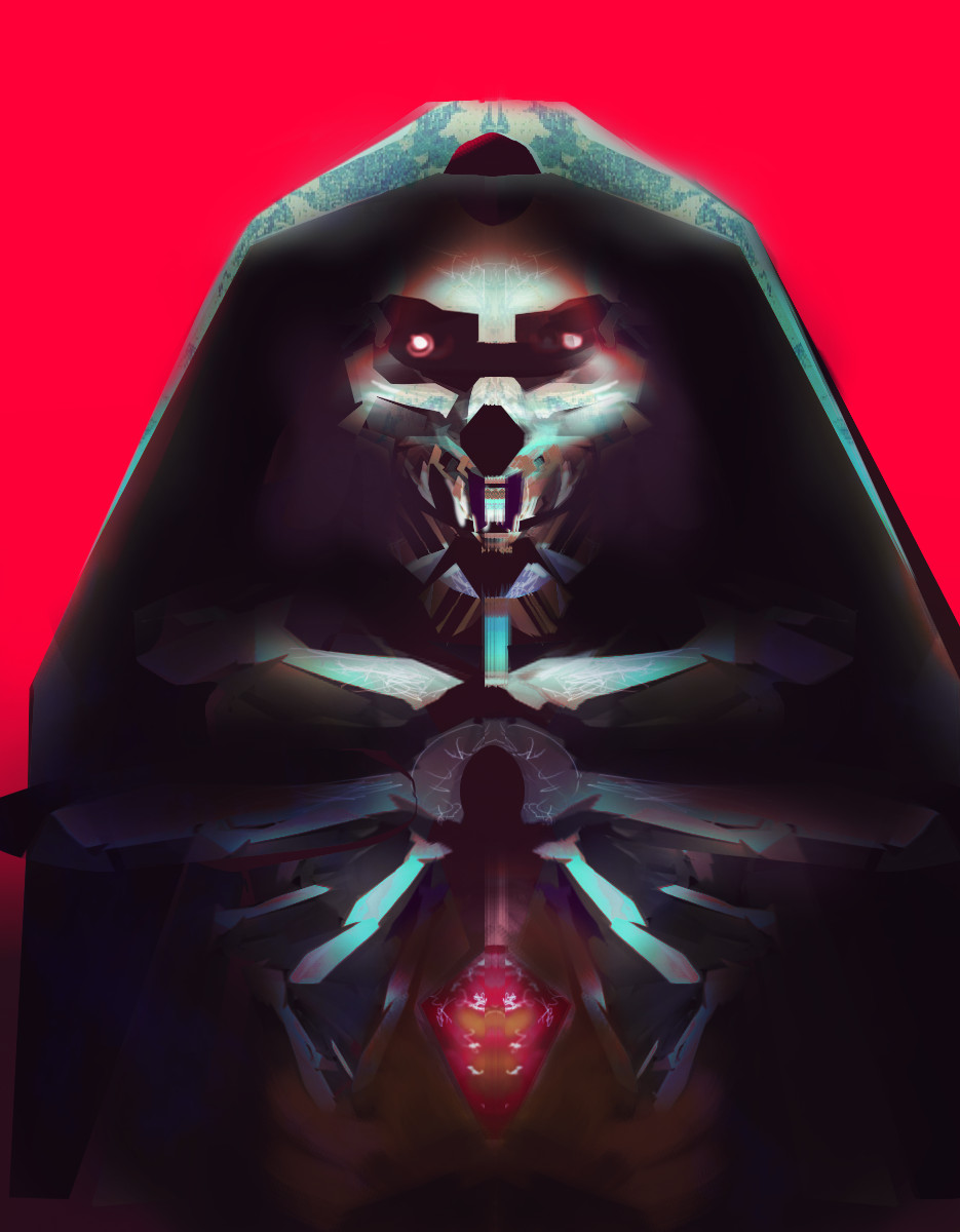
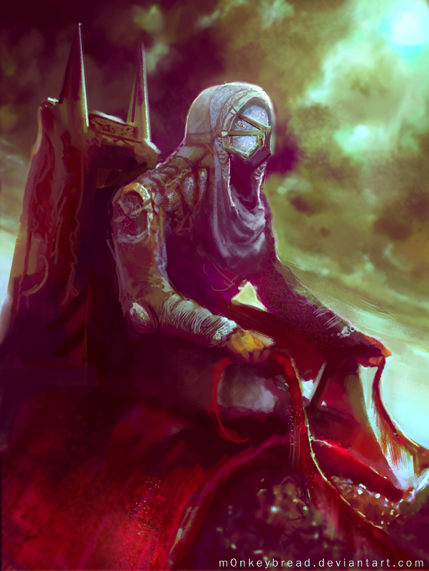
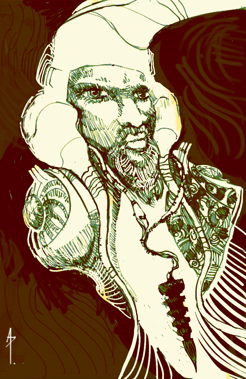
Style test for a comic thingy I'm kinda doing

Posts: 20
Threads: 2
Joined: May 2013
Reputation:
0
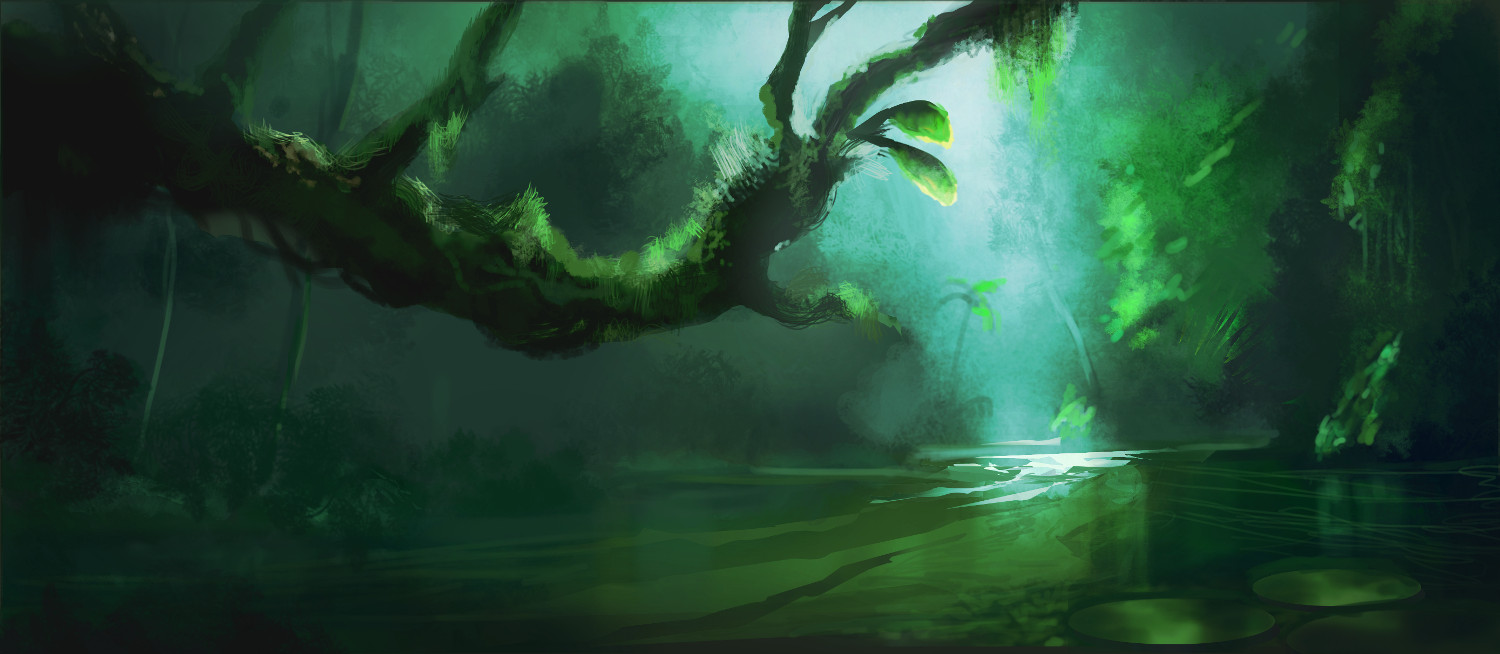
Hey man, I love the enviros and character designs! You use good vibrant colours, and your greyscales have nice values =]
|
![[Image: attachment.php?aid=16709]](https://crimsondaggers.com/forum/attachment.php?aid=16709)


