Alves' Sketchbook
#1
Ok guys, here it goes!

This is some stuff I've been trying out recently.

I know this is kind of an art dump but I just wanted to get this thing going! Next time I post here I'll give a short heads up regarding what my thoughts were.

Skeleton study:
[Image: iylZGYc.png]

Face study:
[Image: 4TCi3WG.png]

Some random face using the loomis method:
[Image: G5RC2Qh.png]

Some character thumbs:
[Image: HNla6wn.png]

A mech-suit:
[Image: l76i4Mp.jpg]

A spaceship concept I did 2 days ago:
[Image: 8Nv6wTT.jpg]

Looking forward to hear your crits, anything to become better at this!
Reply
#2
Hi Luis.

I like your design decisions on your last piece. I think you have a good grasp on perspective, although there are times where it looks like you went a bit freestyle and went against it (e.g. like the streaks on the side, the nose does not look symmetrical). I know it's tough, especially when handling mechanical stuff, but there are sections of the drawing where you make it look easy. I'm confident you can hammer things down better the next time around!

And your line weight decisions can use a bit of work. General rule of thumb is, if it's nearer the camera, the line is thicker. The farther it is, the lines get thinner. Pull that off and it will help sell a sense of depth in your works.

Your craft looks promising! Here's to hoping for more!

If you are reading this, I most likely just gave you a crappy crit! What I'm basically trying to say is, don't give up!  
----
IG: @thatpuddinhead
Reply
#3
(05-22-2016, 08:44 AM)John Wrote: Hi Luis.

I like your design decisions on your last piece. I think you have a good grasp on perspective, although there are times where it looks like you went a bit freestyle and went against it (e.g. like the streaks on the side, the nose does not look symmetrical). I know it's tough, especially when handling mechanical stuff, but there are sections of the drawing where you make it look easy. I'm confident you can hammer things down better the next time around!

And your line weight decisions can use a bit of work. General rule of thumb is, if it's nearer the camera, the line is thicker. The farther it is, the lines get thinner. Pull that off and it will help sell a sense of depth in your works.

Your craft looks promising! Here's to hoping for more!

Hey John! Thanks for the awesome feedback man I think you really described the way I feel about it!

Aye, absolutely... I got too lazy with those streaks on the side. Busted.

And the line weight... that is definitely a tricky subject for me, I feel like I'm not able to control it the way I want to. How should I be doing it, add the extra weight after completing the base line drawing or do it as I go?

EDIT: Also I just noticed another mistake, I added extra line weight on the scratchiest section of the drawing :/
Reply
#4
[Image: DNGqhJ3.jpg]

Trying to do a Viking this time! One problem I see is that even though I didn't use any reference it's starting to look a bit too much like Floki lol.

Anyway guys, I will try to finish it soon but I think it's looking a bit too bland color and value-wise, any tips on how to bring it to life and also how to render that kind of fabric?

Cheers!!
Reply
#5
My apologies. It took awhile for me to respond.

Determining line weights is definitely a tricky subject that becomes easier upon repetition. I personally struggle with it especially when the subject is more intricate and complex.

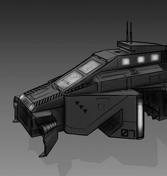
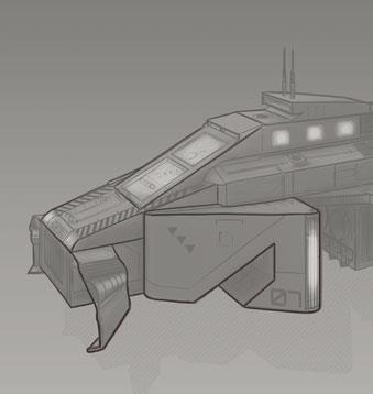
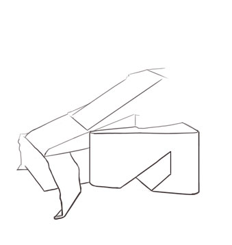
By the way, I hope you don't mind that I did a quick sketch over your piece:
Original:


Tracing Paper with line weight:


I made the line weights heavier at the bottom because I'm imagining there's a light source on the upper right hand side. Line weight also tend to go thinner/lighter when it hits the light, and heavier when it's close to the shadow.

How should you be doing it:
At your own discretion, whatever feels comfortable by you. Your proposal of finishing the base lines first and tracing over it with line weights in mind works. Or you could do a rough sketch and be mindful of the line weights when you're going to do the cleaner pass!

Hope this helps even a bit!

If you are reading this, I most likely just gave you a crappy crit! What I'm basically trying to say is, don't give up!  
----
IG: @thatpuddinhead
Reply
#6
(05-29-2016, 07:33 PM)John Wrote: My apologies. It took awhile for me to respond.

Determining line weights is definitely a tricky subject that becomes easier upon repetition. I personally struggle with it especially when the subject is more intricate and complex.

By the way, I hope you don't mind that I did a quick sketch over your piece:
Original:

Tracing Paper with line weight:


I made the line weights heavier at the bottom because I'm imagining there's a light source on the upper right hand side. Line weight also tend to go thinner/lighter when it hits the light, and heavier when it's close to the shadow.

How should you be doing it:
At your own discretion, whatever feels comfortable by you. Your proposal of finishing the base lines first and tracing over it with line weights in mind works. Or you could do a rough sketch and be mindful of the line weights when you're going to do the cleaner pass!

Hope this helps even a bit!
Wow, Sorry for taking so long to notice this man... thank you so much for the advice, really appreciate it :) I definitely need to spend more time refining my drawings.

I've been lazy to update my sketchbook here lately, as I've only been posting to instagram... I'll make sure to update it some of the stuff I've been doing soon.

Once again, kudos to you man!
Reply
#7
Damn I've been extremely lazy to update this sketchbook.. But that'll change.

Before going into the actual stuff, I'm going to make an effort to deliberately think about my current struggles:
1. I tend to go into speed-sketching mode without first thinking about what I'm drawing. While this might be good option when you feel like things are getting too stiff and technical, what I do is quite the opposite, I get too loose, too often.
2. Lines are too sketchy. Probably a consequence of 1. as these sketching lines serve the purpose of mindless exploration. And also I feel I'm getting very lazy and instead of refining and cleaning up stuff I end up falling for the anxiety of wanting to do something new. Any advice for this?
3. Running out of ideas. I'm not sure it is a case of lacking in the visual library department, because if someone asks me to draw a random thing I think I do a good job of at representing it with reasonable fidelity, but it may be that I need some new inspirations.

Ok, now onto the drawings. The first 2 are plain random. The 3rd one I tried to sketchout some old school bullies. The 4th was an attempt to design a young mexican cowboy. 5th was me trying to sketchout some environment pieces, not very happy with them though, I still suck at environments, even though they are some of the stuff that I love looking at the most, along with vehicles. The last one was actually one of my most structured attempts as of late, I took inspiration from Half Life 2 and Wolfenstein New Order to design an Authoritarian Cop set in a dystopian future.

[Image: PfbyzGY.jpg]
[Image: bWHHa1L.jpg]
[Image: SUrmsCe.jpg]
[Image: 067W4EE.jpg]
[Image: SIl6LE2.jpg]
[Image: QXotDEe.jpg]

Any tips guys? Would love to hear all kinds of advice! :)
Reply
#8
Study from life
[Image: 4Yxb7O2.jpg]
Reply
#9
Fun portrait from memory [Image: z2kHVGk.jpg]

And an attempt at colouring it
[Image: toBHIKw.jpg]
Reply


Forum Jump:


Users browsing this thread: 3 Guest(s)