Stuck and in need of critique or paintover
#1
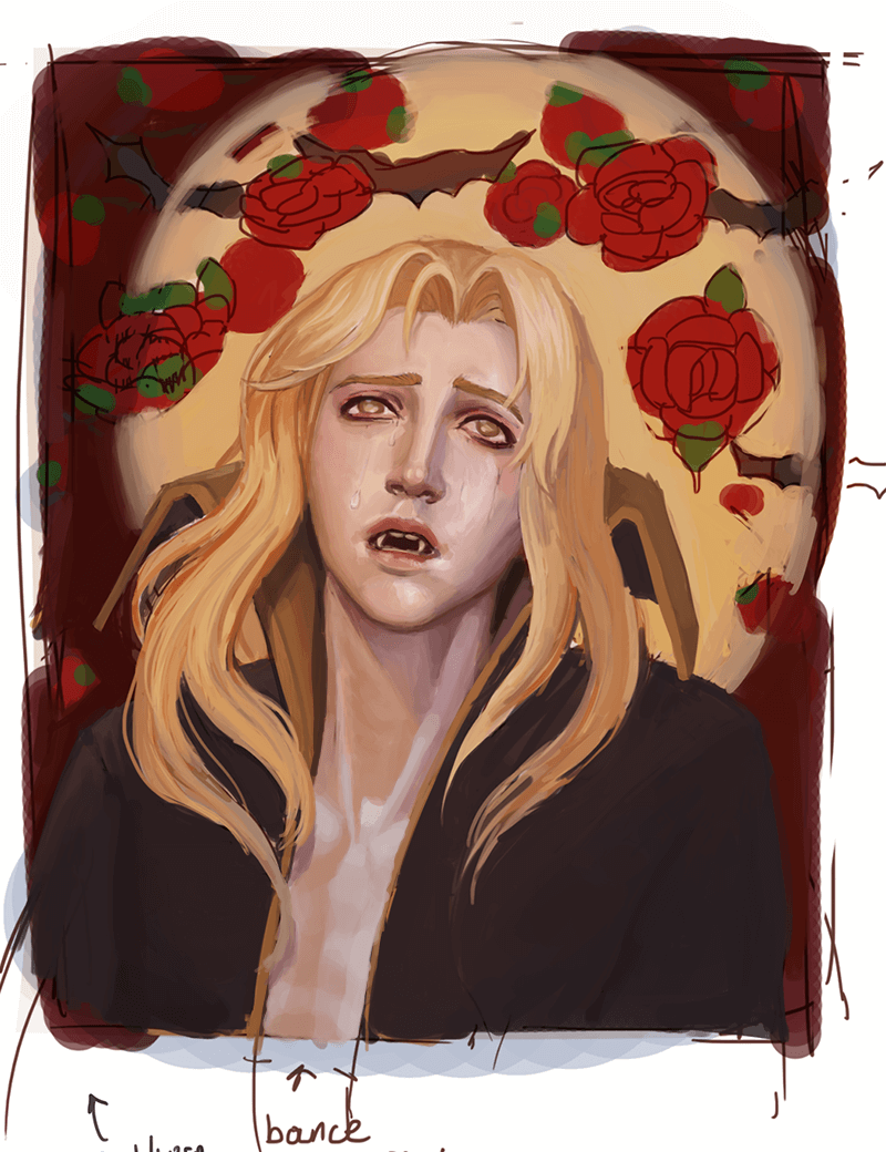
I was excited about this when I started it back in the beginning of March, but I knew from the get go this was going to really push my artistic abilities. Now, I open it maybe once a week, do what I can for half of an hour, and then feel unsure of how to fix and finish the piece. I don't want to drop it completely as I'm honestly really proud of it as it is, but I need some help getting it to the finish line.

Any critique, redline, paintover, etc is welcome!


Attached Files Image(s)


Reply
#2
Well uh. The attachment system isn't working all that well for me, and hitting 'remove' ended up........posting the post instead of removing the attachment? 

Here is the lighting and pose reference.


Attached Files Image(s)


Reply
#3
It's not a bad piece at all. It has a very nice color scheme with the orange tones and cool highlights. There's some asymmetry compared to the reference, but it's not a huge deal. If you aren't already in the habit of flipping your canvas horizontally now and then, give it a try; it makes it easier to see asymmetry.

As for suggestions for improvement, here's a paintover. I did this hastily, so don't take it as gospel. Think of it as suggestions for changes you COULD make, if you think it looks better. I'll talk about the significant changes I made and why.


Firstly, that reference is a difficult one to use for lighting. It's an indoor environment with multiple artifical light sources (obvious due to the multiple cast shadows on her neck), and it looks like you condensed it down to 1 yellowish direct light source and 1 blue-ish ambient light source, which is a good idea, but it's best to pick references with the exact lighting scheme you have in mind when you are inexperienced and non-confident with painting.

I thought the main thing that could be improved was his collar. I'd expect to see a cast shadow from his head and occlusion shadows where it meets his neck. I may have over-done it, but I thought it made the picture read better.

His pecs are too exaggerated for this lighting, and the chest anatomy is not as realistic as the face and neck (I made it even funkier though). You just need to find a good ref to get it right. Male high jumpers or swimmers might have the appropriate level of muscularity you're looking for. Or Iggy Pop.

There is little value difference between the lit areas and shadowed areas, which is appropriate if there's a strong ambient light, but I ended up making the neck shadow just a LITTLE darker to make it read better.

I added cast shadows from his hair. You don't have to put in EVERY single cast shadow that would logically appear, nor do you have to make them as big as they would be in real life; but if they will improve the 3D illusion, add them.


I hope that helped. Let me know if you have any questions.
Reply
#4
The most likely reason you have problem with attachment is either the format of the image isn't supported or your attachment is to file size is to large if it neither of both you might want to contact an admin to learn more about the issue.

My Sketchbook

Perfection is unmeasurable therefor it impossible to reach it.
Reply
#5
(04-20-2020, 01:57 AM)Pubic Enemy Wrote: It's not a bad piece at all. It has a very nice color scheme with the orange tones and cool highlights. There's some asymmetry compared to the reference, but it's not a huge deal. If you aren't already in the habit of flipping your canvas horizontally now and then, give it a try; it makes it easier to see asymmetry.

As for suggestions for improvement, here's a paintover. I did this hastily, so don't take it as gospel. Think of it as suggestions for changes you COULD make, if you think it looks better. I'll talk about the significant changes I made and why.


Firstly, that reference is a difficult one to use for lighting. It's an indoor environment with multiple artifical light sources (obvious due to the multiple cast shadows on her neck), and it looks like you condensed it down to 1 yellowish direct light source and 1 blue-ish ambient light source, which is a good idea, but it's best to pick references with the exact lighting scheme you have in mind when you are inexperienced and non-confident with painting.

I thought the main thing that could be improved was his collar. I'd expect to see a cast shadow from his head and occlusion shadows where it meets his neck. I may have over-done it, but I thought it made the picture read better.

His pecs are too exaggerated for this lighting, and the chest anatomy is not as realistic as the face and neck (I made it even funkier though). You just need to find a good ref to get it right. Male high jumpers or swimmers might have the appropriate level of muscularity you're looking for. Or Iggy Pop.

There is little value difference between the lit areas and shadowed areas, which is appropriate if there's a strong ambient light, but I ended up making the neck shadow just a LITTLE darker to make it read better.

I added cast shadows from his hair. You don't have to put in EVERY single cast shadow that would logically appear, nor do you have to make them as big as they would be in real life; but if they will improve the 3D illusion, add them.


I hope that helped. Let me know if you have any questions.

I'm trying to get into the habit of flipping my canvas, but unfortunately I usually remember to do it once I'm already a decent way in, so I end up with a lot that needs fixing. I don't think I flipped this one at all yet, so I'll definitely give that a go, I'm betting I'll find some of the smaller problems I can't pinpoint. 

Thank you so much for the paintover! I was struggling with his neck, especially his (goes to google neck muscles) SCM, that is really helpful. I very much like the cast shadows and you're right, it does read a lot better.

Those references are perfect, just what I need omg. You've been a huge help. I have one question; does the collar look okay? The left side feels good to me, but I'm not entirely sold on the right. I feel like the angle is wrong. What do you think?
Reply
#6
Cool start dremorai, I like the vibes.

For me, personally, the thing that looks the most "off" is the hair and collar, and their relation to one and other. It's quite a thick collar, right? It juts out past the face (based off the reference images). So if that is the case, then the hair looks like it's floating in mid-air well in front of the collar (which is already in front of the face). It gives it an unnatural sense since the hair is shaded as if it was just sitting normal. So, perhaps play around with the hair, it's direction, the depth perception, the shading, and how it sits.

Since his head is tilted backwards, we should be seeing more of the under side of his chin. If you look at the photograph reference image it is evident there, albeit a bit harder to notice since it's bathed in shadow.

Also to get in the habit of flipping your canvas, I've found hotkeying it is the best thing, especially if you are already in the habit of saving frequently.
Reply
#7
dremorai: I don't think anything is outright wrong with the collar. If there is a problem, it's most likely due to its relationship with the hair, as chubby_cat pointed out.
Reply


Forum Jump:


Users browsing this thread: 8 Guest(s)