07-30-2020, 05:22 AM
Page 9 - version 1
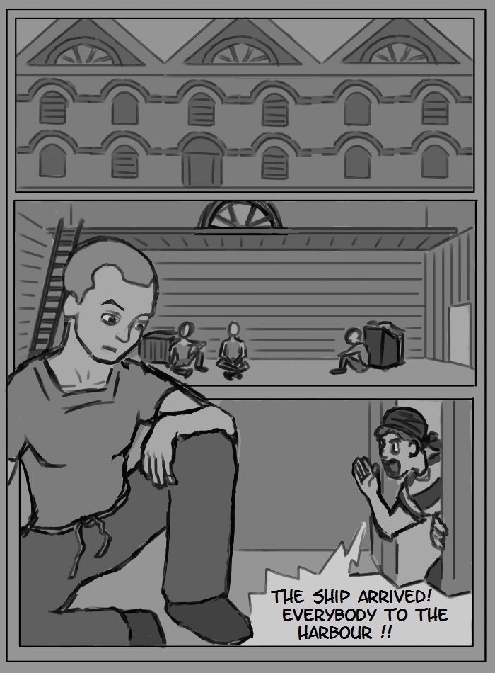

on DeviantArt
|
Making a graphic novel / manga
|
|
07-31-2020, 04:08 AM
I had a few thoughts that came into my mind as I was reading your comic. I gathered them in this quick overpaint/oversketch. Hope they help!
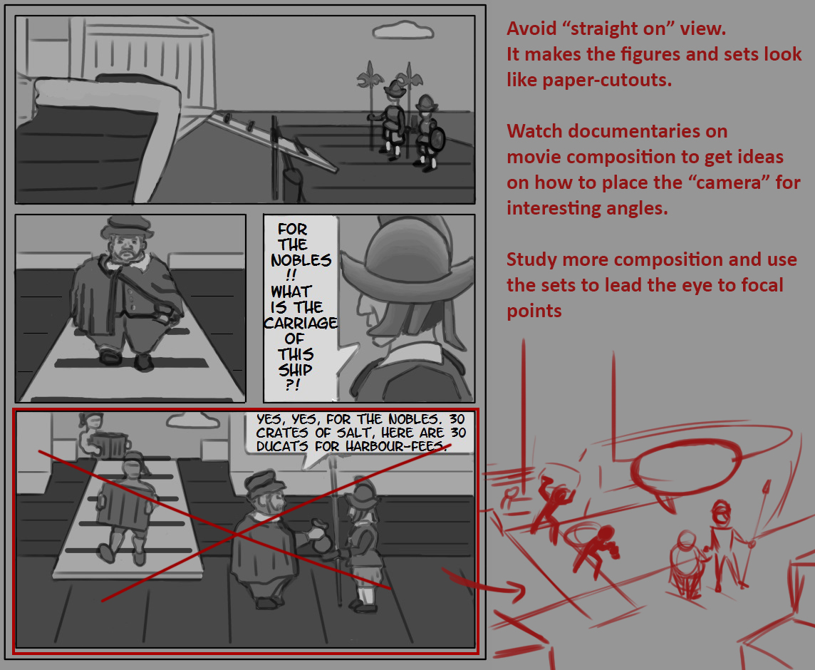
07-31-2020, 10:12 AM
(07-31-2020, 04:08 AM)Zorrentos Wrote: I gathered them in this quick overpaint/oversketch. Thank you very much. This is very appreciated. I will re-do that one in the future. also I have questions: 1. how would you "study composition"? I have the book "framed ink", which I guess is really good, but I do not know what in the "studying" of the book/composition the "milestones" are, that I have to reach. Do you know them? How do I determine if I am "better" now or not? Its not like "lesson 1 do this. lesson 2 do this. lesson 3 do this." 2. I am thinking that I can "overdo" it. By that I mean, for example the picture you corrected, is not a major point in the story. Should I anyways make all of the pictures, whereever I can make them as good looking as it is possible? that may make some pretty meaningless scenes come across as very important, doesnt it? I dont know. Maybe its always good to have every picture as goodlooking as possible, could be the case also, i dont know... But definitely you are right with the point you made, your sketch is better! (but I am very happy, seeing in your sketch, that my sketch completely conveyed the idea I wanted it to! :) )
on DeviantArt
08-01-2020, 03:37 AM
1. There are videos on YouTube that analyze compositions in movies and how the director conveys the mood and ideas. If you search, you should find videos on how famous directors and studios set up their scenes.
A graphic novel can be described as a series of "still frames", just like a movie (thats how I like to think about it when im making comics). The book Framed Ink that you are using is a very good start, and you should really read and analyze the book to get an idea how to set up your scenes. 2. You should set up a scene so that it conveys the mood and clearly tells the story to the reader. Its important to let other people read through your thumbnails/sketches and ask them if they understood the entire story and who is supposed to be who (I often had the problem when I was younger that readers could not understand what was happening in my comics). I dont think you have to worry about overdoing it, indeed, you may wanna dumb it down A LOT so that everybody can understand the graphic novel clearly. 
08-17-2020, 04:55 AM
Page 10 Version 1.
I tried the technique of "leading the eye" here on the bottom panel for the first time consciously. I blocked all the sides and corners with something and the viewer should be directed towards all the crates. 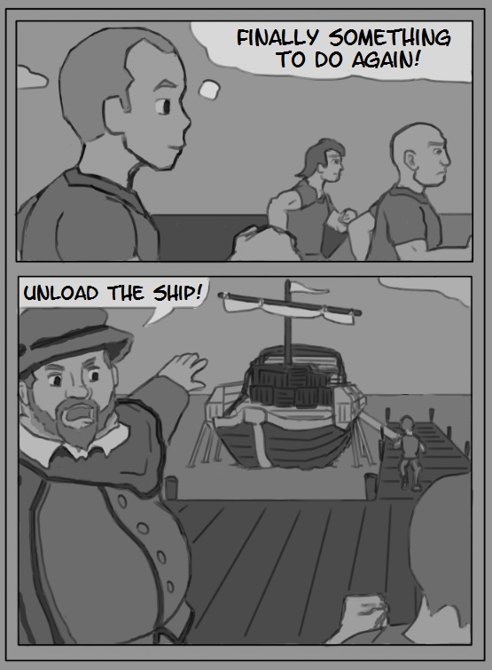
on DeviantArt
08-21-2020, 06:45 PM
A clear improvement over the previous pages.
Here are some useful links and reading that may help you. I especially recommend the second link (scroll down a bit to get to the bit about composition and placement) http://rebloggy.com/post/disney-cinderel...1465999228 https://floobynooby.blogspot.com/2011/01...carol.html
08-25-2020, 07:19 AM
(08-21-2020, 06:45 PM)Zorrentos Wrote: A clear improvement over the previous pages. Thanks! I went though a part of it, but it was so much, that it can not be done in one session. I will go through more of it in the future. I read the part about the line of action, I get the impression, that its not always good to have a strong line of action, it seems to me the stronger the line of action, the cartoonier the figure looks. But its definitely something to experiment with. ___ Here we have the next page. It has no improved techniques like leading the eye, not even good camera-placement, but I want to push the story a little bit, until I finally finish chapter 1 (which means page 20-30). I already lined up several pages in not-so-advanced-style. Page 11 Version 1 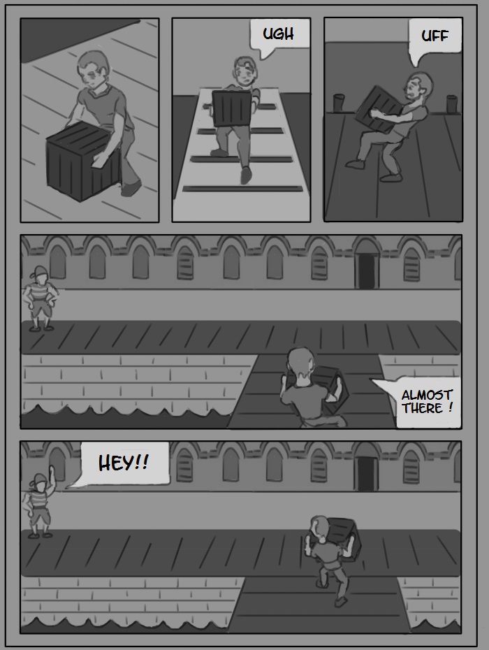 Oh yeah, and here a little concept of the merchant. 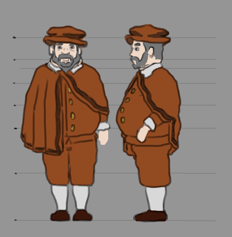
on DeviantArt
08-25-2020, 11:25 AM
You probably have felt by now that it a big project to try to do all the aspect of a story. Let me just enumerate some of the hat your trying to take on world building,concept art,storyboarding,text layout,spellchecking,researching trying to do all this it crazy time consuming and honestly i think the result with be half of what it could have been if you tried to stick to what you where meant to do of course writing a story would be nice to be done all by yourself but is it really possible that what i want to ask you seriously.I know it going to be hard on you to hear this but i think the problem right now is you would do yourself a favor by finding what is the aspect you want to really focus on so can be good at and get good at atleast one of those thing first.Trying to get good in all those thing is simply to me being scatter brain in my opinion.It couragous but kinda naive at the same time.If you really want to push something to the finish you would be better of trying to find people who can complement you in your ambition.But working with people isn't child play either unless there passionate and willing to push through the hardship.
It a noble effort to try to find out what you like and that is i think what your inconsicously doing but it seem to me your chewing more than you can bite if you know what i mean.I would say your falling into a common pit fall that is to try to wears all hat the hat at the same time this more of the domain of someone who as had a life time of exploring different aspect of art and is bored by what he as now mastered i am trying to be the voice of reason here if you allow for a minute.Would you not be better of trying to master fewer thing instead of trying to build the pyramid right away if i can use this metaphor? Of course no pressure if you do this as a hobby in that case you are free to go at your own rythem but the idea of avoiding to be to scatter brain would still apply so that you can atleast if later on you want to make it professionally give yourself a fighting chance.
08-27-2020, 09:50 AM
(08-25-2020, 11:25 AM)darktiste Wrote: Trying to get good in all those thing is simply to me being scatter brain in my opinion.It couragous but kinda naive at the same time. Of course I see why it would appear that way. You are right in that regard, that there is soo much stuff that could be improved. And you are totally right that it would be too much to improve everything at once at the same time. But I also have a very clear goal and am progressing towards that goal in a very step-by-step process: the big goal right now is "finish a graphic novel". The small goal for that at the moment is "finish Chapter 1". Whenever I post a new page I write next to it "version 1" meaning, that in the future I can redo it and improve some aspects to make it look better. What I am posting right now is more like the very first rough draft for the story. When I finished Chapter 1 (which will be aroung page 30, maybe a little bit earlier), this whole thing will at least be a tiny little bit into the story so that it can have a glimpse of "being interesting" for a viewer. And then I can go over every single page and improve on the composition, and go over and improve the line of action and maybe the anatomy and so on. So I totally see why it may have looked like "wearing too many hats at once" but I am really focused on one single goal: "finish the first version of Chapter 1".
on DeviantArt
08-27-2020, 01:02 PM
Quote:It has no improved techniques like leading the eye, not even good camera-placement, but I want to push the story a little bit, until I finally finish chapter 1 (which means page 20-30). I already lined up several pages in not-so-advanced-style. These are just my thoughts, so feel free to dismiss them entirely. But if every page you are currently making are drafts that are going to be redone later (meaning there's no reason to be precious over them and how they currently look), isn't this the perfect opportunity to actively study and apply what you learn? You learn and progress your skills faster if you apply what you've just learnt directly to your own personal work. So isn't it a wasted opportunity to not heavily intertwine studies and learning into your project? I'm not saying study everything under the sun all at once, but instead to pick an aspect of art to study. Why not study something like composition and then try and apply it to your next page? Study perspective then apply. Values, then apply. Etc etc. Basically, what I am saying is that this is a great opportunity to study - apply - study - apply - study -apply so on and so on. Keep building up your skills as you go along, instead of just doing page after page with the same knowledge and mindset of just wanting to complete the goal. Anyway, it's food for thought
08-30-2020, 01:49 AM
[quote id='128463' dateline='1598497337']
isn't this the perfect opportunity to actively study and apply what you learn? Basically, what I am saying is that this is a great opportunity to study - apply - study - apply - study -apply so on [/quote] Yes, of course that's a good thing. I'll try to do it more intertwined next month. September shall bring big progress for this project. I am thinking about studying and then vlogging about what I learned on the youtube channel, since I have it. _____ Here are pages 12 and 13 versions 1. 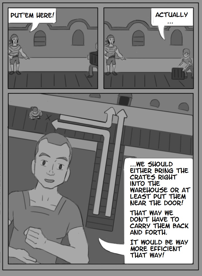 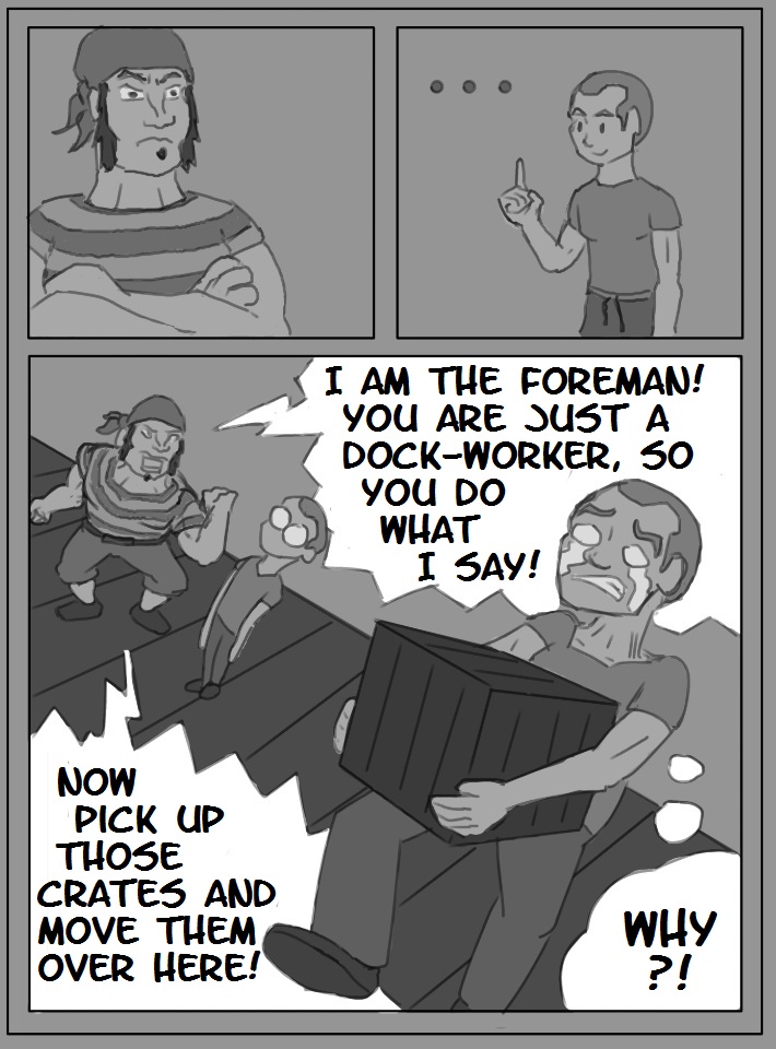
on DeviantArt
08-31-2020, 09:11 PM
Pages 14 and 15 Version 1
and now I think I will try improving some previous page and try to find a good, finished look. 14 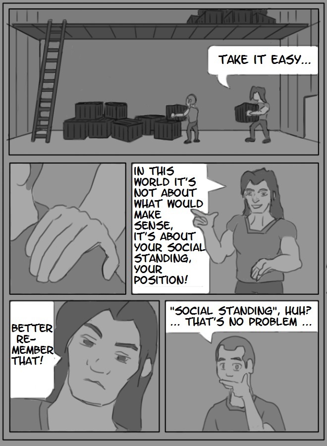 15 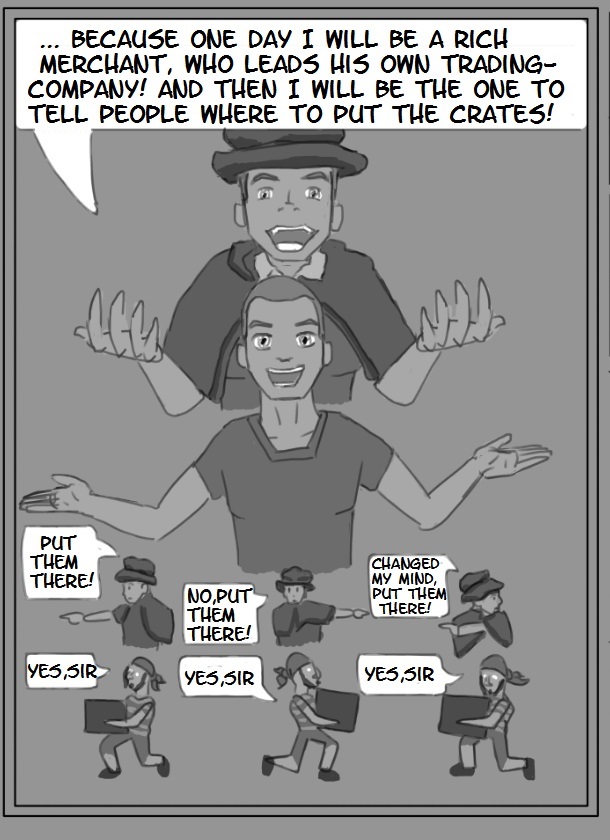
on DeviantArt
09-04-2020, 06:32 AM
So the most important thing, that I want to improve is to choose a style, that the finished version shall be done in.
I have 3 styles at hand that I found in other works, that I like and each I wanted to try. One style that I want to try right now, is the classic `normal` Manga style. The second is like a mixture of comicy and manga style. And the third I think I will not be able to do, its `cool-looking, rough comic-style`. (i might show examples of each in the future.) So I am studying those and try to get a grasp on how they do characters, and how they make character-consistency, so that the same character looks like the same always. But I find this pretty hard to understand. I show you pictures of some studies. I looked at the noses (and in manga eyes also), that are each from the same character. They always change what they draw and I cant see the system behind it. on the one picture you see a green, red and blue box around the faces, they mean all the noses inside are from the same character. Does anybody know: How do they decide, which lines to draw, and where to leave a blank, just indicating the border of the nose by showing nothing? How is decided when to draw a line and when to not draw it? Sometimes its just a dot at the bottom of the nose and the reader reads it still as a whole nose. But sometimes the whole nose with nostrels and everything is drawn. But it is not annoying, when you read the manga. Also, in the comicy style, they always draw the whole nose with all details, but every character has a completely unique nose and unique eyes and mouth. I dont know how they come up with a whole set of facial features unique for each character. That seems so hard! 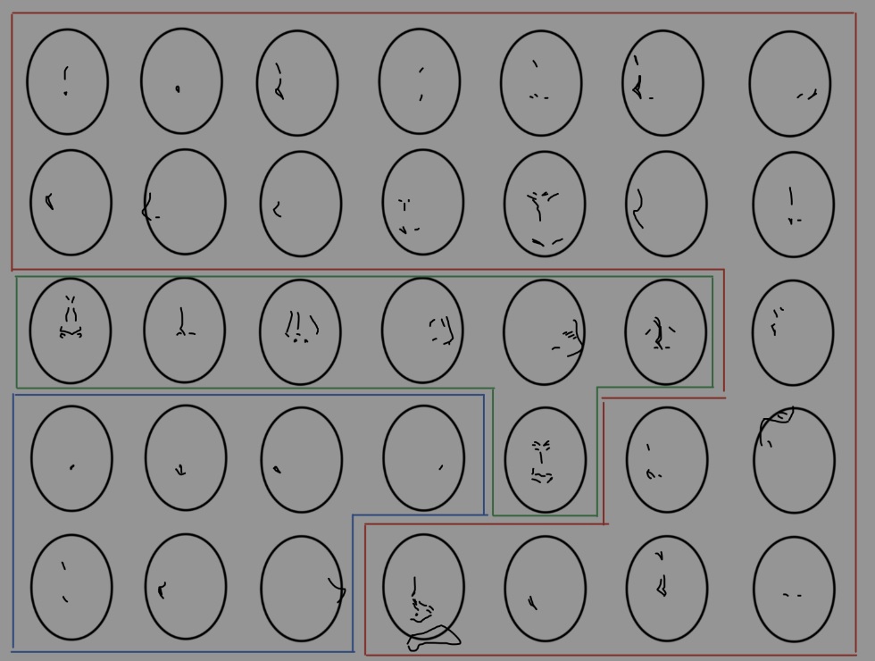 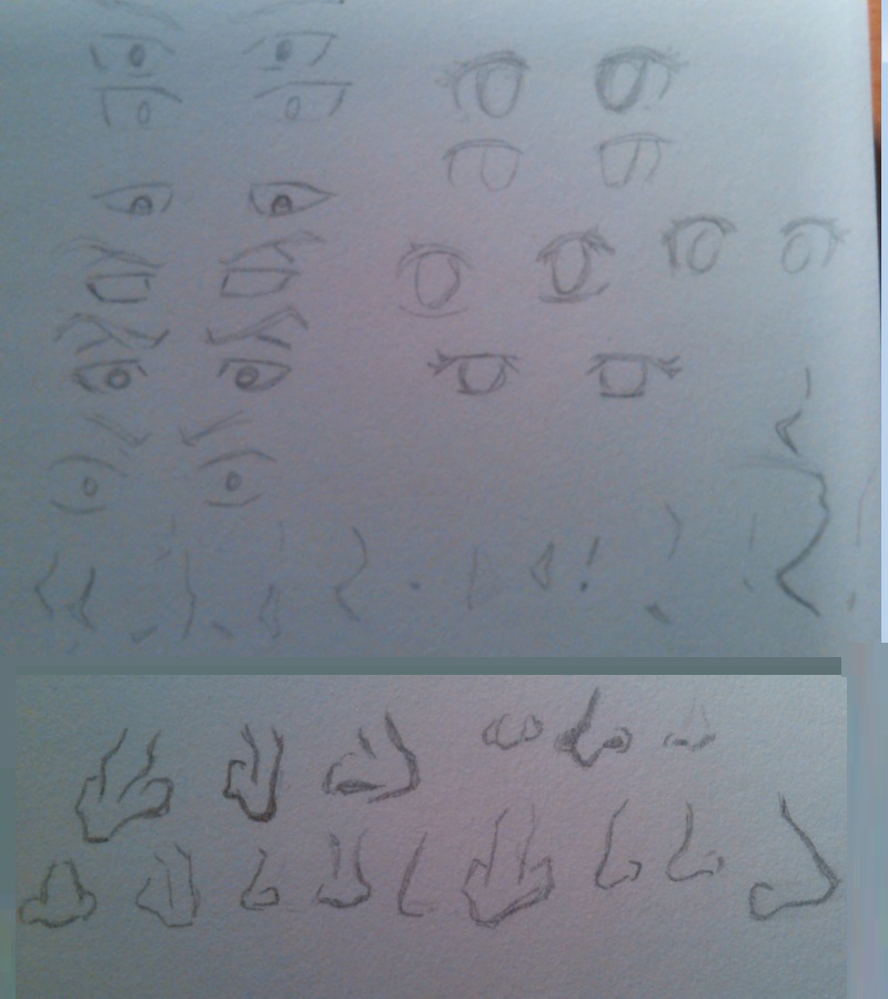
on DeviantArt
09-04-2020, 07:17 AM
How you decide how a line look is not a secret there no method it come from a understanding of the fundamental such as plane,value change due to light.When we talk about stylisation is how to apply the concept of visual simplification or in short term how to visually reduce the symbolism of a object to a certain level of detail.Take picasso for example compare to leonardo da vinci they don't use the same line process to imply a nose.Visual simplification is a choose no body is going to make for you.You either learn how someone simplify by studying them or you create your own methodology to simplify object the key is to have enough information that anyone who see those set of stroke can still recognize the symbolic object your drawing.For example we could have a house draw with only a square and a triangle roof and a square window and a rectangle door vs we could have a complex house in a 3 d view those are two artistic example of stylistic choose with varying degree of simplification.
09-04-2020, 09:56 AM
This is my first attempt on what I meant by "mixture of comicy and manga style".
Maybe the outlines could be even thicker and more black. (I am not a Painter as you see) I would say a complete Comic-Book made in this fashion would not repulse a reader, would it? 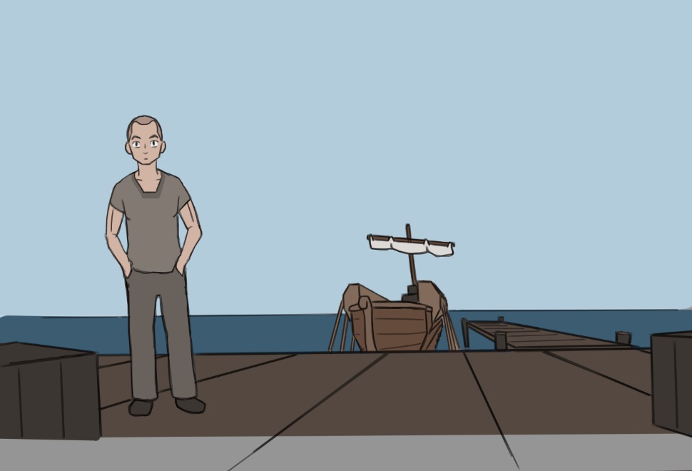
on DeviantArt
09-04-2020, 12:22 PM
I think i term of level of detail this is way to simplistic there not even an attempt at texturing but your using color to do that i would say not sure if it would work in black and white.I would advise to look at other web comic outside the realm of amateur comic if you want a idea of what you should strive to become.There no wrong or right anwers what is appealing is appealing what isn't isn't.My personal point of view is that if the artwork doesn't engage me it will be hard for me to want to read.Your art style should appeal to your targeted audience if anything that the only rule simple art style tend to work better with young audience will older audience will probably prefer a nice level of detail.A in between adult and young audience will therefor enjoy a moderately high level of detail.
I think outside of all those concern one of your primary goal should be to avoid alot of dialogue which can become really heavy on the read and avoid static pose and boring composition that are a eye sore in term of immersion of course i do understand that action scene are probably outside your current skillset it just more of a comment for your future self if you read this again. I think that if can give you an advise is do your draft version in black and white and if the result is satifiying enough and generating enough interest make a color version else i think coloring is nice but it time consuming and i think were your at in term of skill it would be better time spent learning more art fundamental and principle of design or spending time to study various thing to inform your work and make it more believable.Coloring is relaxing but there no much to learn from it so don't inconsciously use coloring as an excuse to say your doing some work use yor limited time wisely.You can focus on what you like and enjoy or you can spend time coloring and see less progress in your work.
09-05-2020, 02:50 AM
I think what really bother me in your work is when you put a blank background behind your character if your gonna do that atleast frame your subject n a way where the subject take most of the space or it just empty space and waste of space on a page and it gonna add to your cost if you intend to produce it later on.Look at the first frame of your example as example of what i mean by using framing and blank background or if you want to make a ''blank'' background use the action line like in the third square to make thing more interesting.
09-07-2020, 05:14 AM
Its great to see that you are continuing to study and work on the side while creating your personal project!
I had some thoughts about one of the pages you posted. Quick and dirty overpaint, but maybe it explains my idea a bit: 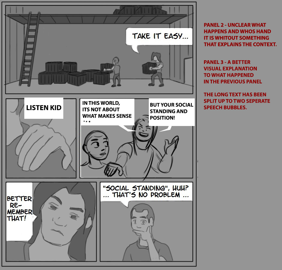
09-10-2020, 07:21 AM
(09-07-2020, 05:14 AM)Zorrentos Wrote: Its great to see that you are continuing to study and work on the side while creating your personal project! Thanks for the suggestion, Zorrentos. I can apply that suggestion, when working over that page. __________________ Here are my recent experiments with finding a style for a colored/finished version. These are all versions of Page 16. (blank version) 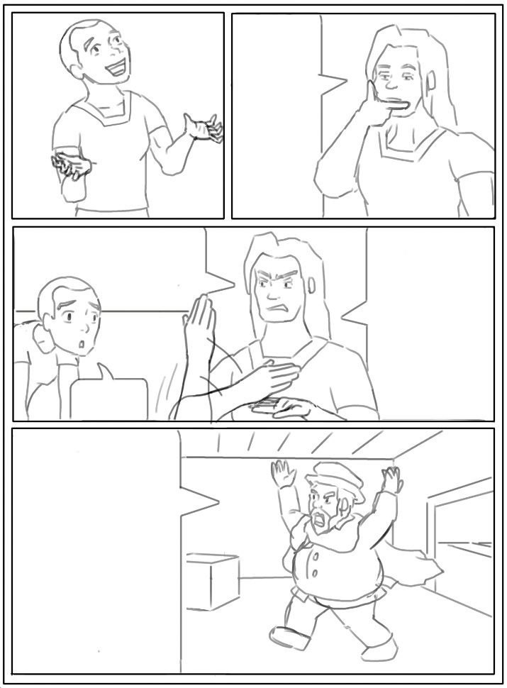 Comicy version 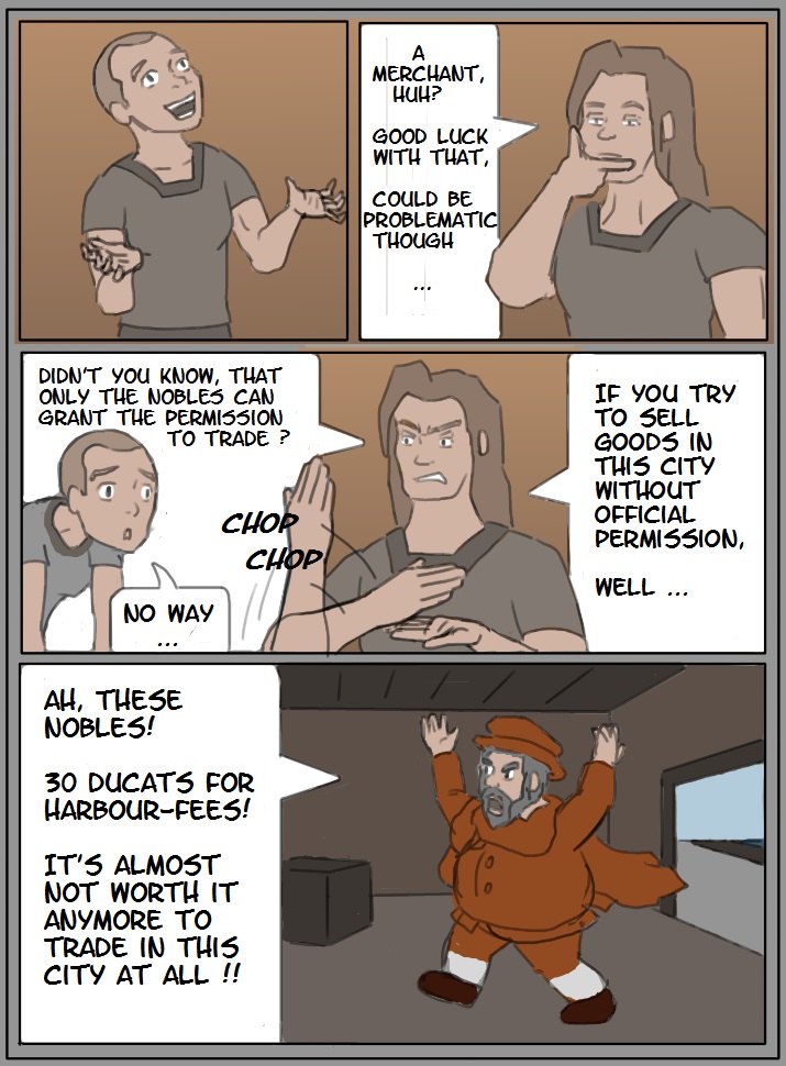 Try of a Manga-coloring by using dots to make darker areas - made in Krita 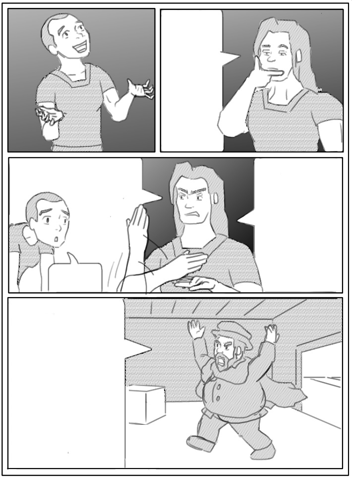 Try of a Manga-coloring - made in Medibang (this program seems promising for this, but I have to practice it to get a better-looking result.) 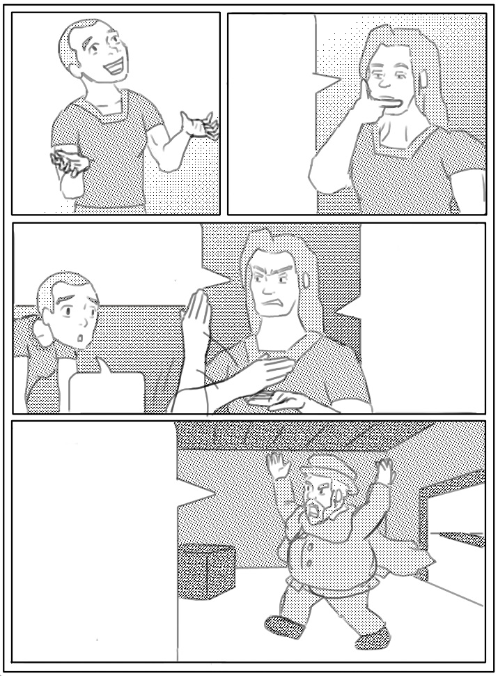
on DeviantArt
|
|
« Next Oldest | Next Newest »
|