How can i learn to improve my color theory
#1
I always wonder how other artist practice color theory. Like what kind of exercise can help improve color theory and how do you extract better ''understand'' from those study like what are you suppose to be improving exactly that the question. Like i know there something call muddy color which seem to be something you want to avoid but apart from that what is there to learn in term of technique it seem like it pretty much just about testing color palette or something.I know there warm and cold but i am not really sure if there situation when you want warm over cold etc and why.I know there a book on color by james gurney that everyone seem to praise but does it mainly focus around concept applicable to painting or does it also translate to digital medium.I don't personally paint as of now due to constraint and i have not much interest in it in all honestly just in case you might be wondering.

If you can answers some of my question or give me some thought it would be appreciated.If you can tailor the answers toward concept art that would be appreciate if possible.

My Sketchbook

Perfection is unmeasurable therefor it impossible to reach it.
Reply
#2
There's a lot to be said about colors. There's mood, being truthful to phenomena, depicting materials, widening your palette, training your eye to detect their relationships and more. I know that this doesn't sound very helpful but it's immensely useful to have interest in colors in first place. Like, what exactly do you want to do with them? What about colors draw you to a specific painting? This will guide the initial studies you'll make.

If you're feeling your palette is too restricted then speedpaint studies with some longer targeted ones to nail down some specific effect mixed with things from imagination is a good way to go.

If you feel your skin depictions are lifeless then studies + stuff from mind + reading about the physical properties of skin (subsurface scattering, reflectance relationship to skin tone) will help. A similar approach of observation and thinking hard about it will also help with understanding colors behavior in lights and shadows.

Understanding warm vs cold is more a matter of staring intently at things you like to see how these are used and why before trying your hand at these out of duty to "doing the things under the color theory" umbrella. It'll also require training your eye to the relatively of colors, as they can get drastically warmer or colder depending on what's surrounding them.

And regarding muddy colors, it usually happens when you have either way too saturated hues everywhere or mixes plain black/white or you substitute for black and white (like purple and yellow) indiscriminately for light and shadows. It's a matter of working with a narrow, insecure palette, often compounded by misplaced hue/value transitions. You get out of it by broadening yours, by getting used to use different colors and multiple degrees of lack of colors.

Reply
#3
Yeah i been drawing my skin in a really doll like way thank for pointing it out now that i think about it.

My eye is certainly not trained in detecting what color are there dominant mix if i can say it like this.

I thought muddy color was the result of blending to much and using wrong color mix.

My biggest question is how do i do practical exercise and the usual where do i take the beast by the tail first.

Thank for the answers it reiginited my interest for color.

My Sketchbook

Perfection is unmeasurable therefor it impossible to reach it.
Reply
#4
I have to say in my estimation, muddy colors are almost always a result of values being wrong. This can be proven, too, because if you have a painting which looks muddy to you, you can put it in black and white and look at it without color. If it still looks muddy, even though there's no color, then logically the color wasn't the problem. 

Also you can do the same thing with a nice painting.. Just put random and ugly colors all over it on a color layer. It won't look good, but it won't make it muddier. Colors is practically inseparable from value. Color is composed of value and hue, so if you have the value wrong, you have the color wrong, too. This is why it's often best to study light and shade without color.

I don't want to use someone else's work as a bad example, so i'll just use mine.

I did this color study a few years ago, so it's old, and I'm not going to claim it's perfect or anything like that. But i don't think the colors are muddy either, it's pretty clear.
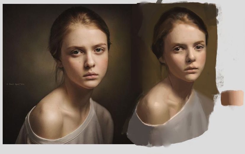


If I mess up the values, the modeling, you get that recognizable muddy look that we want to avoid. It looks like she has dirt on her face or something. And you could say, oh but it's because the color is too grey or not red enough or something. But no. If you put it in black and white, the problem remains. So it isn't the color that is the problem.
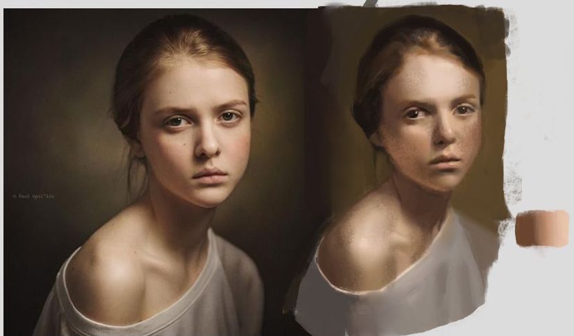
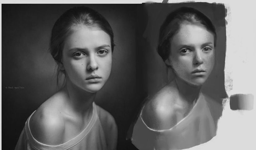
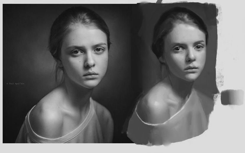


And on the other hand i could take the other version and paint completely wrong colors without changing the value. It doesn't look very good. But it's actually kind of hard to make it look muddy. 
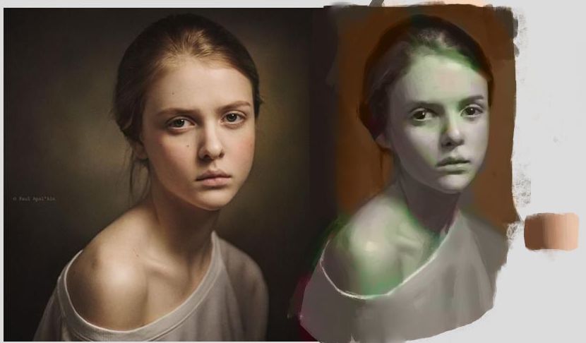


Of course, it's very rare to get values exactly right while having the color completely wrong, usually both are going to be wrong if you're painting in color. Which is why if there's a problem, question the values first, before assuming it's the color.

So a great exercise to improve color is to paint in color, of course! But no color theory in the world will be of help unless you can also get the value right, and in the right place for whatever you're painting, which also applies to something not from reference. Probably applies even more to digital art and concept paintings, since you're not doing a direct translation from nature. So you need to understand value in terms of light on form really well. And in fact I would recommend just forgetting about most color theory that gets repeated a lot. It kind of just puts ideas in your head you don't need at all. Like it's a lot of rules that are true sometimes, but not always. That's just my hot take though, I'm sure lots of people would disagree lol. It's not that there's nothing you can learn about it, but it's probably better to approach the subject without prejudice of what color should be. You learn more just from doing paintings, and realizing your mistakes.

Reply
#5
(04-27-2021, 01:38 PM)JosephCow Wrote: I have to say in my estimation, muddy colors are almost always a result of values being wrong. This can be proven, too, because if you have a painting which looks muddy to you, you can put it in black and white and look at it without color. If it still looks muddy, even though there's no color, then logically the color wasn't the problem. 

Also you can do the same thing with a nice painting.. Just put random and ugly colors all over it on a color layer. It won't look good, but it won't make it muddier. Colors is practically inseparable from value. Color is composed of value and hue, so if you have the value wrong, you have the color wrong, too. This is why it's often best to study light and shade without color.

I don't want to use someone else's work as a bad example, so i'll just use mine.

I did this color study a few years ago, so it's old, and I'm not going to claim it's perfect or anything like that. But i don't think the colors are muddy either, it's pretty clear.


If I mess up the values, the modeling, you get that recognizable muddy look that we want to avoid. It looks like she has dirt on her face or something. And you could say, oh but it's because the color is too grey or not red enough or something. But no. If you put it in black and white, the problem remains. So it isn't the color that is the problem.


And on the other hand i could take the other version and paint completely wrong colors without changing the value. It doesn't look very good. But it's actually kind of hard to make it look muddy. 


Of course, it's very rare to get values exactly right while having the color completely wrong, usually both are going to be wrong if you're painting in color. Which is why if there's a problem, question the values first, before assuming it's the color.

So a great exercise to improve color is to paint in color, of course! But no color theory in the world will be of help unless you can also get the value right, and in the right place for whatever you're painting, which also applies to something not from reference. Probably applies even more to digital art and concept paintings, since you're not doing a direct translation from nature. So you need to understand value in terms of light on form really well. And in fact I would recommend just forgetting about most color theory that gets repeated a lot. It kind of just puts ideas in your head you don't need at all. Like it's a lot of rules that are true sometimes, but not always. That's just my hot take though, I'm sure lots of people would disagree lol. It's not that there's nothing you can learn about it, but it's probably better to approach the subject without prejudice of what color should be. You learn more just from doing paintings, and realizing your mistakes.
I think that will be put to the test in the future.But i certainly see that it seem to hold truth from the example given so far.I just need to be fearless about it i guess

My Sketchbook

Perfection is unmeasurable therefor it impossible to reach it.
Reply


Forum Jump:


Users browsing this thread: 8 Guest(s)