Trees and Shrubs for Video Game
#1
Hello everyone,

I hesitated a good deal before posting this (a few weeks) as this forum seems to be aimed at very advanced artists but on the other hand I can't find any art forums to receive feedback anymore. I might be using google wrong or maybe social media has eliminated the need for old fashioned forums, not sure.

I'm using Krita and working on creating assets for my game. I therefore try to use the RPG perspective.

I can handle interiors good enough to my liking but have been putting off trees and the like because I'm not happy with the result. 

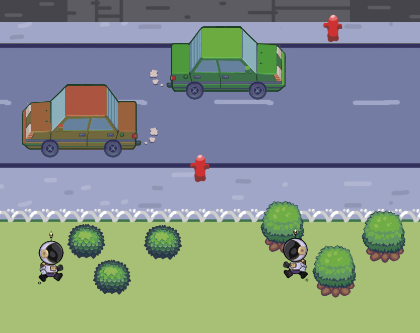
[Image: Jl69qMZ.png]

I've included a car to give you the idea of the art I'm going for as well as the main character of the game. The car will likely be resized but still. 

I think the shrub on the left is ok but the tree on the right looks wrong... too wrong to include in the game anyway. 

I was hoping for some paint overs or feedback. I don't mind any sort of criticism as long as it's feedback. I'd like to support the forum through donations to show my gratefulness. 

Thank you.
Reply
#2
I think these assets look really good. I agree the shrub on the left feels like it fits better. I guess it's more in style with the character. But on the other hand, the character and car are outlined, whereas I see that more with the shrub on the right. Maybe you could simplify some of the leaves on the left shrub and add the 1 pixel outline we see on the character. Maybe it's also a matter of needing more context than just 3 assets to build a cohesive set.

The only other thing i see is that the wheels on the car are like perfectly circular, like we are looking directly at them, but the car is in perspective. So I would expect to see the tires be in perspective too, and see a little bit of the top of them. But obviously i know it's not supposed to be realistic.

This is pretty much the only forum like this that I know of that is actually active.

Reply
#3
An asset isn't design most of the time to be by it own it as to be in sometime in harmony with the other asset or in opposite in some case for example the color of two team.This is why such concept as constrast are useful to define more than light they give importance to what need to be seen first by the player and what is secondary and support the user experience.My point is something might look good but when it put into relation with the rest is might start to create clash.Good asset design goes throught stage of developpement when the game permit it.So a good place to start is the environnement as it the background against which asset color need to be adjusted accordingly.For example you want to design a green monkey does it sound logical to use the same green if your environment ?Probably no because it will be hard to see.Now let take the previous idea and see what can be improve we could make the green for the monkey more satured to give it importance and the other green more desaturated for the background because it less harsh on the eye and is secondary in importance.Of course that just to illustrate that even just a lil difference of hue can help create better visual experience.

Now aside from that try to draw alot that will help you gain more confidence in your ability to create tree no only that you will get better at making less generic looking asset and be able to think outside the box when need be.

My Sketchbook

Perfection is unmeasurable therefor it impossible to reach it.
Reply
#4
(01-28-2021, 11:29 AM)darktiste Wrote: An asset isn't design most of the time to be by it own it as to be in sometime in harmony with the other asset or in opposite in some case for example the color of two team.This is why such concept as constrast are useful to define more than light they give importance to what need to be seen first by the player and what is secondary and support the user experience.My point is something might look good but when it put into relation with the rest is might start to create clash.Good asset design goes throught stage of developpement when the game permit it.So a good place to start is the environnement as it the background against which asset color need to be adjusted accordingly.For example you want to design a green monkey does it sound logical to use the same green if your environment ?Probably no because it will be hard to see.Now let take the previous idea and see what can be improve we could make the green for the monkey more satured to give it importance and the other green more desaturated for the background because it less harsh on the eye and is secondary in importance.Of course that just to illustrate that even just a lil difference of hue can help create better visual experience.

Now aside from that try to draw alot that will help you gain more confidence in your ability to create tree no only that you will get better at making less generic looking asset and be able to think outside the box when need be.

Super agree with everything above: You can't pick a "best version". I don't think one bush is any better than the other, art technically speaking. It all depends on the art style and the context.

Rest assured; no game asset is created once, perfectly, and never touched again. Game art and regular art are both iterative processes!


"No man is more unhappy than he who never faces adversity. For he is not permitted to prove himself." - Seneca
Reply
#5
Thank you for the warm welcome, much appreciated. 


(01-28-2021, 09:37 AM)JosephCow Wrote: Maybe it's also a matter of needing more context than just 3 assets to build a cohesive set.

Of course sensei, you are right. Here's all the objects I've made so far. I hope it gives a better idea of ghe vibe I'm going for.


[Image: 4E6twlS.png]

I will try again based on your suggestions for the trees. 

@gerbenpasjes and @dartiste:
Will reply to your replies in my next update after I've shared the results.
Reply
#6
Alright, here it is, two hours later with some comments:

@gerbenpesjes:
I like your edit! I was thinking of doing fire hydrants later on :). I'll also probably steal the concept for the fence, haha.

@darktiste:
What I gather from your post is that assets should be posted as a whole as opposed to individual pieces. I agree and will try to put a coherent whole by the end of this thread when I have an hopefully nice scenery going on.

Comments follows the image:

[Image: Vnvf4V8.png]
3: Very simple, perhaps too simple. Perspective is a bit off too.
4: An improvement over 3, trying to simplify the leaves as mentioned before but not happy with the result.
5: Working on texture again, hit and miss at various spots.
6: Like #3, simple, could potentially work.
7: Perspective is off and colors are the bottom wrong and fix the top.
8: Tried to correct that the texturing t the bottom. 
9: At a glance, same as #8, my bad!
10: Tried to fix the perspective of 7-8-9 but the color o top too saturated.
11. Tried a new approach again with simpler leaves as recommended. 
12. I like the perspective but the texture is wrong.

That's my own self-criticism. I'll keep at it if you guys could point suggestions or edit. 

Thank you!
Reply
#7
Here's another attempt, 13 to 20.

[Image: ltFMrI5.png]
Ideas? Suggestions?
Reply
#8
I think the issue as i said is you should be having the background of the outside before you make the colored tree and bush asset.If you have problem creating background without the asset try to only do them in linework so that you can still use check for proportion and don't have to color until you choose your background color.As i said previously adjusting color isn't necessarly hard or long to do but if you have to recolor alot of asset it become an issue.Here a order of how you could approch creating asset first the character because they are the center of the action they should be draw so they can scale if need be than the background because it generally occupy alot of space than the smaller object on top .Element that player interact with should be a little more constrasted than what around it or have a certain glow to them that indicate this element can be interact with.

My Sketchbook

Perfection is unmeasurable therefor it impossible to reach it.
Reply
#9
Ohhh I didn't realize you had a lot more. The interior assets generally look great! You have a good consistency of design with the shapes tending toward a rounded rectangle.

Now that I see those, honestly 2 seems the closest to what makes sense to me, if only it had a little bit more relief so it isn't quite so flat, but not so much to make it busy. Just because if you think about it, everything you've drawn so far has a shadow color, and maybe a little pattern when applicable. But nothing like gradation or shading like you have on a lot of the bushes. Most of the shrubberies do look fine on their own, but I wonder if they are over shaded in comparison to your other assets. I feel like you could see how some of them look in context and then decide on it better.

I've done a little pixel art, but you are definitely the expert. So i almost don't even want to give my opinion because at the end of the day it doesn't really mean squat. 


X-smile

Reply
#10
It's actually not pixel art :). I just use very small brushes since my tiles are 32x32. I've looked at your sketchbook and I think I could learn a lot from you so I'm always open your suggestions and idea.

Quote:2 seems the closest to what makes sense to me, if only it had a little bit more relief so it isn't quite so flat, but not so much to make it busy.


Ok, I'll try that! I'm not sure how to achieve that relief but I'll give it a shot!

Quote:I think the issue as i said is you should be having the background of the outside before you make the colored tree and bush asset.

Well, the character is there in the sample if that's what you mean. As for having the rest of the elements of the background, I need to start from something, I mean something has to come first so why not the trees? I'm genuinely curious as I feel I'm missing your point. 

Unless you mean I should provide more elements as well? Like this?:

[Image: vkB4wjm.png]
Reply
#11
Don't worry to much sometime insisting only create more confusion.Just take the time to read back if you don't understand something try to email me if you want.

My Sketchbook

Perfection is unmeasurable therefor it impossible to reach it.
Reply
#12
Fair enough! If you want to attempt a paint over, it might help me understand. A picture is worth a thousand words as they say. :)

So I've attempted a few more which I don't really want to show as I wasn't happy with it. I checked how Mother 3 (Earthbound 2) handle trees and tried to reproduce the foliage.

So at the moment I'm trying to create a cohesive whole.

[Image: jUGQ45a.png]
Reply
#13
Trying to add more elements to make a cohesive whole and adding cliff and water.

[Image: gvEifhh.png]
Reply
#14
Ok so,

V.4:

a. I've removed all of the outlines at the bottom of objects.

b. I've added shadows.

c. Gotten rid of the overdetailed bushes and other elements.

d. Add a few varieties of flowers.

e. Added a fence.

f. Removed some ponds which were subpar to focus on the current one.

g. Added more grass variety.

h. Restricted my palette. I've bookmarked my palette in the upper right and as far as I can tell, they're the only colors I'm using at the moment (excluding the character).

[Image: hH9n4bj.png]
Comments, suggestions?
Reply
#15
Well i would say keep experimenting but at the same time clarify your goal and vision.Work on task that get you closer to your goal.Don't take side quest that doesn't benefit your overall goal.Most game have npc and collectable item maybe you could work on that next.Don"t forget menu and loading screen etc.There alot to a game it really depend what your looking to be doing.You could do some building or just some mob.As far as what you done you seem to be into environnement which make sense for the start of a project.

My Sketchbook

Perfection is unmeasurable therefor it impossible to reach it.
Reply
#16
There's actually quite a lot of content done for the game :). I'm trying to get feedback on the outdoor set because that's currently what is giving me more trouble to in order for something to be presentable. Feedback is hard to find for me so this is taking more time than I anticipated. I don't put them here because they're not what I'm looking feedback for (although I take any feedback, I wouldn't want my current challenge to be sidetracked).

To give you an idea:
[Image: Got_Item_Animation_6.gif]

[Image: Walking_16.gif]

[Image: Battle_System_40.png]

[Image: Speech_Bubble_Text_Animation.gif]

There's more and I'd need to explain everything above but what I'm showing here is the tip of the iceberg so to speak.
Reply
#17
This all looks really good quality! Are you doing this all on your own, or are you on a dev team for this game?

Wish i could help more but it's kind of out of my area.

Reply
#18
I do everything except for the programming and music.
Reply
#19
Feedback only goes as far as what your willing to show us.For the rest it just advise that might be relevant or not.The more clear and rich your vocabulary is the better your able to get the result you envisioned the rest is a matter of skill and effort.We as far as the viewer do not know much of what isn't shown so were feedback are really limited.The problem with is your determine the lenght of what your doing.You could spend week on just drawing outdoor set you need to set yourself deadline and goal if you want to move toward something final else you run into the risk of the project coming to an end due to fatigue and leak of vision.For example this week i will draw an outdoor set that contain x element.Now you have a quantity of achievable and a time frame to achieve it.Without those two thing you can be stuck doing this for ever or until you move on to something else.Designing a game is a big task specially if you don't know how big it gonna be.Think small that would be my advise try to start with the smallest game possible and build on those experience unless you have previously sucessfully work on project that lead to a final product.

Small note for the health bar it not clear how many square are left in the red zone of the health bar because the red start to blend with the color of the seperation.

My Sketchbook

Perfection is unmeasurable therefor it impossible to reach it.
Reply
#20
It's not actually a health bar, it's an ATB :).

I guess what I'm trying to figure out is whether or not the top of the well should be round or elliptical:
[Image: H2Mc8KS.png]
Reply


Forum Jump:


Users browsing this thread: 16 Guest(s)