Cosmic Inhabitant's Sketchbook
#41
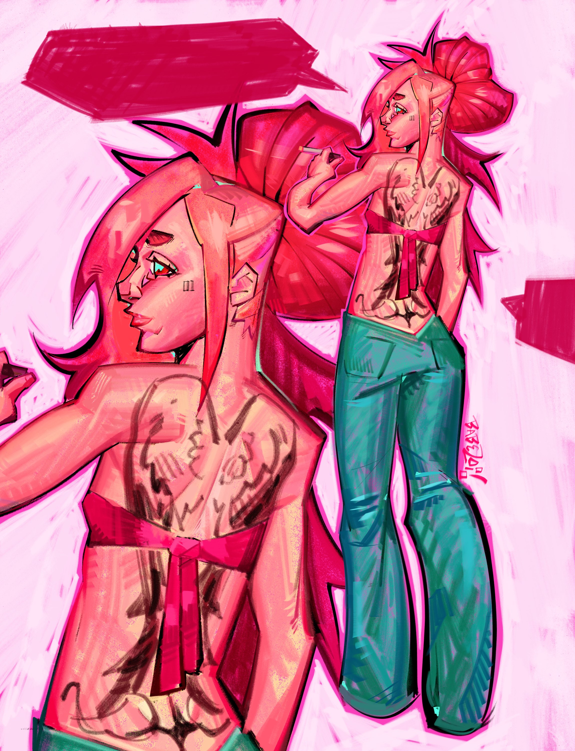
Great updates, loving the character designs of your latest post, very interesting and well drawn and rendered!

Reply
#42
@cgmythology - Thanks a lot! I do think I am improving a bit in rendering, specifically in texturing things. I use to not even attempt to texture much at all, but I am actually at least trying to show or indicate some sort of texture now more often.

---

So with my new piece I am working on currently (droid walking down the hallway) my plan is to go all in focus mode on it. Trying to bring it to a complete status as fast as possible (and as for "complete", I mean to a presentable standard relative to my ability). Cause usually I work on several pieces at a time, and get distracted by other ideas and what not. I want to see how long it really takes for me to finish a piece if all focus is put in to it, and I plan to keep track of roughly how long it takes me as well.

Also I have been doing some 3D sculpting. I've done some before in Blender, but several months ago I found a simple in-browser sculpting app called SculptGL. I've been messing around with it and had quite a bit of fun making stuffs. Its completely free and as I said earlier can be used in-browser, but there is a stand alone app too.

Here's a link to it for anyone interested - https://stephaneginier.com/sculptgl/
And here for the standalone version - https://stephaneginier.com/

I know there is Blender, and I have used it before, but it has a lot of features and is very complex compared to SculptGL. So I think for now I'll stick with SculptGL until I eventually start to out grow its limited features and then I'll slowly make the transition to Blender.


Reply
#43
Great updates! Loving your 3D sculpts as well, it's great to try out different techniques and programs and you seem to have it down quite well already, good stuff!

Reply
#44
@[b]cgmythology[/b] - Hey thanks! Yeah, it was a good find when I was randomly looking around for 3D sculpting programs. 3D sculpting is something I am definitely interested in, even 3D animation I'd want to look in to at some point in the more distant future.

---

So I've made alterations to the piece, and thanks to the user who brought up the issue with the perspective on the droid. Not sure what happened to them, but their post here and elsewhere seem to have disappeared.

It's funny how when I look at it, I wonder what I was thinking lol. The droids left leg and left arm were at an angle as if we were looking down upon it, even though the horizon line is from its knees and below. So I started out by just making a very simplified version of the droid to help with understanding things easier. I also altered the droids gesture slightly so it doesn't look as stiff, mostly just swung the arms out a tad bit more.

I also tried out 2 different 3D poser programs where you can place a figure and move it around which helped nail down the perspective more and reinforce that it is now properly in perspective. The programs are called Design Doll, and PoseMy.Art (both are free, but have payed versions for more features).


I'd say I am about 60%-ish done with this piece at this point. Got the base lighting down, decided to go with the main light being from the walkway lights, then a slight secondary light from outside. The combination of the outside natural light and walkway lights create a rim light around the main subject so it pops out more from the darkness.

So now I gotta clean up the shading a bit and add texture, highlights, some reflections, then it is done. Hopefully with a bit more focus I can get it done within a week or two tops from now.

(Oh, and also, happy Star Wars day! May the force be with you!)


Reply
#45
Critic on ''minimalic character''

To me it appear that you are cutting corner and other trick to avoid dealing with tricky anatomy or just to save time which is bad practice.

Sure you can foreshorten stuff to save time but not so much that you see like 10% of limb or an object a think you want to aim for like 30% atleast.Foreshorten and hiding thing behind object create unecessary confusion that take away from the story.It also give a signature amateur look.

Critic on ''robot in space station''

Right now i would say if i was you i try would to learn more about how to get pleasing light the lightning is inconsistent and don't play into a strong design it look more like it being place there to fill the space which doesn't help drive the narrative.The light on the celling doesn't look like it casting any light and what ever is on the floor look more like smoke than a light source i know it work in progress personally it a disservice to you to present half bake lightning atleast if you gave us some thumbnail we would be alot further in knowing if you made good design decision much earlier and wouldn't have to cast doubt as to where this is heading.

A problem with the piece is that there isn't anything that as a strong focal contrast there to many thing with equal importance in term of value.The only thing that really drive the eye is the level of detail being high on the character and low everywhere else and the color contrast with the red.

The wall look just a bit to empty.I suggest you to thinking of how you could separete that empty space with small medium and big shape something that is more then just lighting and air vent.How are those thing put together it does not make sense to have a wall made of one giant piece but sure you can say ''ALIEN'' but no i suggest you think about how thing are put together it make thing look more believable and it show you care about what you design.

Whatever is at the end of the tunnel is so small it hard to read i had to zoom in to see what it was so an idea would be to shorten the tunnel so we can see an appreciate a bit more what in the background and i think that monitor thing would make more sense if the tunnel was shorten and the exit was closer now it just sitting in what seem to be the middle of tunnel atleast for the viewer point of view.That would help give a clearer context to the story.

Overall i think you use to much of the backlighting and floor lighting it almost seem like you don't want to deal with cast shadow.I understand that interior space really are a pain when it come to casting shadow again it just show that you can't just slap something and hope it work you gotta plan and be cleaver about the choose you make.For example is it necessary to have the character in full? How can you frame the character so you can avoid that cast shadow?Those are some question that save time sure making the choose of not having to deal with cast shadow save time but it not always logical if it add to the story and the more you push away thing you find problematic to deal with the more you are a slave to those decision that if repeated become crippling and limiting.

My Sketchbook
The journey of an artist truly begin when he can learn from everyone error.
Teamwork make your dream work.
Asking help is the key to growth.
Reply


Forum Jump:


Users browsing this thread: 5 Guest(s)