09-05-2016, 11:48 PM
Hello, I'm here and this is my first character design. After studying some silhouettes, which is below:
![[Image: oYTZLoK.jpg]](http://i.imgur.com/oYTZLoK.jpg)
I chose are here:
![[Image: mSrLQNR.jpg]](http://i.imgur.com/mSrLQNR.jpg)
Well, I developed a drawing to help my idea (something I have to improve> drawing and anatomy) and will translate ideas:
![[Image: AxbgA4r.jpg]](http://i.imgur.com/AxbgA4r.jpg)
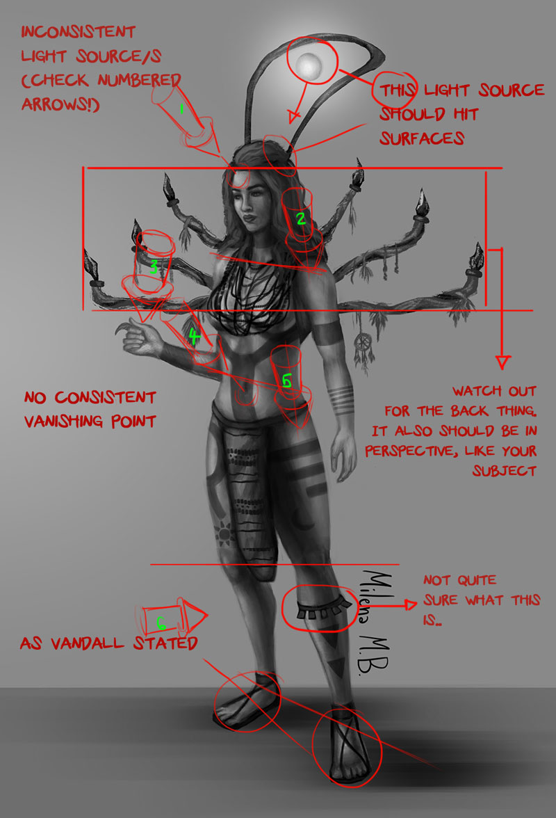
This character is an ancient civilization that has disappeared, who owned a large prehistoric technology.
This ball on top of the arch is a "divine light", which is the source of power of the character.
These spears are physical and spiritual protection, has an indigenous ornaments because she lives in the forest.
Well, tattoos are decorations same but has the meaning that it is a protective forest, a tribe that is good.
Okay, I made a pose sketches to see if the silhouette work and such, I chose the one in black at the end.
![[Image: NH6DYzY.jpg]](http://i.imgur.com/NH6DYzY.jpg)
And starting this, I started to paint. She is holding a leaf and looking at her because she has this connection to the forest.
![[Image: 5zZGduO.jpg]](http://i.imgur.com/5zZGduO.jpg)
This is my final result and would like reviews, help and tips before I start giving color.
Anatomy tips, pose, finish and the universe of character same design, to see if I am in a way that functional and productive.
I hope you enjoyed and to post there, please hahah
Kisses, Mi.


